It’s been over a year and a half in the making (and so much longer since the last substantial update to the app), and now it is finally here. I’m so very happy to announce the release of ScreenFloat 2, available now!
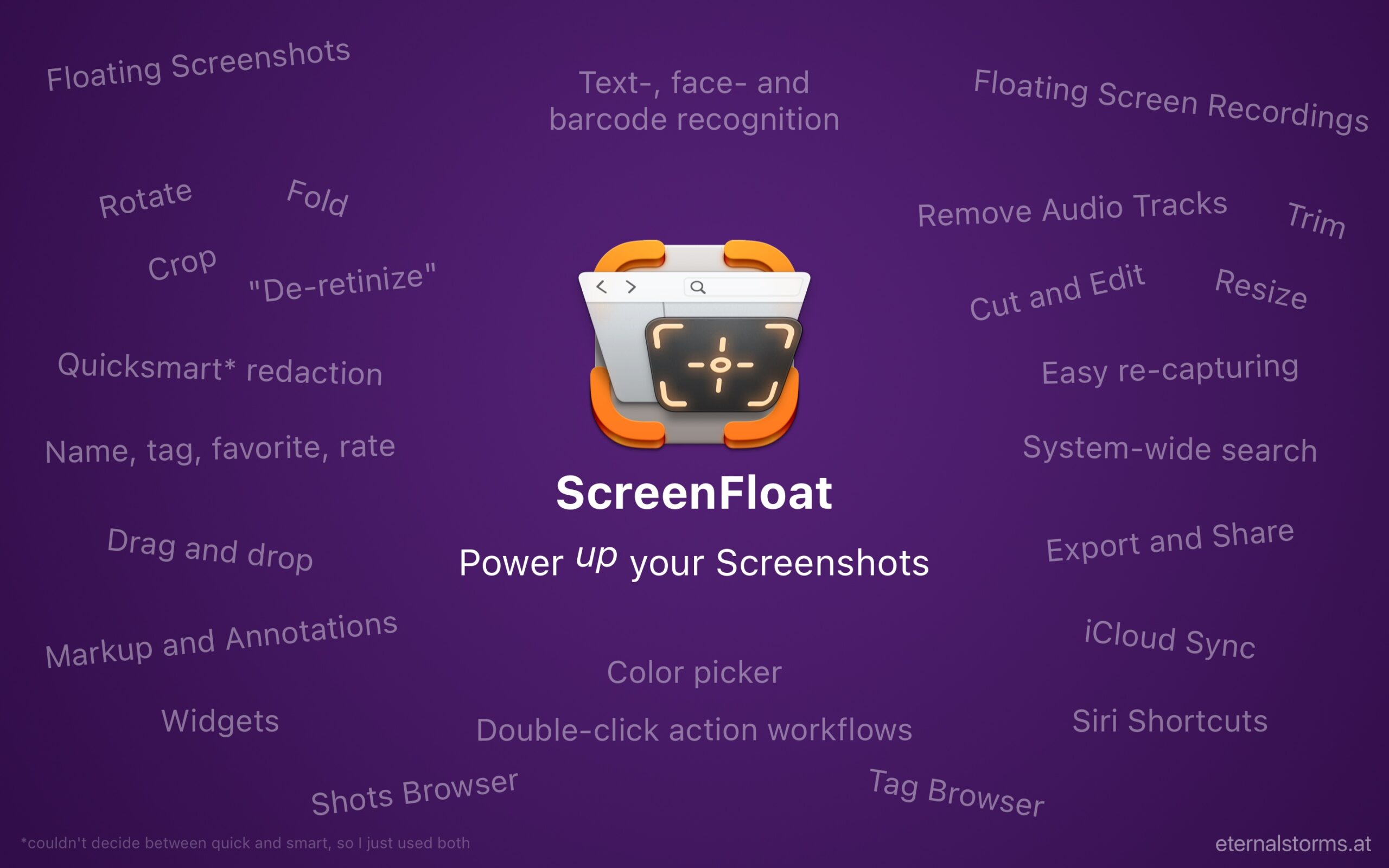
Re-written completely from the ground up in Swift and based on Core Data, ScreenFloat 2 keeps true to its roots – floating screenshots, and the Shots Browser – and builds upon them in multiple, very useful ways.
If you’d like to skip all the details and just download the trial or get the app from the Mac App Store, please feel free to scroll all the way down.
What is ScreenFloat?
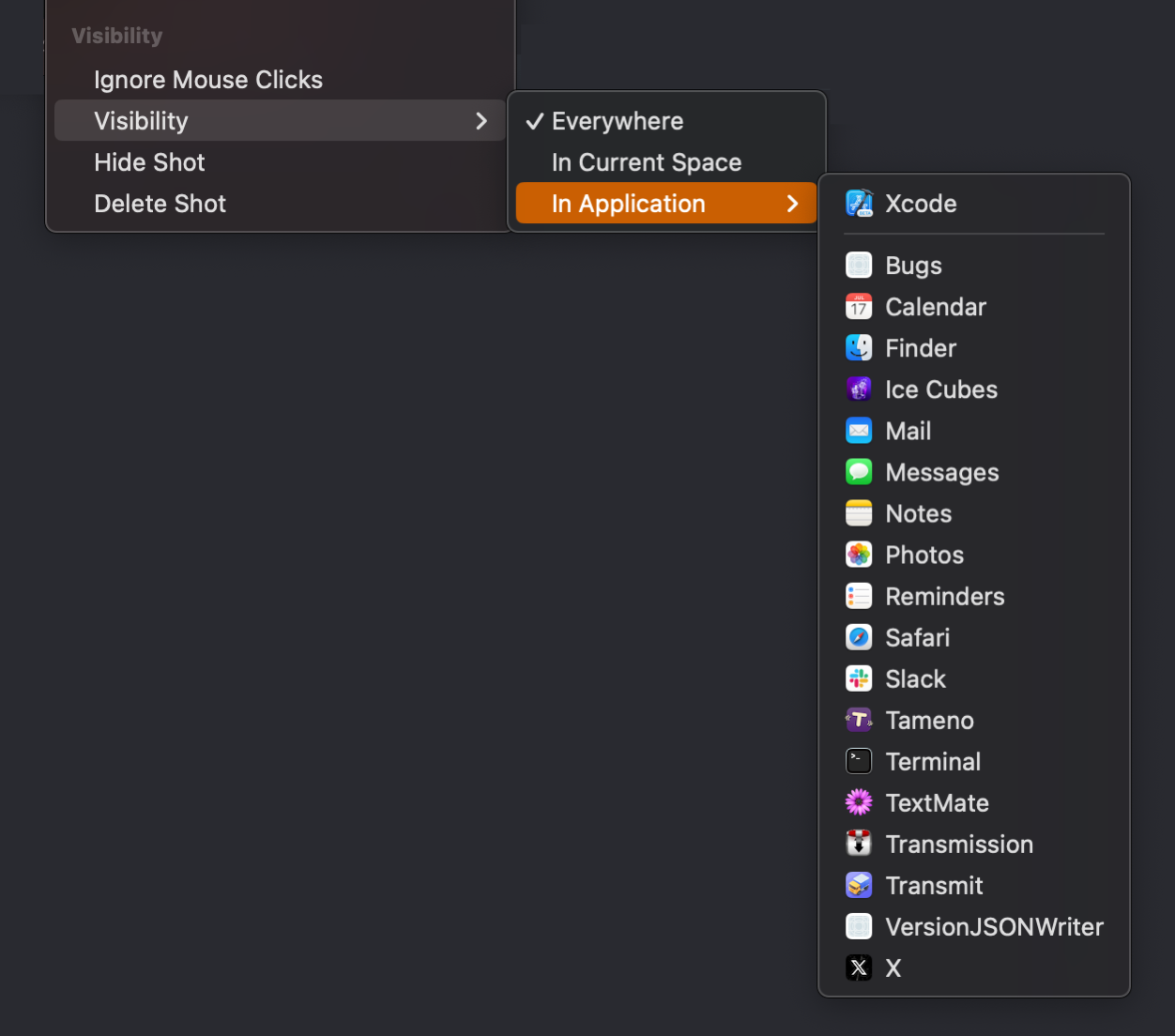
At its core, ScreenFloat creates floating screenshots. Think of it as Picture-in-Picture for your screenshots and recordings: it keeps information always in sight, no matter what window, (fullscreen-) app or Space you’re in. It’s useful in so many ways: you want to remember something, you want to transfer information from one app to another, you want to keep a visual reference to something on screen – anything you can screenshot, you can float with ScreenFloat.
In the Shots Browser, your shots are stored and organized. It keeps your desktop clutter-free and your shots always at your disposal.
What’s New with ScreenFloat 2’s Floating Shots?
ScreenFloat 2 brings a lot of changes to floating shots, so here are the most important ones.
+ Screen Recordings
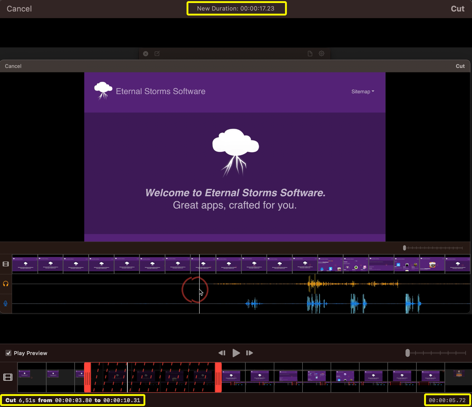
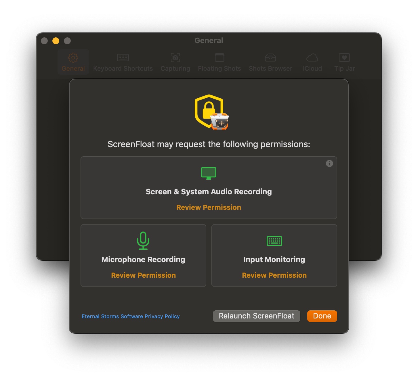
Not only can ScreenFloat 2 take screenshots, it can also record your screen, together with (optional) microphone- and system audio. Of course, these recordings can be floated and interacted with, like you would any other screenshot. They can be trimmed, rotated, cropped and muted. Still-images can be easily extracted.
+ Text-, Face- and Barcode Detection
Every shot you take is analyzed for text, faces and barcodes. It’s so easy to view the contents of a QR Code (supported are urls, calendar events, vCards and more), or quickly redact information, with a simple right-click.
+ Annotation, Markup and Redaction (non-destructive)
You can add annotations and markup to shots: freedraw, rectangles, ovals, lines, arrows, stars, checkmarks, x-marks, text, smart enumerated lists, highlights and redactions. All of this is non-destructive. That means you can always come back and make changes, or delete them all and revert to the original image. Double-click a tool or an annotation to edit its properties, like line weight, font, or color.
+ Crop, Rotate, “Fold”, Resize, “De-Retinize”
Crop shots, rotate them, “fold” them(see video above), and resize them effortlessly. Reduce a shot’s resolution from its “retina” dpi of >= 144 to 72 dpi when you want to save some space, or know you won’t need the higher resolution going forward.
+ Quick Drag
Drag a floating shot’s document icon to any app to share the image as you see it via drag and drop. Or click the document icon, and get access to quick export options so you’re able to drag out a different format, at a different quality, “de-retinized”, at a different size, and with or without annotations/markup.
+ Color Picker
When you option(⌥)-click-drag on a floating shot, the color picker will appear. When you release the mouse button over a pixel, you’ll be able to copy that pixel’s color’s values, a color sample image, and even drag out the color onto a target in another app.
+ Double-click Action Workflows
Set up custom, keyboard-modifier-key-based double-click workflows, like: – Reduce the floating shot’s opacity to 40% and make it ignore mouse clicks or – Edit the shot with annotations, and when I’m done, upload it to iCloud(see above)
What’s New in the Shots Browser?
Apart from adding the ability to rate and favorite shots, here are the most important new features in the Shots Browser.
+ iCloud Sync
Your shots, tags, annotations/markup and metadata are synced over iCloud across your devices. You have the last say over what gets synced, though: all shots, only image or video shots, or only shots up to a certain file size.
+ Privacy
With Privacy enabled, your Trash and any folder that may contain hidden shots require authorization before you can access their contents.
Smart Folders come with a lot of new criteria for you to find just the shots you’re looking for. These are also available in the Shots Browser’s search. Shots are (optionally) indexed with Spotlight, so you can find them system-wide.
(Spotlight) Search and Smart Folder criteria not only find attributes you give your shots (like filenames or tags), but also what’s in a shot, like texts, or barcode contents.
+ Tag Browser
With the Tag Browser, you rename, favorite, merge and delete tags, so you can keep things clean, neat and organized.
+ Exporting, Sharing
Export shots in the format, quality, size and resolution you need. With or without annotations and metadata. Upload multiple or large shots to iCloud and share a link to that, instead of attaching a large file.
What else is New in ScreenFloat 2?
+ Siri Shortcuts
Automate taking screenshots, timed screenshots and recordings with Siri Shortcuts. Add a title, notes, tags, and move them into folders, all in one go.
+ Widgets
Access your shots, folders, picked colors and more with ScreenFloat’s widgets.
Availability and Pricing
Alright, let’s get down to the nitty-gritty.
– ScreenFloat 2 requires macOS 12 Monterey or newer.macOS 13 Ventura or newer required for recording your microphone/system audio alongside screen recordings. – A (free) iCloud account is required if you wish to have ScreenFloat synchronize your library across your devices.
ScreenFloat 2 is a free upgrade for existing customers of the app.If you’d like to support my work beyond its one-time purchase price, there’s a completely voluntary and optional tipping mechanism (in-app-purchase) available in ScreenFloat 2’s settings.
There’s a free, 28-day trial for you to download here (direct download link) You can purchase ScreenFloat exclusively on the Mac App Store at USD 6.99 / EUR 7,99 / GBP 6.99 for a limited time, then the price will go up to USD 14.99 / EUR 15,99 / GBP 14.99. It is at this time localized into English, German and Chinese (Simplified).
If you have any questions or feedback, please do not hesitate to write me. If you’d like to review ScreenFloat 2 in a publication of some sort (blog, news site, podcast, etc), you’re more than welcome to write me and I’ll get you the information you need. I do look forward to hearing from you.
I hope you’ll enjoy ScreenFloat 2. I couldn’t be happier it’s finally out!
ScreenFloat lets you keep visual references to anything you see on your screen floating above other windows using screenshots. It’s also a screenshot organizer.
I’m now working on ScreenFloat 2, and I thought it would be fun to chronicle my progress, struggles, successes, failures and break-throughs, as well as random stuff while developing it.
Disclaimer: Estimated Time of Arrival, Pricing
I don’t have an ETA. I’m a solo developer, with multiple apps that need maintenance and updates, there are just too many moving parts for me to be able to estimate, well, basically anything. And while that may be a serious lack of managerial skill: I accept that flaw and ignore it 🤷♂️.
Regarding pricing, I don’t know what ScreenFloat 2 will cost yet. But I am resolved on its upgrade path: existing customers of ScreenFloat 1 will receive ScreenFloat 2 for free.
Entry 4 – Roadblock: Deadlock
It’s been quiet in this journal recently. The reason’s twofold. 1) I’ve been busy making good progress on the app and didn’t want to interrupt my flow. 2) I encountered a deadlock issue in my Core Data stack that I’ve been trying to debug for the last one-and-a-half weeks (and never solved directly, but found a way around it).
So much has happened and changed, though, so it’s high time I give an update.
Floating Shots
I reworked the floating shots a bit. If you recall, I had a few kinks to work out regarding the floating shot’s framing. I reconsidered my approach and instead of using a window below the actual shot content’s window to act as the framing that holds the buttons, the entire thing is just one single window now, and with that change, I was able to get rid of all the issues I had. Getting the resizing of a floating shot was a bit of a hassle: the image itself has a different aspect ratio than the “outer” framing window. However, the user resizes that outer window, not the shot itself, so the resizing has to take that into account. Nothing a bit of trial-and-error couldn’t fix; I ended up with an aspect ratio NSLayoutConstraint on the image that does the heavy lifting for me. The only downside is that if the image’s width is larger than the image’s height, resizing the window from its lower or upper edge won’t work. Conversely, if the image’s height is larger than its width, it can’t be resized from the sides. Thankfully, resizing from the corners always work, so it’s not a deal-breaker, but it’s something I’ll investigate further later down the road.
Shots Browser
I defined my first milestone in ScreenFloat 2’s development to be “feature parity” with ScreenFloat 1. That’s the thing about complete re-writes (which ScreenFloat 2 is – see journal entry #1 for my reasoning): you’re spending a *lot* of time re-implementing stuff that’s already there and works. That can be frustrating at times, because you’re not making any progress on those cool new features you want to implement with the new version. But it can be equally rewarding, because you get to improve upon what’s already there, and use all the experience you’ve gained since implementing the original.
Now, as part of the “feature parity” milestone, the next step for me was to get started on the Shots Browser.
It’s your basic three-pane-setup. The left pane is your source list. It consists of app-defined folders (like “All Shots”, “Favorites” and “Recently Deleted”) and (smart) folders you can create. The middle pane shows shots contained in the folder you selected in the source pane. The right pane shows information about the currently selected shot (if any).
The source list is an ordinary NSOutlineView, and has been improved quite a bit already in this early stage over its v1 counterpart.
Folders can now be duplicated, and its contained shots exported via the contextual menu. You can also drag out folders – for example, to Finder – which will trigger an export of the contained shots to the dragged-to destination. Aside from deleting the folder, you can also hold the option (⌥) key to show the alternate option, which deletes the folder, and all its contained shots.
ScreenFloat 2 defines a couple of smart folders for you, like “Favorites” or “Floating Shots”. Hover over the Library header, and you’ll be able to add and remove any you want or don’t want:
For each of those, you can change just what “Recently” means to you:
Apart from the app-defined folders, you can create your own (smart) folders. “Normal” folders just hold the shots you add to them, whereas smart folders automatically populate themselves according to rules you set up for them:
I’m very happy with the tag suggestions feature. It serves up tags in the following way: First, it displays tags that *begin* with the exact string you typed. Second, it displays tags that *contain* the exact string you typed, *anywhere* within the tag. And lastly, as you can see in the video, where I type “ysmt” and it serves up “yosemite”, it does a bit of regex matching. With all that searching going on, I figured it would make sense to split that up into multiple threads (each search on one thread). However, as it turns out, that’s actually slower than doing it one after another – instead of 0.0002+ seconds, it takes 0.0003+ seconds per search. Maybe with a gazillion of tags, multi-threading would be the way to go, but I decided against it for now. Instead, I’m doing some smart caching, where any subsequent search only operates on the result of the previous search, so if you type “y”, all tags are filtered for “y”. Then you go on to type “o” (entire string now would be “yo”), and it will only operate the new search on the already existing result from the “y” search. All results are cached for the duration of the creation of the smart folder, after which, it’s discarded, because tags are more likely to change then.
Smart Folder rules can become quite complex, and it’s something I’m looking into improving going forward, as those are directly matched against the Core Data shots library. In my testing, adding lots of tags to lots of shots, it can bring the Mac down to its knees (partly Core Data querying, but mostly my own current implementation of displaying the number of shots in a Smart Folder). To improve that, I’m moving all boolean rules (like isFavorite, or isInCategories) to the front of the search, as those are much faster than string comparisons. This way, subsequent string searches would only be executed on a subset of the shots (i.e., only on shots that are a favorite), not the entire set, which would be the case if the string search was the first thing in the matching process.
I’ve also started work on importing shots into the Shots Browser. Obviously, taking a floating screenshot using ScreenFloat is the main way to get new shots into the app, but I also want to facilitate other ways and sources. So the Shots Browser supports drag and drop for ordinary file drags, and promise file drags. It can also create a folder for you right away, depending on where you drag the files:
Enough about the source list. Let’s move on to the middle pane: the shots list. Not much UI work has gone into this yet, but behind the scenes, a lot has changed. ScreenFloat 1 uses IKImageBrowserView, which served me well, but it’s about to be deprecated by Apple, and it’s recommended to switch to NSCollectionView instead, so that’s what I did. I have a rudimentary system for displaying shot previews set up, but it’s not finished yet and can take up quite a bit of memory right now, but that’s obviously just for now, while I get things going. For shots to be displayed, I look at my app’s thumbnail cache and see if I have an image cached. If not, I look at the app’s Caches directory to see if I’ve already created a thumbnail in the size I require and load it from disk. If not, I create a thumbnail from the original image (because it’s usually smaller than the original shot), save that to disk (so I don’t have to do the thumbnail creation again later) and load it into the app’s cache (so I don’t have to read it from disk every time I display the shot).
I don’t know if resizing the previews is necessary (although it is available in ScreenFloat 1), but I probably will implement it in ScreenFloat 2, too. It’s just a bit of additional work because IKImageBrowserView allowed for it more readily than NSCollectionView.
Moving on to the info pane. It went through a couple of iterations:
What I like most about it, if I may say so myself, is my custom implementation of a “compressible” date field. The smaller the pane gets, the less info the date shows, in order not to be cut off / truncated:
Tags Browser
A new feature in ScreenFloat 2 is the Tags Browser. While working on the migration from the SF 1 database to the new Core Data backed one, it occurred to me I had many duplicate tags, just spelled differently – uppercase, lowercase, with or without space, etc. I wanted a way to edit (rename), delete, favorite and – most importantly – merge tags. That’s how the idea for the Tags Browser was born.
As you can see, I have both “cocoa” and “Cocoa”. Now I can merge them into just one (or an entirely new one), and the Shots tagged with those tags will update automatically, thanks to Core Data.
Bad Luck, Dead lock
You know how they say you’re insane when you do the exact same thing over and over, and expect different results?
Speaking of tags, I discovered an issue that drove me friggin’ crazy the past two weeks.
First, a quick note on what a deadlock is. An app can have multiple layers of execution (threads). Every app has at least the main thread, which is where UI work happens (for example, updating the Shots Browser’s Source List happens on the main thread). For longer running tasks, it might be better to run them on a background thread, so that the main thread – and thus, the app’s UI -, is not blocked. However, if the background thread requires the main thread to complete something, and the main thread requires the background thread to complete something at the same time, it’s game over. You’re done. Finished. Kaputt.
And that’s exactly what I experienced. But that’s not the driving-me-insane part. It’s that this only occurred sporadically. A bug is fairly easy to figure out and fix if you can reproduce it reliably. You execute function A, and the app crashes. Good. Fix function A. But if you execute function A a thousand times, and out of that, it crashes twice, what to do then?
I had my Core Data stack set up like this:
Three contexts. Context A is on a background queue, which writes to disk. It’s good to have this on a background queue, in order to not block the UI/app if it’s a longer operation. Context B is on the main queue, so I can populate the interface with objects’ contents. Context C is on another background queue, if I have to fetch a lot of shots, for example.
When I save context C, it saves to context B (not yet to disk). When I save context B, it saves to context A (not yet to disk). When I save context A, it saves to disk.
So in order to save a change I have made on queue C, I have to save C, B and A subsequently. And it works fine. Except when it doesn’t. I found that when I drag > 700 shots to one tag, context C and B save fine, but context A deadlocks. But sometimes, it works without a hitch. Or when I create a new Folder with > 700 shots, and save from C to A and to disk, it deadlocks. But sometimes, it works without a hitch.
You know how they say you’re insane when you do the exact same thing over and over, and expect different results? Well, what say you to this, Einstein!?
I thought it might be an NSFetchedResultsController (which is a way to automatically be notified about changes to objects in Core Data, simply put) that gets in the way, as it is updated behind the scenes by Core Data when saving occurs. So I disabled them. Same result. I then created a sample project, trying to isolate the issue, and sure enough, it happened there as well.
This sort of thing gnaws at me. It’s always in the back of my mind, because I can’t figure it out. I tend to fixate and get frustrated, and eventually end up thinking the project is doomed.
To vent, I took to twitter asking for help. And thankfully, I got a pointer, directing me to NSPersistentContainer (thank you, Frank Reiff and Steve Harris). I did know about it, but for some reason I thought it was only available on macOS Big Sur (11.0) and newer. I was wrong – it’s available on macOS Sierra 10.12 and up.
It does things differently, and it solved my deadlocking. Instead of having one context writing to disk and child contexts on top (see drawing above), it has one main context (for UI work) which writes to disk, and offers backgroundContexts, which also write to disk directly. The way it’s set up, though, is that when you change something in a background context, the main context is notified about it and also has those changes more or less right away.
Now I must admit, I don’t know Core Data well enough to understand why I deadlocked before. And after almost two weeks of trying to understand, I really don’t care anymore. I’m just happy it’s working now. I tried getting it to deadlock multiple times – with more than 700 shots dragged to a tag and saving – and it all works like a charm.
Fingers crossed.
That’s it for now. It’s been tough – but any project eventually (and sometimes, repeatedly – yay) hits a point where I think it’s all over. At least, for me, that’s always been the case. I guess, the lesson here is: no matter what happens, keep going. Don’t let it get you down too much. Ask for help if you need it, there’s always someone out there who’s been through it already, or knows something you don’t. And the Mac developer community is one of the friendliest and most willing to help there is.
Thank you for joining me. Feedback, input and questions are welcome: mail me, tweet me. Take care!
ScreenFloat lets you keep visual references to anything you see on your screen floating above other windows using screenshots. It’s also a screenshot organizer.
I’m now working on ScreenFloat 2, and I thought it would be fun to chronicle my progress, struggles, successes, failures and break-throughs, as well as random stuff while developing it.
Disclaimer: Estimated Time of Arrival, Pricing
I don’t do ETAs for my own products. I’m a solo developer, I have multiple apps that need maintenance and updates, there are just too many moving parts for me to be able to estimate basically anything. And while that may be a serious lack of managerial skill: I accept that flaw and ignore it 🤷♂️.
Regarding pricing, I don’t know what ScreenFloat 2 will cost yet. But I am resolved on its upgrade path: existing customers of ScreenFloat 1 will receive ScreenFloat 2 for free.
Entry 3 – Busy Doing Nothing*
I feel like I got nothing done in regards to ScreenFloat 2 over the last two weeks. But it’s not because I didn’t work on it. It’s much rather that I’m not quite sure if what I worked on will make it into ScreenFloat at all. It was all a bunch of UI experiments and refinements. *Refining something that might not make it into the final product does sometimes sadly feel like doing nothing.
I made a much needed change to the way I render screenshots in these floating windows. Whereas in v1, I used to set NSWindow‘s backgroundColor to a pattern color of the image, I now use an NSImageView, like a sane person. I have no clue why I used to do it like that before. Perhaps I couldn’t figure out how to make a window move by its background with an NSImageView on top (see NSView’s mouseDownCanMoveWindow)? Maybe it was just “easier” or quicker than adding an NSImageView to the window in code? Maybe it was left over from early prototyping and I never refactored it, because it worked well enough? Whichever you think it is, rest assured that they all do sound like something I would do. If you ask me, the answer is: “all of the above”.
Another important performance improvement I made is that, when a floating shot is hidden (not closed), instead of only reducing its alphaValue to 0.0 (lazy me), I now call orderOut on the window, effectively removing it from the list of windows the WindowServer has to manage. And though the window is still in memory and can be re-shown any time (at which point I’ll order it back in and animate its alphaValue to what it was before hiding it), while it’s hidden, it doesn’t affect performance as much as a hidden floating shot in v1 does. And the more hidden floating shots you have, the more you’d notice.
Resizing Shots
Floating shots can already be resized in v1 of ScreenFloat. Just like any other window, you can grab one of its edges and drag it to resize it. Version 2 will provide feedback during resizing: it’ll show the shot’s size as a percentage, and in absolute values:
I also removed the upper limit, which was 200% in ScreenFloat 1. It snaps to 100% when you’re close to it, which can be toggled off by keeping the command (⌘) key pressed.
Shot Transparency
ScreenFloat 2 will continue to allow you to make a floating shot transparent by scrolling up or down within it, with a couple of improvements. 1) It will remember the transparency value over restarts of the app, or when hiding/closing and re-floating a shot. 2) It provides feedback while changing the transparency. 3) For convenience, the opacity can be changed all the way down to 0%, and when the scrolling ends (you lift your finger from the trackpad), it bounces back up to a minimum value of 40%.
– Introducing: The Periodic Table of NSVisualEffectView
About “Busy Doing Nothing”: this is part of that “nothing”.
While working on that feedback panel that comes up when resizing a shot, or changing its transparency (see above), I needed an overview of the different appearances an NSVisualEffectView can have. During testing, I discovered that NSVisualEffectView accepts material values from 0-37, of which only a few are documented. With that in mind, this sample app shows 152 NSVisualEffectViews. 76 light, 76 dark, each consisting of 38 vibrant and 38 non-vibrant variants. Some of them look like they produce duplicate results, but all I needed was a brute-force way of showing all variants at once for comparison, so I didn’t bother filtering out anything.
You can download the source code here, if you’d like to play around with it yourself. By default, it uses your desktop image as its background, but can be changed to a basic color easily – just follow the instructions in the code’s comments.
I’ve only tested it on macOS 12 Monterey for now, so it might not work on earlier versions of macOS because of the undocumented material usage. Alas, backwards-compatibility is something I’ll get to a bit later in ScreenFloat 2’s development, as I don’t want to restrict myself from the get-go from which APIs I am able to use.
Floating Shots UI
Most of the time I spent on ScreenFloat 2 in the last two weeks was on the floating shot’s UI – and even though I’m pretty happy with it now, I’m still not sure if it’ll make it into the final product.
Here’s what the UI looks like in ScreenFloat 1 when you move your mouse over a floating shot:
The top left button closes or deletes a shot, the top right button gives access to various functionality, and the bottom left image-file-icon allows you to drag a file-representation of the shot to other apps.
My goal for ScreenFloat 2 is to not overlay too much stuff over the screenshot itself, while at the same time offering access to more functionality. Here’s what that looks like right now:
I like it because it keeps the floating shot itself clean, and gives all sorts of options to the user. It can also be extended, like a bottom bar, for example. And while it looks simple enough, implementing it was quite a journey. And painful, at times. My first attempt at implementing it was to extend the actual floating shot’s window. I’d extend the NSLayoutConstraints at all edges and animate-in the additional UI. It worked, but it moved the floating shot out of place, a tiny bit every time. I’d counter that with another animation of the shot’s window’s frame to keep it in place, but that made things even more janky. Fail. What you see in the video above is my second, better-but-more-complex approach. The additional UI that appears is a separate, second window, placed underneath the floating shot window. This way, when the UI appears, the shot keeps in place perfectly still. In fact, the shot’s window’s frame isn’t affected by it at all. So far so good, but what about moving the window? What about resizing it? What about adjusting the transparency? That’s where the pain starts.
The “additional UI” window is a child of the floating shots window, so that when you move the shot, the UI window moves in relation to it. But that doesn’t go the other way around – when you move the UI window, the shot would remain where it is. And the docs say not to set the parent of a child as the child of that child, which could perhaps solve this (I didn’t try. It sounded too weird to even attempt it. It’s one of those things that destroy the space-time continuum). Instead, you have to hook into the frame-updating functions. The trick here is to find the right one to hook into, so that moving the child window does not result in the parent’s movement to lag behind. In my testing, overriding setFrame(_ : display: ) was the sweet point where I couldn’t notice a lag.
Resizing the shot with the UI window visible was (and continues to be – I’m not completely done with that yet) another pain point and again a potential source of laggy UI. When the shot is resized, the UI window needs to be resized in accordance. Not only that, the shot has a specific aspect ratio I don’t want to ruin, which is easy enough to implement for the shots window alone, but resizing the encompassing UI window in accordance took a bit more tinkering (and coffee ☕️). Finally, the whole thing has to work the other way around again, so that when I resize the UI window, the shot has to resize in accordance, with both respecting their own, respective aspect ratios.
Adjusting the transparency was the easiest thing to do, on the other hand. I just “hand over” the scrolling event to the floating shot’s window, and it does its thing.
Being able to drag a file-representation of the floating shot out of the app right away is very convenient, so it has to be available in v2. For now, I settled on this simple approach: Click and hold onto the floating shot, then drag the file to wherever you want it:
Once you know how it’s done, it’s very convenient. But would you have known? If this remains, there’s got to be some introduction to it. Work in progress.
– Still to be figured out
A video says more than words in this case, so, for your amusement, here are a few kinks that still need working out:
This actually shows a cute, little implementational detail: The “additional UI” window is not completely “solid”. The part where it’s obstructed by the floating shot’s window is “chiselled” out. When changing the transparency of the shot, it would be a shame to have what is revealed underneath darkened by the “additional UI” window – even if that, too, is changed to a lower transparency. The only solution was to create a maskImage for the NSVisualEffectView and remove the part that is underneath the floating shot. Yet another thing that has to be updated when the shots window or the UI window is resized.
Screen Capture
I spent all day yesterday on being able to actually capture new screenshots. Like I did in ScreenFloat v1, v2 will use the screencapture tool macOS provides. Long-time-readers of this blog might remember my attempt to re-implement that very CLI myself. Frankly, it’s too much trouble. So as long as Apple allows 3rd party developers to use the screencapture CLI, I will continue to do so.
The new implementation, even though it’s now Swift, is more or less the same as v1’s, but there are a few improvements I was able to make. Most prominently, the placement of the shot. Here’s the placement of a newly created shot in ScreenFloat 1:
And here’s how newly created shots are placed in ScreenFloat 2:
In recent versions of macOS, screencapture outputs the capture frame in a couple of ways: stdErr, the resulting image file’s extended file attributes (“com.apple.metadata:kMDItemScreenCaptureGlobalRect“), and, if indexed by Spotlight, as a general metadata value of the resulting file. If all fails, ScreenFloat 2 reverts to ScreenFloat 1’s behavior. As usual, there’s something to be aware of: screencapture‘s captureFrame originates at the top left of your screen, and the x/y coordinate of the frame is at the top left of the frame, whereas many of macOS’ drawing APIs are bottom-left based (but not all – that’s the fun!). So before this can be used to place the floating shot properly, it needs to be converted to “bottom-left” based coordinates instead of “top-left” ones.
This leads me to the second improvement I was able to make: re-take previous screenshots. Using the captureFrame, and feeding it back into screencapture, I’m able to re-create a screenshot of the same area, without user interaction. I haven’t implemented it yet, but tested it in Terminal. What could possibly go wrong?
That’s it for this time. Thank you for joining me. Feedback, input and questions are welcome: mail me, tweet me. Take care! 🤗