macOS

[Note: This is a guest blog post written by Thomas Zoechling (@weichsel on twitter), a macOS developer based in Austria, about his Mac app Claquette]

Claquette Mac App Icon

Animated GIF is not a good video format.
Actually it even isn’t a proper video format because it lacks random access and audio support. Nonetheless animated GIFs experienced a rennaisance in recent years.
My theory is, that the format’s success doesn’t stem from the features it has, but from the ones it lacks:

  • No random access: Defaults to autoplay – No playback interaction needed
  • No sound: Guarantees silence – Always “Safe for Work”
  • No support for 32bit colors: Moderate file sizes and a characteristic look

Given those constraints, GIFs are a great way to communicate simple concepts or interactions.
Want to showcase an animation or an application feature? Instead of a static screenshot with paragraphs of text, a 3 second GIF works equally well and also draws more attention.

In my daily life as software developer, I often need a quick way to capture graphical bugs. Those clips can be easily shared with colleagues or included with bug reports.
Sometimes it’s also simpler to attach a GIF to customer support requests instead of explaining how a certain feature works.
To cover my own needs, I wrote a small macOS application that allows me to record the screen and export the result as animated GIF. The app uses a custom recording codec and also covers the rest of the GIF creation workflow like crop, trim and file size optimization.

You can download Claquette from the Mac App Store. For detailed product information, please visit our website.

Development

When I started to implement the Animated GIF feature for Claquette, I began with a naïve approach.
Armed with several years of experience in writing Objective-C and some knowledge about video APIs on the Mac, I wrote a small prototype.
That first version just read a video file frame by frame and sent the resulting frames to ImageIO. ImageIO is a system framework that supports reading and writing several file formats.
It also comes with a basic Animated GIF encoder and so I decided to skip any third party libraries and just use the built-in mechanisms of macOS.
I was able to come up with a working prototype in a single afternoon. The program was just a simple command line utility, but it was able to turn an arbitrary video file into an animated GIF.

There was just one problem… Or actually there were several of them: Due to the inner workings of ImageIO, the program used vast amounts of memory. Also, the encoding took very long and the files it created were huge. On top of all that, the resulting GIFs looked horrible.
So while it only took me one Sunday afternoon to create a working prototype, it took me several months to fix the above issues. Especially the large file size and the bad visual appearance of the resulting GIFs required a lot of research.

Getting the most out of a 30 year old file format

The original GIF specification (GIF87a) was written in 1987 – almost 30 years ago. Animation features were added in GIF89a, which is still the most recent version of the format.
So how is it possible that a file format designed for low resolution screens and 256 colors is still in use today?
It turns out that the GIF specification contains some sections that open room for exploitation. Additionally, the visual nature of GIFs allows for optimizations to trick human color perception.

The format is simple and has the following basic structure:

  1. Header
  2. Logical Screen Descriptor
  3. Global Color Table
  4. Graphic Control Extension (Frame #1)
    – Delay
    – Disposal Method
    – Local Color Table
    – Image Descriptor
    – Image Data
  5. Graphic Control Extensions (Frame #2)
  6. Graphic Control Extension (Frame #3)
  7. … (1 GCE for each animation frame)
  8. Trailer

Header and Trailer are basically just magic numbers that mark the start and the end of the file. The Logical Screen Descriptor contains some general image information like width, height and background color. The Global Color Table is a simple list of colors that may contain a maximum of 256 entries.
Main image information is stored in one or more Graphic Control Extension blocks.

Color Table Generation

The color table sections of the format specification are a good starting point to optimize the visual quality of an animated GIF.
Both palettes are restricted by the format’s infamous 256 color limit. When reducing an image that uses 32bit (16.777.216 colors, 256 alpha values) to 8bit (255 colors, 1 alpha bit) it becomes really important which colors you leave out. The process of reducing large palettes to small ones is called Color Quantization. Choosing a good quantization algorithm is crucial when aiming for visually similar images with a reduced palette.
Naïve quantization implementations are based on occurrence, where seldom used colors are left out in the final image. More elaborate algorithms use techniques like dimensional clustering or tree partitioning.

When developing for Apple devices there are several libraries that provide color quantization functionality. macOS and iOS even have basic color quantization algorithms built-in. Apple’s implementation is part of the ImageIO framework’s CGImageDestination API.

The following sample images were created using different quantization techniques. They illustrate the quality impact of the used algorithm on the final image.

CGImageDestination Quantization

The first image shows the output of CGImageDestination. The resulting colors are noticeably off. Apple’s encoder also messes up the transparency color in the GIF palette, which leads to holes in some areas of the image (e.g. the titlebar).

FFmpeg Quantization

The open source library FFmpeg also includes a color quantizer. FFmpeg produces way better results than CGImageDestination. The colors are more vibrant and the transparency color is set correctly.

Claquette Quantization

The color quantization library used by Claquette also outputs a good choice of colors. Additionally the app performs color matching to avoid color shifts and to guarantee correct gamma values.

Frame Difference Calculation

Another important factor during GIF generation is efficient frame difference calculation.
The disposal mode in the Graphic Control Extension allows an encoder to specify how the context is set up before the next frame gets rendered.
GIF89a defines 4 disposal modes:

  • Unspecified: Replaces the existing canvas with the full contents of the current frame.
  • Do not Dispose: Leaves the existing canvas as-is and composites the current (sub)frame over it.
  • Restore to Background: Sets a defined background color and draws the current frame. Areas outside of the subsection in the Image Descriptor shine through.
  • Restore to Previous: Fully restores the canvas to the last frame that did not specify a disposal method.

The Image Descriptor section can be used to define a sub-image which does not provide pixel data for a full frame. Instead it contains coordinates and pixel data for a subsection of the full image.
By using frame differences and sub-images with a proper disposal mode, redundant image data can be avoided. Depending on the nature of the input video, this can greatly reduce the file size of the final GIF.
Modern video codecs like H.264 use techniques like macro blocks and motion compensation. Those methods introduce small errors that propagate from frame to frame. Propagated errors show up as noise when calculating frame diffs and eventually lead to unnecessary large files.
Claquette uses a custom lossless codec, that only stores regions that actually changed. This guarantees exact frame diffs.

The following images show the difference between frame #1 and frame #2 of a screen recording. The only effective change between those frames is a change in the mouse cursor location. An exact diff should therefore only contain an offsetted cursor image.

FFmpeg Diff

The above diff image was created between 2 frames of an H.264 encoded movie. The visible noise is a result of intra-frame encoding errors.

Claquette Diff

The second image was created by Claquette’s image diff algorithm. It only contains the mouse cursor – The only image element that actually changed between frame #1 and #2.

Finishing Touches

After implementing technical details like encoding and optimization, there were still some features missing. Claquette needed an editing UI to handle the whole GIF creation workflow.
As I wanted to keep the app lightweight and simple to use, I decided to add only a small set of editing capabilities: Trim and Crop.
Claquette uses AVFoundation, and therefore I was able to use the AVPlayer class, which comes with a built-in trim tool.
Crop functionality was a bit harder to implement. AVFoundation doesn’t provide any UI component to display crop handles so I had to implement my own.
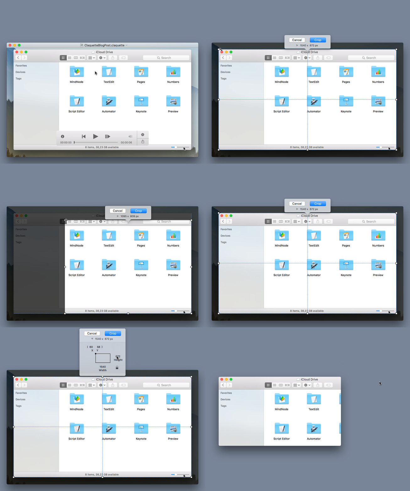
Besides the standard drag & move interface, my implementation also provides some unique features. It offers alignment guides with haptic feedback and the possibility to enter crop coordinates.

You can see the final implementation of the crop utility in the animated GIF below:

ClaquetteCrop

Launch

To launch the animated GIF feature, I prepared a press kit and wrote mails to review sites that mostly cover Mac software.
Additionally I submitted the app to Product Hunt and informed Apple’s App Store Marketing team.
I can really recommend to launch on Product Hunt: Claquette received over 400 upvotes and finished in the top 3 on launch day. The site also hosts a friendly community, that makes extensive use of the Q&A section below each hunted product.
I was also lucky to get some mentions from high profile Twitter users and good App Store reviews.
Two weeks after launch, Apple suddenly moved Claquette into the “New and Noteworthy” feature section on the Mac App Store front page. Of course this also lead to a noticeable spike in the sales charts.
Overall I was very pleased with the release and the reception of Claquette 1.5.


Thomas Zoechling is an independent software developer living in Vienna, Austria.
Besides working on his own products, he is also doing contract work. Currently he is helping IdeasOnCanvas to develop the excellent mind mapping software MindNode (macOS, iOS).

Read more

I like to be prepared for worst-case-scenarios.
And when I found out my Mac app ScreenFloat didn’t work anymore on Apple’s upcoming macOS Sierra because of a new sandbox restriction (you can read the backstory here), I knew fixing it could have gone one of two ways:

  1. Apple fixes it for me in a new beta of macOS Sierra (which, as I now know, is what happened in the form of a new sandbox entitlement), or
  2. I’d have to write my own solution for creating screenshots, basically reimplementing macOS’ screencapture command line utility

At the time, I didn’t know Apple would provide a new sandbox entitlement, so for me, the only choice was to take a couple of days and reimplement macOS’ screencapture‘s functionality.
Now, when I say “reimplement”, I mean I looked at the features I needed in ScreenFloat and implemented them, leaving those I didn’t need aside (fullscreen screenshots, screenshot sounds or capturing windows’ shadows, to name a few).
Time was of the essence, after all, and I didn’t know how long it would take me to implement this stuff.

Deconstructing screencapture

Before I started working on my own solution, I thought it’d be good to understand how macOS’ screencapture utility was implemented.
I executed ‘strings /usr/sbin/screencapture’ in Terminal thinking I could find a clue as to how capturing the screen was done, but all I could find were references to private APIs, like CGSGetScreenRectForWindow or CGSGetWindowLevel:


kCGSMovementParent
CGSGetScreenRectForWindow failed: %d
CGSGetWindowLevel failed: %d

I could not find any references as to how capturing the screen is done, but I suspect the CGDisplay* APIs are used, and ‘nm /usr/sbin/screencapture’ seems to confirm that theory:


U _CGDisplayBounds
U _CGDisplayCreateImage
U _CGDisplayCreateImageForRect

Next, I wanted to know how screencapture draws its selection rectangle and cursor.
Knowing there’s basically no drawing on screen without an NSWindow, I created a small app that would filter out screencapture‘s windows during an interactive screenshot, create an image of each and write them to disk.
In doing so, I learned the following:

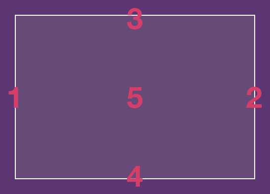
  • screencapture uses 5 windows to display its selection rect: 4 for the edges and 1 for the fill
  • These windows are present even if you’re not currently making a selection (albeit transparent), and they follow around your mouse cursor
  • The selection cursor isn’t drawn in its own window, it’s an ordinary NSCursor, using private APIs to set it
screencapture CLI's windows during selection

The windows surprised me.
Why would you need 5 windows to draw something you could draw in one, using Core Animation or an NSView?

screencapture has existed since Mac OS X Jaguar (10.2), and there was no Core Animation framework yet, so that’s out of the running.
That leaves NSView’s -drawRect:. Why not use that? Frankly, I don’t know. But I suspect it’s a performance thing – perhaps drawing 5 individual single-colored windows was faster on Mac OS X Jaguar (and still might be on today’s macOS) than one NSView’s -drawRect: and they just kept going with it over the years.
A friend and indie-colleague of mine, Andreas Monitzer (@anlumo1 on twitter) confirmed my suspicions: “Single-colored windows don’t need -drawRect:, and that’s probably just way more efficient.”

Also interesting is that screencapture adds specific Spotlight metadata tags to the screenshot files it creates:

  • kMDItemIsScreenCapture – a boolean value indicating whether the image file is a screenshot (YES). Only present when the file is a screenshot, so there’s no case where NO would be specified – the tag would be missing instead.
  • kMDItemScreenCaptureType – the type of screenshot: “display” for a fullscreen screenshot, “window” for a window-selected screenshot and “selection” for an interactive screenshot.
  • kMDItemScreenCaptureGlobalRect – Not really a rectangular value. As far as I can tell, it only contains the interactive screenshot’s origin point’s x value (where on the screen the screenshot was taken).

To set the cursor, I suspect there’s some private API magic at play.
An app can set its cursor in different ways: via cursor rectangles or directly via NSCursor. But it only works if the app is active and its window is frontmost – something that isn’t the case with screencapture.
‘nm’ reveals the private API CGSRegisterCursorWithImages, and several more:

U _CGSCreateRegisteredCursorImage
U _CGSGetCurrentCursorLocation
U _CGSHardwareCursorActive
U _CGSHideCursor
U _CGSRegisterCursorWithImages
U _CGSSetSystemDefinedCursor
U _CGSShowCursor
U _CoreCursorSet

So much goodness I’m not able to use in a Mac App Store app, just because it’s hidden away in a private API…

screencapture also does another thing I was interested in: When you press ⌘-⇧-4, followed by the space bar, you can move your mouse cursor over individual windows to screenshot them exclusively, and it’ll tint it to let you know about the selection.
I have no idea how it’s done – it’s either a window that gets painted over the selected window, inserted at the correct hierarchy level, or it’s a private API that lets you paint over any NSWindow.
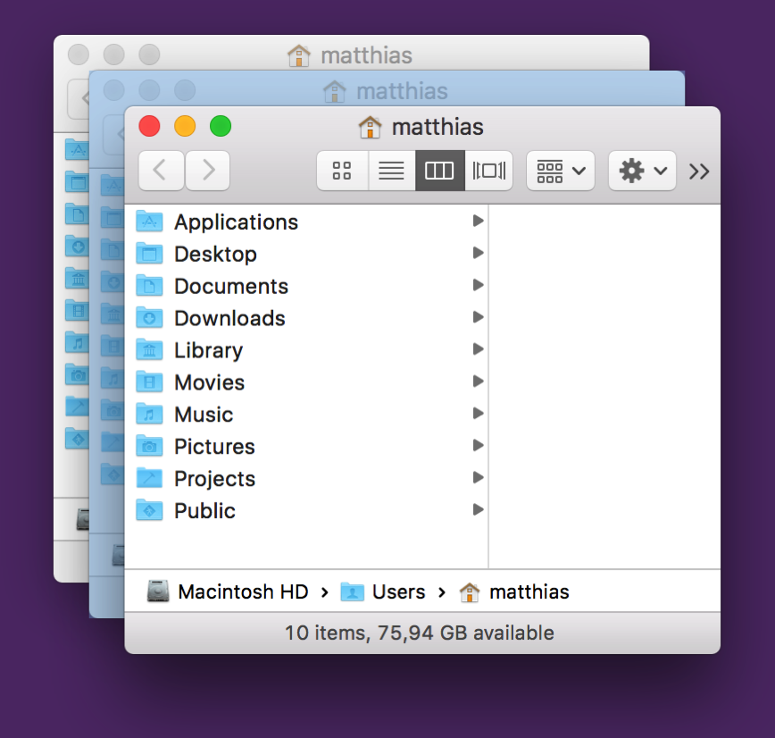
Behind-Window-Window-Selection

Now I was ready to begin

Reimplementing screencapture

In reimplementing the features I needed, I had to hit several milestones:

Milestone #1: Actually capturing the screen somehow

Because I was using screencapture via NSTask to do all the heavy lifting for me, I had no idea where to start for creating user-selected screenshots.
I started with giving AVFoundation a try, as I remembered a couple of WWDC sessions mentioning capturing the screen – for video. Soon enough, though, issues popped up.
Like the image’s compression. A screenshot created with AVFoundation wasn’t anywhere near the quality a screencapture screenshot has – although it was to be expected, since it’s for videos, and videos are heavily compressed.
When text is involved, it’s especially painful:

Comparison of AVFoundation capturing and screencapture's outputLeft: AVFoundation’s output. Right: screencapture‘s

There are different quality settings you can try to play with to improve the shot a little, but it’ll never come close to anything screencapture produces. That’s just unacceptable.
After poking around screencapture, I learned Apple provides APIs for exactly this purpose: CGDisplayCreateImage, to capture an entire screen, and CGDisplayCreateImageForRect, for a manual selection, which is what I was interested in.

#Milestone 2: Drawing into a completely transparent NSWindow

For NSWindow to react to mouse events, it needs to have a colored background with an transparency value of at least 0.05. That sounds very low, but it’s still very noticeable when it’s suddenly put over your screen. You may not be able to pinpoint it, but you know something happened.
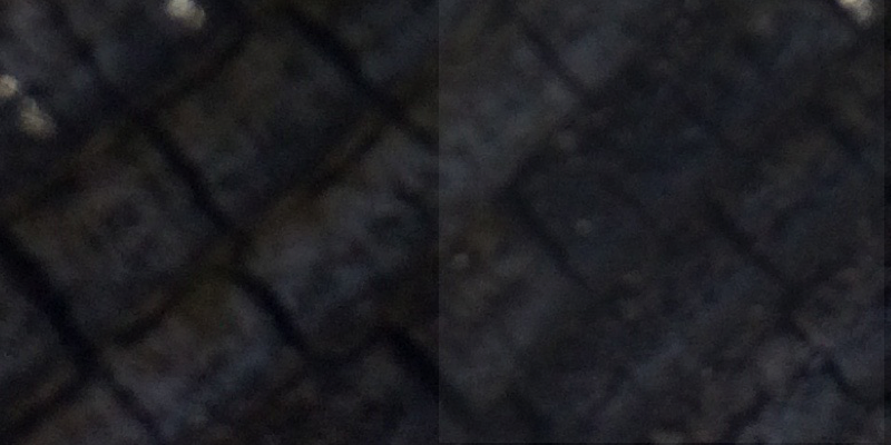
A white window with an alpha value of 0.05Left: The desktop. Right: The desktop below a white window with an alpha value of 0.05

That’s why I’m very grateful to Nick Moore, indie developer of PilotMoon fame.
He discovered that you can have a completely transparent NSWindow accept mouse events, by setting its contentView’s layer’s contents to a transparent NSImage.

#Milestone 2: Selection Drawing

With that out of the way, I could move on to actually drawing a selection.
For what the selection would look like, I didn’t have to think much. I wanted to keep it consistent with screencapture: white borders with a white-transparent fill.
But the APIs I’d use to draw the selection were up to me.
Since I didn’t want to use 5 windows like screencapture does, I briefly experimented with NSView’s -drawRect:, but discarded that in favor of something more modern and more performant: CAShapeLayer.
In my tests, it’s looks and feels just as the original, and even if it’s not, it’s indistinguishable to my eyes (on a retina MacBook Pro Mid-2012).

The selection’s functionality would have to be the same as screencapture‘s – drag to select, keep the space bar pressed to move the selection, release the space bar to continue the selection, press the space bar once to enter window-selection mode, press it again to exit again. Nothing that couldn’t be done with NSResponder’s ordinary methods.

Moving a selection with the space barMy reimplementation’s behavior when using the spacebar to move the selection.

Milestone #3: Custom Selection- and Window Capturing

Because of CGDisplayCreateImageForRect, creating a screenshot of a custom selection is fairly straightforward.
Window capturing is a little more work. You *could* do it with CGDisplayCreateImageForRect, but you’d have remnants beneath the window’s rounded corners of anything that was below it at the time of the capture.
It’s good to know Apple provides an API for those cases as well, then: CGWindowListCreateImage. It will let you define the window you’d like to capture and the “features” it should have (shadows, no shadows, include windows below it, don’t include them, etc).
You can get a reference to the window you’d like to capture using CGWindowListCopyWindowInfo – it’ll give you its rect on screen, its window level and more information about it.

Milestone #4: Window Selection Drawing

That last API, CGWindowListCopyWindowInfo, also comes in handy when drawing the window selection (for when you hit the spacebar).
After all, you need to know where all the windows are and their dimensions on the screen, so you can draw the selection accordingly.
Once I have that information, it’s easy to put up another CAShapeLayer above the selected window.
But wait. What if the selected window is beneath another window, or several windows?
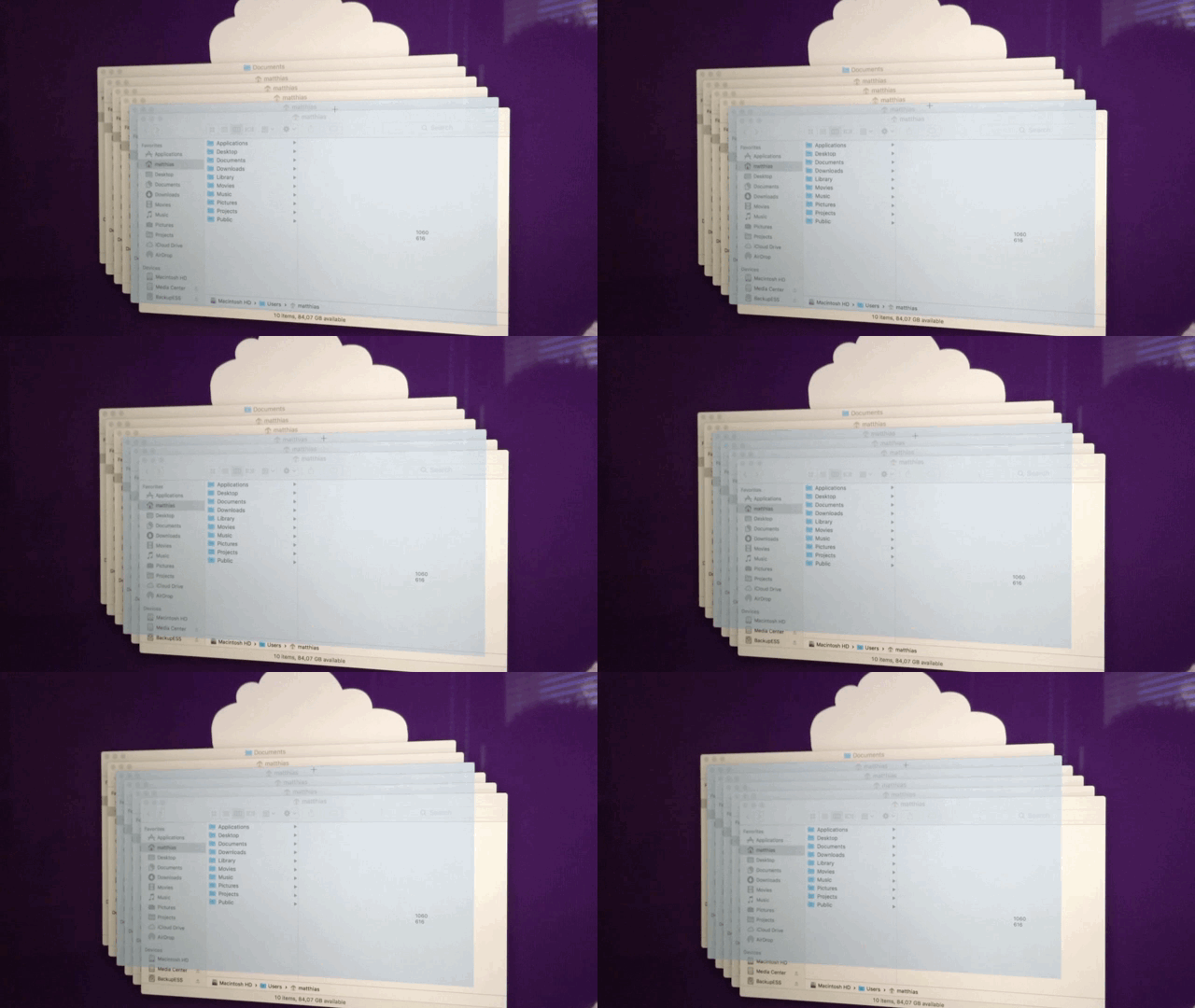
Faulty Window SelectionA first try at implementing window selection, clearly failing for windows that are beneath other windows.

That’s where it gets tricky and why I assume Apple is using private APIs here, which lets it either insert a new, selection-color-colored, translucent window into the window hierarchy at the right position or draw directly onto the window.

My solution was to use another CAShapeLayer.
It’s based on CGPath (which I convert to from an NSBezierPath) to draw the colored overlay.
I use the results from CGWindowListCopyWindowInfo to find out which windows are atop the currently selected window, create an NSBezierPath from their bounds, subtract them from my initial NSBezierPath and feed that to the CAShapeLayer.
It works pretty well:
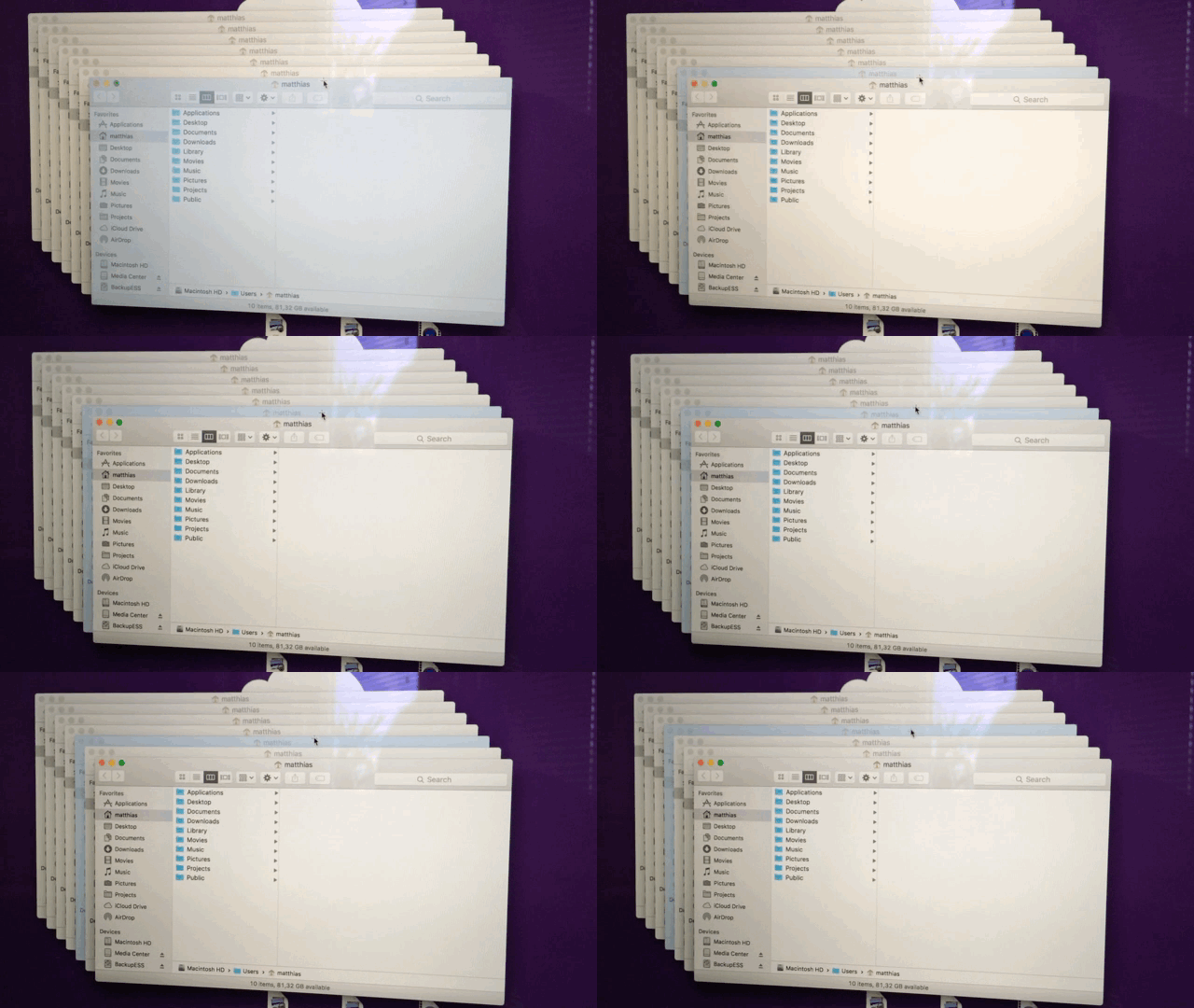
Working Window Selection

It didn’t work like this right away, though. There was a lot of trial and error, sweat and, yes, tears involved in this. But I think it was worth the effort. Doesn’t it look just like the original?

Milestone #5: Drawing the Cursor

The cursor in screencapture has a unique feature: it displays the coordinates next to it, or if a selection is being made, the dimensions (width and height) of that selection.
I wanted the very same thing, so custom drawing was necessary.

I started out using NSCursor, but for every mouse move I’d need to create a new NSImage with the coordinates (or dimensions) and set it as the cursor – that seemed pretty inefficient to me.
I then moved on to using part NSCursor, part CATextLayer. The NSCursor part would be the crosshair, a constant image, set-it-and-forget-it.
The text layer would be updated in -mouseMoved:, updating its position to be next to the cursor and its contents to reflect the cursor position or dimensions.
Sure enough, it worked, but when moving the mouse cursor around fast, the text layer would “lag behind”, not correctly sticking to the cursor. It’s nothing major, but it bothered me.
With this, we come to my final approach.
I hide the system cursor entirely and draw both the crosshair and the text using CALayers. Since they both are now updated inside the same -mouseMoved: (or -mouseDragged:) call, there’s no noticeable “lag” for the text layer – they now move together nicely, as if drawn in one NSCursor object.

Milestone #5: Focus without focus

The tricky thing about screencapture is that it has mouse and keyboard focus without it taking you out of the app you’re in (the window’s close, minimize and fullscreen buttons are not greyed out, for example).
Again, in my desire to be consistent with the Apple-provided command line utility, I needed the very same thing.

It’s difficult to get certain NSResponder method calls if your window is not key, and it prompted another trial and error session to get the right combination of -isKeyWindow, -acceptsFirstResponder, etc.
It now works, but it’s not as nice as Apple’s implementation.
Which brings us to the Caveats section.

Caveats of my implementation

Caveat #1: “Across-Screens Screenshots”

With screencapture, you can make a selection that spans several displays, due to the way it’s implemented (using NSWindows to draw the selection).
With my implementation, that’s not possible, as I put up one transparent window for each screen that’s connected to your Mac. But I settled – I think it’s very rare you’d make that sort of a selection.

Caveat #2: The Cursor

In some cases, the system cursor will pop up again, and it won’t go away until a new screenshot session is started.
This is the hideous result:
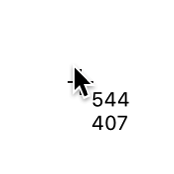
The system cursor drawn above the custom cursor

Caveat #3: Capturing Fullscreen Windows

When you click the green fullscreen button on a window, it transitions from being one window into being two windows without you knowing about it – one for the the titlebar/toolbar (which moves down a little when you move your mouse to the top edge of your screen to reveal the menu bar), and one for the actual window.
screencapture is somehow aware of this, and when you do a window selection, it will properly draw its selection rectangle above the entire window.
My implementation doesn’t know about fullscreen windows and treats those two windows separately:
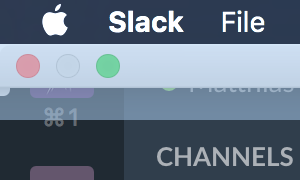
My implementation's fullscreen window selection bugInstead of the entire window, just the titlebar and its shadow are selected.

I haven’t found a solution to this, yet.

Caveat #4: Exposé

When you start Exposé to show all open windows, screencapture can be used to screenshoot them individually.
My implementation falls short of that, as Exposé seems to be a semi-modal mode where other windows can not be moved over it.
Of course, screencapture can.

Pros of my implementation

Apart from these caveats, I also see a couple of upsides to having your own implementation:

Pro #1: Control over the UX

With a custom implementation, I can change anything I want at any time, be it any cursor icon or the behavior in general. I don’t have that luxury with Apple’s built-in tool.

Pro #1 and a half: Timed Shots

Speaking of UX:
Yes, Apple’s built-in tool features timed shots (a screenshot that is not created immediately, but after a small delay). But I think it’s clumsily implemented.
When you start a timed shot:

  • You don’t know how much time there’s left until the shot is taken
  • You can’t click anything beneath the selection rectangle

With a custom implementation, I can provide a better experience here.

Pro #2: Screenshot placement

Something that concerns ScreenFloat exclusively is the placement of the floating shot after taking it.
Using screencapture, I just centred the shot at the mouse cursor. It works, but it’s not very nice.
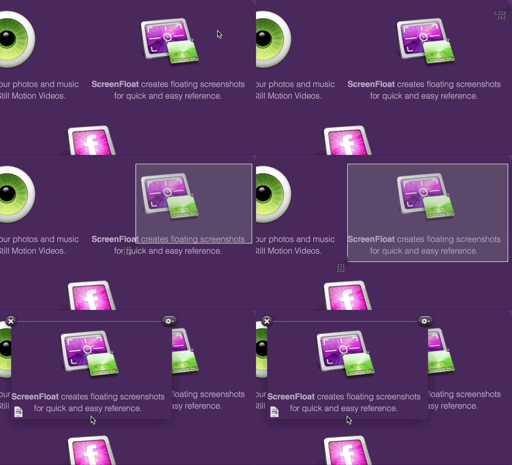
With a custom implementation, I know exactly where the screenshot was taken and can place it accordingly:
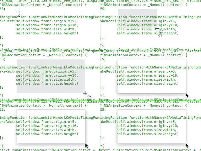
Screenshot Appearance

or I can do a little animation to make it more clear that a screenshot was created:
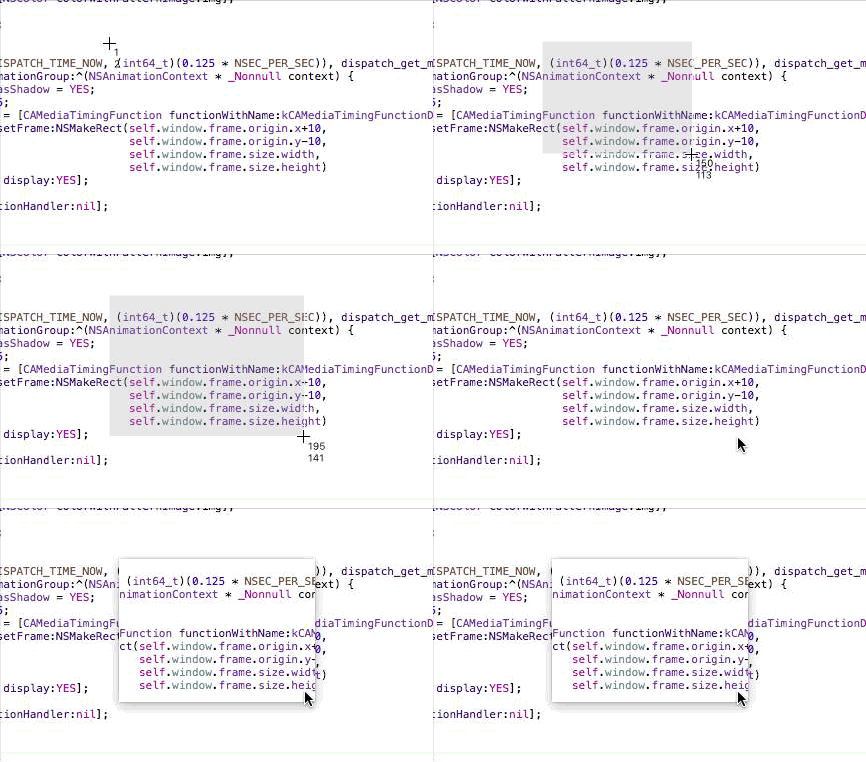
Screenshot Appearance Animation

Pro #3: Sandbox

With a custom implementation, I don’t need to worry about temporary entitlements – it works without any.

Open Source?

I’m planning on making the source available at some point, but before I do, there’s still a couple of things I need to do, like implement timed shots, which I haven’t gotten around to yet.
Also, so I don’t make a fool of myself, I need to clean up the code, and that’s dependent on the free time I get, which recently is little (I’m not complaining – I love being busy).

Anyway, this has been quite the journey, and if I can manage to fix some of the caveats I described above, I might use my own implementation instead of Apple’s built-in screencapture CLI in ScreenFloat at some point. But for now, I’m happy I’m again able to use Apple’s built-in tool.

Eternal Storms Software Logo– – – Do you enjoy my blog and/or my software? – – –
Stay up-to-date on all things Eternal Storms Software and join my low-frequency newsletter (one mail a month at most).
Thank you 🙂

Read more

ScreenFloat Mac App Icon

Today I finally was able to release ScreenFloat 1.5.13 on the Mac App Store. It’s a free update for existing customers of the app.
A 15-day trial can be downloaded for free from the website, even if you’ve tried it before.

What Is ScreenFloat?

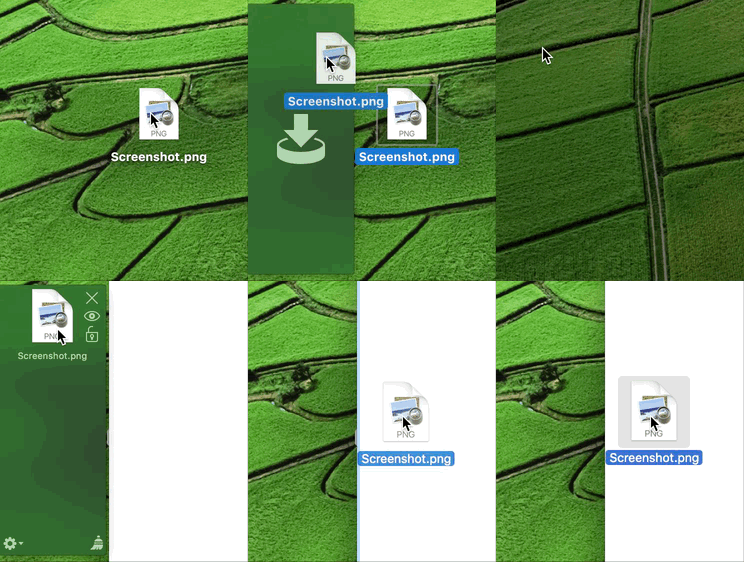
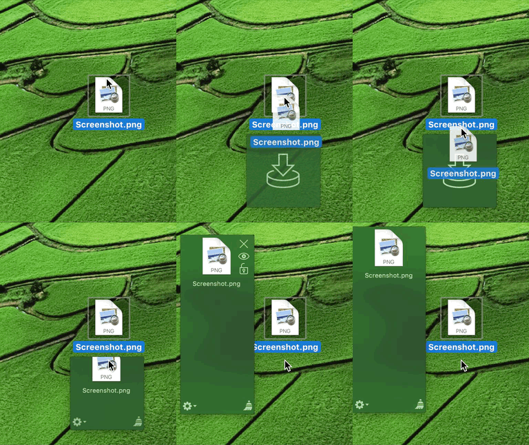
ScreenFloat lets you create screenshots that float on top of everything, enabling you to keep an eye on information you currently need without having to switch back and forth between windows, applications or spaces.

Customers use it in all sorts of cases – when coding for code snippets, when making wire transfers for IBAN numbers and such, when working in Photoshop to compare images, the list goes on and on.

ScreenFloat in Action

Basically, any time you need to keep something in your field of view or need to remember something on screen, ScreenFloat is there for you. The floating shots follow you around, no matter what window, app or space you are in, or you can pin them to specific spaces.

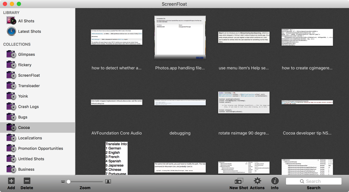
Shots you close are not deleted, but kept for you in the Shots Browser, where you can organize and categorize them:

ScreenFloat's Shots Browser

What’s New in ScreenFloat v1.5.13?

• Most importantly, ScreenFloat now works on macOS Sierra.
As I wrote about earlier, macOS Sierra has a new sandbox entitlement that was prohibiting ScreenFloat from performing correctly, so that is fixed now.
While I was at it, I put the screenshot creation into its own XPC process, so I could isolate the new entitlement from the rest of the app, as Apple encourages doing.
• Aside from now working on macOS Sierra, it fixes two bugs and a (rare) crash, so I definitely recommend updating to version 1.5.13.

A Little Background on ScreenFloat’s App Store Review

When I first submitted this update of ScreenFloat to the Mac App Store, I included this line in is App Store description:
“Improves compatibility with macOS Sierra”
The update was rejected because of it. You are not allowed to mention Apple pre-release software in your App Store description. Instead, they suggest you use this line:
“Improves compatibility with an upcoming OS”
I think that’s rubbish. Everyone knows what the next OS is going to be called – it was publicly unveiled already under that name, so the likelihood of it changing now is virtually zero.
Secondly, they have a public beta out, for crying out loud. It’s in peoples’ hands already, but they don’t want developers to let their customers know that the app now works on Apple’s latest and greatest new system?
So I sent an appeal to the Review Board, it got rejected, I submitted the app again with the suggested line and it went through.
Still, I don’t think “an upcoming OS” is helping anyone. In fact, it’s more confusing than anything, if you ask me. “An upcoming OS” is ambiguous, whereas “macOS Sierra” lets the user know exactly what you mean.
Anyway, this will be my process from now on: Submit with my original line mentioning the OS update explicitly, getting rejected, appealing and then submitting with their suggested line. Perhaps they’ll get tired of it and let it through at some point. Probably not, though.

Pricing and Availability

ScreenFloat v1.5.13 is available for purchase on the Mac App Store for the price of $8.99 / £6.99 / €8,99. It is a free update for existing customers of the app.
A 15-day trial can be downloaded for free from the website, even if you’ve already tried the app.
ScreenFloat runs on Macs with OS X Lion 10.7.3 or newer.

If you’re interested in writing about ScreenFloat, you can download its press kit here, which contains screenshots, icons, a short sample video and further information.
A limited amount of promotional codes are available to members of the press at press(at)eternalstorms(dot)at.

Links

ScreenFloat Website
http://eternalstorms.at/ScreenFloat

ScreenFloat on the Mac App Store
https://itunes.apple.com/app/screenfloat/id414528154?mt=12&at=1001l8pT&ct=blog

ScreenFloat Demo Download
http://eternalstorms.at/ScreenFloat/ScreenFloat.zip

ScreenFloat Press Kit
http://eternalstorms.at/press/ScreenFloat-1-Press-Kit.zip

ScreenFloat Video Preview on YouTube
https://youtu.be/MYtEzOP41Os

I’m looking forward to hearing from you and to see what you think about ScreenFloat 1.5.13. If you like the app, please consider leaving a little review on the Mac App Store, it would help me out a lot! Should you have any feedback or questions, please be sure to get in touch, I’d love to hear from you! Thank you.


Eternal Storms Software Logo

– – – Do you enjoy my blog and/or my software? – – –
Stay up-to-date on all things Eternal Storms Software and join my low-frequency newsletter (one mail a month at most).
Thank you 🙂
 

Read more

Glimpses Icon

Today, Glimpses v2.1, an app that creates Still Motion Videos in just a few clicks, is available for download from the Mac App Store.
It’s a free upgrade for everyone who purchased it before.
A free, 15-day trial is available for download here, even if you’ve tried it before.

What Is Glimpses?

When you want to show your awesome photos from your recent vacation but there are just too many, you can either sort through them and heavy-heartedly decide which ones to toss aside, or you show them all – with a Still Motion Video.
Still Motion Videos show photos in very rapid succession, usually for the fraction of a second. Mix that with a soundtrack, and you can make your video action-packed and powerful, or mellow and soothing. Or even both.

Glimpses lets you create such high-quality videos with just a few clicks.
Import your photos (from your Photos.app library, a hard drive, Flickr or Instagram), add one or more soundtracks and you’re set – Glimpses figures out the rest.
The app creates your video in a smart way:

  • The video’s resolution (ranging from 240p to 4K) will be calculated by looking at the smallest photos you supply
  • Its duration is based on the amount of photos you imported, and the duration of the soundtracks you supplied
  • Soundtracks that turn out too long will automatically fade out smoothly at the end of your video, whereas short soundtracks can be looped
  • Pillar- and letterboxes can be eliminated, if the photo’s resolution allows for it
  • Due to built-in facial recognition, photos are positioned in a way that faces aren’t outside of the video’s frame

However, control is always at the user’s fingertips. For example, soundtracks can be edited so only your favorite part of it is used, in an easy-to-use, yet powerful way:

Screenshot of Glimpses' Soundtrack Editor

Additionally, every other aspect of your video can be manually set up:

Screenshot of Glimpses' Video Settings

What’s New in v2.1?

  • Improves integration with macOS by providing a QuickLook plugin that offers an easier and quicker way to identify Glimpses project files
  • Improves integration with Photos.app by supporting drag and drop from the app and offering a Share Extension so photos can be imported to Glimpses without leaving Photos.app
  • Photos can be edited using external editors
  • Shuffle photos to add a random touch to your video
  • Performance improvements, refinements and bug fixes throughout the app

Pricing and Availability

Glimpses 2.1 is available for purchase on the Mac App Store for the price of $19.99 / £14.99 / €19.99.
It is a free update for existing customers of the app.
A free, 15-day trial is available on the website, even if you’ve already tried the app.
Glimpses runs on Macs with OS X Yosemite or newer.

If you’re interested in writing about Glimpses, you can download its press kit here, which contains screenshots, a short sample video and further information.
A limited amount of promotional codes are available to members of the press at press(at)eternalstorms(dot)at.

Links

Glimpses Website
http://eternalstorms.at/glimpses
Glimpses on the Mac App Store
https://itunes.apple.com/app/glimpses/id637565340?mt=12
Glimpses Demo Download
http://eternalstorms.at/glimpses/Glimpses.zip
Glimpses Press Kit
http://eternalstorms.at/press/Glimpses-2-Press-Kit.zip
Glimpses Sample Video on YouTube
https://youtu.be/NCa4Fg6uLoI

I’m looking forward to hearing from you and to see what you think about Glimpses 2.1.
If you like the app, please consider leaving a little review on the Mac App Store, it would help me out a lot!
Should you have any feedback or questions, please be sure to get in touch, I’d love to hear from you! Thank you.


Eternal Storms Software Logo

– – – Do you enjoy my blog and/or my software? – – –

Stay up-to-date on all things Eternal Storms Software and join my low-frequency newsletter (one mail a month at most).
Thank you 🙂
Read more