In an effort to show preferences for configuring Force Touch in my apps (in particular, Yoink) only when a Force Touch device is actually available, I had to find a way to figure out how to detect Force Touch devices.
If this was iOS, I’d be done by now
On iOS, Apple provides a simple API for this:
UIForceTouchCapabilityUnavailable and UIForceTouchCapabilityAvailable
which you can check by calling UIView’s – (UIForceTouchCapability)traitCollection;. Lo and behold, a simple API like this is sadly not available on OS X. On the Mac, you have to do it yourself.
IOKit is where it’s at
Using IOKit, you can sort of set up a set of properties you’re looking for in a device and see if it returns anything. This does not only include an external or internal keyboard, mouse or trackpad, but also graphic cards, for example. To find out what the right properties are, I downloaded Apple’s Hardware IO Tools for Xcode 7.1 from their developer downloads site (Apple Developer account required) and launched the app IORegistryExplorer.
Digging down the IO Registry
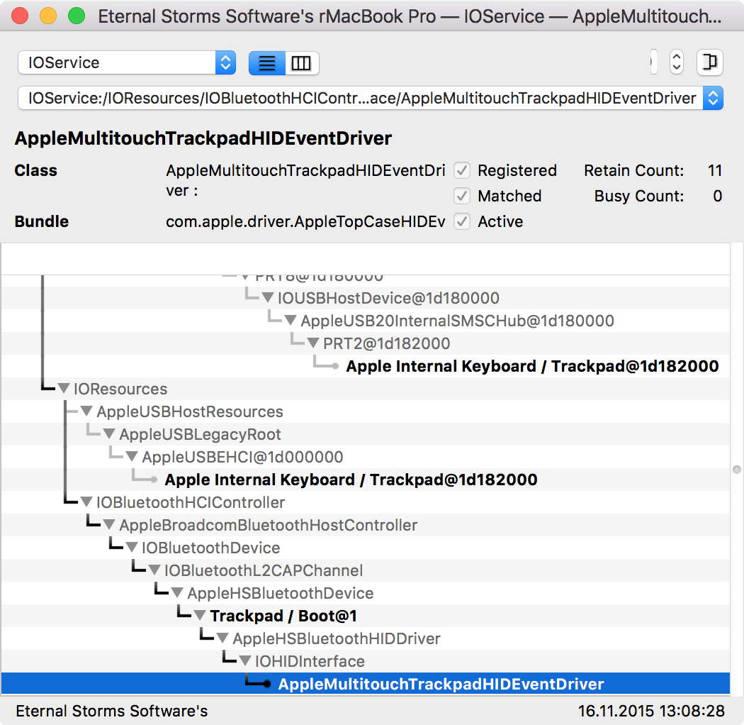
I do have a Magic Trackpad 2 “attached” to my Mac via Bluetooth, so I tried searching for the term “Trackpad”, and sure enough, I saw my internal and external ones:
 The Trackpads attached to my Mac, either via Bluetooth or internally.
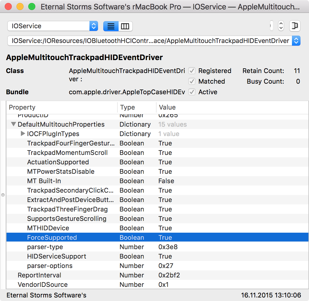
Having found the Magic Trackpad 2, the next step is to see what properties it offers and if they are unique to the class of the device:
 Jackpot!
Sure enough, there it is – ForceSupported: True. I could not find such a key in the internal trackpad’s properties, hinting that it might be exclusive to devices that do support Force Touch. There’s also an entry for “Manufacturer”, which is “Apple Inc.”. Perfect.
Looking for Devices with IOKit
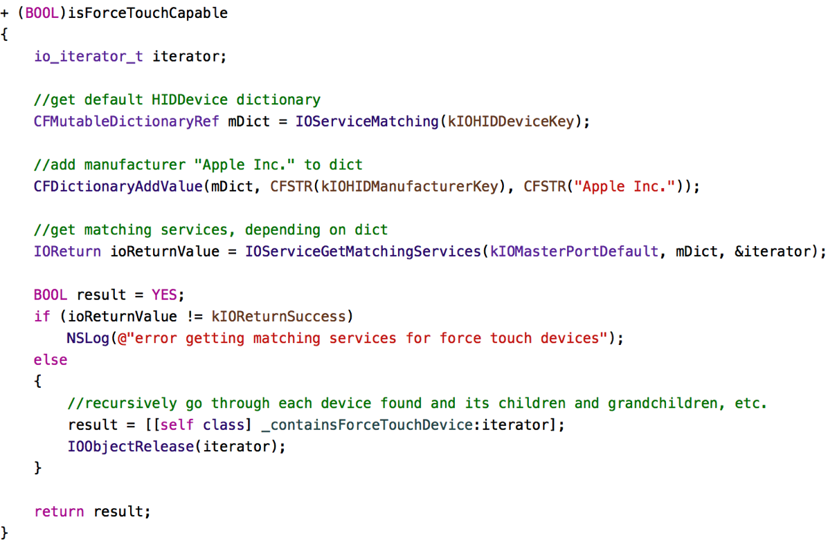
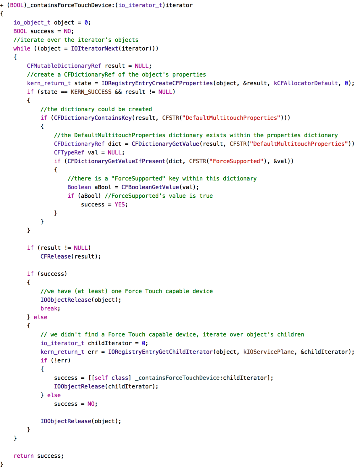
Now all I have to do is filtering devices by the Manufacturer – “Apple Inc.” -, iterate over the resulting devices, and filter out devices that have a DefaultMultitouchProperties key, containing a ForceSupported key with a value of true. If such a device is found, it means a device with Force Touch capabilities is available.

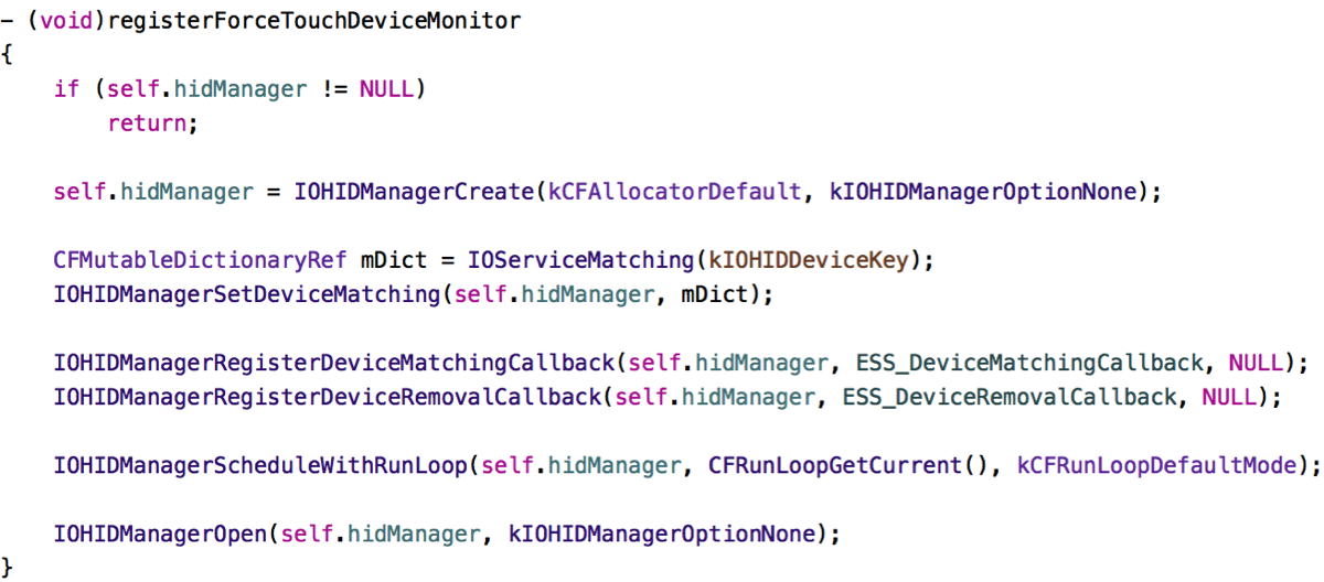
In this method, I create a dictionary mDict that is used to find matching devices. In this case, I’m looking for devices with the Manufacturer set to “Apple Inc.”. I query for possible devices using IOServiceGetMatchingServices. I can then iterate over the returned io_iterator_t iterator and recursively over the children in the core of all of this: – (BOOL)_containsForceTouchDevice:io_iterator_t)iterator;.

Here, we iterate recursively over iterator’s objects, checking for the DefaultMultitouchProperties key and, subsequently the ForceSupported key (and value).
Testing it with other Trackpads
The code you see above is final. However, in a previous version, all I could use to test it with was my Magic Trackpad 2 – an internal Force Touch Trackpad (the likes of which the new MacBooks and MacBook Pros feature) was not available to me directly. So I sent the first draft of the code to my friend (and fellow developer) Maurice Kelly (@mauricerkelly on twitter) who was kind enough to volunteer as my “test subject”; and – of course – it didn’t work. Turns out I shouldn’t assume the vendorID to be the same (which I used in the first draft just like the Manufacturer to filter the possible results). After leaving it out, it worked fine over all currently available Force Touch Trackpads.
Hot (Un-)Plugging
Sometimes you might want to get notified when devices are plugged in to or unplugged from the Mac. In Yoink, I’d like to display preferences specific to Force Touch if according hardware is available, but not show them if there isn’t any hardware connected that supports it. Also, as a nice touch, I’d like to hide the preferences if according hardware is disconnected and show it again when it is connected. We can accomplish this like that:

Sandbox
The code works just as well in the Sandbox environment, these entitlements have to be set, though, for the notifications to work:

com.apple.security.device.usb and com.apple.security.device.bluetooth
Future Proof?
I’m not sure this code is future proof. The basic APIs will stay around, sure, but it all depends on the keys DefaultMultitouchProperties, ForceSupported and their according values which are not defined in the IOKit header files, which I unsuccessfully searched for constants pertaining to force/pressure. So, depending on this, the code might break with future versions of the Force Touch Trackpad and I’ll have to keep testing it as Apple releases new hardware. Nevertheless, I’m quite happy with the code and it works very well.
Getting the Source Code
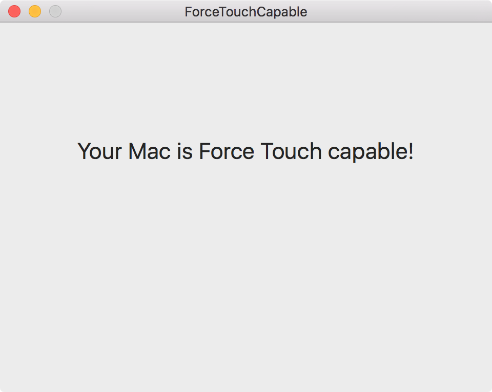
I’ve uploaded a sample project to my server, you can download it here. The category on NSApplication in which this is available can be downloaded from Github. The example app is pretty simple:

At launch, it asks if a Force Touch capable device is available and displays an according message. If subsequently the availability status changes, the message will be updated accordingly.
If you’d like to get in touch, you can mail me or write me on twitter. I’m looking forward to hearing from you 🙂

![]()
