Software Development

For Briefly, I needed a nice, subtle animation for switching between the detail soundtrack view and the reorderable list view. In OS X Yosemite 10.10.3’s Photos.app, I noticed something I liked very much.
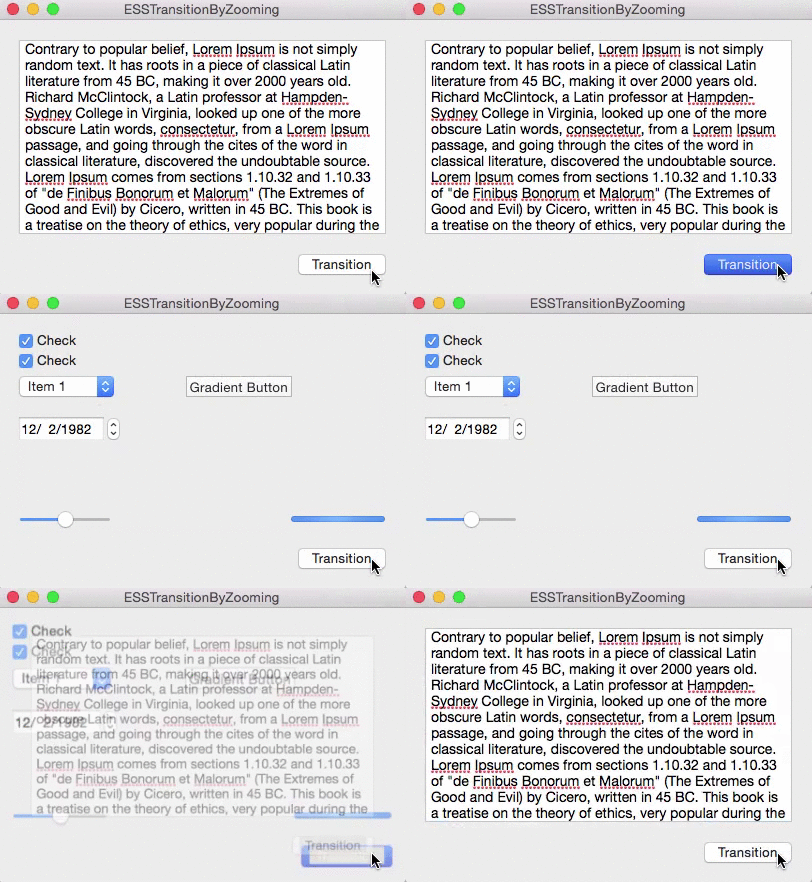
When going into an album, for example, the current view is zoomed out of focus and the new view is zoomed in.

Zoomtransition Animation Gif

NSView+ESSViewCategory

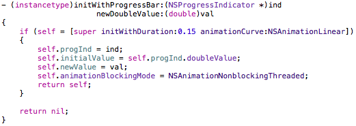
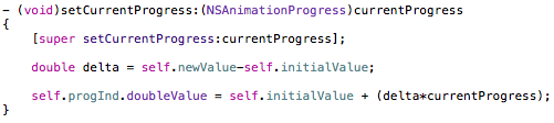
I wrote a little category on NSView to do just that, it’s a one liner (ironically, in this pic, it’s more than one line) :

Line of code

It’s pretty self-explanatory. You pass in the view you want to transition from and the one you want to transition to, the type of transition (zooming in or out), the duration and an optional completionHandler that’s called when the animation ends.

Alternatively, it’s also available as an instance method where the view you call this on will be passed into the class method as fromView:

Instancemethod

The Views

For the transition to work, fromView has to be in a view hierarchy, toView shouldn’t. They should be the same size, otherwise more work on your part is necessary (which I had to do in Briefly because the NSPopover the views reside in resizes before / after the transition), but either way the code provided should give you a nice head start.

fromView’s superview is temporarily set to have a CALayer to make use of Core Animation during the transition. After the animation ends, the superview’s wantsLayer – state is reset to what it was before the animation. If we didn’t do this, the animation would appear sluggish.

ESSViewZoomTransition

As you can see in the gif above, there are two types of the transition:

ESSViewZoomTransitionZoomOut – the transition from the textView to the view with the checkboxes.
ESSViewZoomTransitionZoomIn the transition from the checkbox-view to the textView

How To Use NSView+ESSViewCategory

You’ll have to first add the NSView+ESSViewCategory.h and *.m files to your project.
Please note that the category imports <Quartz/Quartz.h> for Core Animation’s CAMediaTiming class, so you might have to add that framework to your project, too.

fromView
It has to be inside of a view hierarchy. Fades out during the transition.

toView
Can be in a different xib file (for example, a NSViewController) or in the same as fromView. It’s important that it is not already on screen somewhere. Fades in during the transition.

Once you have set up your views, either call the class method and pass fromView and toView as well as the other parameters or call the instance method on fromView.

How It Works

The method creates an NSImage of both toView and fromView, puts them into two NSImageViews that have the same frame as the views and animates those two NSImageViews accordingly (calling imageView.animator.frame = …; and imageView.animator.alphaValue = …; )
Because fromView’s superview temporarily gets a CALayer, .animator is powered by Core Animation, which makes for a much smoother animation than doing the same without a layer-backed view.

ImagecreationCreating an NSImage of toView.

So the views themselves aren’t actually resized, they’re just screenshotted, removed from view as we place the NSImageView on top of it, creating the illusion that nothing happened. Then we animate the NSImageViews and insert toView after the animation is done, removing both NSImageViews.

The Source Code

The repository (a sample OS X app) is available on Github.

It was developed (and tested) on OS X Yosemite 10.10.3 using Xcode 6.3.1, but should work on earlier versions of the operating system.

I have some more source code available here (or directly on my github profile page) if you’re interested. If you have any questions or feedback regarding my open source projects, please be sure to mail or tweet me – I’m looking forward to your feedback!

Enjoy!

Read more

In an effort to bring some personality to my apps, website and blog and make them easily recognizable by “connecting” them visually I rolled out a minor re-”design” of my website and blog yesterday.

The Color Scheme

The entire color scheme is based off the Eternal Storms Software logo.
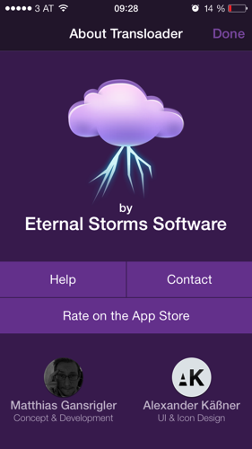
Up until now, neither the website nor this blog reflected those colors. As a matter of fact, the only place that had some of this personality was the iOS part of Transloader. In its “About” screen, you’d see this:

IMG 9025Screenshot of Transloader on iOS

It’s immediately recognizable – and not only by the logo.

The Website and Blog

It was about time I brought that over to the website, because it looked like this (please excuse the missing text and bezels, I took this from the Wayback Machine as I stupidly don’t keep old websites around):

Old eternalstorms.at websiteeternalstorms.at before the re-“design”

At the time, I had a good reason for it. I wanted the user to be able to see all my apps at once, without any distraction. But it lacks a certain “je-ne-sais-quoi”. It has no identity. You don’t know who it’s from. Heck, there’s not even a logo anywhere to be seen.

Lo and behold, the new website looks like this:

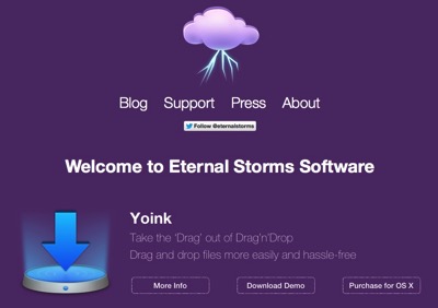
Untitledeternalstorms.at after the re-“design”

It’s probably not the best website you’ve ever seen, but it’s certainly an improvement over the old one.

The Apps

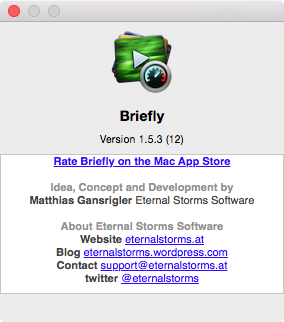
Now I can’t go in and make all my apps purple. That would look ludicrous (or would it?). But I still want to carry over some of this into my apps, and I believe the best place to do this is in the apps’ About windows. Currently, they look like this:

Briefly's old About WindowBriefly’s About window before the re-design

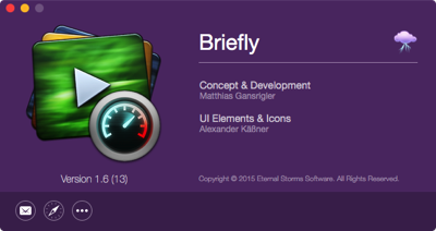
It has all the necessary information in there, but it could be more personal, more fun, if you will. Here’s what the new one will look like:

Briefly's new about windowBriefly’s About window after the re-design

It will roll out in all apps with future updates. The nice thing is that it’s very much a drop-in replacement for the standard about panel Apple’s providing in Cocoa. It takes all its information from the app’s Info.plist file and additional information (like twitter, Facebook, Acknowledgements, Credits) can be provided in a strings file which will then be used in the about panel. So I just drop it in, change some strings in the strings file and I’m done, I don’t need to touch the xib in Interface Builder. Perhaps I’ll do a blog post about it some other time.

App Store Screenshots

All this kind of raises the question – should I brand my App Store screenshots as well? I’m leaning toward “no”. Definitely no logo or slogan, though. That would just distract from the product. Perhaps I could color explanation text accordingly, or put them in colored overlays. Or create an Eternal Storms Software Desktop Background Image that will be present in all App Store screenshots, that would definitely be a more subtle way of doing it. I might try it out on an app and see how it does.

But in general, I am against branding of App Store Screenshots. They should present the app. A description of the company could always be put into the last paragraph of the App Store App description. That’s a nice place for it.

Read more

ESSSquareProgressIndicator animating

What Is ESSSquareProgressIndicator?

It’s an indeterminate progress indicator originally developed for the iOS game ZEN.

It uses Core Animation (specifically, CAShapeLayers) to do its job and it’s pretty straight forward.

CGPathRefs, CAShapeLayer

CAShapeLayer has two animatable properties – -strokeStart and -strokeEnd (with a minimum value of 0.0 – start of path – and 1.0 – end of path). Going beyond 1.0 or below 0.0 doesn’t work.

So when trying to animate those values along a rectangular path – which was the first thing I tried when creating this – you do get a nice animation, but it ends at the 0.0/1.0 (which is, basically, the same) mark. So you end up with something like this:

glitchy progress indicator animation

The goal, then, was to animate beyond 1.0. The solution I came to – I’m sure there are other ways – was to use a second CAShapeLayer that animated alongside the first for the last/first part of the animation.

For a square, the values of the CAShapeLayer’s -strokeStart and -strokeEnd are as follows (starting at the top left corner):

CAShapeLayer strokeStart strokeEnd values

The CGPath begins and ends in the top left corner because I drew the path that way (you could make it start in the lower left corner or in the middle of a side, it all depends on where you start the CGPath with CGPathMoveToPoint).

The progress indicator starts at the middle of the left line and reaches to the middle of the top line. These are the two CAShapeLayers at work. The left part is one shape layer, the top line is another. I’ll do this in pictures I drew in code so it’s simpler to understand (the lines represent where the layer animated to, the dots are the invisible rest of the square).

Animating

Animation Part 1We start at this position. The line to the left is layer2(strokeStart:0.875, strokeEnd:1.0), the line at the top is layer1(strokeStart:0.0, strokeEnd:0.125).

Animation Part 2The transition to this is the reason we need two layers as we can not animate one layer beyond the 1.0 value.
So we animate layer2 to (1.0, 1.0) and at the same time animate layer1 to (0.0, 0.25) which makes it look like one line moving.

Animation Part 3This next part is easy. We animate layer1 to (0.75, 1.0).

Animation Part 4Lastly, we animate with two layers again to get to the initial position so we can repeat the whole thing from there on.
We animate layer2 from (0.75, 1.0) to (0.875, 1.0) and layer1 from (0.0, 0.0) to (0.0, 0.125) at the same time, again making it look like one line moving.

The Source Code

The repository (a sample iOS app, but the class works the same on OS X) is available on Github.

It was developed for iOS 7.1 but should work on earlier systems, and has been tested on OS X Yosemite, but should work on earlier systems as well.

You just drop in an ordinary UIView or NSView and set its class to ESSSquareProgressIndicator. Done. You can then set the color and stroke width right within Interface Builder thanks to the fairly new Xcode macros IB_Designable and IBInspectable.

Open Source

I have some more source code available here (or directly on my github profile page) if you’re interested. If you have any questions or feedback regarding this progress indicator, please be sure to mail or tweet me 😉

Enjoy!

—-
My name is Matt, I’m the developer of Eternal Storms Software. If you’d like to comment, you can catch me on twitter here: [twitter-follow screen_name=’eternalstorms’ show_count=’yes’] or by eMail.

Read more

That’s a question I’ve been asking myself ever since I started releasing software to the public.

Googling “When to send a press release”, I get articles talking about on what specific weekday to send it or at what time of day.
Or “send a press release when you have something newsworthy”.

Although that is good advice – never send anything not newsworthy, you’ll just alienate people – that’s not the subject of this blog post.

What I mean by ‘When’ is: should I send a press release a couple of days before I release an app or on the same day?
And yes, it is an “either – or” kind of situation. I’ve been told by journalists I asked if it’s cool to follow up a week after (or send the press release again) – definitely don’t do that.

Non-Embargoed Press Releases

To issue press releases the same day I release the app itself always felt natural to me. I’ve been doing it for as long as I’ve released software.
No advance notice, no follow up – just “send it and forget it”. I want to get the news out when it’s fresh and hot and when it’s available for everyone to download.

Control Is An Illusion

Front and foremost, it gives me this feeling of ‘control’. When sending out a press release the day of, I feel like I’m on the mind of the journalist and like they’re more inclined to write about my app since it is “fresh off the press” and just happened. And there might be some truth to that as I’ve seen good results with that approach. But you never have any control to speak of. That’s an illusion.

Secondly, there’s the App Store Review process. It takes time. So once the review is done and the app has been approved, I’m usually very eager to get the app out the door as soon as possible and not have to wait around a couple of days more to be able to send out press releases ahead of time.
I also don’t want to send out a press release while the app is still in review – that’s got ‘catastrophe’ written all over it.
If you send out a press release with an embargo only to have your app rejected some time later, you’ll have to issue a redaction and that’s just hideously tedious. It’s a one-way-ticket onto the journalist’s blacklist.
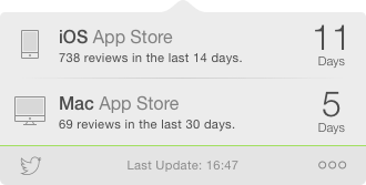
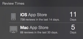
Even though there are apps for checking the average review times for the iOS and Mac App Stores, it’s just too uncertain in my opinion.

Forget me not

It’s not fun to spend hours writing a decent press release, send it out early to members of the media just to find out they forgot about it come the actual date of the app release. This is probably not much of an issue with bigger news sites and blogs that have systems in place for embargoed press releases, but smaller blogs run by independent reviewers might do all this by hand, so things might slip their minds.

Sending press releases with an embargo also has the risk of of the news leaking.
You send out your news with an embargo of one week, but that doesn’t mean that every member of the media is going to respect that – they might publish early to break the news first (a problem I assume only bigger companies face who’s news appeals to a broader audience than mine, a small indie developer’s press release; but nonetheless, it’s still something to be wary of).
I hear that embargoes aren’t legally binding, so be wary of that as well. 

Embargoed Press Releases

With everything you’ve read by now, you might think sending a press release beforehand might not be a good idea. And you’re right, a lot of it speaks against it (although it depends heavily on each individual case).

But there is one thing about it that appeals to me more and more the longer I ponder it – with a press release you send early, you give your potential reviewers time.

Time for Preparation

Imagine being a journalist, getting a couple dozen press releases each day (or more) and some of them are to be released on the same day. There’s simply no way you could check out all those apps and publish on the same day. Pressed for time, a journalist might be inclined to just post the entire or edited press release, publish late or not post about it at all. But a full review is out of the question, that’s for sure.

If you issue that press release a week early, though, you’re helping out not only the journalists you’re addressing, but also yourself.
You give the greatest gift there is: time.

Time to check out your app in detail, less in a hurry to get to the next press release, because they do pile up, I’m sure.
Time to use the app for a few days, should they decide to cover it and get a deeper look at how the app works and feels.
Time to experience details about the app that make it stand out over its competitors.
Time to get more details about the app, e.g. check out the app’s Press Kit; ask you for more details if something isn’t clear or if they have any questions in general.

I believe that is invaluable for all parties involved.

Testing Embargoed Press Releases

To put this to a test, for the release of Transloader 2.1, I sent out the press release one week ahead of the release and the result has been way better than I thought. As I wrote before, I sent out PR with the bad aftertaste of thinking it would be forgotten on the actual day of the release.

But that was not the case. Quite the contrary, actually.

After sending out an embargoed PR, I pretty soon received requests for promo codes to an extent I have not experienced before. That might be attributed to the extended time frame they had for reviews, given the embargo. I imagine journalists don’t bother asking for promo codes if they don’t have the time to really look at the app anyway.

The embargo itself worked very well, not one site posted early. I used the following wording (in bold print) right before the press release body

Embargo: Please do not publish before March 10th, 2015

I think I will take out the “Embargo:” part, though, it sounds kind of demanding.

Among others, MacNNc|net and the german site MacGadget posted favorable reviews of Transloader and @MacTrast called it their iOS App of the Day.

All in all, it went very well and I’m very satisfied with how it turned out.

Conclusion

I will be moving to embargoed press releases from now on. The benefits of giving journalists some time to check out your app by far outweighs the disadvantages listed above and I think it engaged journalists more.

And that’s what press releases are all about.

—-

My name is Matt, I’m the developer of Eternal Storms Software. If you’d like to comment, you can catch me on twitter here: [twitter-follow screen_name=’eternalstorms’ show_count=’yes’] or by eMail.

Read more