ios

We recently cancelled our cable/general TV subscription, which left us with a bit of an entertainment void. Not that TV was entertaining – we hardly watched anymore, hence the cancelling – but we do like to just “put something on” every now and then. So we decided to get Apple One (Premium, because we’re sharing with my mom).
I was, at first, a bit hesitant to enable iCloud Photos – we have nearly 40.000 photos/videos, and obviously we don’t want to lose any of them. So I asked my cousin how he felt about it (he’s been using it for quite some time). He seemed happy with it, so I was confident in turning it on. A couple of backups on multiple drives later, I clicked the checkbox in Photos’ preferences on my Mac – and the waiting began.

Upload Observations

All in all, it took well over 36 hours to finish the upload. I began in the morning, let it run overnight in the hopes it would finish, but the next morning, it still kept going for more than half a day. I noticed that Photos didn’t continuously upload all photos. It uploads for a bit, then does some encoding for a bit, and then uploads again a bit. Now thankfully, my connection is pretty good with a consistent upload rate of ~7MB/s so I thought it would be done fairly quickly, but I didn’t consider that any encoding could be going on. Judging from Activity Monitor, at least videos are encoded before they go up into the cloud.

My Mac (which has all the photos) was the first where I turned it on, and after it had finished, I also enabled it on my iPhone and iPad. Those were done syncing in about two days. “Thanks” to what Apple probably considers a “feature”: the constant pausing of the syncing process on iOS devices, in order to conserve battery: “Paused syncing to save battery”, it said anytime I looked. No! Why!? Sync!, that’s what the battery’s there for. Just do it, I don’t care. And don’t let me enable it for “a day”, let me enable it forever. Seriously. Get it done.

Comparing to Photo Stream

Previously, I mostly collected photos on my Mac via Photo Stream. And I have to say, while I do enjoy the new syncing features iCloud Photos offers (syncing albums, photo-edits, etc), newly taken photos now take noticeably longer to appear on other devices than before. Not a deal breaker, but noticeable.

“Unable to Upload”

65 photos were unable to upload, according to Photos on my Mac. Why? I couldn’t honestly tell you. Photos didn’t tell me. It should have, if you ask me. I’d have liked to know. And there’s no way to retry to sync those photos with iCloud. They’re just in the “Unable to Upload” smart-album forever.
Albeit, a bit of online research reveals an Apple support document with one of the weirdest and Apple-unlike solutions to a problem I’ve ever come across:
Step 1: Export the photos in question “unmodified” to a folder on your disk.
Step 2: Delete them from Photos (scary)
Step 3: Import those photos you just exported into Photos again to retry their syncing.
It worked (mostly), but still, why can’t I just do this in Photos itself?

Varying Photos count

An interesting tidbit: All my synced devices show a different photo count.

DevicePhoto countVideo count
Mac37.831461
iPad37.835461
iPhone37.834461
The video-count is the same on all devices, but photo-counts vary.

Of course, with that amount of photos, there’s no way – ever – for me to find out which photos are missing on which device. Because interestingly, when I connect the iPhone or iPad to my Mac, it tells me that the connected device only contains items that are already on my Mac. Go figure.

General Impressions

I’m happy with iCloud Photos. Finally, all my videos sync, and so do all “fancy” photos (with blurry backgrounds or any sort of effects) and edits, and the syncing seems to so far be very reliable.
No longer do I need to connect them once a month to make sure I have all photos collected on my main machine. Nice.

Face- and duplicates analyses appear to happen on each device individually, probably in the name of privacy (and iOS devices need to be – again, why? – connected to power for that to happen). I wouldn’t mind if that synced over (the found faces appear to, anyway).
It’s kind of weird that they constantly turn off those features to conserve battery, and then have all my devices do the same work. Wouldn’t it save even more battery if just one device did it? Oh well…

Read more

I’m happy to announce a new app today: Citator for iPhone and iPad.
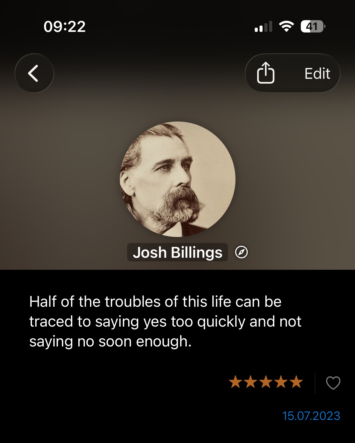
The brain-child of Clemens Bauer, Citator is a currently free app that lets you store, cherish and share memorable quotes.

Earlier this year, Clemens – whom I’ve known from the time we worked together on a local Apple Retailer’s customer loyalty app – approached me with an idea for an app to safe-keep quotes in.
Previous apps he had used for this appeared to become abandoned, and he desired a fresh, modern approach.

Features

  • A beautiful list you can filter or search to quickly find quotes you’ve stored before
  • Save Quotes from the app, or from any app using the Share- or Action sheet
  • In addition to the quote itself, you can specify the author of a quote, where and when it originated, and where you found it
  • Author’s images are automatically loaded from Wikipedia if available
  • Display a static quote you select on your Home- or Lock Screen (requires iOS 16) with a widget
  • Display a random quote (which can change in an interval of your choosing) on your Home- or Lock Screen (requires iOS 16) with a widget
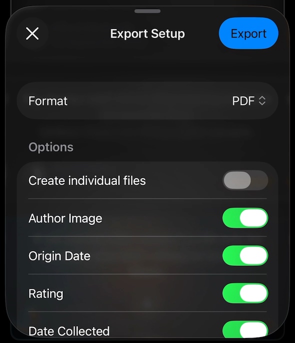
  • Share quotes as text, or as beautifully rendered images
A quote shared as an image from Citator
Automatic loading author images from Wikipedia in action.

Pricing and Availability

Citator is currently free, available for iPhone and iPad on the App Store.
The app requires iOS 15 or newer and is currently localized in English and German.

TidBits and Fun Facts about the App and its Development

SwiftUI

The app is 100% SwiftUI, which, apart from a few SwiftUI widgets here and there for my other apps, marks my first fully-featured SwiftUI app.
I’ve always said that learning something new is always easiest on-the-go. That’s how I learned Objective-C many years back, it’s how I learned Swift, and now, it’s how I’m learning SwiftUI.
But It’s been a struggle for sure, and I don’t know yet what to think of it. I do like parts of it.
Yet I passionately hate that sometimes the simplest of things require workarounds upon workarounds. I’m not saying I know a lot about SwiftUI (I do not!), but as “the future of developing for Apple platforms” (paraphrasing here), it’s nowhere where it should be, in my opinion.
You want different code-paths for different iOS versions in your @ViewBuilder? You’re entering a world of pain.
You want to show a simple share sheet pre-iOS 16? Not available natively.
You want to show a popover for a specific row in a list? Yeah, right, virtually impossible.
There are a lot more like these, and it can be very frustrating.
And I admit, I don’t quite understand the premise of SwiftUI. Years and years were spent on creating graphical user interfaces, to the point where, in Xcode, for example, one could drag user interface elements for the app you’re working on where you want them to be and have an options interface to configure them to look the way you desire.
Now, the supposed future is going back to command-line-like interface programming for GUIs? Isn’t that a step back?
For now, I’d choose Xcode’s storyboards and auto-layout over SwiftUI any time.

It me.
List Row Backgrounds

The background of a quote in Citator is a blurred, darkened (or lightened, in light mode) version of the author’s image.
However, sometimes, there is no author specified for a quote, or an image cannot be found, which would render that quote’s background solid black or white, making it stand out in an out-of-place fashion.
Luckily, I found an – in my opinion – elegant solution. I thought it would be neat to have a background image created from the quote text itself. I don’t know why, but the concept of the quote text itself creating its own, unique background felt fitting to me, especially for this app.

Colors can be represented as hexadecimal values (i.e., #FF0000 for red, #00FF00 for green, or #0000FF for blue). All I needed was to turn the quote text into a hexadecimal representation.
The hashing algorithm MD5 takes data and creates a hash value of it, which consists of characters from A-F and from 0-9, which is the same hex color values consist of.
So when no author image is available, Citator creates an MD5 hash of the quote text and a bit of “salt” for added randomness (the author and the date), splits it up into individual, 6-character/digit strings and uses those to create a blurred, darkened/lightened gradient background image.

Colorful quote backgrounds, created from the quotes themselves.
Customizable Widgets

I love how the widgets turned out.
You can have static ones, where a quote you select will be displayed until you change it, and you can have dynamic/random ones, where the quote changes in an interval you define, with rules you set up.

A Citator widget, displaying a quote by Joan Baez.
Options for a dynamic / random-quote widget.

I also adore the new Lock Screen widgets. Clemens in particular was very happy that widgets can now be displayed on the Lock Screen in iOS 16, and they are a perfect fit for Citator.

Two Citator widgets on the iOS 16 Lock Screen.

The quotes used in App Store promotional material

At first, I thought I’d use quotes from movies (like in the short video above, with quotes from the fictional characters Dr. Ellie Sattler, Dr. Ian Malcolm and Indiana Jones). But then I got worried about copyright issues and scrapped the idea.
After a while of thinking about it, my mind wandered to Apple’s Think Different campaign, and that’s when I had the solution to my problem.
All quotes featured in the App Store promotional screenshots are by personalities featured in Apple’s Think Different campaign, like Amelia Earheart, Orson Welles, Alfred Hitchcock, Joan Baez, Martha Graham and John Lennon.


Clemens and I hope you enjoy Citator.
There’s more cool stuff yet to come!

Read more

Transloader – an app that lets you start downloads on your Macs, remotely from your iPhones, iPads, and other Macs – is now available in version 3.1.1 for both macOS and iOS.

v3.1.1 is a maintenance update which includes minor improvements and fixes.
– Now remembers previously selected Macs in Transloader and its Share extension
– The “local” Mac is now included in the Add Download dialogs
– Improved imagery for Macs and iOS devices
– Improved behavior of Transloader’s popover (when used as a menu bar app)
– Improved positioning of Transloader’s popover if the menu bar item is currently being truncated by macOS

– Fixes a bug where sometimes clearing all data from Transloader’s iCloud would fail
– Fixes a bug where copying preferences over from another Mac would confuse Transloader into thinking it is that other Mac
– Reduces the frequency of the appearance of rating requests from 6 to 9 months (if there’s been an update in between)

Links

Transloader Website
Transloader on the Mac App Store ($9.99 / € 9.99)
Transloader for Mac on Setapp
Transloader on the iOS App Store (free)
Transloader Usage Tips
Eternal Storms Software Productivity Bundle (includes Transloader, Yoink and ScreenFloat at ~25% off)

Enjoy 🤗

Read more

icon most likely not final

ScreenFloat 2 has officially entered “production”.
Apart from a bit of prototyping of various new features over the last couple of months and years, not a lot has happened in regards to ScreenFloat. But I feel now is the time to finally get it done.

ScreenFloat lets you keep visual references to anything you see on your screen floating above other windows using screenshots. It’s also a screenshot organizer.

Disclaimer: Estimated Time of Arrival, Pricing

I don’t do ETAs for my own products.
I’m a solo developer, I have multiple apps that need maintenance and updates, there are just too many moving parts for me to be able to estimate basically anything. And while that may be a serious lack of managerial skill: I accept that flaw and ignore it 🤷‍♂️.

Regarding pricing, I don’t know what ScreenFloat 2 will cost yet. But I am resolved on its upgrade path: existing customers of ScreenFloat 1 will receive ScreenFloat 2 for free.

About this Journal

I thought it would be fun to chronicle my progress, struggles, successes, failures, struggles, failures, break-throughs, failures, and random stuff while developing ScreenFloat 2. That’s all.

Fundamental Decisions

Before I can start coding, there are a few decisions I have to make in order to be clear on where I want to go and what I want to achieve.

Decision 1 – Build on ScreenFloat 1’s code base, or start from scratch?

I began work on ScreenFloat 1 on March 11th, 2010.
Memory is still managed manually (for you youngster coders out there: google retain / release to know what I’m talking about).
Objective-C’s @property wasn’t even available yet back then.
It’s ancient!
In addition, it was one of my first apps, so ScreenFloat 1’s code is all over the place. And while I don’t think code has to be “pretty”, I do think it has to be readable and understandable; ScreenFloat 1 is neither.
So yes, I’ll definitely be starting ScreenFloat 2 from scratch.
Which my next decision factored into…

Decision 2 – Objective-C, or Swift?

Swift, of course. I love Objective-C (it’s got me this far), but I think by now it’s clear that the future is written in Swift. That’s not to say that if there wasn’t Swift, I wouldn’t love to continue working in Objective-C. However, with more and more frameworks being Swift only (for example, Widgets), I need to move on as well.
While this decision is of no consequence to users of the final product – a feature in an app should work no matter what language was used to program it -, it is quite consequential to me.
I began learning Swift earlier this year – my freeware developer tool BackLog is a first result of that – and I’ll continue to learn. For me, the easiest way to do that is “on the job”: to actually work on something I’m going to ship. Two birds with one stone.
Will that increase development time? Possibly.
Is it worth it? I believe so.

Decision 3 – Keep old storage model, or migrate to Core Data?

ScreenFloat 1’s “storage model” was two plist files (one for the shots library and associated metadata, and one for categories the user created in the Shots Browser) and a folder full of image files.
It worked ok, but I’d like something more sophisticated, robust and scalable.
That sounds like Core Data to me.
It’s not a new framework to me (thankfully – it is a lot to learn). I’ve been using it for a couple of internal tools, and for apps I’m maintaining for third parties.

As a side note, I do want to keep the “folder full of image files”. It makes them accessible in Finder, instead of being stored somewhere on disk in an opaque Core Data storage file.

Decision 4 – Core Data with CloudKit, or Core Data with custom iCloud/CloudKit sync?

I recently took to twitter to see what other developers thought about Core Data with built-in iCloud sync. The consensus was pretty much to stay away: it can be slow, very opaque as to what it’s doing, and thus difficult to debug.

Synchronisation is difficult to debug as it is, so I don’t want to make it any harder than it has to be.
Over the years, I’ve gained quite a bit of experience when it comes to syncing with iCloud / CloudKit (I manually sync with iCloud using CloudKit in Yoink for iPad and iPhone and Transloader), so I’m confident I’ll be able to write my own custom CloudKit sync solution for ScreenFloat 2.

Decision 5 – macOS, sure, but what about iOS/iPadOS?

ScreenFloat 2 will be available for Mac, as well as iOS/iPadOS.
So some code (most notably storage and sync) has to be able to run on all those platforms – something to consider going forward.

As with all my other apps, ScreenFloat 2 for Mac and ScreenFloat 2 for iOS will be developed for and tailored to each respective platform mostly separately, and so they will also be sold separately.

That’s it for this time.
Thank you for joining me. Feedback, input and questions are welcome: mail me, tweet me.
Take care! 🤗

Read more