User Experience

First Concept of ZEN
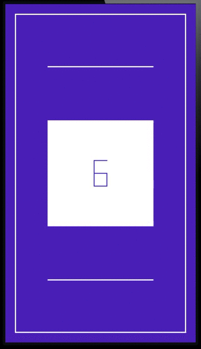
First concept of ZEN

After last week’s guest blog post by my cousin Sebastian about how he came up with the idea of the iOS game ZEN, the design and conception process behind it and the soundtrack, today it’s my turn to talk about putting it in code and making it all come to life.

The Premise

Like a lot of developers I know, I became intrigued with programming because of games. As a kid, I always wanted to develop games for a living, make the next Diablo. So of course I jumped at the idea of creating a game when my cousin asked me if I was interested.

I had never actually programmed a game before, so when Sebastian approached me about developing a game with him, I was already seeing myself having to learn OpenGL and everything that comes with it.

Luckily, it soon became clear that it would be a 2D game, almost 8-bit-ish, like an old Super Mario Bros game. So my fears of having to learn something new* were put to rest and the more he told me about the game, the more I realized that Core Animation would be the perfect fit for this project.

The game is about a cube with random numbers on it. Your goal is to reach ten with these numbers by turning the cube and selecting the appropriate sides within ten seconds.

ZEN Cube Animation

*just kidding, I love learning new stuff, but for a side-project having to learn OpenGL would have been a little much, especially with all my other apps that need constant attention

Core Animation actually was pretty much made for this kind of stuff. Even if the game had had some 3D effects (for example, some sort of perspective distortion when turning the cube, etc), it would have been fairly easy to implement.

First Blood

The first thing I did in the process of developing ZEN was to prototype the cube itself. I began by mapping out the cube because a) I didn’t have one handy and b) to get a visual on each side:

Mapping out the cube

Because I was using Core Animation and it was all in 2D space, I had to figure out what side would go where when the cube was turned from left to right, right to left, from the top or the bottom, so that the numbers would stay on the same side and not end up any place they shouldn’t be. I went so far to write down which side would go where once the cube was turned in any direction

Mapping out which cube side would go whereWhich side goes where when turning the cube?

To make the animation possible, I would have to use at least two CALayers that changed in shape and color, and would have to be kept up to date in terms of data (which side holds which number).

One layer would always be hidden, the layer to turn to, so to speak, the other layer would always be visible. They would alternate in doing that.
For example:

Layer 1 is visible with the front number of the cube.
You turn the cube right and layer 2 (still hidden) gets the number of the left side of the cube.
Layer 1 is animated to fold to the right
Layer 2 shows and animates to the full size of the front cube side.
Layer 1 is hidden

Turning Cube Down on PaperTurning the cube from the top on paper

With that done, I had the cube – of course, there were some kinks to be worked out (for example, sometimes the hidden layer would suddenly be visible with a completely wrong size), but basically, the cube was working.
In code, turning the cube upwards looks like this:

- (void)turnUp
{
ESSCubeSide *oldUp = self.topSide;
ESSCubeSide *oldFront = self.frontSide;
ESSCubeSide *oldDown = self.bottomSide;
ESSCubeSide *oldBack = self.backSide;
self._cubeDict[ESSCUBE_FRONT] = oldDown;
self._cubeDict[ESSCUBE_TOP] = oldFront;
self._cubeDict[ESSCUBE_BACK] = oldUp;
self._cubeDict[ESSCUBE_BOTTOM] = oldBack;
}

This is only the data model, of course. The view code just the two layers – resizing them in unison, hiding one layer and showing the other, etc.

Random Numbers

The next thing that had to be done was to fill the cube with random numbers, some of which would add up to ten.

I chose to do the following:

  1. Decide how many sides it takes to solve the current cube (a number between 2 and 6); let’s say it’s 3 – 3 sides to solve the cube.
  2. Loop while we create 3 random numbers between 1 and 9 that add up to ten.
  3. Fill the rest of the cube (3 more sides) with random numbers between 1 and 9.
  4. Shuffle the resulting array of six numbers so the solving sides aren’t always on the same sides
The same principle works for the minus mode, where there are positive and negative integers that you need to select to add up to ten.

Interface

The first interface concept, as you can see in the first screenshot of this blog post, was pretty simple. The title and three buttons. There was no mention of animations!

As it always happens, things change during the development process, you iterate on everything, and the interface gets overhauled as well. This new one was, in my opinion, much nicer as it demonstrates the “cube-y” nature of the game very nicely.

ZEN Line animation

But it took me some time to get there. I was hoping that Sebastian could define the animations in svg or gif or something like that and I could just load them in and display them.
However, I could not do that – apparently iOS doesn’t support svgs or gifs out of the box (and I didn’t want to rely on 3rd party libraries to do the job). After googling around for a couple of days (because, you know, you want to be thorough), I tried doing it in a web view, because these animations would work in the browser. However, I wouldn’t have that amount of control over them as I did with the final approach I took – code it in Core Animation as well.

So I have one view class that, depending on the width and height of the bounds of the view either expands horizontally or vertically. That was the easy part.

The hard part was creating all the views in Xcode’s Interface Builder with the proper dimensions and positioning them so they would define the buttons and letters. I’m just glad the Help – view is not animated 😉 :

Help ViewThe Help View – thankfully for me, not animated

Creating ZEN was a very exciting experience and I learned a lot during the process. As I usually work alone, working within a team on this project (even if it’s just two people) was a breath of fresh air and is a lot of fun, bouncing ideas off of each other, inspiring each other – there’s a whole lot of energy there.
While I do have a few dear friends with whom I can exchange ideas over the internet for my own projects, it’s quite different when you’re one on one, face to face.

It’s been  a lot of fun.

—-
My name is Matt, I’m the developer of Eternal Storms Software. If you’d like to comment, you can catch me on twitter here: [twitter-follow screen_name=’eternalstorms’ show_count=’yes’] or by eMail.

Read more

For the upcoming action extension in Transloader, I’m using a UIWebView to show the webpage the user is currently browsing, so they can tap on a link they’d like to download:

UIWebView without zoomTransloader’s Action Extension, displaying a UIWebView

It’s nice, but I wanted to go an extra step. A user might zoom and scroll in Safari before launching the action extension and when they do, the web page would be shown from the top, not zoomed. Here’s how I changed that.

Context and Flow

One of the main purposes of an action extension is to allow a user access to functionality from a different app without a) leaving the current app and b) without leaving the current context (which is more or less the same, but context is the point I’d like to drive home with this post).

In that vain, I thought it would be neat to present the website a user was viewing in Safari the same way in the action extension – meaning the zoom level and scroll position.

I figured, a user browses a site, perhaps zooms in on stuff and when they find a link they’d like to download to their Mac, they press the Share button in Safari and select Transloader’s action extension.

The thing is, the UIWebView of the extension loads the website for itself again and hence starts from the top, not zoomed in. So the user is ripped out of the context, they’d have to scroll and zoom again to get to the same position they had in the Safari web view. I wanted to change that:
A user should see the same part of the website in Transloader’s action extension as the part they were viewing in Safari before tapping the Share button.

Luckily, Apple implemented a way that allows us to do just that.

Java Script Preprocessing

In an Action extension for webpages (action extensions that are displayed in the action sheet if the NSExtensionActivationSupportsWebPageWithMaxCount criteria is met), you can supply a JavaScript preprocessing file that will let you examine the contents of the webpage before your native code is called.

This way, we can extract the current page scale and the scroll position. Here’s how we do that. In the Action.js, we call our native code with these parameters:

arguments.completionFunction({
“pageXOffset”:window.pageXOffset,
“pageYOffset”:window.pageYOffset,
“pageScale”:(document.body.clientWidth/window.innerWidth),
“baseURI”:document.URL
})

– pageXOffset is the horizontal scroll value
– pageYOffset is the vertical scroll value
– pageScale is how far the user has zoomed into the page
– baseURI is the current URL displayed in Safari

With these parameters, we can do what we set out to do – display the web page in the Action extension the same way as the user left it in Safari.

In our implementation file, in the WebView’s delegate method “-webViewDidFinishLoad:”, all we basically need to do is apply these parameters to our own web view:

[self.webView.scrollView setZoomScale:self._pageScale
animated:YES];

[self.webView stringByEvaluatingJavaScriptFromString:[NSString stringWithFormat:@”window.scrollTo(%ld,%ld)”,self._pageXOffset,self._pageYOffset]];

For a complete project of how this exactly works, please scroll down where you’ll find a Xcode Project on Github.

And this is what it looks like in action – notice that after the Action extension is tapped, the website appears the same way as it was in Safari:

UIWebView Zoom and Scroll in Action

Example Project

TL;DR – I uploaded a demo project here on Github.

I hope you can make good use of this code – and if you do, please be sure to let me know! 🙂

—-
My name is Matt, I’m the developer of Eternal Storms Software. If you’d like to comment, you can catch me on twitter here: [twitter-follow screen_name=’eternalstorms’ show_count=’yes’] or by eMail.

Read more

At the end of September 2014, I wrote about upcoming changes in Transloader for iOS.

Transloader iOS 8 Action Extension Icon

Today Widget

In that blog post, I wrote about a Today Widget that you could use to easily paste URLs you had copied to your pasteboard on iOS.
It would look like this:

I was pretty sure this would be the way to go, but after using it for a while and iterating on it, I became more and more convinced that this was not an optimal solution.

It’s not optimal for a couple of reasons.

– Although it’s far better than before iOS 8, where you had to open the Transloader app itself to get things going, the Today Widget approach is still a little cumbersome: copy the link, open Notification Center and tap the + button
– You’d have to do this for every link you’d like to add from a website, for example
– Doing that would erase your pasteboard contents you had copied before
– It takes you out of the app’s context

Action Extensions to the Rescue

So I started looking into Action Extensions. And now, this is possible:

transloaderaction

Exactly. Instead of going back and forth to copy several links from a website to add to Transloader, it can all be done on the website itself.

If you’re on a file site itself (for example, you’re viewing a PDF in your browser), you can add it to Transloader more easily as well:

fileaction

Conclusion

I think the combination of these two, the Today Widget (where you’ll still be able to paste links into Transloader, because I think it might still be useful to a lot of users) and the Action Extension will make Transloader very accessible and easy to use on iOS 8.

It will be available soon on the App Store.

—-
My name is Matt, I’m the developer of Eternal Storms Software. If you’d like to comment, you can catch me on twitter here: [twitter-follow screen_name=’eternalstorms’ show_count=’yes’] or by eMail.

Read more

[Note: This is a guest blog post written by my cousin, Sebastian Gansrigler, about the iOS game ZEN (App Store) he and I developed during 2014]

It was around March 2014, I started to set up a basic idea for a game I wanted to create in my spare time. How about combining a Rubik’s Cube and 3D game mechanics with complex mathematical theory and provide all of this with minimalistic pixel art on a touch interface? ZEN was born.

Basic concept on paper, pixel measurements, final screenBasic concept on paper, pixel measurements, final screen

I can’t really say where the idea came from, the game was always based on the concept of a rotating cube, about revealing something that’s hidden, about stress, learning, advancing and getting better and better by repeating it over and over again. ZEN was a good name: …a school of Mahayana Buddhism that developed in China during the 6th century. The word might be translated as something like “absorption” or “meditative state”.

Since I didn’t want to use any fonts, plugins or other preset assets, I created everything from scratch. Beginning with first scribbles on paper, I subsequently moved on to Photoshop and Illustrator to build a basic grid system, alignment rules, colors, etc. I tried to treat pixels like real pixels, there’s not one element in the game that’s round or off grid. Everything had to be perfectly consistent and at the end, of course, fun to play. From then on I went into After Effects for animations and interactions.

All game elementsAll game elements

One musician I had in mind for ZEN’s sound design was Brian Grainger aka Milieu. He created the original score for “Eufloria”, which I played a few years ago on PS3 and totally loved. I wanted something relaxing, yet stressful and packed with tension. Somewhere between Mount Kimbie, Kavinsky and Baiyon. I wrote him, Brian got on board and created an amazing soundtrack (soon available on his Bandcamp) and all sound effects.

Matthias Gansrigler, my cousin, has created some great apps for OS X and iOS, so I contacted him about the game. He did all the code and actual implementation of graphics and animations. The bug fixing was most fun, as soon as something had been fixed, something else came up. Special thanks to Das Möbel in Vienna for a great location to brainstorm and discuss (and of course for the ham & cheese toasts).

Funny button bugFunny button bug

After quite a bit over half a year of production, the game was completed and went online on December 21 2014 on the App Store for iPhone and iPad.


Sebastian Gansrigler is a 20-year old photographer and designer in Vienna, Austria. He works for WDM responsible for web and graphic design. You can reach him on twitter under @gansrigler.

Read more