One of these days, I’d like to put some of the still-in-development ScreenFloat 2’s features through its paces (for instance, and most importantly, the migration of a ScreenFloat 1 library into the new format).
So I’m starting to put together a list of heavy-duty ScreenFloat users now, so that, once I’m ready, I can send out TestFlight invitations and get some feedback and insights right away.
If you consider yourself a heavy-duty ScreenFloat user, and/or have a large-ish library of shots and collections in ScreenFloat 1, please do reach out, I’d appreciate your help.
It’s still going to be a little while as I think about what I want to test exactly, and how, but I’ll be in touch nonetheless, you can be sure of that.
We recently cancelled our cable/general TV subscription, which left us with a bit of an entertainment void. Not that TV was entertaining – we hardly watched anymore, hence the cancelling – but we do like to just “put something on” every now and then. So we decided to get Apple One (Premium, because we’re sharing with my mom). I was, at first, a bit hesitant to enable iCloud Photos – we have nearly 40.000 photos/videos, and obviously we don’t want to lose any of them. So I asked my cousin how he felt about it (he’s been using it for quite some time). He seemed happy with it, so I was confident in turning it on. A couple of backups on multiple drives later, I clicked the checkbox in Photos’ preferences on my Mac – and the waiting began.
Upload Observations
All in all, it took well over 36 hours to finish the upload. I began in the morning, let it run overnight in the hopes it would finish, but the next morning, it still kept going for more than half a day. I noticed that Photos didn’t continuously upload all photos. It uploads for a bit, then does some encoding for a bit, and then uploads again a bit. Now thankfully, my connection is pretty good with a consistent upload rate of ~7MB/s so I thought it would be done fairly quickly, but I didn’t consider that any encoding could be going on. Judging from Activity Monitor, at least videos are encoded before they go up into the cloud.
My Mac (which has all the photos) was the first where I turned it on, and after it had finished, I also enabled it on my iPhone and iPad. Those were done syncing in about two days. “Thanks” to what Apple probably considers a “feature”: the constant pausing of the syncing process on iOS devices, in order to conserve battery: “Paused syncing to save battery”, it said anytime I looked. No! Why!? Sync!, that’s what the battery’s there for. Just do it, I don’t care. And don’t let me enable it for “a day”, let me enable it forever. Seriously. Get it done.
Comparing to Photo Stream
Previously, I mostly collected photos on my Mac via Photo Stream. And I have to say, while I do enjoy the new syncing features iCloud Photos offers (syncing albums, photo-edits, etc), newly taken photos now take noticeably longer to appear on other devices than before. Not a deal breaker, but noticeable.
“Unable to Upload”
65 photos were unable to upload, according to Photos on my Mac. Why? I couldn’t honestly tell you. Photos didn’t tell me. It should have, if you ask me. I’d have liked to know. And there’s no way to retry to sync those photos with iCloud. They’re just in the “Unable to Upload” smart-album forever. Albeit, a bit of online research reveals an Apple support document with one of the weirdest and Apple-unlike solutions to a problem I’ve ever come across: Step 1: Export the photos in question “unmodified” to a folder on your disk. Step 2: Delete them from Photos (scary) Step 3: Import those photos you just exported into Photos again to retry their syncing. It worked (mostly), but still, why can’t I just do this in Photos itself?
Varying Photos count
An interesting tidbit: All my synced devices show a different photo count.
Device
Photo count
Video count
Mac
37.831
461
iPad
37.835
461
iPhone
37.834
461
The video-count is the same on all devices, but photo-counts vary.
Of course, with that amount of photos, there’s no way – ever – for me to find out which photos are missing on which device. Because interestingly, when I connect the iPhone or iPad to my Mac, it tells me that the connected device only contains items that are already on my Mac. Go figure.
General Impressions
I’m happy with iCloud Photos. Finally, all my videos sync, and so do all “fancy” photos (with blurry backgrounds or any sort of effects) and edits, and the syncing seems to so far be very reliable. No longer do I need to connect them once a month to make sure I have all photos collected on my main machine. Nice.
Face- and duplicates analyses appear to happen on each device individually, probably in the name of privacy (and iOS devices need to be – again, why? – connected to power for that to happen). I wouldn’t mind if that synced over (the found faces appear to, anyway). It’s kind of weird that they constantly turn off those features to conserve battery, and then have all my devices do the same work. Wouldn’t it save even more battery if just one device did it? Oh well…
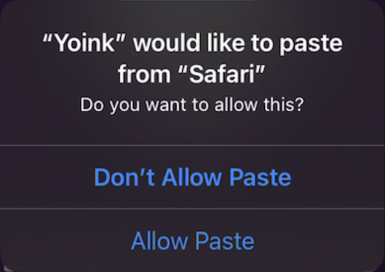
If you’re using Yoink for iPad and iPhone’s Clipboard Monitor – which, if active, automatically saves anything you copy from other apps, even if Yoink is completely in the background –, you’re probably familiar with this dialog since iOS 16:
While this is useful information for apps you wouldn’t expect to be pasting at that moment, if you’ve activated Yoink’s Clipboard Monitor, you don’t want to have to confirm each and every single paste operation – it can get annoying very quickly:
I did file a feedback with Apple for adding an option to “Always Allow” pastes during the early days of iOS 16, and thankfully, in iOS 16.1, they introduced exactly that:
How to enable Always Allow “Paste from Other Apps” for Yoink.
– Open Settings.app – Scroll all the way down to Yoink and select it – Tap on Paste from Other Apps – Select Allow
With this enabled (you can revoke it at any time using the same steps), you go from the confirmation-hell above to this:
When copying now, Yoink’s Clipboard Monitor picks up the copied item right away, without confirmation. A notification that a paste occurred is displayed.
You’ll still get notified that Yoink pasted from the source app, but you won’t need to confirm the paste each time 🥲
With Yoink for Mac‘s clipboard history working again on macOS Big Sur and newer, I’ve seen, in forums and such, some questions about how the clipboard history operates and what it stores, in regards to privacy. I’ve answered those questions, but figured I’d let everyone know about it as well here on my blog, since this *should* be publicly available info:
General Notes about Yoink’s Clipboard History
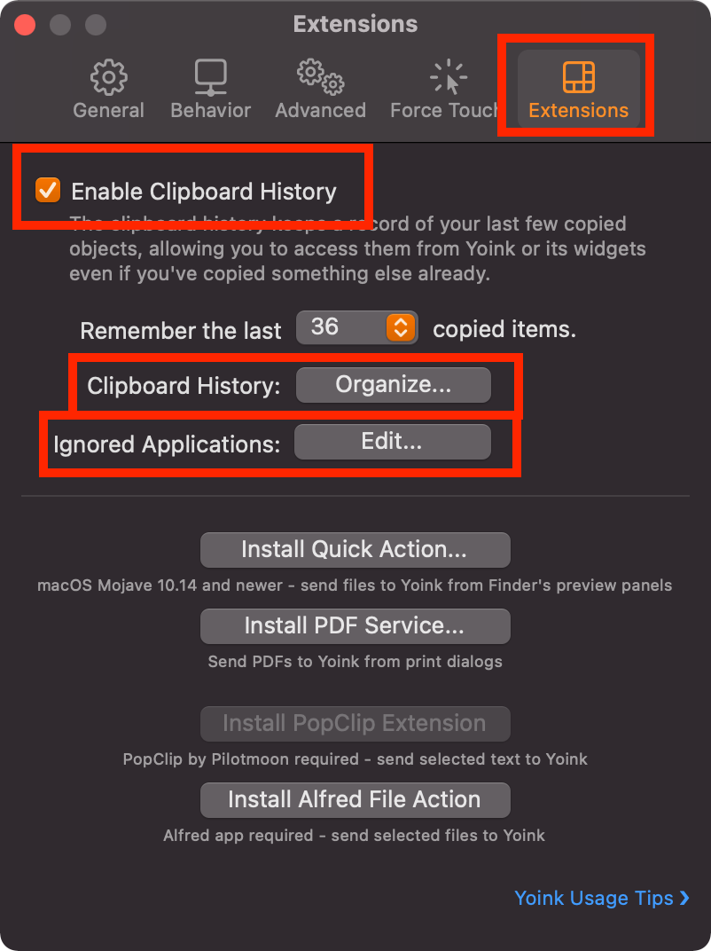
By default, the clipboard history feature is disabled. It has to be manually enabled by either clicking onto the widget in Notification Center, or in Yoink’s preferences, under Extensions.
The clipboard history feature can be disabled at any time (and will clear any stored items at that point) in Yoink’s preferences, under Extensions.
Individual items can be deleted in the Clipboard History browser, accessible by command-clicking onto an item in the widget, by selecting Clipboard History > Organize… in Yoink’s contextual menu, or by clicking Organize… in Yoink’s preferences under Extensions.
What the Clipboard History stores
By default, Yoink stores anything you copy or cut, be it some text from a document, an image on a website, or a file in Finder, for example. Please read “What the Clipboard History does not store” below for important exceptions to this.
The clipboard history can be configured by you to completely ignore copy/cut operations in certain apps. This can be done in Yoink’s preferences, under Extensions, by pressing “Ignored Applications: Edit…”
The clipboard history is stored locally on your Mac and does not leave your Mac, unless you do it manually.
What the Clipboard History does *not* store
Yoink completely ignores cut/copy operations from any app or process that has one of the following in its name: Keychain, Enpass, 1Password, KeePass, LastPass, Password, Kaspersky, mSecure, AppLocker, Keeper Password, Passwort, oneSafe, Secrets, Strongbox, RememBear, Dashlane and Bitwarden. Anything copied from an app whose name contains one of the above (case insensitive) does not get stored in Yoink’s clipboard history.
In addition to that, Yoink also ignores copied content from any app, if the resulting clipboard content contains any of the following data types (as suggested by developers, for developers, on nspasteboard.org): com.agilebits.onepassword, org.nspasteboard.TransientType, org.nspasteboard.ConcealedType and org.nspasteboard.AutoGeneratedType. If you copy something from an app, and that app writes, say, a string to the pasteboard, and also specifies one of the data types above, the clipboard history will not pick it up.
If you have any suggestions, possible additions, questions or feedback regarding this, please do mail me.
I’ve also updated my privacy policy to clarify all of this.
Long story short: I’m not interested in anybody’s data. I don’t do any tracking, no usage statistics, and, if my apps use your internet connection, it’s exclusively for a specific feature that it offers to you, the user.