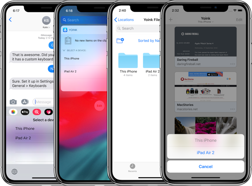
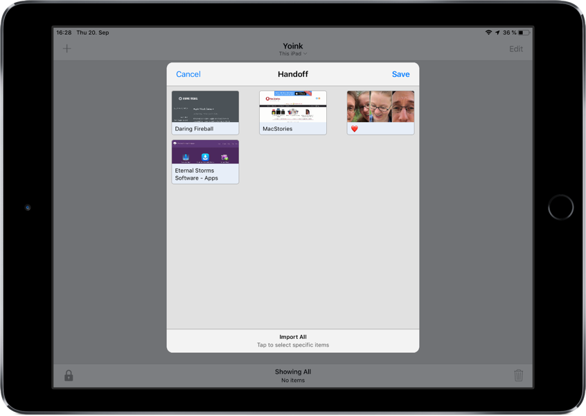
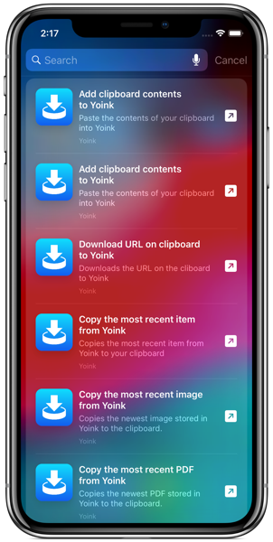
yoink

Yoink Promotion on TwoDollarTuesday

I’d like to quickly inform you that, as part of TwoDollarTuesday, I have a sale of Yoink going on right now.

Yoink is 72% off on the Mac App Store ($1.99 instead of $6.99) for a limited time.

Also, yesterday I released an update for it, bringing it to version 3.2.6, fixing an issue with Microsoft Outlook and the Dock. It also brings minor improvements in low-memory situations.

Links:
Yoink on the Mac App Store
Yoink Website / direct Demo download

I hope you enjoy it 🙂

Read more

[This is a follow-up to this blog post. It was inspired by the response I received through social media and different websites.]

In a previous version of Yoink, I had the following conundrum:

Yoink 3.2 Preferences Inactive Checkbox

The checkbox “Show window near mouse pointer when drag is initiated” is inactive and needs extra steps to be activated.
If I’m a new user of the app, at first, I have no idea how to activate that checkbox. At best, it’s something I need to set in this preference panel, at worst it’s a setting in a different one.
As a new user, my only option is to blindly change settings, waiting for one to activate the checkbox so I can select it.

There are different solutions to this problem, of varying degrees of effective- and usefulness:

  • A tooltip. If the checkbox is inactive and you hover over it, a tooltip appears, explaining what to do to activate the checkbox.
    It’s a quick and easy solution, however, it’s almost undiscoverable. I know of many users who don’t even know tooltips exist.
  • Hiding the checkbox instead of having it be inactive.
    That’s better, as it reduces clutter (as the checkbox would be inactive anyway). But it introduces another problem – nobody knows that the option even exists.

“For that UI, I think maybe an additional improvement would be to actually hide and show the checkbox completely instead of disabling it.
Also, indent the second checkbox so that it feels like it’s a sub-section of the first.
Another option might be to split things out into radio buttons instead of checkboxes and the popup menu.
That way you could expose the additional option tied to the appropriate radio choice, which you can’t exactly do with the menu item.”

Manton Reece, via Core Intuition’s slack channel

  • Speaking of radio buttons, Adrien Maston wrote me a very detailed mail with some ideas he had about resolving the issue:
    Adrien Maston Radio Button Yoink

Since there are only two options for « automatically show when », maybe the setting could be radios instead of a select.
Then each option would be formatted as a column and each column would contain specific settings (the « drag starts » column would contain the « Show window near mouse pointer when drag is initiated » checkbox. Then it would make sens that clicking the checkbox would also set to « drag starts ».

Adrien Maston, via eMail

What I ended up doing in Yoink v3.2.1, the release that followed this discussion, was this:

Yoink 3.2.1 Preferences Active Checkbox

Instead of having the checkbox inactive, it’s active at all times and can be clicked right away. The advantage of this is that for one, the user knows the option exists and two, the user can select the option right away without having to figure out how to activate it.
The downside, and this has been pointed out to me a couple of times, and I agree, is that clicking the checkbox changes two settings at once (the checkbox and the popup, as you can see in the GIF above). It changes a setting the user has made before. And that’s bad UX design on its own right there.
My thinking was, it’s in the same preference pane, so the user sees what’s happening right away. It still was the wrong decision (as has been pointed out to me in the comments on designernews.co).

For Yoink v3.2.5, I re-thought the whole thing and decided to make it three options in a popup.
This is the result:

Yoink's Behavior Preference Pane in v3.2.5

It solves a couple of things:

  • The inactive checkbox is a thing of the past
  • The options you have for when and where Yoink should appear are much clearer
  • You get a preview video for every option so you know right away how each setting affects Yoink
Additionally, I think it’s the nicest Yoink’s Behavior preference pane has ever looked, so that’s a plus 😉

Eternal Storms Software Logo

– – – Do you enjoy my blog and/or my software? – – –
Stay up-to-date on all things Eternal Storms Software and join my low-frequency newsletter (one mail a month at most).
Thank you 🙂

Read more

Yoink Mac App Icon

I’m happy to tell you that today, Yoink 3.2.5 is available for download from the Mac App Store. It’s a free upgrade for everyone who’s purchased it before.
You can download a 15-day trial for the app here, even if you’ve tried it before.

What Is Yoink?

Yoink simplifies and improves drag and drop on your Mac.

Simplify.

It simplifies drag and drop by providing a temporary place for files you drag, so you can navigate more easily to the destination of the files. It’s especially useful when trying to move or copy files between different windows, Spaces or (fullscreen) applications.

Moving a file with Yoink

When you start moving a file in Finder, or app-content like an image from a website, Yoink appears at the edge of your screen, offering a temporary place for you to drag the files to. Without having to keep the mouse button pressed, you can now get to the destination of your file quicker and easier.

Improve.

Drag and drop is improved in several ways, including:

  • Collect multiple files from different locations you’d like to move to one destination without having to go back and forth
  • Split up a multiple-files-drag so you can move files to different places without having to go back and forth
  • Copy files to multiple locations more efficiently

Customize.

You can customize Yoink’s behavior so it fits in perfectly with your workflow. Aside from having to option to show it at either edge of your screen (at the top, center or bottom), you can set it up to only appear when you drag files to the edge of your screen or to appear directly at your mouse cursor when you start dragging, making drag and drop even faster.

Yoink appearing at the mouse cursor

For applications where you don’t need Yoink, add them to a “blacklist”, so Yoink doesn’t interfere with your work. A keyboard shortcut (by default, F5) lets you manually show or hide it, should you need it anyways.

What’s New in Yoink 3.2.5?

Version 3.2.5 improves support for photos dragged from Photos.app on macOS Sierra, reduces the app’s energy footprint and CPU usage during drags and improves the user experience throughout several parts of the app.
As a result of the discussion about disabled checkboxes being poor UX design (blog post), I updated Yoink’s “Behavior” preferences pane to have a more understandable UI:

Yoink 3.2.5's new Behavior preference pane

Further Improvements

  • Improved Yoink’s behavior if auto-recognition of drags is disabled
  • Force-Touch-To-Select-All-Then-Drag-Out is now a more pleasant experience
  • At first launch, Yoink now respects and reflects macOS Sierra’s “Reduce Motion” setting
  • Several bug fixes regarding QuickLook, Force Touch and file cleanup

Pricing and Availability

Yoink 3.2.5 is available for purchase on the Mac App Store for the price of $6.99 / £4.99 / €6,99. It is a free update for existing customers of the app.
You can download a free, 15-day demo version here, even if you’ve tried Yoink before.
Yoink runs on Macs with OS X Lion 10.7.3 or newer. OS X Yosemite or newer is recommended.

If you’re interested in writing about Yoink, you can download the press kit here, which contains screenshots, links to a short video and further information. Promo codes are available to members of the press at press (at) eternalstorms (dot) at.

Yoink Usage Tips

To get the most out of Yoink, I’m collecting useful tips and tricks for you on this website.

I’m looking forward to hearing from you and to see what you think about Yoink v3.2.5. If you like the app, please consider leaving a little review on the Mac App Store, it would help me out a lot! Should you have trouble with it or have any feedback or questions, please be sure to get in touch, I’d love to hear from you! Thank you.

Eternal Storms Software Logo

– – – Do you enjoy my blog and/or my software? – – –
Stay up-to-date on all things Eternal Storms Software and join my low-frequency newsletter (one mail a month at most).
Thank you 🙂

Read more

Translating your app into different languages is becoming more and more important. And articles like this one (techcrunch) seem to confirm that.

With Yoink 3.0 (mac app store, website), I localized the app into Japanese, Simplified Chinese, French, Portuguese (European and Brazilian), Korean and Italian (in addition to the languages that existed from the start: English and German).

Yoink In Brazilian Portuguese

Yoink in Portuguese

Here’s how revenue of Yoink increased a month after its 3.0 release (compared to the month before):

  • Japan: 305%
  • France: 212%
  • China: 144%
  • Portugal: 120%
  • Italy: 80%
  • Canada: 76%
  • Brazil: 45%
  • Belgium: 37%
  • South Korea: 16%
  • Switzerland: 4 %
There are great services available to help you: iCanLocalize, Gengo, wordcrafts, brlingo, just to name a few.
Yoink in Japanese

Yoink in Japanese

So, if I have one tip for you today, try to localize your apps at least into Japanese and Chinese – it will be worth it.

Eternal Storms Software Logo

– – – Do you enjoy my blog and/or my software? – – –
Stay up-to-date on all things Eternal Storms Software and join my low-frequency newsletter (one mail a month at most).
Thank you 🙂

Read more