After having spent over a (completely fruitless) month on fiddling with this without having an actual Force Touch Trackpad to test with, having gotten one recently, it still was insanely difficult for me to finally figure out how to receive Force Touch events from an NSTableView. But I finally did it. Here’s how.
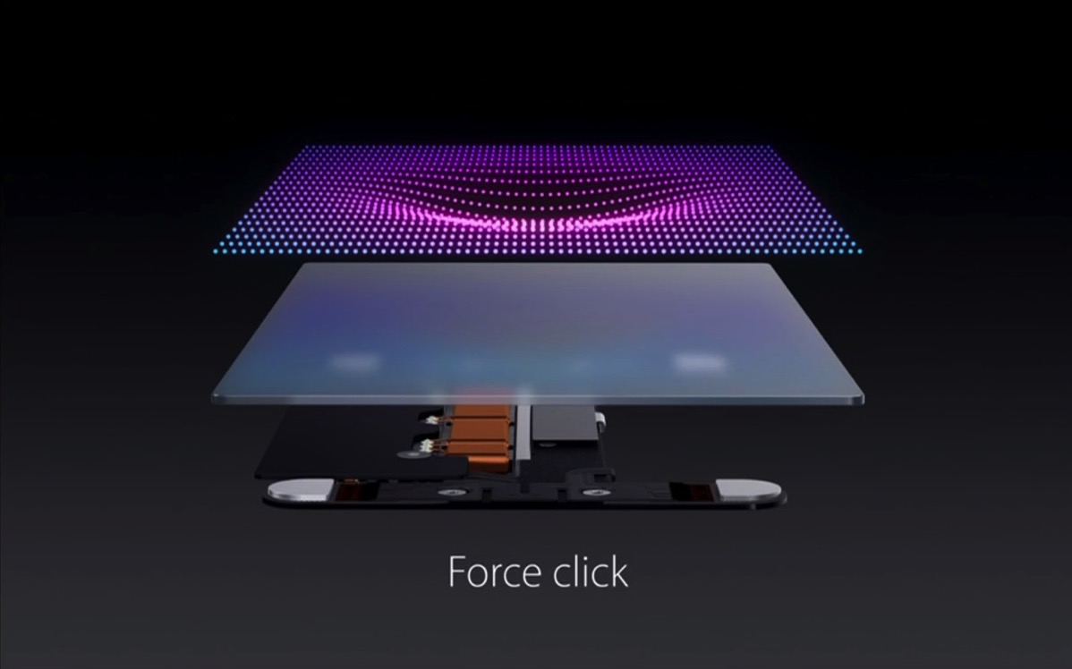 Image Credit: Apple, Inc.
The Premise
In Yoink, the usual way to select all files (pressing ⌘-A like you would in almost any application) is not a viable option. Yoink is written to not have key focus, as it would otherwise interfere with work in other applications too much (believe me, I’ve tried).
So I had to come up with a different way to do it. What I’ve done up until now is to allow the user to hold down the option (⌥) key on the keyboard and double-clicking onto any file in Yoink to select all files.
When Force Touch was introduced, I thought that would be a very nice alternative to option-double-clicking. And it is. Once I got it working, anyway.
The Issue
What I thought would be the easiest way to get Force Touch events from an NSTableView was to override – (void)pressureChangeWithEvent:(NSEvent *)theEvent.
Only that it doesn’t get called as it would normally be called: continuously, after – (void)mouseDown:(NSEvent *)theEvent, with every change of pressure on the trackpad.
No, in an NSView-based NSTableView (I haven’t tested cell-based tableViews), -pressureChangeWithEvent: gets called at -mouseDown: with a pressure of 0.0, and then just “dies”, not getting called again until the next -mouseDown:.
That’s interesting. And there’s more interesting-ness going on.
Once I override the tableView’s -mouseDown:, -pressureChangeWithEvent: suddenly gets called continuously, as you’d expect. So something apparently happens inside the tableView’s -mouseDown: implementation that sort of prevents -pressureChangeWithEvent: from getting called.
Finding A Solution
Knowing that the table view’s default implementation of -mouseDown: somehow interferes with the easy way of using -pressureChangeWithEvent:, my first attempt at a solution was to override -mouseDown: and re-implement its functionality myself, because then I would receive -pressureChangeWithEvent: properly. Then it dawned on me what I was in for. Dragging something out of the tableView (something kind of essential in Yoink) suddenly didn’t work anymore. I’d have to re-implement the selection mechanism (selecting with a mouse click, de-selecting with the command key pressed, adding an additional selection with either the shift- or the command key, etc.)
That alone would have taken more time than the entire feature of having force-click-to-select-all is worth.
Next, I thought NSGestureRecognizer could work. I created a subclass of it that overrides -pressureChangeWithEvent: and checked to see if it was called. But it was the same thing all over again. Adding it to the tableView, the NSTableRowView, the NSTableCellView and the underlying contentView of NSWindow, trying to figure out if they maybe swallowed the method call yielded no result or any change. It was all the same. It got called at the first -mouseDown: call, but then stopped.
Next I tried a local NSEvent monitor thinking it might do the trick, and it works, but only when the window’s contentView is force clicked, not the tableView. A global monitor doesn’t seem to work with pressure events.
So the only way that seemed to get me anywhere at all was to override NSTableView’s -mouseDown:. And that’s what I ended up doing. At first. After a day’s work, though, it still didn’t yield any results what-so-ever. The amount of time I’ve wasted on this is astounding, but apparently, when you keep going and really want to get somewhere, you eventually will.
The Solution
In OS X 10.10 Yosemite, Apple introduced a new NSEvent-tracking API in NSWindow: – (void)trackEventsMatchingMask:(NSEventMask)mask timeout:(NSTimeInterval)timeout mode:(NSString *)mode handler:(void(^)(NSEvent *event, BOOL *stop))trackingHandler that lets you, in a tracking loop, monitor for events matching the mask you provide, in this case, NSEventMaskPressure.
I actually had played around with this before, coming recommended from Markus Müller (@fafner on twitter), developer of the marvellous Mac and iOS app MindNode, who, by the way, in order for me to be able to test this stuff before I got my own Force Touch-able Trackpad, kindly invited me to their office to use his MacBook – thank you, Markus.
However, I didn’t get very far, as I didn’t know how to use the API correctly. Calling it from – (void)awakeFromNib, for example, isn’t the best idea, as it a) doesn’t appear to be able to track anything and b) locks up the app. It has to be called from inside a tracking loop (like -mouseDown: or -pressureChangeWithEvent:).
Again, after a lot of time wasted getting nowhere, this is the solution I came up with:
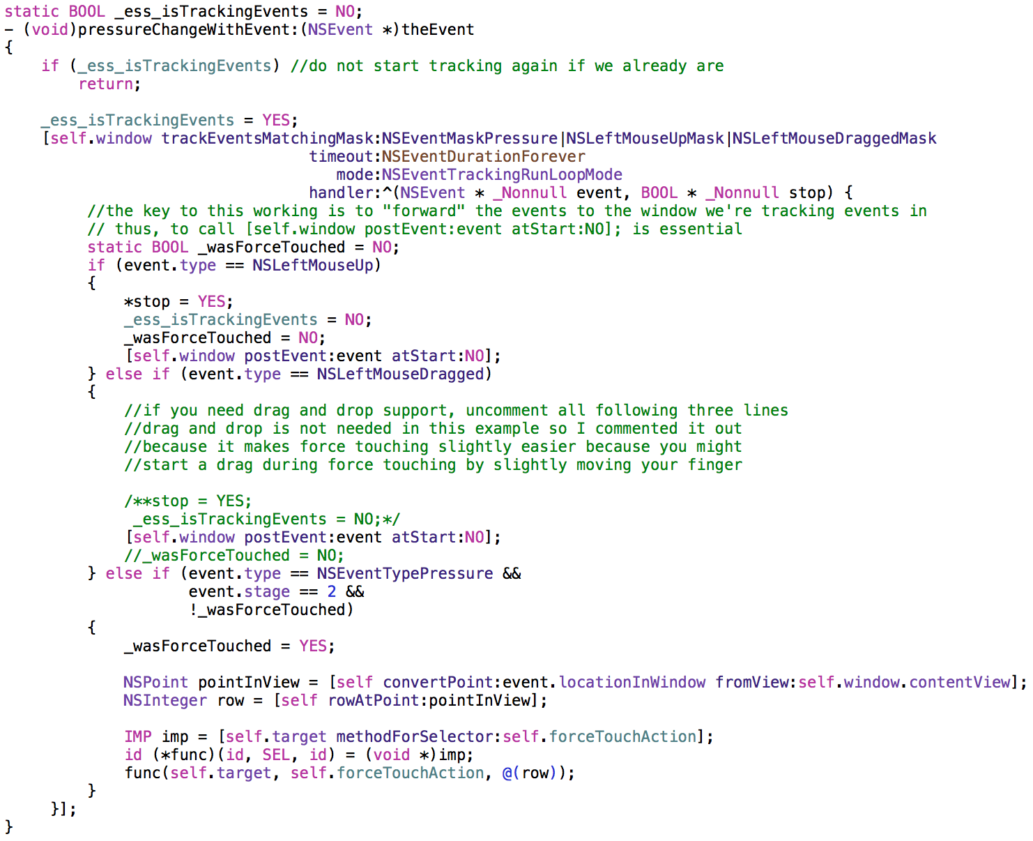
I decided to imitate NSTableView’s -action and -doubleAction methods for handling receiving force touch events in a target.
NSTableView can be set up with a -target that should receive the selectors set in -action, -doubleAction, and with this, -forceTouchAction, as seen in the code above, uses the same approach – send the specified selector to the NSTableView’s -target.
This code starts tracking Pressure-, Drag- and Mouse Up events in -pressureChangeWithEvent:, and practically waits until the Pressure event’s stage 2 is reached, which is a force touch. Then it sends the -forceTouchAction to -target.
The important lesson that I learned here is that the events have to be forwarded to the window, as they’re intercepted. So calling [self.window postEvent:event atStart:NO]; is imperative.
I watch for NSLeftMouseUp and NSLeftMouseDragged because I need to be able to stop tracking at some point, and mouseUp and mouseDragged are the perfect moments to do that.
Sample Project
I’ve uploaded a quick sample project to my server which you can download here. It requires OS X 10.10.3 (because of the APIs used). I’ve only tested it On 10.11 El Capitan, though, so your mileage may vary.
I hope this sample code is useful to you and saves you all the headaches I’ve experienced (and a lot of time) figuring this stuff out. Maybe I’m not smart enough. Or maybe this is harder than it should be. I dream of a time where the Force Touch APIs on OS X get the loving treatment 3D Touch enjoys on iOS 😉

