Cocoa

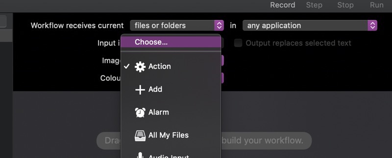
When creating a custom Quick Action for macOS Mojave’s Finder, you have the option to supply a custom icon:
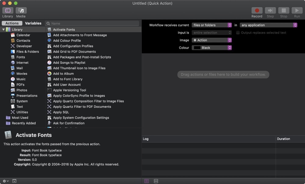
Creating a custom Quick Action in Automator for macOS Mojave

Selecting an icon in Automator

But this is what happens when you supply an ordinary image in Dark Mode:

A Quick Action's icon without adjustments

or Light Mode:

Unmodified Quick Action icon

(in Light Mode, it’s obviously better, but still not as subdued as it should be, which is more grey than pitch-black, or whatever color your original icon file might have).

Tip #1 – Getting the icon’s color right

The trick is to have the file end in ‘Template’, like ‘MyWorkflowIconTemplate.tiff’. But that’s not all there is to it. When you add a custom icon through Automator, it automatically gets renamed into ‘workflowCustomImage.png’. So no matter what you name your file, it won’t matter.

To fix this, add a custom icon to your Quick Action in Automator, save, switch to Finder and navigate to /Users/yourname/Library/Services/, where your newly saved Quick Action will end up.
There, right-click your Quick Action, select ‘Show Package Contents’, and navigate into Resources, where your icon file will be. Rename it to ‘workflowCustomImageTemplate.png’.
Now, navigate into Contents and open Info.plist. Look for <key>NSIconName</key> and change ‘workflowCustomImage’ to ‘workflowCustomImageTemplate’. Save.

Now the icon will look like this:

Modified Quick Action icon in Dark Mode

Modified Quick Action icon in Light Mode

That’s much better. But there’s another issue we need to take care of:

Touch Bar with oversized Quick Action icon

The icon’s a bit too large, even though in Finder and the “More…” menu, it looks well-sized.

Tip #2 – Getting the Touch Bar icon to play nice

I thought I’d be smart about it, since the “append ‘Template’ “ trick worked, I’d have three differently sized images and append @2x and @3x. But it didn’t work.
The trick is to have a TIFF file with 2 (or 3, to be on the safe side) representations – one at 1x, one at 2x and one at 3x.
And voila, it worked:

Quick Action icon in Touch Bar with properly sized icon

To create the TIFF, I wrote a small app that takes my icon file, creates three NSBitmapImageRep objects from it and adds them to an NSImage instance. Then it writes the NSImage object’s TIFFRepresentation to disk.
Open that file in Preview.app and you’ll notice all three icons inside that one TIFF (you might have to select View – Thumbnails in the menu to show them)
Select the first and select Tools -> Adjust Size… in the menu bar.
Resize the image to 16×16 (which I found to be working nicely) and set its resolution to 72, if it isn’t already.
Select the next thumbnail and resize it to 32×32 at 144 DPI, and the third thumbnail to 48×48 at 216 DPI. Save.
Now repeat Tip #1 with this new file and you’re all set.

I hope this will save you some time, as it cost me plenty 😉

_____
Matthias Gansrigler
 | Founder & Developer – Eternal Storms Software
e: blog@eternalstorms.at
twitter | facebook | instagram
Read more

When testing your Today Widget on macOS Mojave and you see something like this using Dark Mode:

Widget with wrong appearance in macOS Mojave's Dark Mode

don’t fret, there’s a rather easy fix.

In your Today Widget’s Info.plist, in NSExtension > NSExtensionAttributes, there’s NSExtensionPointVersion.
For the widget above – with the wrong appearance – the version was set to 2.0:

NSExtensionPointVersion in Info.plist

To see where the problem might be, I created a new widget under macOS Mojave, and it turns out, it uses version 3.0, which also fixes the appearance issue:

New NSExtensionPointVersion in Info.plist

and voilà, it worked like a charm:

Widget with correct appearance in Dark Mode on macOS Mojave

Compatibility

I’ve tested back to macOS El Capitan 10.11 and it worked, it will possibly work for earlier versions of macOS, too.


Hope it helps 🙂

Read more

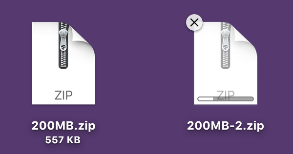
When copying files in Finder, you might have noticed that the newly created, still-being-written-to files are ‘grayed out’, conveniently informing the user that the file is not ready yet.

Greyed out files in Finder

I wanted to replicate that for an upcoming upgrade of Transloader (along with a progress indicator, as you can see in the screenshot above, but that’s another topic), and after trying a couple of things, I found out how to do it.

I tested this on macOS High Sierra only, since it’s the OS version I’m targeting right now, but I don’t see a reason why it wouldn’t work on earlier versions of macOS.

It’s All in the Date

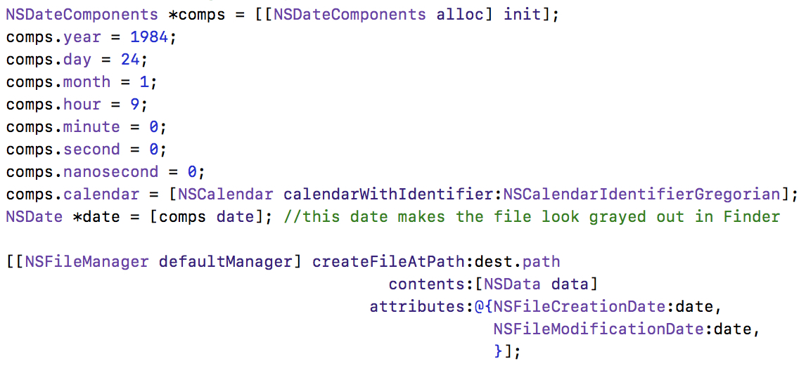
After digging around on the internet, I found that all that needs to be done is to change the file’s creation- and modification dates to one specific date, namely:
January 24th, 1984, 09:00:00 AM

Setting the creation and modification dates of the file to be greyed out

And it works great – the created file appears ‘grayed out’ in Finder.

There’s a downside, however:
When copying a file in Finder, and trying to move that still-being-written-to file, Finder will display a convenient message that tells the user the file is in use and moving it might cause problems.
This doesn’t happen when using this date-setting approach.

So I kept digging.

The Solution

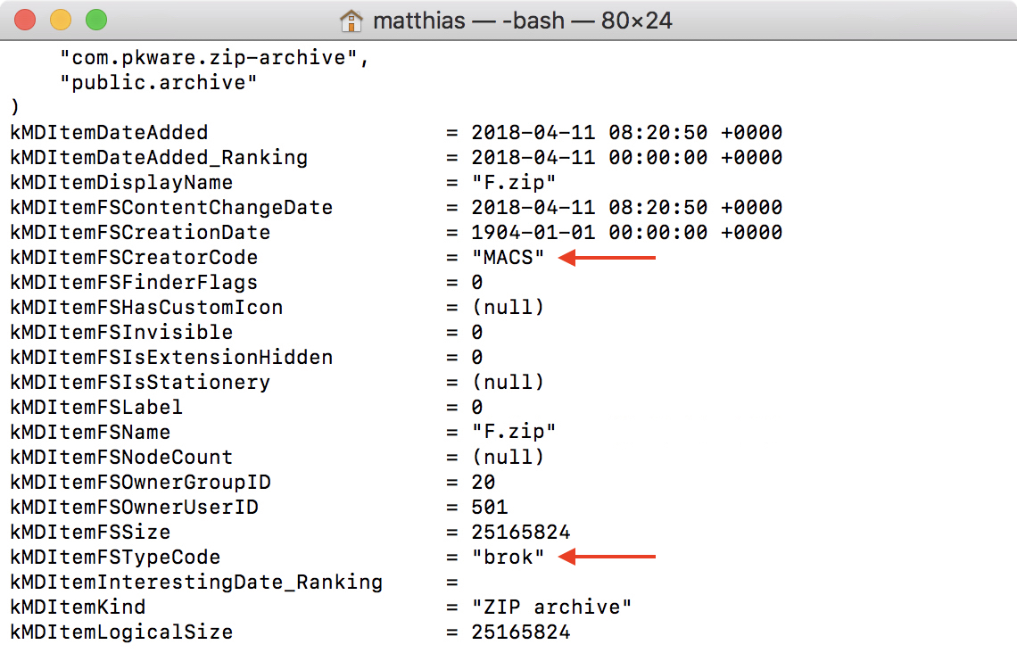
What I did, then, was use Terminal and the ‘mdls’ command to list the meta data of the still-being-written-to file:

mdls in Terminal on a copying file

At first, coming from the date-approach, I noticed the kMDItemFSCreationDate item, stating
1904-01-01 00:00:00 +0000

However, setting that as the creation date does nothing at all.

Then, I noticed the kMDItemFSCreatorCode and kMDItemFSTypeCode fields (red arrows in the screenshot of Terminal above).

Setting those like this…

Setting creator and type codes in Objective-C

…does exactly what I wanted – it ‘grays out’ the file in Finder, and displays the convenient Finder error message when trying to move it:

Finder error message when trying to move a still being written to file

Mission accomplished – we’re done!

Please keep in mind, though, that the user may still choose “Continue” to move the file, so you should definitely use an NSFileCoordinator to take care of that.

Read more

One of Yoink v3.3‘s new features is the detection of favicons for webloc files dragged into the app, making it easier to quickly identify individual weblocs at a glance. (A webloc file is something Finder creates when you drag a URL/link to it).
Think of it as QuickLook icon previews, just for websites:

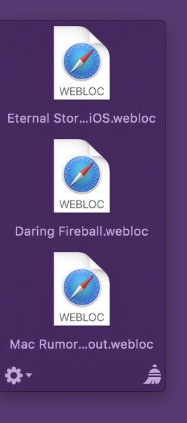
Yoink with webloc files without favicons

weblocs without favicons

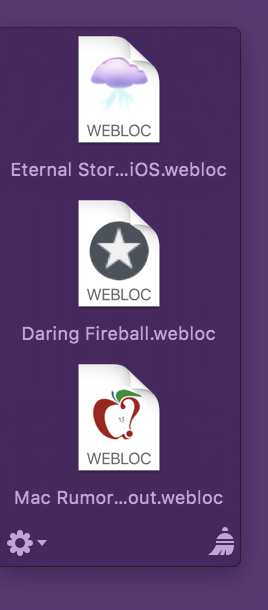
Yoink with webloc files with favicons

weblocs with favicons

The advantage is obvious right away, that’s why I jumped on it the second the feature was suggested to me.

Optional Setting

Even though I really like favicon detection and have it enabled on my Mac, I decided right at the start that favicon detection would be opt-in (disabled by default), for a couple of reasons:

  1. It requires an internet connection
  2. It uses data (very little, but still)
  3. I thought I’d use a Google Service for this (which I discarded after the prototype) and wasn’t comfortable having users use it without their “consent”

1) Internet Connection

Yoink is not an app that should require an internet connection at all.
It’s a “local” Mac app, it helps you with drag and drop, why need an internet connection?

As a side note, the connection itself actually doesn’t happen in the main Yoink app, it’s an XPC service that has the sandbox privilege, so the main app isn’t affected.

2) Data Volume

A Mac usually connects to the internet over WiFi or an Ethernet connection, and the data transferred for favicons *is* very small.
But there’s still a chance you’re using weblocs like crazy on a Mac connected to the internet via your iPhone’s Personal Hotspot on a data plan, which also makes it obvious why the user needs to be able to turn this option on and off.

It just made me more comfortable to have users opt-in to this option, instead of opt-out.

3a) Google?

Google has a nice favicon detection service, which is just a URL you pass another URL into to receive the image data:

http://www.google.com/s2/favicons?domain_url=PERCENT-ESCAPED-URL

There’ no need to parse the HTML yourself for the URL to the favicon, Google does it all for you.

3b) So Why Not Google?

What if the service goes away?
With Google having a bad rep for some users, would they use this feature?
What about privacy? (I don’t know, but they might collect your IP and then know what URL a favicon was loaded for, etc.)

So even though it worked very nicely, I decided to implement it myself.

Getting the Favicon

With Google out of the picture, I had to roll my own detection and parsing.
What I do is actually very, very simple.

I load the webloc’s URL’s HTML content, and then look through the header part.
In particular, I look for one of the following lines:

rel=“apple-touch-icon”
rel=“shortcut icon”
rel=“icon”
rel=“apple-touch-icon-precomposed”

in that order. (I’m sure there are more I could go through, but those were the ones that I came across while testing.)
Should none of those exist, I just try something like:

•) http:// … /favicon.ico
•)  …/favicon.png
•) rinse and repeat for every image format you can think of

If I have no luck there, either, I bail and return macOS’ default webloc icon.

If I am lucky and I find a “rel” I’m interested in, I figure out what the href contains (an absolute link to the image, a relative path to the image, or just the name of the image file itself). Once I know that, I can load the image file and composite it into the final icon.

The final icon is cached so Yoink won’t have to connect to the internet and re-download favicons for weblocs that point to the same base URL.

Drawing the “personalized” webloc icon

I went through three iterations, each at its own, unique laziness level.

Iteration 1, laziness level 3 (extremely lazy)

Just show the favicon:

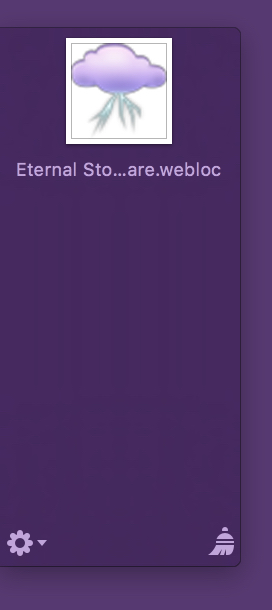
Iteration 1 of Favicons in Yoink

No wonder I didn’t use it. It’s so lazy.
Second, it doesn’t even remotely resemble a webloc file anymore. It actually looks more like an image file’s QuickLook preview icon, and that’s a bad thing, as it could very possibly confuse users.

So I went on to

Iteration 2, laziness level 2 (pretty lazy)

Show the favicon super-imposed on the webloc icon:

Yoink Favicon Icon Iteration 2

That’s better. But not good, either. Favicons can be transparent, like the one here, but they can also be opaque, blocking the WEBLOC text in the icon and making the overall icon look more blocky and less nice.

Onwards and upwards!

Iteration 3, laziness level 1 (not that lazy)

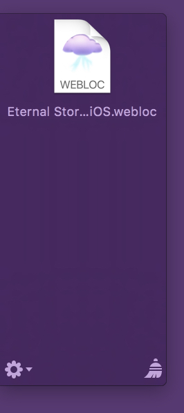
Crop out the “Safari” part of the webloc icon and paint the favicon below it:

Yoink Favicon Icon Iteration 3

If the favicon is transparent, I draw it on top of a white background (so it would fit with the rest of the original webloc icon), if it’s not transparent, the favicon’s background is used, solving everybody’s problems. And you can still see that it’s a webloc file, at first glance!

Eternal Storms Software Logo

– – – Do you enjoy my blog and/or my software? – – –
Stay up-to-date on all things Eternal Storms Software and join my low-frequency newsletter (one mail a month at most).
Thank you 🙂

Read more