Apple

With iOS 14 comes a new privacy feature – a little banner at the top that shows you whenever an app accesses the clipboard.
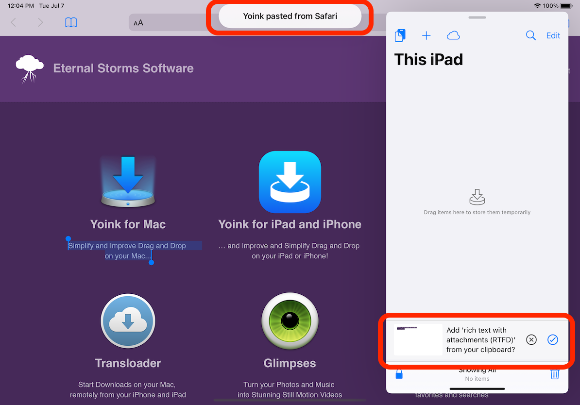
Screenshot of iOS 14's Simulator showing the clipboard alert banner

I recently was asked in a tweet whether this was a bug. It’s not. It’s a feature 😉
But please let me explain in a little more detail what Yoink is doing here exactly.

Yoink accesses the clipboard without direct user-input in three cases:

Case 1 – Yoink’s Clipboard Bar

As you can see in the screenshot above, Yoink displays a small bar with the contents of the clipboard, allowing you to quickly store that content in Yoink (or, if it’s a URL pointing to a file, download that URL in Yoink).
To be able to display this bar, Yoink asks the clipboard whether it has new contents. It asks once when the app is put into the foreground, or regularly, in an interval whenever Yoink is used as a Side-by-Side or Slide-Over app (to be able to update the contents of the bar).

The clipboard bar comes in three settings (which can be changed in Settings.app > Yoink) :

  1. Ask
    This will make the clipboard bar appear whenever something new is on the clipboard (and will “monitor” the clipboard when the app is used as Slide-Over or Side-by-Side)
  2. Automatically store
    This turns off the clipboard bar, but will still check the clipboard for new content and automatically store it in Yoink.
  3. Never
    Turns off the clipboard bar and the auto-store feature, so the clipboard isn’t accessed

What I’m changing about this with the next update

Right now, the default setting is 1 – Always Ask for new clipboard content. This I want to keep, because I believe it to be a nice feature (and I’ve seen it used a lot).
However, I’m making it more obvious to turn it off, as you currently have to navigate into the Settings.app to change it.
So, whenever the ‘x’ button is pressed (to tell Yoink no, don’t store the clipboard’s current content right now), I’m asking the user directly if they’d like to keep the bar, turn it off, or always store new content automatically.
It’ll look something like this, after the bar has been dismissed:
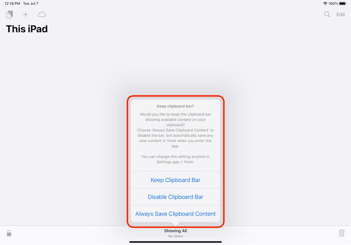
Screenshot of new settings options

Case 2 – The Add from Clipboard Button

In Yoink’s top left corner sits the Add from Clipboard button. It is either active or not. To enable and disable it, Yoink queries the clipboard’s contents regularly (if it’s used in Slide-Over or Side-by-Side), and thus also causes the “clipboard accessed alert” to be shown.
It’s just a UI thing I thought would be neat, but ultimately, it’s unnecessary.

What I’m changing about this with the next update

I’ll remove the clipboard checking for this button and display an alert instead if there was nothing to be pasted on the clipboard.

Case 3 – Download a URL

Whenever you select “Download URL” from Yoink’s “+” menu, Yoink will check your pasteboard to see if you’ve copied a URL. If there is a URL, it’ll insert it automatically for you, if there isn’t, it leaves the URL field empty (and ignores the clipboard, of course).
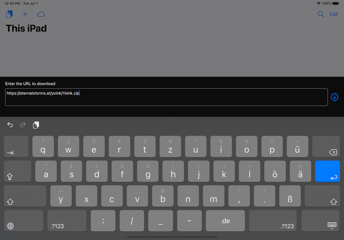
Screenshot of Yoink's Download URL UI

What I’m changing about this with the next update

In iOS 14, Apple provides new API which allows developers to see if there might be a URL on the clipboard without actually accessing it. I’ll be using this going forward.

I hope that clears things up about Yoink’s usage of your clipboard.
And just to reiterate: I’m not interested in anybody’s data at all, and you can review my privacy policy here.

Read more

As some of you may know, getting Yoink for iOS through Apple’s App Review was, to say it lightly, a bit of a pain.
In the end, I was able to release it, but a month late. Had this been my first app as an indie developer, there’s a good chance I would have had to declare bankruptcy now.
I am fortunate enough to have a couple of apps out already that create a steady income, but still, I spent about two months exclusively on this app, so it’s still scary thinking about how I got rejected over and over.

Long story short, here’s a couple of thoughts I’ve had during all of this.

TestFlight App Review

From the very beginning, I’ve had Yoink available to a couple of (awesome) testers via TestFlight.
Now, when you add a new app or a new version of the app to TestFlight, it has to go through a review before testers can download and test it.

My question, then, is: Why not reject the app right there if it doesn’t comply with the rules in the App Reviewer’s eyes?
If this is not checked, why have a review for TestFlight apps in the first place?

Or if that’s unrealistic for some reason, perhaps TestFlight App Review could give sort of a “likelihood of getting through the ‘real’ App Review”. Maybe on the levels of “yea, good luck with that” to “possibly, tentatively not going to be rejected”.

It would have saved me (and the App Review person) a *lot* of time and nerves had, for example, the File Provider extension been rejected right then and there for not being cloud-storage based. Or the keyboard, for not having a traditional method of input. Those are all things that could have been avoided, had TestFlight App Review caught these things.

Reasons for Rejection

Yoink was rejected for different reasons and in different areas of the app.
But those reasons were given to me one by one, one submission and “Waiting for Review” -> “In Review” cycle after another.
That’s *such* a waste of time (not only for the developer, but also for the reviewer. But *especially* for the developer).
Why not keep going after finding a reason for rejection and see if there are other issues after that? If so, the reviewer could note them all down and give them to the developer all at once, not one by one.

Notice of Escalation

When an App Reviewer isn’t sure about an app, the review is “escalated”, meaning it goes up one instance in the App Reviewer hierarchy to be reviewed by a “superior”.
That would be the perfect time to let the developer know in advance that, “look, review is going to take a little longer because we’ve run into an issue with your app. Please stay tuned, we’re working on it.”.
Not only would the developer know that it’s going to take longer for the app to be reviewed, they’d also have reassurance that the App Reviewer hasn’t forgotten about the app – anybody who had an app “In Review” for more than twelve hours knows that feeling 😉

In closing, I’d like to say that I have nothing but respect for App Reviewers. Their job is difficult and, mostly, unthankful.
But I believe a lot of grievances on both sides could be avoided if some of these suggestions were put in place.

Eternal Storms Software Logo

– – – Do you enjoy my blog and/or my software? – – –
Stay up-to-date on all things Eternal Storms Software and join my low-frequency newsletter (one mail a month at most).
Thank you 🙂

Read more

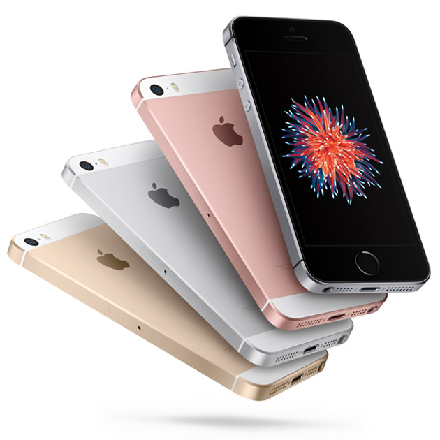
iPhone SE, by Apple, Inc.

Before I tell you why I won’t be buying one, let me say this: I love the iPhone SE. I love its form factor, I love its power.
As a matter of fact, I’m still using – and loving – my iPhone 5s and I think, for me, the 4’’ screen is just perfect.

Why I Won’t Buy the iPhone SE

Personally, I want to keep to the 4’’ form factor, but I can’t. As a user, I probably could do without 3D Touch, but since I want to develop for it, I need some way to test it. While the simulator with Magic Trackpad (Force Touch) support is nice for initial development, I’ll have to test on a real device sooner or later (and better sooner rather than later).

So as a user, I’d probably purchase the iPhone SE, but as a developer, I can’t do it, so I’ll have to wait for the iPhone 7.

But let’s get on to the actual point of this post.
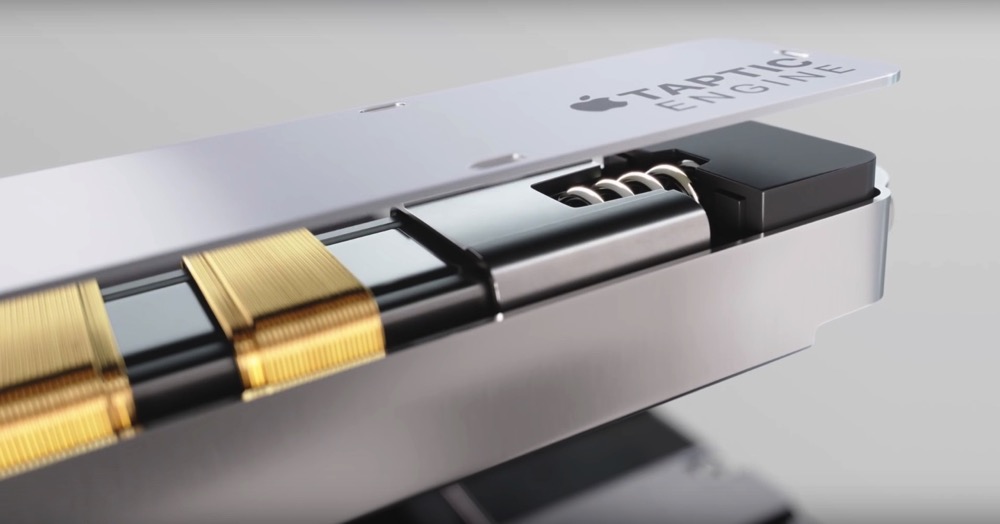
IPhone 6s Taptic Engine 3D Touch

Why The iPhone SE Should Have 3D Touch

It’s clear to me why Apple isn’t including it – it gives the iPhone 6s and Plus (and future “mainstream” iPhones) a USP and makes it more attractive for surely lots of users, while allowing to offer a slightly cheaper iPhone for those that don’t have as deep a pocket.
Still, I think it’s a mistake not including 3D Touch in the recently announced iPhone SE. Here’s why.

It “Cheapens” the Technology

To play a Live Photo, normally you’d Force Press. On the iPhone SE, you long-press to play Live Photos. The question then becomes, what do I really need 3D Touch for?
Live Photos kind of were presented together with 3D Touch (Live Photos on the Lock Screen), but a long press does this just as well, so, yeah, whatever.
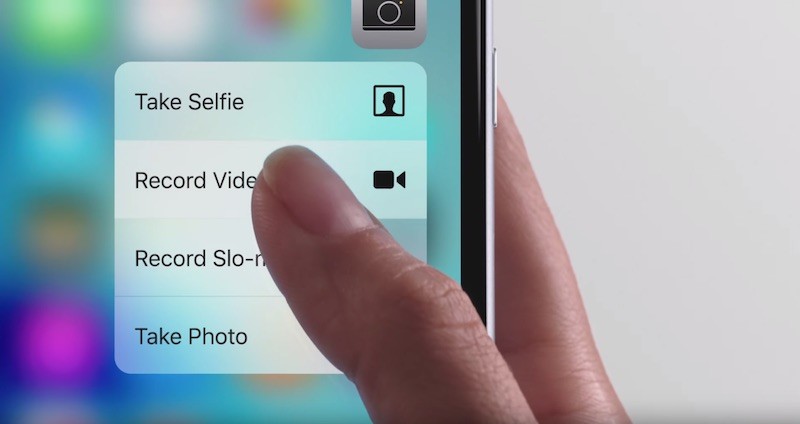
IPhone 6s 3D Touch Quick Action

It remains useful for Peek & Pop and Quick Actions, of course. So not having that on the iPhone SE is bad for all involved:
– The User, because they can not use these functions on an iPhone SE
– The developer, because their apps could be perceived as less functional because of it
– Apple, because of those two reasons

It May Stifle Adoption and Innovation by Developers

Quick Actions as well as Peek and Pop are pretty easy to implement with the APIs Apple provides for it, but anything that goes beyond it does take a certain amount of work and effort.
With only the “premium” iPhones having 3D Touch, developers (especially indies, who have less resources) will think twice before taking what might turn out to be a couple of weeks to implement a unique or innovative use of 3D Touch, seeing as they might not reach the entire market with it and having to develop and maintain different code-paths for different devices.

TL;DR

The iPhone SE will probably be sold for years to come and seeing as it’s a lower-priced phone, its customers are (in my way of thinking) less likely to upgrade, say, every year, which means 3D Touch will not be available “everywhere”™ for too long a time to come for the technology to go “mainstream” among developers to do something beyond Peek & Pop or Quick Actions.

Read more

Wwdc13

Image credit: developer.apple.com/wwdc

The Keynote presentation

If you haven’t seen yesterday’s (Monday, June 11th, 2013) WWDC keynote yet, you can watch it here on Apple’s website.

The keynote started with a very inspirational video. It’s a direct answer to recent ramblings about how Apple have lost their drive or stopped innovating and it somehow gave me the feeling it’s a direct successor to the famous “Here’s to the crazy ones“. A mantra Tim Cook doesn’t get tired of sharing any chance he gets – It’s all about the best product they can possibly make.
Watching this video literally made me think “This is going to be a WWDC keynote we’ll remember for quite a while”.

Tim Cook, CEO

seemed very energetic and enthusiastic about what he had to tell us. Frankly, I think it was the best performance from him yet. His voice was also not as ‘whispery’ as usual but a little louder and more profound. He seemed happy to be there and excited to be sharing new stuff (probably because he got tired of all those stupid “What’s Apple going to do next” questions – I’m looking at you, D11 – and finally had to show something new, silencing those questions)
And as a plus, he said “Only Apple could do this” just once which is a plus in my book. At past occasions, I think he overdid that phrase a little.

Craig Federighi, SVP Software Engineering

was, in a word, epic. Drew Wilson nailed it, in my opinion. He’s naturally funny and doesn’t ignore what’s going on around him, reacting to reactions from the audience, which, if not overdone, is a very good thing, loosening up everyone involved.
He’s a natural at giving presentations and he has fun doing what he does. A class act all around. I’d like to see him more often.

The way Craig talked about the textures in OS X (specifically, Calendar) and iOS (specifically, Game Center), I wonder if he played a key-role in Scott Forstall’s ousting.

Here a few quotes, when demoing OS X Mavericks:

“Absolutely no virtual cows were harmed in the making of this user interface.”
“It’s really amazing – even without the stitching, the window still sticks right there on the screen, it doesn’t fall off without the stitching.”

And later, when demoing iOS 7:

“We just completely ran out of green felt and wood – this has got to be good for the environment.”

No, I don’t think Federighi and Forstall were very fond of each other. But what do I know, perhaps he was making fun of himself 😉

Phil Schiller, SVP Worldwide Marketing

was solid and fun, as always. “‘Stopped innovating’ my ass” was, obviously, one of the best lines in the keynote. Seems to me he’s always the one to comment on certain publications in keynotes in a fun way, and that’s what I like about him. He doesn’t ignore those things but addresses them head-on.
Yes, he did mix up Firewire 2 with Thunderbolt 2 when introducing the Mac Pro, but who cares? It’s a new friggin’ Mac Pro!
Phil’s a very down to earth, straight up guy, very sympathetic.

I actually ‘met’ him during the WWDC 2004 Campus Bash – he was eating a taco (they had a make-it-yourself-taco-bar) and I was so stunned he stood in front of me all of a sudden, I just nodded at him and he nodded back. Yes, we’re the bestest buddies now!

He’s even cooler in person.

Roger Rosner, VP Productivity Applications

I frankly can’t remember the last time we saw him in a keynote (if ever), so I can’t really compare this one to previous appearances.
That aside, it was a decent performance, though I feel he lags behind the others – maybe because he hasn’t had too many chances to present at a keynote.
He did seem excited about iWork for iCloud, though, and I hope for his and his team’s sake it doesn’t share the same fate as iwork.com which was in beta for a while and then cancelled without much fanfare. 

Eddy Cue, SVP Internet Software and Services

Also a decent performance and I bet he’s got a new friend in US Senator John McCain.
I wish he had mentioned something about improving iCloud’s key-value storage, though. But I guess that’s something that will be probably handled less publicly at WWDC’s sessions and labs.
It’s nice they’re introducing new services (like iTunes Radio), but their existing services could use some love. Seriously.

The new stuff

Enough about the presenters, let’s talk about the announcements they made.

OS X Mavericks

Oh, that name.

First off, I keep calling it Maverick, as Maverick_s_ seems too “plural-y” to me.
It’s a name like MacBook. I can’t say how much I hated that name. But now, I love it. iBook and PowerBook seem odd to me now, and I think it will be the same with the new naming scheme of OS X.

But right now, I actually would have preferred Sea Lion. Change is hard.

iBooks, Maps on Mac

was just a matter of time. I don’t quite understand why it took so long – I think it might be a marketing thing, to have something exclusive for iPad/iPhone. Create momentum there and bring it back to the Mac to use that momentum some more.

Maps’ ‘Send location to iOS’ is awesome. The interface seems very minimalistic (which isn’t a bad thing), however, after all the textures I was used to from OS X (Mountain) Lion, it looks naked. But it’s just a matter of getting used to it again.

Calendar.app is stripped down to its bare minimum, also – no textures. It looks very nice and will look even better once I’m used to it again.

Multiple Displays

Finally that fullscreen button in the windows’ top right corner is actually usable. With OS X Mavericks, fullscreen is finally the way it should have been from the beginning.
SecondBar got sherlocked as the menu bar is now shown on the second display and the Dock can be summoned there.

AirPlay Display is a very welcome addition, though I do not own an AppleTV. But any way to extend the desktop is very fine by me.

Finder Tabs, Tags

‘Finally’, is all I can say for the tabs. And they will make Yoink more useful as well.

Tags are Spotlight comments taken mainstream. Good move. And an important step in the no-filesystem-direction.

Advanced Technologies

The improvements made on the core of OS X amaze me. It really shows how smart the people working at Apple are.

Timer coalescing and memory compression are great new ways to improve CPU- and memory usage. And even things where you’d think that after 9 releases, there would be no way to improve upon them, were indeed improved upon, like video- and audio playback, which uses up to 35% less energy.

App Nap fits in well with the energy saving ideology introduced in previous OS releases with automatic and sudden termination.

Albeit, it’s not only about saving energy, it’s also about freeing up resources for applications in the foreground that really need them.

It’s great to see so much love for OS X and the Mac again. The advancements and improvements made show that Apple is still very much interested in the Mac and its future. At least for the next decade (both Craig Federighi and Phil Schiller said something about “the next ten years” – though I shouldn’t read too much into that).

On another note, I wonder why some of the icons – or the interface in general –  weren’t changed to be in the same vain as iOS 7’s. But then again, even the iPad (beta) version of iOS 7 isn’t finished yet and I imagine OS X would be an even bigger undertaking. Perhaps there’s another ‘Back to the Mac’ event coming. 

Mac Pro

Speaking of the Mac – Apple finally introduced a new Mac Pro (by the way – if you haven’t seen Apple’s website for the new Mac Pro yet, you really should – it’s very well done!).

And what a Mac Pro it is. It’s breathtaking.

I can’t help make the comparison to the (sadly ill-fated) G4 Cube (and, as pointed out to me by @F451 on twitter, the 20th Anniversary Mac). I think it’s the Cube done right, cylindrically – though I don’t know anything about the price, yet. I just hope it’s priced aggressively.

Phil Schiller said it’s unusual for Apple to show a sneak peek of a future product. But for the Mac Pro, it was the right time.
– Pro customers were getting restless (there was a lot of talk about Apple ignoring the needs of its Pro customers)
– They aren’t sold in Europe anymore
– The last (very minor) update was a year ago and
– I don’t think too many people were buying them anymore.
So the fear of cannibalisation by a future product was non-existent.
This was the right time.

iWork for iCloud

To be honest, I’m not too interested in web apps. I haven’t once used anything on icloud.com or the ill-fated iwork.com beta.
There’s probably a sophisticated strategy behind the web version of iWork, but I’d rather they put those efforts and resources into a new version for the Mac.

Alas, Rosner assured us there would in fact be a new version of iWork for the Mac and iOS coming later this year and I’m very excited about that. I just wish they’d presented that instead of the web apps.

iOS

Man, there’s  a rift going through the iOS community. People I follow on twitter are either ecstatically pleased about the new changes or devastatingly disappointed and appalled.

As far as I’m concerned, I like it – very much so.
I don’t like a couple of icons (most gradients look weird and the Safari icon doesn’t look good at all to me), but everything else I’ve seen so far is pretty neat (which isn’t much, I have an iPhone 3GS so I can’t even install the beta, I guess it’s finally time for me to upgrade… or get an iPod touch).

Control Center is a godsend and way overdue – and the one new feature I’m most excited about in iOS 7. How much time I wasted drilling into the settings to disable WiFi, the cellular network or Bluetooth, I don’t even want to think about it.

The End

As I said before, Tim Cook doesn’t get tired reiterating what Apple’s goal is:

“I’d like to close this morning with a reminder. That our goal at Apple is to make amazing products that our customers love. Really great products that enrich people’s lives. The words you saw at the beginning of the show are more than just words to us. They’re the values we live by. They drive us. You’ve seen them reflected in the products over the years and just as much in the products this morning. And you will continue to see these reflected in the products in the future. We created an ad to help us express just how deeply we feel about this.”

And another video is played. “This is it. This is what matters.”

I think this was one of the best keynotes. They all were on their top of their game, and the stuff they had to show was breathtaking. Makes me even more inspired to work on my own stuff.

I wish I was at WWDC this year. Sadly, 71 seconds is what it takes my ISP to connect to developer.apple.com/wwdc … 😉


[twitter-follow screen_name=’eternalstorms’ show_count=’yes’]

Read more