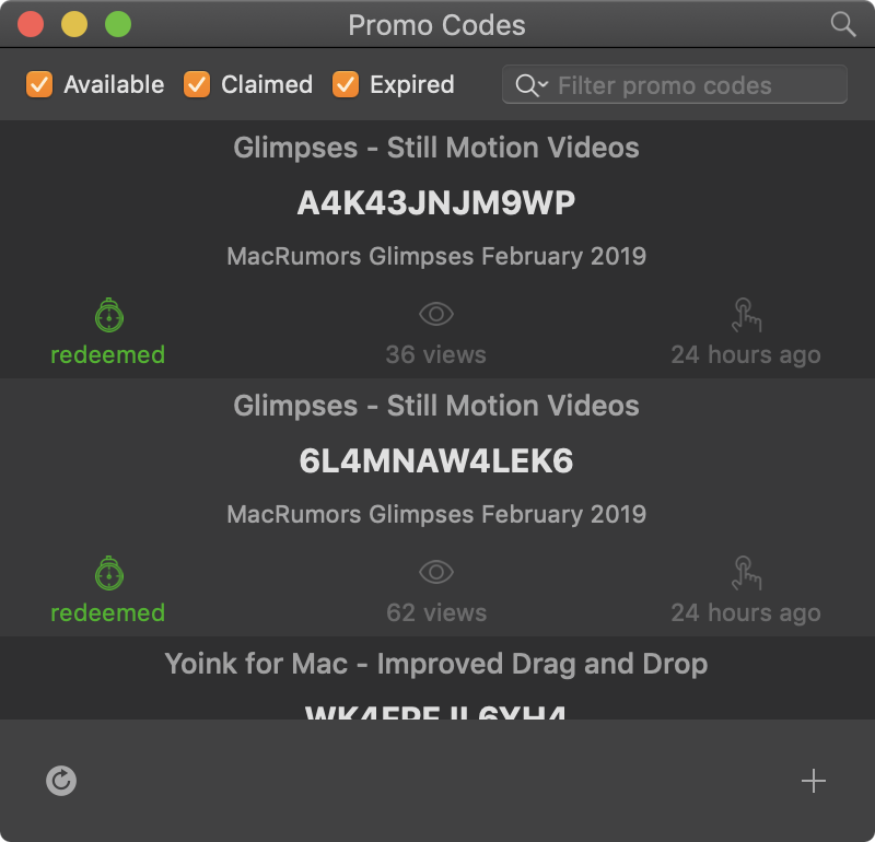
About the creation of an internal tool to create and track promo codes created for apps on App Store Connect.
Yoink v2.0.1 for iPad and iPhone now available
![]()
Yoink v2.0.1 for iPad and iPhone brings many bug fixes and improvements, increasing the overall stability and performance of the app. It is a free update for existing customers.
Yoink Overview
What’s Yoink?
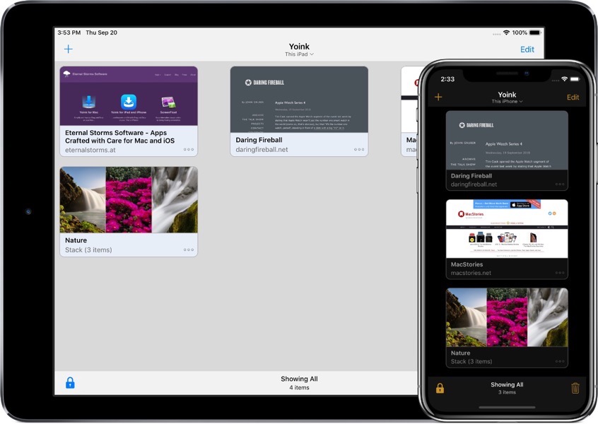
Yoink is your storage space (or “shelf”, as some would call it) for everything you’d like to keep around for a little while – text snippets, images, files – just about anything you wish.
Use drag and drop with Yoink as a Slide-Over or Side-by-Side app to store files, or use the Action/Share extension, the Today Widget or the File Provider to get files into Yoink.

How does Yoink work?
The most obvious use case is to drag and drop files to it from other apps, like selected text, or images from websites, or emails, or map locations, just to name a few.
However, there are a number of ways to save files in Yoink:
– Yoink’s Share/Action extension shows up in almost any share sheet
– The Today widget lets you quickly store your clipboard’s contents
– In the Files app, you can drag and drop files to Yoink’s file provider (and actually do that from any app that supports iOS 11’s files browser)
– Siri Shortcuts help you save your clipboard’s contents or start downloads with a simple voice command, and without having to activate Yoink
So, now that you’ve got all your files in Yoink, how can you get them out again?
– You can drag and drop anything from Yoink to any other app that supports drag and drop (and the dragged file types).
– Anything in Yoink can be copied to your clipboard.
– Yoink’s keyboard: Wherever you’re editing text, Yoink is right there with you – in the form of a keyboard.
On iPad, drag and drop items out to where you’d like them in your text; on iPhone tap to copy items.
– Yoink’s Today widget: Tap any item in the widget and it’s copied to your clipboard
– The file provider: Any app that support’s iOS 11’s Files browser can access items stored in Yoink
– Spotlight search: The system-wide search can find any item stored in Yoink and take you right to it in the app
What’s New in Yoink v2.0.1?
Being a maintenance update, there are no flashy new features. Instead, the update focuses on stability, reliability and performance.
Apart from fixing a couple of crashes, improving the reliability of iCloud sync and saving items in Yoink in general and many minor improvements and bug fixes, the update now (finally! – I know) fully supports the new iPads’ screen sizes, makes it easier to access Yoink’s settings and switch to Dark/Light mode, and, when sharing a URL to Yoink, it tries to figure out for you if you’d like to download a file, or just save the link in Yoink.
You can find the full list of changes on Yoink’s App Store page.
Pricing and Availability
Yoink for iPad and iPhone is available on the App Store for the price of $5.99 / £5.99 / €6,99, with all features unlocked – there’s no subscription or in-app purchase.
Yoink requires an iPad or iPhone that runs iOS 11 or newer. It’s available in English, German, Japanese, Simplified Chinese and Korean. More languages will follow.
Yoink is also available for (and originated on) Mac, exclusively available on the Mac App Store for the price of $6.99 / £6.99 / €7,99, with a free, 15-day trial available on its website.
Links
Yoink for iPad and iPhone – Website
Yoink for iPad and iPhone – App Store
App Preview Video – “Add”
App Preview Video – “Drag out”
Yoink for iPad and iPhone – Usage Tips
Yoink for iPad and iPhone – Press Kit
Yoink for Mac – Website
Yoink for Mac – Mac App Store
Eternal Storms Software – Website
Eternal Storms Software – Blog
Eternal Storms Software – Twitter
Eternal Storms Software – YouTube
Eternal Storms Software – Facebook
Eternal Storms Software – Instagram
I’m looking forward to seeing and hearing what you think about this update. I hope you’ll enjoy it 🙂
If you have any feedback or questions, please don’t hesitate to write me!
With warm regards,
– Matt
⚡️ Black Friday 2018 – Sale
It’s Black Friday (November 23rd, 2018) – here are my deals:
Yoink (Mac): $7.99 -> $5.99 (~25% off)
Website / Demo
Mac App Store
Yoink (iOS): $5.99 -> $4.99 (~16% off)
Website
iOS App Store
ScreenFloat (Mac): $8.99 -> $5.99 (~33% off)
Website / Demo
Mac App Store
Transloader (Mac): $5.99 -> $4.99 (~28% off)
Website
Mac App Store
Mac App Store Bundle
For users of macOS Mojave, I also offer an app bundle (the Eternal Storms Software Productivity Bundle), which includes Yoink for Mac, ScreenFloat for Mac and Transloader for Mac, which offers an additional ~11% off on the apps:
Eternal Storms Software Productivity Bundle (macOS Mojave): $17.99 -> $14.99 (~16% off its previous discount)
Mac App Store
Enjoy 🙂
All the best,
– Matt
Yoink v3.5.2 for Mac now available
![]()
A maintenance (and minor feature-) update for Yoink for Mac is now available on the Mac App Store.
What’s new in Yoink v3.5.2?
– Support for system services (right-click a file or Stack in Yoink and it will show the available services for it)
– Yoink’s optional menu bar icon now also accepts drags
– Improved support with apps Discord, VSCode and Photos
– Improved Yoink’s Share extension to better handle text and other content
– Many bug fixes and improved support for older versions of macOS
New Usage Tips
On this website, I collect useful tips to get the most out of Yoink for Mac – I’ve added a couple of new tips to it!
Tips are also available for the iOS version of the app here.
Eternal Storms Software Productivity Bundle
New on the Mac App Store are bundles. Yoink is part of the “Eternal Storms Software Productivity Bundle”, where you get Yoink, ScreenFloat and Transloader at ~25% off!
You can check it out here (macOS Mojave required – though apps purchased with a bundle on macOS Mojave are available on earlier versions of macOS for free re-download).
Yoink Overview
What is Yoink?
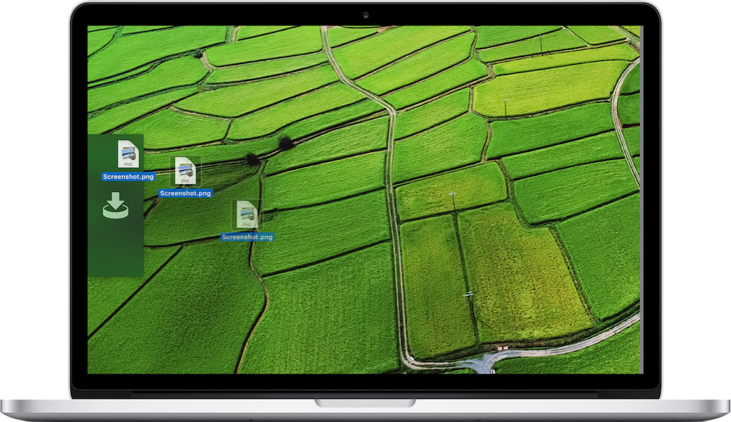
Yoink offers a temporary place for file- and app-content drags to free your mouse so you can more easily and quickly navigate to the actual destination of your drag.
This is especially helpful when it comes to moving and copying files between different windows, spaces or (fullscreen-) apps.
How does Yoink fit into my workflow?
Yoink stays in the background most of the time, waiting for you to drag someting. The app fades in at the edge of your screen when you start a drag, like a file in Finder, or app-content like an image from a website, or text from a document.
Drag your files to Yoink, and your mouse is free for you to navigate more easily and comfortably.
Yoink will hold on to the files you drag to it until you drag them out again.
The app can be customized in a number of ways. You can set up where it should appear (at either side of your screen, top, center or bottom; or at the mouse cursor), when it should appear (when a drag starts, or when a drag reaches the edge of your screen) and what apps it should (or should not) appear in.
If a file drag contains multiple files, a Stack is created so you can drag them out together again easily.
Stacks can also be split up if you’d like to drag out one specific file in that drag.
QuickLook is available for all files you add to Yoink, as icon previews for quick identification and as full previews for a detailed look. A keyboard shortcut lets you hide Yoink if you currently don’t need it, and show it again when you do.
Pricing and Availability
Yoink for Mac is available on the Mac App Store for the price of $7.99 / £7.99 / €8,99, with a free, 15-day trial available on its website.
Yoink is also part of the “Eternal Storms Software Productivity Bundle” – together with ScreenFloat and Transloader at ~25% off on the Mac App Store (macOS Mojave required – though apps purchased with a bundle on macOS Mojave are available on earlier versions of macOS for free re-download).
It requires at least macOS Lion 10.7.3, macOS High Sierra 10.13 or newer is recommended.
The app is localized in English, German, French, Italian, Chinese (Simplified), Korean, Japanese, Portuguese (Portugal) and Portuguese (Brazil).
Yoink is also available for iPad and iPhone, exclusively available on the App Store for the price of $5.99 / £5.99 / €6,99.
Links
Yoink for Mac – Website
Yoink for Mac – Mac App Store
Yoink for Mac – Usage Tips
Yoink for Mac – Press Kit
Yoink for Mac – App Preview Video (Basic Functionality)
Yoink for Mac – App Preview Video (Today Widget)
Yoink for iPad and iPhone – Website
Yoink for iPad and iPhone – App Store
Eternal Storms Software – Website
Eternal Storms Software – Blog
Eternal Storms Software – Twitter
Eternal Storms Software – YouTube
Eternal Storms Software – Facebook
Eternal Storms Software – Instagram
I’m looking forward to seeing and hearing what you think about this update. I hope you’ll enjoy it 🙂
If you have any feedback or questions, please don’t hesitate to write me!
With warm regards,
– Matt

