Yoink simplifies and improves drag and drop on your Mac by providing a temporary place to store your files so you can freely navigate to the actual destination of your files without having to keep the mouse button pressed.
Yoink Workflow – Quickly Add Mail Attachments
Yoink for Mac Usage Tip #8
The following explains how to add attachments directly from Mail.app into Yoink.
For more Usage Tips like this, click here.
Today, I received an eMail from Sandro G. asking me if there was a way to quickly add mail attachments from selected mails in Mail.app to Yoink.
The Problem
Sandro frequently adds attachments from mail messages in Mail.app to Yoink but says it can be cumbersome with lots of mails with a couple of attachments each.
I agree, having to select each mail message with an attachment, scrolling down and dragging each attachment to Yoink can take a lot of time.
Instead, he says, he’d like a way to just select the mail messages that contain the attachments, ideally press a keyboard shortcut and let Yoink do the rest, saving nerves and, most importantly of all, time.
The Solution
As with the “capture screenshots to Yoink”-problem, where Bogdan V. wanted to be able to take screenshots that automatically end up in Yoink, Automator seemed like a good solution for this.
I launched Automator and created a System Service – easily accomplished by creating a new project and selecting Service in the resulting dialog.
A system service is something you can either access through a contextual menu or by the applications Application menu -> Services, containing context-aware services, for example “Look up in Dictionary” or “New Email with Selection”.
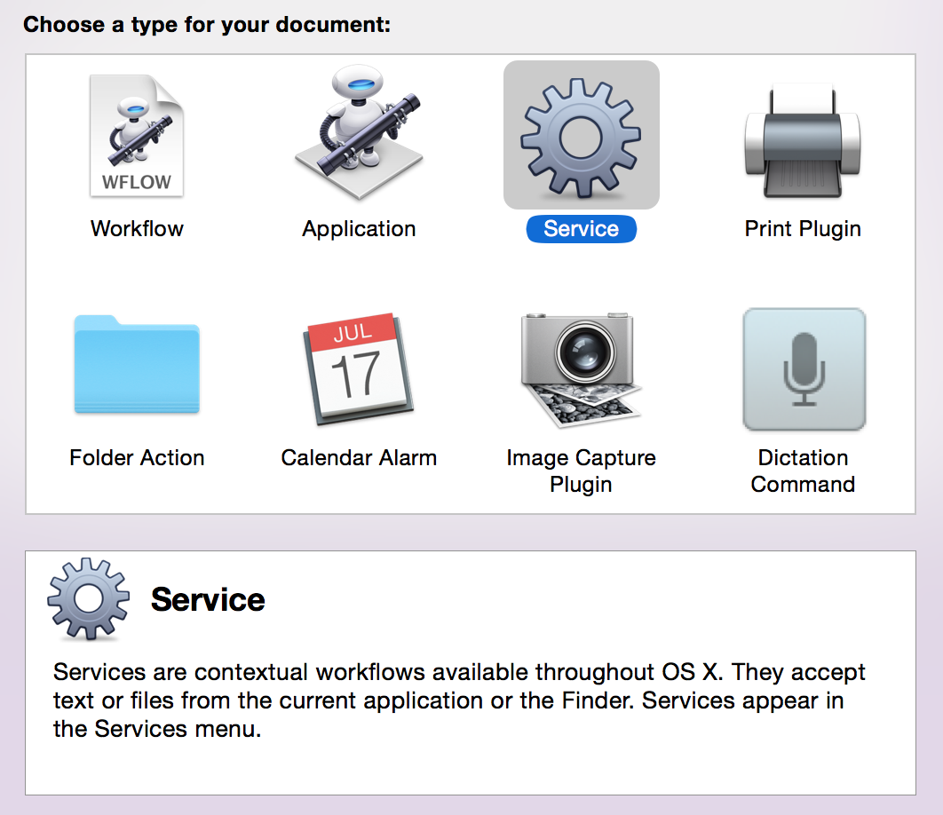 Automator’s New Project Dialog. Select Service and click on Choose.
The Automator Workflow
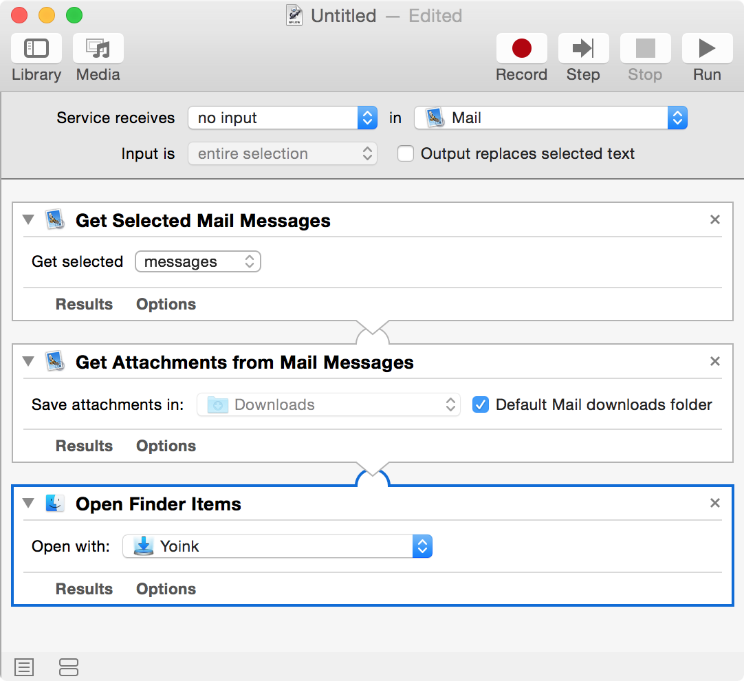 The finished workflow.
Let’s go through it from the top. Specify the service to receive no input (as the other possible values don’t apply) and select Mail as the target application the Service should be available in.
Now we need three actions:
- Get Selected Mail Messages – creates a reference to the currently selected mails in Mail.app
- Get Attachments from Mail Messages – uses the references created before and saves their attachments to a folder, in this case the Default Mail downloads folder
- Open Finder Items – Action 2 passes the attachment files to this action, where we ask Yoink to open those files, resulting in them being added to Yoink’s files
Installation and Keyboard Shortcut
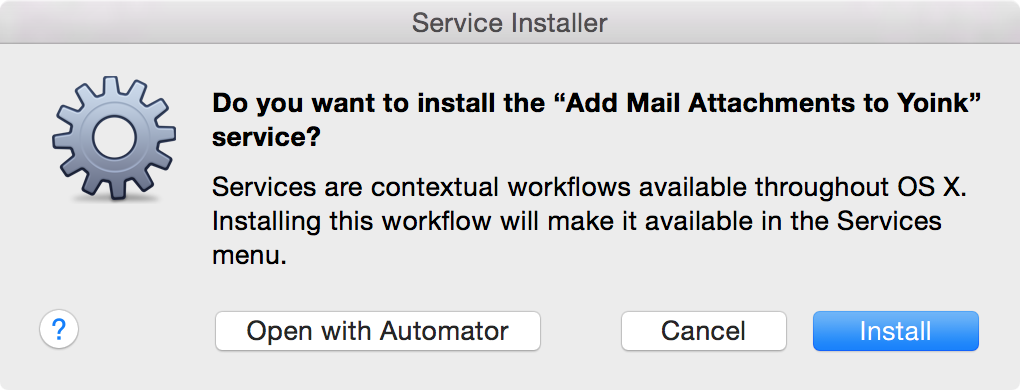
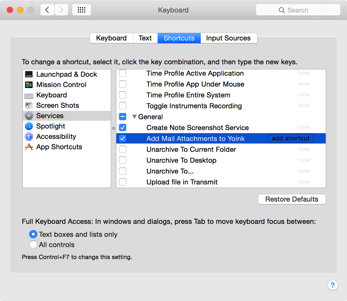
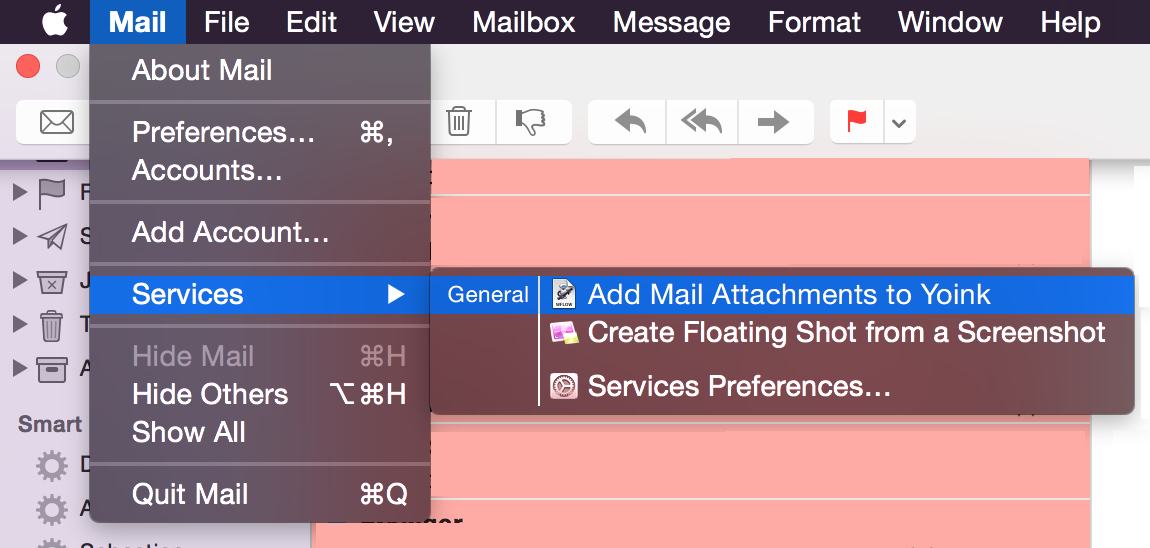
Automator Workflow Download
Unzip, double-click to install. Set up the optional keyboard shortcut – done 🙂
Guest Blog Post: The Story Behind Gestimer
[Note: This is a guest blog post written by Martin Nguyen (@iMaddin on twitter), an OS X- and iOS developer based in Austria, about his Mac app Gestimer]
![]()
I don’t like to keep too many thoughts in my head at the same time. Also, my short-term memory isn’t the greatest. If I had to cook dinner and then went back to my Mac to continue whatever I was working on, I’d probably forget about my dinner.
That’s especially true while coding where I have to be completely focused. Other unrelated thoughts are too distracting when writing code. I feel comfortable knowing that an app will take care of such thoughts as its memory is most likely better than mine.
Not too long ago – while I was at university – I noticed that todo apps weren’t entirely fitting all my needs. Sometimes I had these little tasks like reminding me to make dinner (because I’d forget and be too busy or focused with other things) or that I had to leave for a lecture in half an hour. It was too much of a hassle to set alerts for those tasks that have a short lifespan. To me it just feels slow to enter numbers with a keyboard for inputing dates and times, especially without a num pad.
As the type person who sits at my Mac most of the time, I decided to make a Mac app to work around this problem. After a couple of months and failed attempts at such an app, the idea that later became Gestimer popped into my mind: “Wouldn’t it be great if I could just drag down from the menu bar to create a quick reminder?” This seemed so simple and fast. It was the perfect solution.
Development
With this idea in my mind and a few sketches in my notebook, it was time for the execution. This was back in 2012 when I had just begun learning to code. As every beginner knows, coding is frustrating. Everything can break easily and you have no clue why. Objective-C was also not the easiest thing to learn without any prior programming knowledge. Additionally, making Mac apps appeared to be much more difficult than making iOS apps.
I shelved the project. There was nothing that was anywhere close to Gestimer out there so it was impossible finding resources that would help me realize the app.
With iOS 7, Apple introduced UIKit Dynamics. It seemed like a fun way to make interactions so I played around with it. I noticed that UIKit Dynamics allowed me to easily do something close to what I had in mind. It was only available for iOS and not OS X but it still allowed me to produce a version of Gestimer, even if it wasn’t in the intended environment. Here is the iOS version which was available from 2013 to 2014:
Gestimer for iOS didn’t do too well but that’s okay. I didn’t do any marketing as I simply put it up on the App Store and I was already happy to have an app that I made and used every day. Creating the iOS version taught me a lot and as I learned from more projects over the last couple years, I felt comfortable enough to tackle the Mac version again. I was especially motivated by the announcement and release of Swift.
I made some good progress on Gestimer for the Mac during the summer of 2014. The idea never changed: drag & drop from the menu bar to create a reminder. I worked on the app on and off, whenever I felt like it, whenever I slept off the frustration and head-scratching of the previous day.
As there was no UIKit Dynamics for the Mac, it was a lot more difficult to imitate the iOS version and to get things behaving as intended. By late 2014 I had a rough but useable version. I was never in a rush to release Gestimer. In fact, I stopped working on it for a couple months after that. I was again content with having an app I made and used every day. It also gave me time to simply use the app and think about if it truly did the things well that I wanted it to do.
If you haven’t seen Gestimer yet, have a look at a short clip here.
https://vine.co/v/ehEwHbWKhUj/embed/simple
Marketing
Sometime around mid-April 2015 I started sharing a beta of Gestimer with people who I thought might be interested. Besides gathering feedback, it got me excited about the prospect of launching and hear what even more people will say about it. That’s where I decided to do some proper marketing. I won’t go into detail about this here as it would double the size of this post but I took marketing very seriously.
The basic outline of what I had:
– a short 10s clip of the interaction on the website
– collected email addresses for launch day
– made a YouTube video (currently over 50k views)
– a nice press kit
– localized Gestimer into 9 languages (now even more!)
Launch
There was little press coverage on launch day, but I had Gestimer up on Product Hunt thanks to Matthias who kindly sent me an invite. Someone had also posted the app to Hacker News. Both sites led to a lot of traffic. At the end of the day Gestimer was sitting on the 3rd spot on Product Hunt. To this date, the PH submission for the app has received over 400 upvotes. Twitter also helped a bit, though I believe people overestimate its effectiveness.
More press coverage followed and an increasing number of people spread the word. During launch week Gestimer reached the #1 spot in the Top Paid charts on the Mac App Store in multiple countries including the US, UK, and Germany. While sales numbers on the Mac App Store are small compared to the iOS App Store – even if you reach the top charts – it’s still been good. It’s nothing to complain about.
The reception for Gestimer has been overwhelming and I would have never imagined it becoming this successful. It makes me very proud to have done all the design, code, and marketing work on my own.
If you’d like, you can find out more about Gestimer here.
——
Martin Nguyen (@iMaddin on twitter) sometimes works on iOS and OS X apps and lives in Austria. While he enjoys coding, he is still trying to figure out the next step in his life.
Security-Scoped NSURL bookmarks and Safari’s webarchive files
It was a bug I’ve been carrying along for quite some time in Yoink. But I finally found the culprit: I’m looking at you, OS X sandbox.
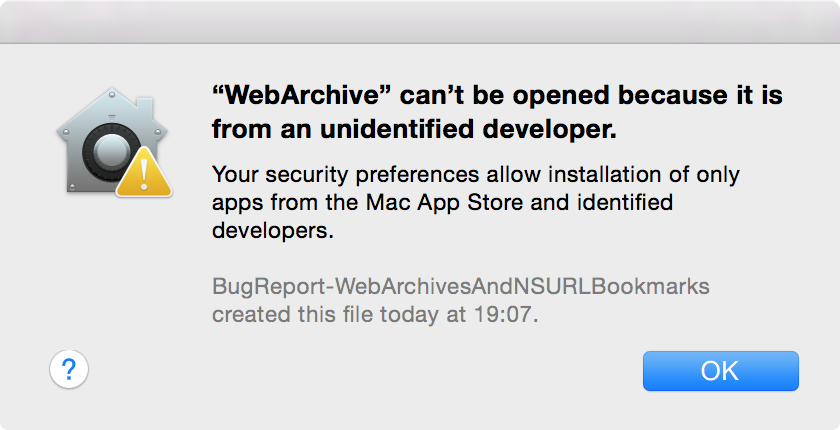 A webarchive created with Safari, after a security-scoped NSURL bookmark was created for it.
The Bug and its Detection
As it happens (sadly), not I discovered the bug, but a customer and user of my app Yoink encountered it. The reason being, I rarely handle .webarchive files (if at all) – webarchive files are created when saving a website in Safari, for example – but one of Yoink’s users, Christoph, appears to have to deal with them regularly.
The bug itself is described fairly easily. You have a .webarchive file you’d like to move using Yoink. So you drag it onto the app and then move it from Yoink to the actual destination. Business as usual.
Only that now, instead of opening the webarchive in your standard browser when double-clicked, above’s warning is shown.
There’s two baffling things about this warning:
- It looks like you’re trying to launch an application instead of just a file (“from an unidentified developer”)
- The creator of the file seems to have changed. Instead of Safari, it now says “BugReport-WebArchivesAndNSURLBookmarks” (the app I submitted to Apple to demonstrate this issue)
Highly concerning, to say the least. To some people, it might even look like something fishy is going on.
Hunting Down the Bug
Seeing as .webarchive files are binary property lists (thank you, Michael Tsai (@mjtsai on twitter) for the correction), I tried other property list files (for example, .plist files), but none exhibited the same behavior.
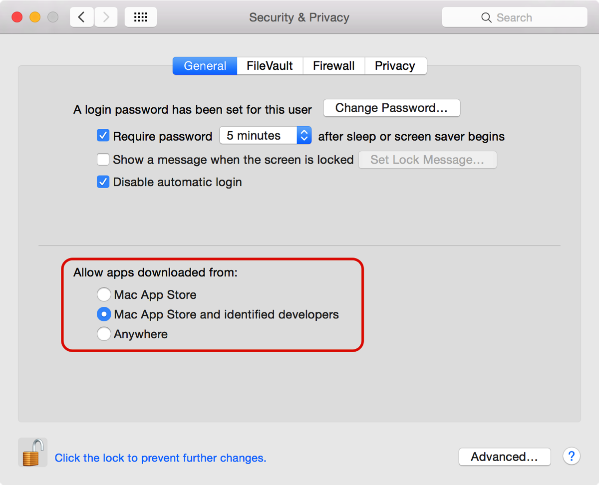
Reproducing it was fairly easy. There’s one pre-requisite for it to appear: that in System Preferences -> Security & Privacy -> Allow apps downloaded from, either ‘Mac App Store’ or ‘Mac App Store and identified developers’ be selected.
Otherwise, Gatekeeper isn’t active and doesn’t react to the issue.
At first I thought it happened when moving the file out of Yoink, since that’s where Yoink actually does something to a file – it moves it from one location to another – who knows what goes on behind the scenes there.
Going through the move-code line by line, commenting out stuff I thought could cause this, made no difference what so ever. Create a new webarchive, move it using Yoink, and get the warning again. Rinse and repeat.
With stuff like this, I get annoyed easily, so my patience usually goes out the window after a couple of alterations to the code.
It was only after the billionth time that I considered it might happen when a file was added to Yoink, not moved from Yoink.
Going through the same process as before, I went through the code line by line, trying different things.
With a recent update to Yoink, the app knows when a file is renamed or deleted in Finder, using GCD (Grand Central Dispatch) and its dispatch sources.
I believed the issue lay there, but after commenting out all of that code as well, it became clear it wasn’t the culprit.
In a fit of anger and a severe feeling of incompetence, I randomly picked at the code (I know, highly professional. But I’m using version control – all is well, right?).
To my surprise, when I removed the code responsible for saving Yoinks files over relaunches of the app, the issue went away.
Security-Scoped NSURL Bookmarks
For a sandbox’ed app to keep a reference to a file added by the user beyond relaunches, it has to use what is called a security-scoped NSURL bookmark.

They can be used if the corresponding entitlement (see above) is added to the app’s sandbox entitlements file.
There are two ways a security-scoped bookmark can be created – either with read and write access, or read-access only (NSURLBookmarkCreationWithSecurityScope or it plus NSURLBookmarkCreationSecurityScopeAllowOnlyReadAccess).
I don’t know why this causes the issue, but changing the bookmark creation options from read and write access to read-access only fixed the issue (and moving the file is still possible with Yoink). It definitely looks like a sandbox bug to me.
Why should an app-internal bookmark (mind you, it’s only a reference to a file, not the file itself, created from an NSURL object) write to and change the webarchive’s file so that it a) can’t be opened anymore and b) shows the bookmark-creating-app as its creator?
Bug Reporting to Apple
I reported this bug to Apple (rdar://21765077) with an example project you can download here, if you’d like to see for yourself. Feel free to dupe the bug with Apple’s Bug Reporter Tool – I’d appreciate it 🙂
Now all that’s left to say is thank you for your patience, Christoph. You reported this issue at the beginning of March 2015 and had to wait until now for it to be fixed (and still a little longer because I have to submit the update to Apple for release on the Mac App Store as well). I really appreciate your continued feedback on the app!
Correction
Thanks to Michael Tsai for pointing out on his blog that .webarchive files aren’t bundles, as I falsely stated, but binary property lists.
