Cocoa

(I apologize for the delay with this post, I had to work on updates for Yoink, ScreenFloat and Briefly and of course lots of work happened on flickery šŸ˜‰ ).

To finally continue with my promised series of blog posts about flickery 2.0ā€™s development, here I am back with: Uploading.
A minor disclaimer before we start: Any interface you see below isnā€™t anything near final, subject to change, etc etc.Ā 

If there is one part thatā€™s integral to any flickr client, it has to be uploading. So with 2.0, I want to make darn sure that itā€™s the best you can get.
Letā€™s dive in!Ā 

Activity (Background Uploading)

In flickery 1.x, uploading blocked the entire app so you couldnā€™t do anything else but wait. Sure, you got a beautiful sheet window to look at with the currently uploading image slowly transitioning from blurry to focused representing the upload progress, but it wasnā€™t very user-friendly.
I wanted to change that with 2.0, so now uploads will be in the background, in the app-wide Activities panel where you can track the progress and potential errors of Up- and Downloads.
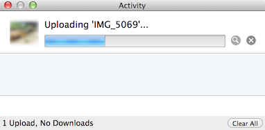
Activityview

Itā€™s out of the way, you can close it and leave it running in the background (and of course the little image also transitions from blurry to focused šŸ˜‰ ). When the activity (Up- or Download) is finished, youā€™ll get an OS X notification letting you know the activity is done.

Notification

Another advantage of background uploads is that you can queue them up. You can begin one Upload and while that is running work on the next. And when you start that one, it will wait for any previous Uploads to finish and then begin uploading.

Adding to Photosets and Groups

Adding to Photosets or Groups for uploads is not very straightforward in flickery 1.x for Uploads. You canā€™t assign photosets right from the Upload view but have to wait until the upload finishes and the button bar at the bottom changes to ā€œAdd to Setā€ and ā€œAdd to Groupā€. By the time the upload is finished, you might not know anymore which photos youā€™d like to add to which photoset or you forget altogether. Itā€™s not really a ā€œset it, then forget itā€ approach.

This is going to change in flickery 2.0. Here, youā€™ll be able to set everything up beforehand and once the upload itself is done, photos are added to the photosets and groups you have set. So you can set everything up and leave it to flickery to do its thing.

Screenshot of flickery  03 04 2014 18 02 34

Location and Maps

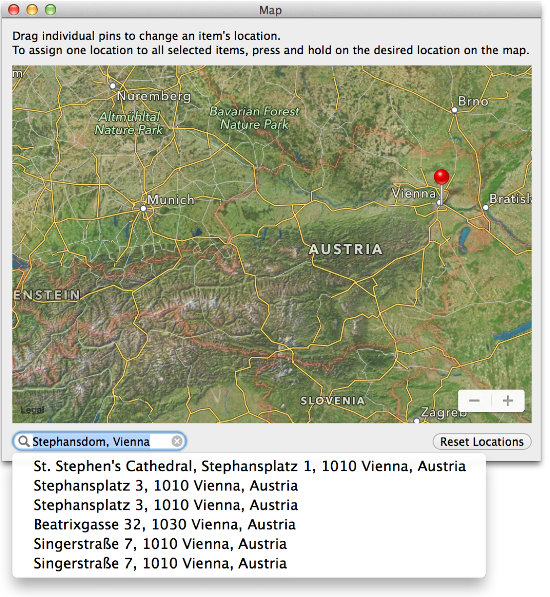
In flickery 2.0, it will be even easier to assign locations to selected items (both photos and videos) using Appleā€™s MapKit features.

Screenshot of flickery  03 04 2014 18 20 01

The big improvement here is that you can now search for locations and flickery will reverse-geocode that info into a latitude/longitude pair that Maps can understand. If you have a camera without GPS and want to assign a specific location, this comes in very handy.

Sorting

Iā€™m adding better sorting to flickery with version 2.0. As you can see in the screenshot below, you can sort by Date and Title (booooring) but also by location, for example, based on the distance from the selected item. Items without a location will be sent to the end of the list.
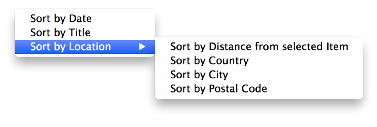
Screenshot of flickery  03 04 2014 18 26 00

Using Googleā€™s Maps APIs (because Appleā€™s reverse-geocoding is a little bit limited), flickery will also let you sort by Country, City and ZIP/Postal Code.
This comes in very handy when youā€™re deciding which photosets to add to, for example, or just for the general order of the uploaded items and how they will appear on flickr.

Sadly, Googleā€™s APIs are limited as well (2,000 requests per day per IP address), but itā€™s better than Appleā€™s limitation (which gives out after about 50 consecutive requests – bug report filed! – and yes, I am not geocoding all items at the same time but one after the other, as ā€œdemandedā€ in Appleā€™s CoreLocation documentation). But I donā€™t think too many will run into issues with that.

Filtering

Dealing with many items for upload, it can become overwhelming trying to keep track of everything. With flickery 2.0 I want to simplify that by implementing filters, so you can quickly view only photos or videos, items with or without description, tags, location and if you’ve assigned a photoset/group or not.
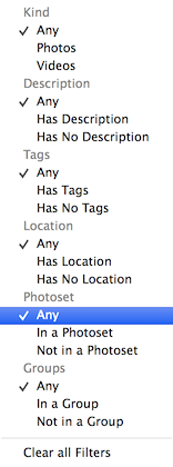
Menu

That wil make it easy for you to keep on top of everything and make sure youā€™ve done everything you had planned for your upload.

Importing unsupported files

Just like in flickery 1.x, flickery 2.0 will let you quickly convert RAW files (which flickr doesnā€™t accept) to JPEG files, trying to keep as much EXIF data as possible (which is new in 2.0).
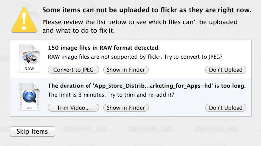
Import

Trimming videos has been in flickery 1.x as well, but is now done with AVKit instead of QuickTime and is quicker and more reliable. It offers the same trimming interface you already know (and hopefully, love) from QuickTime Player:
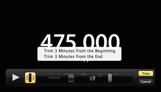
Trim

Editing

Iā€™m not sure yet about how deep I want to go into editing (if at all) with flickery 2.0. I figure, most items will come from iPhoto or Aperture anyway, already post-processed by an app that can do it better and is focused on it more than flickery ever would be.

Perhaps I will include very basic editing functionality like rotating and mirroring, but I think that will be about it.

Quick Uploads

With all this detailed uploading stuff, there needs to be a way to quickly upload something into your stream, a photoset or a group.

So with flickery 2.0, when you drag an image- or video file onto your stream, a photoset or a group it wonā€™t fuzz about and just directly, quickly upload it without you having to do anything else.

Ā 

I think thatā€™s it for this time, Iā€™ll see you next time with some more insights on flickeryā€™s development šŸ™‚

Thank you for reading!
Take care and I hope to see you again next time šŸ™‚

—-
My name is Matt, and Iā€™m the developer ofĀ Eternal Storms Software. You can follow me on twitter here: [twitter-follow screen_name=’eternalstorms’ show_count=’yes’]

Read more

As I am now back working on flickery after a short hiatus – sometimes you need a little distance from a project to be able to reflect on it and maybe get a new perspective on some things, I figured Iā€™d talk about the process as I am working on it, not after, in a so-called ā€œpost-mortemā€, as my memory is now fresh and ā€œin medias resā€.

Before going into about whatā€™s coming though, allow me to go back to see whatā€™s been.

A New Beginning

Starting from scratch is usually admitting to having screwed up before. In flickeryā€™s case, I wouldnā€™t say I screwed up completely. I am, however going to say that I could have done some things better. In some parts, a lot better.

Creation Date of flickery 1

I started developing flickery 1.0 in early 2008. Thatā€™s a long time ago. Iā€™ve become (I hope) a better programmer with a deeper understanding of how things work and are supposed to work. I have (a lot) more experience in Cocoa and a better understanding of UX and UI. I donā€™t let myself get away with things that work ok but could be better that easily anymore.
This is a good time to start from scratch.

Why start from scratch?

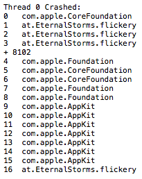
flickery 1 crashlog

They say the way your desk looks, your mind looks. If you apply that to the code base of flickery 1.x, youā€™d commit me. It is not a pretty sight.
Itā€™s really hard to look at, itā€™s difficult to follow and understandā€¦ itā€™s a fine mess, to be honest.

So one part of the reason why I started from scratch is that I didnā€™t see the forest for the trees (the app for the code) anymore.

Additionally, things have changed a lot in OS X since 2008. Which makes version 2.0 a good point to get rid of all the legacy code (individual code paths for OS X Leopard and every iteration that came after) and create clean code for OS X Mavericks and newer. (Mavericks is a no-brainer, itā€™s a free upgrade, everyone should go and get it.)

Thereā€™s blocks, ARC and Objective-C 2.0, just to name few. Going back to flickery 1.0ā€™s code and re-working all the parts might very well have taken just as long (if not longer) as starting anew. It was totally worth it.

New Back-End

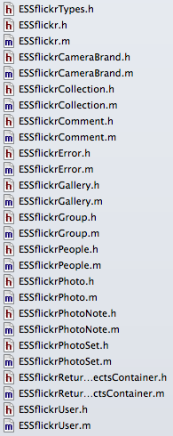
ESSflickr classes in flickery 2

Absolutely essential for flickery is itā€™s communication with flickrā€™s API. Incidentally, in flickery 1.x, that was the #1 cause of crashes and bugs.
Iā€™m not going to tell you how I did it back then; itā€™s just too embarrassing.

This time around, Iā€™m not making the same mistakes again (all the while hoping Iā€™m not making any new ones).

Letā€™s just say, in the old backend, I handed NSDictionaries et.al. back and forth. I didnā€™t use any XML or JSON parsing, I did it all with NSStringā€™s rangeOfString, etc., not always checking if a range existed before working with it. As I said – embarrassing.

So the first thing I did was switch from getting XML from flickrā€™s API to JSON and not parsing it myself, but letting the system do it. Thatā€™s a huge load off my mind right there.

Secondly, Iā€™m done with handing NSDictionaries, NSArrays, etc., around. The new back-end returns proper objects that contain the necessary info in an easily accessible and understandable way.

There are a few Objective-C wrappers for flickrā€™s API out there, but I didnā€™t like any of them. They let you do this (pseudo-code)

NSDictionary *responseDict = [SomeFlickrWrapper executeMethod:@ā€œflickr.photos.searchā€ withParameters:someDictionary];

Aside from also handling OAuth and signing methods, etc., this is all they let you do. So you have to remember the methods, the parameters – itā€™s really not a wrapper, itā€™s an access point to the API.

What makes my back-end different is this:

- (ESSflickrGallery *)createGalleryWithTitle:(NSString *)title
description:(NSString *)description
primaryPhoto:(ESSflickrPhoto *)photo
error:(ESSflickrError **)alert;

You call the method and the back-end does all the parameter and method stuff for you. Itā€™s much neater. In this example, you can also see the use of custom classes instead of dictionaries. ESSflickrGallery, ESSflickrPhoto and ESSflickrError are all wrappers for responses from the API, neatly packed up in an easily accessible class.

I guess I could have used one of the available back-ends as a back-end for my back-end, but I figured, if Iā€™m going through the trouble of matching all available flickr-API-methods, I might as well do the OAuth and signing stuff myself as well.

This new back-end doesnā€™t only make things easier to develop, read and understand, it also improves the appā€™s stability and performance (mostly because itā€™s easier to develop, read and understand šŸ˜‰ ).

As you can imagine, this has taken up the most time up until now. Now comes the fun part of using it to create the next version of the app.

I hope youā€™ll enjoy this upcoming series of posts about the development of flickery 2.0 and some of the design decisions behind it.

Upcoming in Part 2

In part 2, Iā€™ll talk about uploading to flickr with flickery 2.0. Lots of suggestions will make it into the new version šŸ˜‰

Thank you for reading. Enjoy your day!

My name is Matt, and Iā€™m the developer ofĀ Eternal Storms Software. You can follow me on twitterĀ here.

Read more

Transloader Mac Icon

You might have heard about my new app, Transloader, for OS X and iOS.
I’d like to give you a little background info on the app because it’s been an interesting process creating it and getting it out to users.

What Is Transloader?

Transloader (nĆ© Lifeline – as in a line that keeps your connection to your Mac alive) lets you send URLs from your iOS device to your Mac for download.
Say you’re browsing on your iPad and come across a Mac demo app you’d like to try. On your iPad, you can’t download it and even if you can, there’s not much use in it since it’s a Mac app. This is where Transloader is useful.
Enter the URL to the demo into Transloader on your iPad and it gets synced to Transloader on your Mac where the URL will be downloaded to your Downloads folder, ready for you to use when you return to your Mac.
That’s it. Pretty simple, isn’t it?
Creating it, however, wasn’t šŸ˜‰

Got To Get You Into My Life

The idea for Transloader, like for all my other apps, came out of a need I had myself, a little more than two years ago (and I’d been sitting on pins and needles ever since, thinking someone else might come up with a similar idea and beat me to it).

I browse the web a lot on my iPad. And it’s not unusual that I come across a zip or dmg file, or even a movie I’d like to download for later.
What I used to do was send myself an eMail containing the URL to the file – and I can’t tell you how much that bothered me.
It’s so much unnecessary work to do it, it’s so tedious:

  • Copy the URL
  • Open Mail
  • New Mail
  • Enter my eMail address (I have several, so I need to find the right one in the list)
  • Paste the URL into the mail’s body
  • Send
  • Confirm I don’t want a subject for the eMail
  • Sent

And when I’m back on my Mac:

  • Launch Mail (if I don’t forget I sent myself a link)
  • Find the mail
  • Copy the URL
  • Launch my browser
  • Paste the URL into the browser and wait for the download

I believe in writing apps for a single problem, even if it’s a very small one. I like to keep things clean. And to their purpose. I don’t like using eMails to remind myself of something. That’s what the Reminders.app is for or perhaps the Notes app (though I can’t tell you how many times I forgot I put something into Notes.app for later, and only months later found it by accident).

I wanted a much simpler way to do this. So I had the idea for Transloader. The workflow would be very simple:

  • Copy the URL
  • Launch Transloader
  • Add the URL

and on the Mac:

  • If Transloader’s not running either launch it
  • or if it is running – do nothing.

Let the app take care of everything else. The sync, the download – that also has the advantage that the user does not have to initiate the download. It starts downloading as soon as the URL is synced – and, ideally, the download is ready once you’re back at your Mac. That was the idea for Transloader.

We have all the time in the world

To reiterate, I had the idea for the app about 2 years ago – before Apple introduced iCloud.
So I had to find a way to make the iOS app talk to the Mac counterpart.
I basically copied the way Apple’s Remote.app on iOS handles the connection to iTunes on the Mac, asking for a PIN.
The setup needed to be done by the user. Start the server app on the Mac, launch the app on iOS, add the server by entering the IP and the port to connect on and then enter the random PIN displayed on the Mac.
Once the setup was done, the app worked pretty much the same as it does now. Add URLs on iOS and it would get transferred to the Mac directly.

There were quite a few things different, though.
Due to the direct connection to the Mac, more control was possible. For startes, you could have multiple Macs you could differentiate between and send URLs to. You could interrupt downloads, you could see how far along the download on your Mac was and how fast it was going and you could delete the downloaded file from your Mac once it was finished, remotely from your iOS device.
On the other hand, to add URLs, an internet connection was mandatory at the time of entry and the setup to get the app working was tedious. The Mac had to be running, so did the Mac app. Also, adding URLs over the internet was only experimental, only the Bonjour service (meaning you had to be in the same WiFi network for it to work) was really supported. (Although I must say I never had a problem with adding URLs over the internet, but it depends on your WiFi router, port forwarding, etc).

Part of why it took so long to release the app was that I wasn’t completely sure if the “experimental” internet connection would go over well with users. The purpose of the app was to be able to add URLs while on the road, somewhere in a cafĆ© for example, not at home where you’re at your Mac anyway.

Lifline on MacLifeline, the first iteration of Transloader, on the Mac.

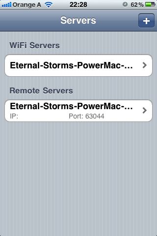
Lifeline on iPhoneLifeline, the first iteration of Transloader, on the iPhone. Server Selection.

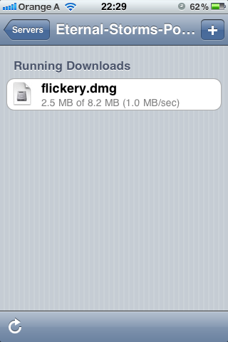
Photo 3Lifeline, the first iteration of Transloader, on the iPhone. Showing progress and speed of the download.

Stuck inside a Cloud

Some time went by where I didn’t do any work on the app. Only using it myself and showing it off to people to get feedback.
Maybe half a year passed. Perhaps a little more.
Then what happened was that Apple announced iCloud. At first I didn’t make the connection, but I soon came to realize that it would be the perfect fit for my app.
I always hated the fact that a server/client configuration was necessary for the app to work. I didn’t want to put the user through any of that.
Also, with iCloud, at the time of entering a new URL, a connection to the internet is not necessary and the Mac app doesn’t have to be running. It gets synced as soon as there is an internet connection again. Big plus.

I realized I wouldn’t be able to give the user the control they would have had with my own implementation (mainly getting feedback on the progress of the download and its speed) and that I would make myself rely on a service that might not be available at times, but knowing that using the app would get much simpler, especially first setup (of which there is basically none now), was enough to make me go for it. And I haven’t regretted the choice since.

Changing from my own system to iCloud was a complete re-write of the app. Obviously.
However, it took way less time than the first implementation since I didn’t have to deal with any server/client implementation or communication between the two. All of that is handled by iCloud.

It took maybe two weeks to get the app working and basically finished (no polish, of course). In comparison, the first version took me a few months.

She feels good, she knows she’s looking fine

Once I got the app working and finished from a coding standpoint, it was time to get the UI done.
Everything you see is the creation of the brilliant Alexander KƤƟner who, I think, couldn’t have done a better job with the app.
And customers seem to agree, they do like the graphical elements very much.
After maybe two days I had a mockup and a few days later, the graphical elements were done and put into the app. It was a quick and painless process.

Do what the rest all do, or face the fact that the Apple Store Review Team may have no other choice than to reject you (in short – DAMN, Transloader was rejected)

I usually submit new apps to the App Store well knowing the first submission will likely result in a rejection.
Transloader was no exception. Not because of the usual reasons (Sandbox, for example, or a stupid unnecessary bug I overlooked in final testing), but because I was using iCloud in a different, unexpected way. And I kind of felt it was going to cause problems.

And I wasn’t wrong. It didn’t take too long until I got a call from a very sweet, patient and understanding representative of the Review Team, telling me Transloader got rejected for using iCloud as a transport mechanism and an iCloud account being necessary for the app to work.

I tried making the point that at no point is any file stored on iCloud and that the sync was used as a sync, not as a transport mechanism – it syncs the URLs to all devices. What the Mac does with that link is a different story, but of no concern to iCloud, because the actual download has nothing to do with iCloud or the sync.
I also tried arguing that if the reason for rejection was that an iCloud account was necessary, there shouldn’t be any twitter, Facebook, flickr or instagram apps allowed on the App Store either because they all needed accounts for their respective services as well (a cheap shot, I know, but I was frustrated).

Anyway, my points didn’t go over well. The rejection was done.

Reconsider, Baby

At this point, I was kind of desperate. I was so close to finally releasing the app but couldn’t have been farther away at the same time.
I resubmitted the app to Apple with a video explaining how the two apps worked together and a lengthy review note providing even more details.
Yet again, no dice. I got another call from the representative, asking me not to submit the app again without significant changes to how it worked.

So I considered going back to my original implementation. Users would just have to endure the horrible server/client setup.
I just wanted the app out at this point. I got lots of positive feedback from friends, family and colleagues about the app so I was confident it would do ok.

I started to work on re-implementing the first implementation when about two weeks later, I got another call. They were sorry it took so long to review, it was a complicated, different way of using iCloud and they had to make sure it all was in order. It would be live on the App Store in a few hours. I just sat there in amazement, mumbling out a “Wow, thank you” and hung up.

I seem to have a guardian angel and I couldn’t be more grateful.

Don’t ask me what I want it for if you don’t want to pay some more

You might have noticed that the iOS app is free and the Mac app is $4.99.
I had to find a way to make sure Windows-PC users wouldn’t pay for an app on iOS they couldn’t use.
Transloader for iOS depends on the Mac app, and the Mac app depends on the iOS app. One without the other is completely, entirely, utterly useless through and through.

Another angle, obviously, is that Mac users might not have an iOS device but pay for the Mac app. I had to decide for one way or another, though, and I figured the chance of a Windows user having an iPhone is higher than a Mac user not having one.
Plus, I added a disclaimer in the apps’ descriptions that both a Mac and iOS device are necessary. So far it hasn’t failed me.
There have been enquiries to develop Transloader for Windows, though šŸ™‚

Now you’re expecting me to live without you…

Transloader is the first app I don’t provide a demo for. It’s not because I don’t want to, it’s because I can’t.
iCloud needs a provisioning profile in the app bundle that is only available to apps downloaded through the Mac/iOS App Store which makes a demo impossible.

It’s been quite a journey and I’m so very happy I was finally able to release the app. I’ve got a few things planned for it and I’m looking forward to putting out updates and implementing some of your amazing suggestions. Keep them coming šŸ™‚

Thank you for your time šŸ™‚
Take care,
Matt

[twitter-follow screen_name=’eternalstorms’ show_count=’yes’]
Read more

Open-Source: NSBegin*AlertSheet(ā€¦) with ^Blocks

There’s NSBeginAlertSheet, NSBeginInformationalAlertSheet and NSBeginCriticalAlertSheet, so the * is a wild-card for all those functions.

Apple Opensource Icon

picture credit: Apple, Inc.

What is this?

I’ve been growing more and more tired of always having to set up a callback-method (in the worst case, two, for didDismiss and didEnd) for NSBegin*AlertSheet(ā€¦) calls,Ā like

– (void)alertSheet:(NSPanel *)panel endedWithCode:(NSInteger)returnCode contextInfo:(void *)info
{
Ā ā€¦code here…
}Ā 

Especially, since we have such a great thing like blocks where you can pass blocks of code as arguments to methods and functions, just like an Objective-C object.

So instead of having to set up callback methods for NSBegin*AlertSheet(ā€¦), I created ESSBegin*AlertSheet(ā€¦). Instead of callback @selectors, it takes blocks for didEnd and didDismiss callbacks.

I find it also makes for cleaner code having the callbacks right in the ESSBegin*AlertSheet(ā€¦) calls as you don’t lose the context of what’s happening before the call in my code.

Available for OS X Snow Leopard and up

Blocks were introduced with OS X Snow Leopard, so I assume (yes, I assume since I’ve only tested this on OS X Mountain Lion) it should run on Snow Leopard as well.

Download and Usage

NSApplication+ESSApplicationCategory Github Repository (refer to the read me for how to implement it in your projects)
Eternal Storms Software Open Source Projects

Ā 

Ā 

Ā 

Enjoy! And let me know what you think šŸ™‚

Take care,
Matthias

[twitter-follow screen_name=’eternalstorms’ show_count=’yes’]

Read more