With yet another month behind us (time flies recently, doesn’t it?), it’s time for another entry in my “What I…” series of blog posts. This time, somehow dental care made its way into it.
… Worked On
Website Update (click)
I felt the need to update my website again. On the landing page, you used to have to scroll to see all the applications available. I didn’t particularly like that. Also, the buttons just didn’t look good. Have a look:
 eternalstorms.at before its recent update
With the recent update, I moved everything around, chose a nicer, easier to read font (Helvetica Neue Ultra Light probably wasn’t the best choice) and removed the buttons:
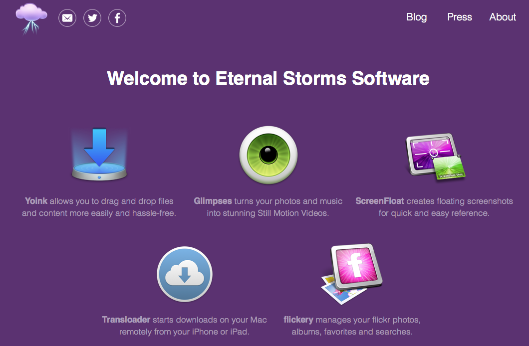 eternalstorms.at after the recent update
You can see how much space I saved solely by scaling the Eternal Storms Software logo and moving it off to the side (which makes it less obvious, sure, but a lot nicer to look at). What’s always important to me on a website is a way to contact the people in charge. I cannot say how much I hate (and I use that word with all its meaning) websites where I have to dig through to get some contact information. So at the top left, you have a button to contact me by mail or twitter and visit my Facebook group. At the right hand side, you can reach my blog, the press page and About/Legal information.
I also hate contact forms. Why hide your mail? From spammers? They’ll get to you anyway. Just give me your email and I can write you from within the comfort zone of my preferred email client. Nothing better than that.
A click onto an app icon or the app’s description will take you to the app’s page, of course:
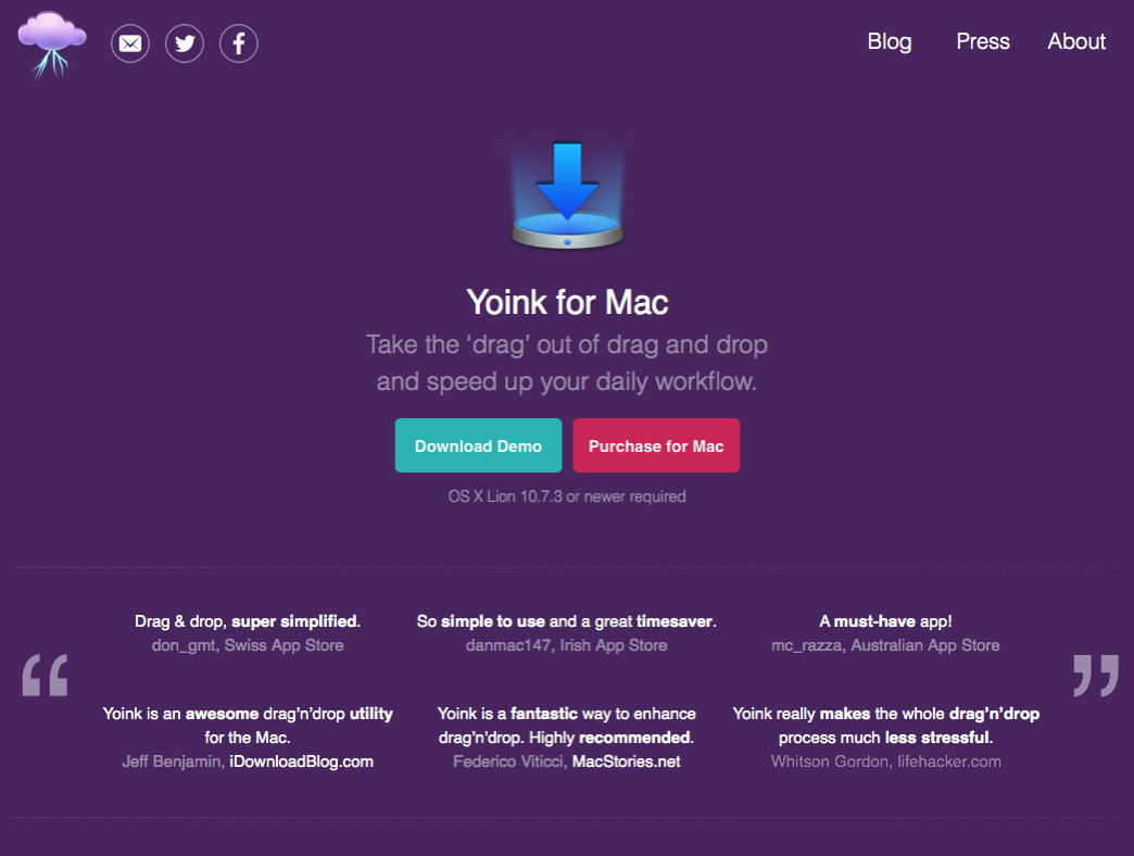 Yoink’s website after the update
I don’t want to overwhelm browsers with too much information up front. A page filled with text can easily scare people away.
So what you see at first is the icon, a short tagline and a Download and Purchase button. Below that, I thought it’d be a nice idea to feature some customer and press reviews to let potential buyers see what people who have used the app thought about it.
Below that, you’ll be greeted by a short screencast and the app’s full description and functionality. If you decide to skip the screencast, there’s a quick GIF of Yoink in action to give you the gist of it.
It took me a couple of days to settle on the colors of the buttons. I started with green and blue, then tried a light shade of purple and blue:
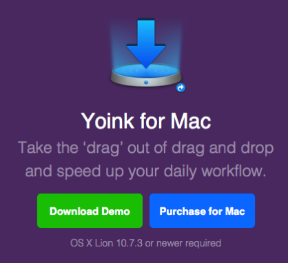
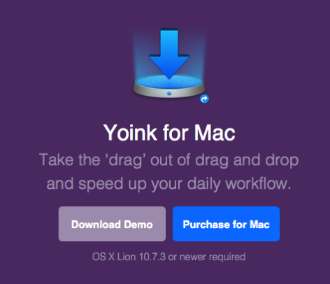
It’s nice, but taking the #ESSPurple background into account, neither the green, grey-ish purple or blue worked that well.
The buttons are much more identifiable as such than the previously used chalk-outline ones (see first screenshot).
For Yoink, I also started a new Quick Tips website, showcasing some lesser-known features.
Yoink Quick Tips Website (click)
It’s kind of a FAQ section. I often got eMails asking how to easily select all files inside Yoink or how to copy files out of Yoink instead of moving them.
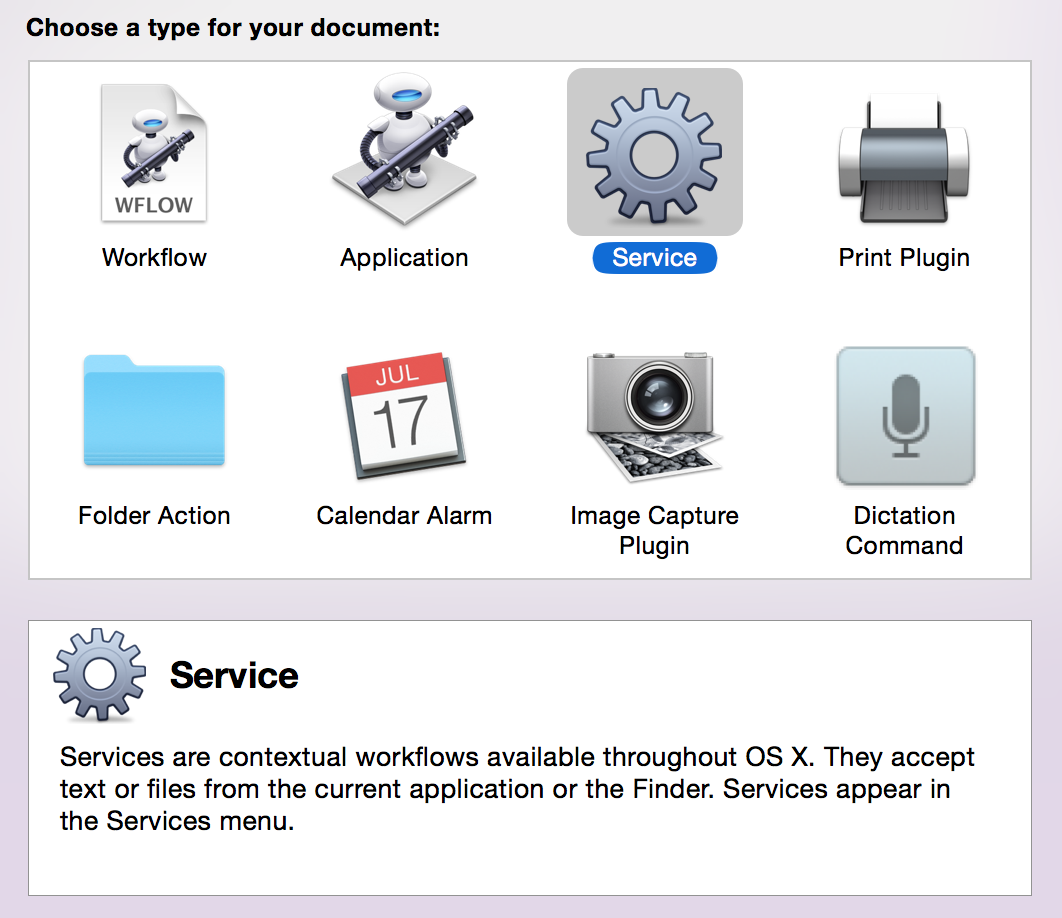
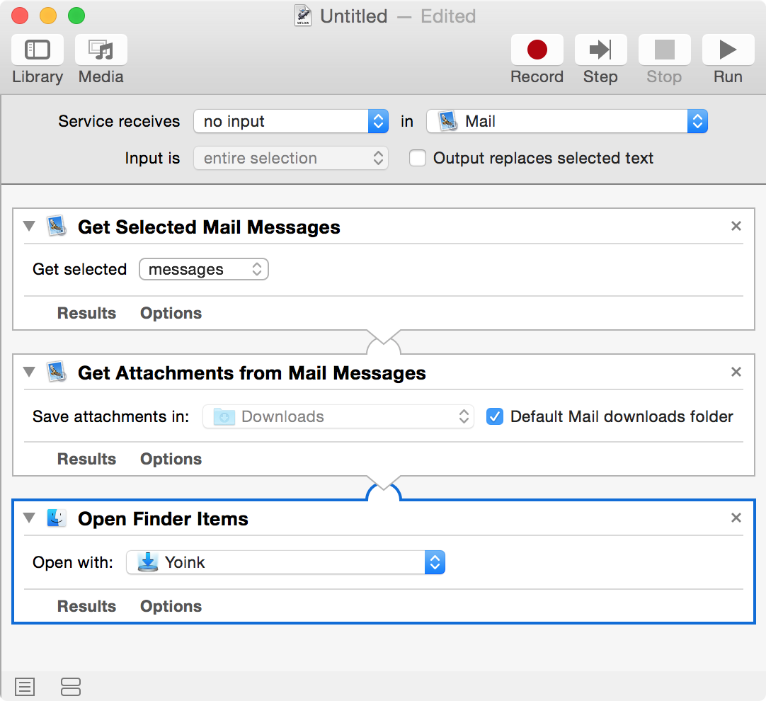
Yoink’s Quick Tips website displays simple tricks like copying and selection, but more complex ones, too, like using Automator in conjunction with Yoink or adding files to Yoink from the Terminal/Shell.
Yoink 3.1 (to be released on September 3rd 2015)
I’ve been working on an update for Yoink which, most importantly, is now localized into additional great languages, like Japanese, Simplified Chinese and Korean (you can find the complete list in the release notes or on Yoink’s website).
Some localizations were “donations” by awesome users of Yoink (Korean, Portuguese (Portugal) and Italian), the others were done by professional localizers via iCanLocalize and BRlingo, which I can both highly recommend.
Besides being localized into new languages, the update provides a cleaner, less cluttered interface, many improvements and bugfixes.
Transloader 2.2.2 (iOS) (click)
Transloader for iOS received a bugfix update, fixing some minor stuff in its Today Widget and Action Extension and URL schemes. The Mac app hasn’t received an update yet.
Reach ZEN – Update (click)
I worked on an update for my cousin’s iPhone and iPad game Reach ZEN, fixing a couple of bugs and interface issues. Most importantly, In-App Purchases are working now 😛
In the game, you turn a cube with random numbers on it, selecting sides that add up to ten in under ten seconds. It’s thrilling and peaceful at the same time – go check it out 🙂
… Didn’t Work On
Swift Language
At some point, I’d like to get into Swift programming. But I don’t see the point in re-writing my apps to use Swift – it doesn’t really provide any use to users, other than knowing that something was built with the “new shiny”.
Hearing stories about how code stops working after an update to the Swift language doesn’t help things, either. When I write something, I want to be sure it works with the next release of the language it was written in.
That is not to say I’m not going to develop apps using Swift – but for now, I’m waiting for a release where I know that from that point on, things don’t change fundamentally and code keeps working over releases.
… Did
My girlfriend and I went to the dentist. For me, it was the first time in 15 years, easy (I know, I’m an idiot). But it went far better than I thought, considering the time span.
Three cavities (one has already been taken care of with two kind of drills and a filling) and one wisdom tooth that’s coming out the wrong way and needs to be surgically removed at some point (that X-Ray was quite shocking, to be honest).
Still, I’ve never had such a pleasant dentist visit. She was very comforting, careful and explaining what she did all the way through. The next appointment is in two weeks where the next tooth is getting fixed (by drilling, I hope).
… Downloaded
 Angry Birds 2 (click)
A worthy successor to the game that started it all. It’s entertaining and fun and pretty much sticks to what made the first game great.
I’m not very far into it due to lack of time, but it is a nice way to relax a little.
 Pac-Man 256 (click)
I didn’t play much of it yet, but it’s Pac-Man – what can go wrong? 😛
I did get to the “Glitch” stage and died pretty soon afterwards and haven’t played it since – to be honest, I’d rather play Crossy Roads.
… Read
Swift – The Genius of Protocols (click)
This article provides a nice look into Protocols in Swift.
I’m not using Swift for anything yet and have only put my pinky toes into the vast sea that is this new programming language, but I do enjoy reading about what it has to offer.
Intro To GCD (Grand Central Dispatch) (click)
I’m familiar with how GCD works and I make extensive use of it, but it never hurts to read up on something you think you know. This is a multi-part series about GCD and if you’re a Mac / iOS developer, I suggest you check it out.
The increasingly long lives of old Macs (click)
Something I’m very thankful for, working on a retina MacBook Pro from 2012 and a 20’’ Apple Cinema Display from ca. 2004.
And OS X El Capitan will give it at least one more year of usage – including the new Metal framework (Macs starting from 2012 are supported, so my rMBP barely made it).
How Runic Games was Reborn After Torchlight: The Story Behind Hob (click)
The story behind a new game from Runic Games and how it deviates from previous games they made while having to deal with key people leaving the company.
… Listened To
Liftoff Podcast (click)
“Liftoff is a fortnightly podcast about space, the universe, and everything.”
I’m kind of into Astronomy, it’s a “hobby” of mine, if you can call it a hobby.
The podcast just started, they’re at episode 2 (episode 3 if you count the intro episode) and it’s been very interesting.
… Watched
Why CG Sucks (Except It Doesn’t) (click)
A short video about why we think CG in movies sucks, but it really doesn’t.
… Ate
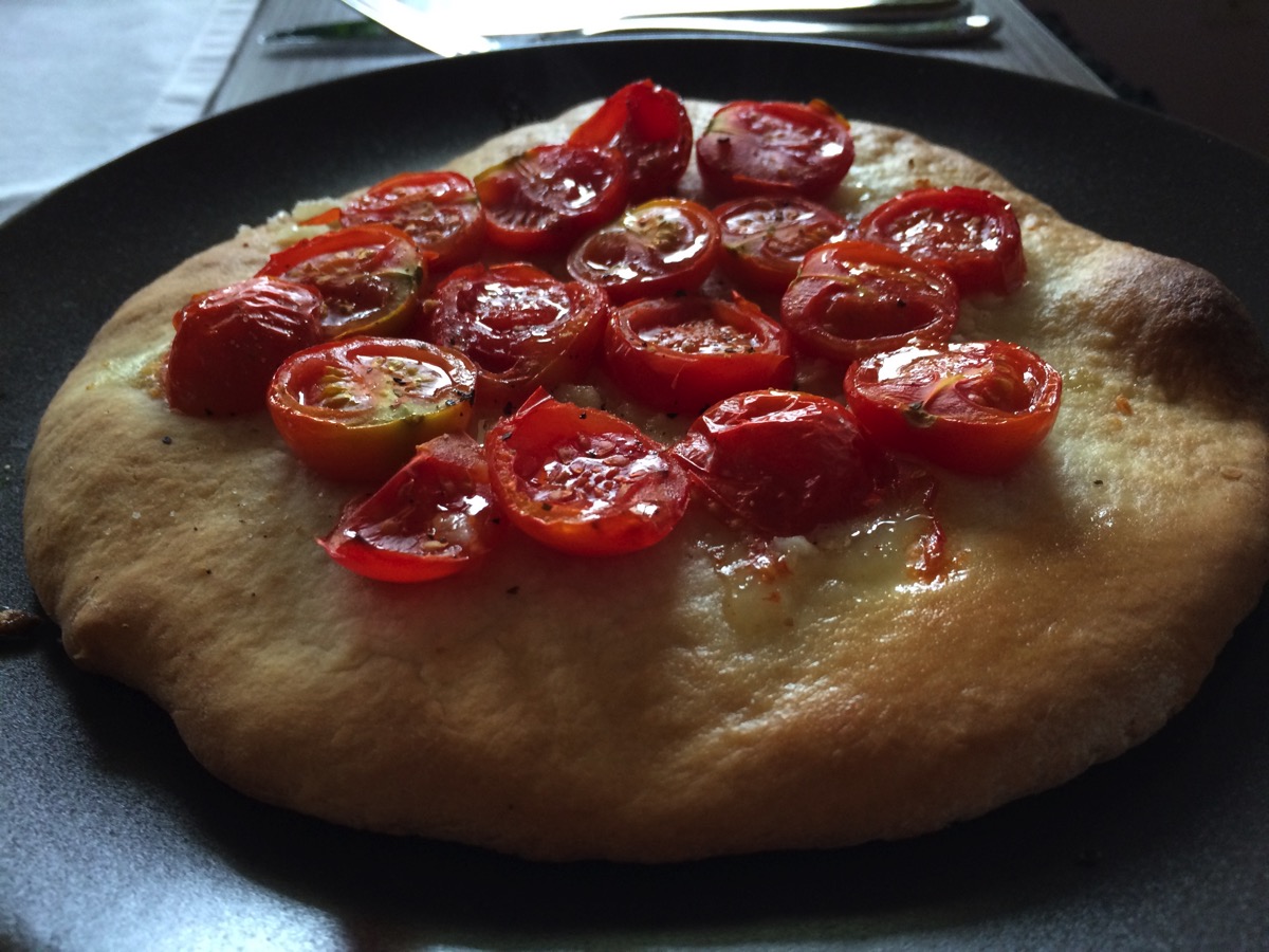 Self-Made Tomato Pizza with Garlic
… Went to See
My girlfriend and I were at quite a few places this month 😉
 Viking Exhibition at Schallaburg
 Setagayapark in Vienna, Döbling.
Between Doebling, a district of Vienna and Setagaya in Tokio, there has been a year-long friendship and cultural agreement.
Out of that, this park was created. Planned by Ken Nkajima.
 Haus des Meeres / House of the Sea, Vienna.
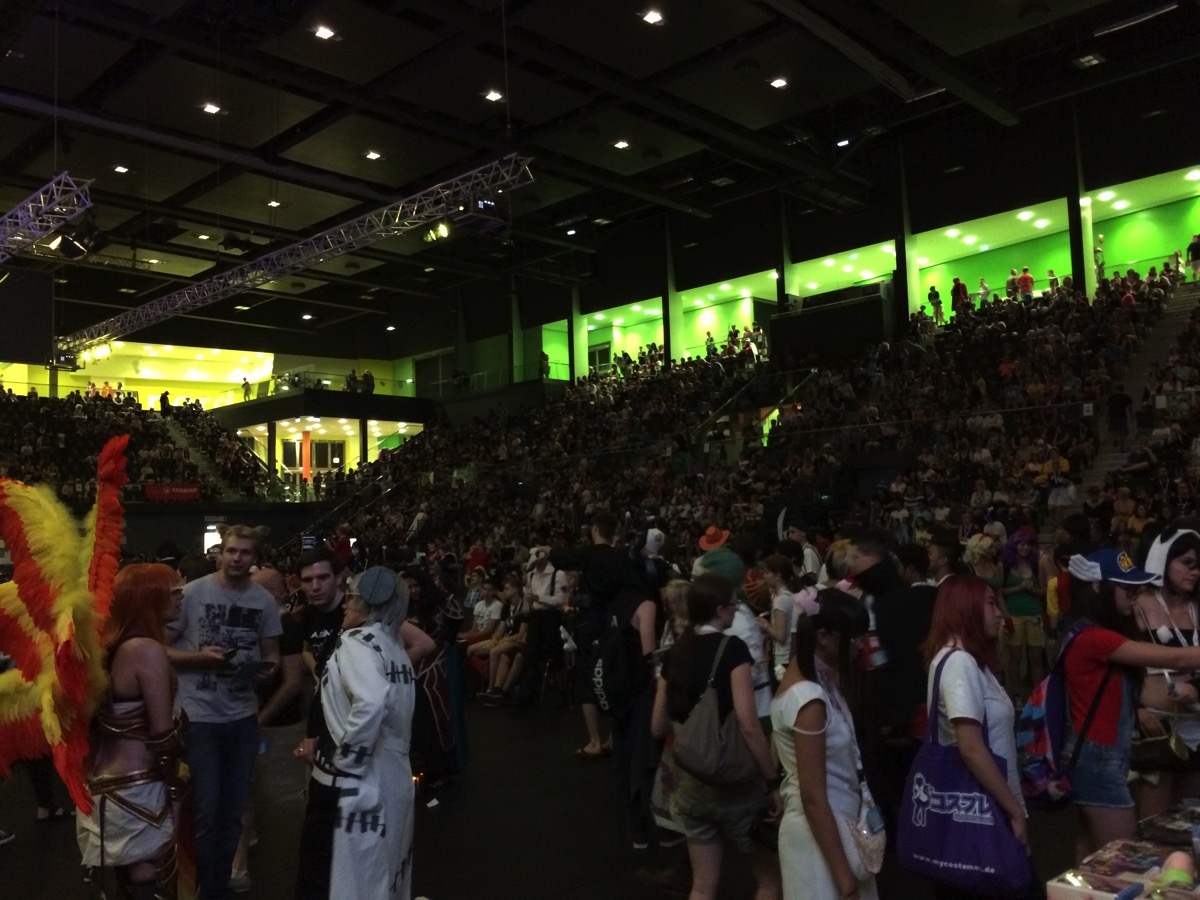 AniNite Convention, Schwechat
Way more people (and cosplayers) than last year.



 Angry Birds 2 (
 Self-Made Tomato Pizza with Garlic
 Viking Exhibition at Schallaburg
 Setagayapark in Vienna, Döbling.
 Haus des Meeres / House of the Sea, Vienna.
 AniNite Convention, Schwechat