User Interface

We recently cancelled our cable/general TV subscription, which left us with a bit of an entertainment void. Not that TV was entertaining – we hardly watched anymore, hence the cancelling – but we do like to just “put something on” every now and then. So we decided to get Apple One (Premium, because we’re sharing with my mom).
I was, at first, a bit hesitant to enable iCloud Photos – we have nearly 40.000 photos/videos, and obviously we don’t want to lose any of them. So I asked my cousin how he felt about it (he’s been using it for quite some time). He seemed happy with it, so I was confident in turning it on. A couple of backups on multiple drives later, I clicked the checkbox in Photos’ preferences on my Mac – and the waiting began.

Upload Observations

All in all, it took well over 36 hours to finish the upload. I began in the morning, let it run overnight in the hopes it would finish, but the next morning, it still kept going for more than half a day. I noticed that Photos didn’t continuously upload all photos. It uploads for a bit, then does some encoding for a bit, and then uploads again a bit. Now thankfully, my connection is pretty good with a consistent upload rate of ~7MB/s so I thought it would be done fairly quickly, but I didn’t consider that any encoding could be going on. Judging from Activity Monitor, at least videos are encoded before they go up into the cloud.

My Mac (which has all the photos) was the first where I turned it on, and after it had finished, I also enabled it on my iPhone and iPad. Those were done syncing in about two days. “Thanks” to what Apple probably considers a “feature”: the constant pausing of the syncing process on iOS devices, in order to conserve battery: “Paused syncing to save battery”, it said anytime I looked. No! Why!? Sync!, that’s what the battery’s there for. Just do it, I don’t care. And don’t let me enable it for “a day”, let me enable it forever. Seriously. Get it done.

Comparing to Photo Stream

Previously, I mostly collected photos on my Mac via Photo Stream. And I have to say, while I do enjoy the new syncing features iCloud Photos offers (syncing albums, photo-edits, etc), newly taken photos now take noticeably longer to appear on other devices than before. Not a deal breaker, but noticeable.

“Unable to Upload”

65 photos were unable to upload, according to Photos on my Mac. Why? I couldn’t honestly tell you. Photos didn’t tell me. It should have, if you ask me. I’d have liked to know. And there’s no way to retry to sync those photos with iCloud. They’re just in the “Unable to Upload” smart-album forever.
Albeit, a bit of online research reveals an Apple support document with one of the weirdest and Apple-unlike solutions to a problem I’ve ever come across:
Step 1: Export the photos in question “unmodified” to a folder on your disk.
Step 2: Delete them from Photos (scary)
Step 3: Import those photos you just exported into Photos again to retry their syncing.
It worked (mostly), but still, why can’t I just do this in Photos itself?

Varying Photos count

An interesting tidbit: All my synced devices show a different photo count.

DevicePhoto countVideo count
Mac37.831461
iPad37.835461
iPhone37.834461
The video-count is the same on all devices, but photo-counts vary.

Of course, with that amount of photos, there’s no way – ever – for me to find out which photos are missing on which device. Because interestingly, when I connect the iPhone or iPad to my Mac, it tells me that the connected device only contains items that are already on my Mac. Go figure.

General Impressions

I’m happy with iCloud Photos. Finally, all my videos sync, and so do all “fancy” photos (with blurry backgrounds or any sort of effects) and edits, and the syncing seems to so far be very reliable.
No longer do I need to connect them once a month to make sure I have all photos collected on my main machine. Nice.

Face- and duplicates analyses appear to happen on each device individually, probably in the name of privacy (and iOS devices need to be – again, why? – connected to power for that to happen). I wouldn’t mind if that synced over (the found faces appear to, anyway).
It’s kind of weird that they constantly turn off those features to conserve battery, and then have all my devices do the same work. Wouldn’t it save even more battery if just one device did it? Oh well…

Read more

Since I’ve had to go re-watch WWDC20’s “Adopt the New Look of macOS” session (at around the 07:03 mark), I thought I’d note it down here – for anyone else late to the update-for-macOS-Big-Sur-game 😉

What we want to achieve is go from this UI (basically standard on any macOS before Big Sur):

Screenshot of Yoink's preferences on macOS Catalina and earlier

to this UI (new UI for Preferences windows on macOS Big Sur):

Screenshot of Yoink's Preferences on macOS Big Sur

And it’s fairly easy to do so. All you need to call is (pardon the Objective-C, Yoink for Mac (and iPad and iPhone, for that matter), is still 100% Swift-free..)

self.window.toolbarStyle = NSWindowToolbarStylePreference;

and update your toolbar items’ icons, and you’re all set.

Screenshot of Xcode  24 09 2020 08 48 22


– Matthias
mail | website | twitter | instagram | facebook

Read more

[This is a follow-up to this blog post. It was inspired by the response I received through social media and different websites.]

In a previous version of Yoink, I had the following conundrum:

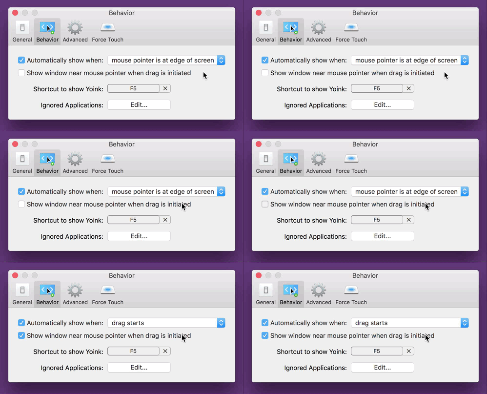
Yoink 3.2 Preferences Inactive Checkbox

The checkbox “Show window near mouse pointer when drag is initiated” is inactive and needs extra steps to be activated.
If I’m a new user of the app, at first, I have no idea how to activate that checkbox. At best, it’s something I need to set in this preference panel, at worst it’s a setting in a different one.
As a new user, my only option is to blindly change settings, waiting for one to activate the checkbox so I can select it.

There are different solutions to this problem, of varying degrees of effective- and usefulness:

  • A tooltip. If the checkbox is inactive and you hover over it, a tooltip appears, explaining what to do to activate the checkbox.
    It’s a quick and easy solution, however, it’s almost undiscoverable. I know of many users who don’t even know tooltips exist.
  • Hiding the checkbox instead of having it be inactive.
    That’s better, as it reduces clutter (as the checkbox would be inactive anyway). But it introduces another problem – nobody knows that the option even exists.

“For that UI, I think maybe an additional improvement would be to actually hide and show the checkbox completely instead of disabling it.
Also, indent the second checkbox so that it feels like it’s a sub-section of the first.
Another option might be to split things out into radio buttons instead of checkboxes and the popup menu.
That way you could expose the additional option tied to the appropriate radio choice, which you can’t exactly do with the menu item.”

Manton Reece, via Core Intuition’s slack channel

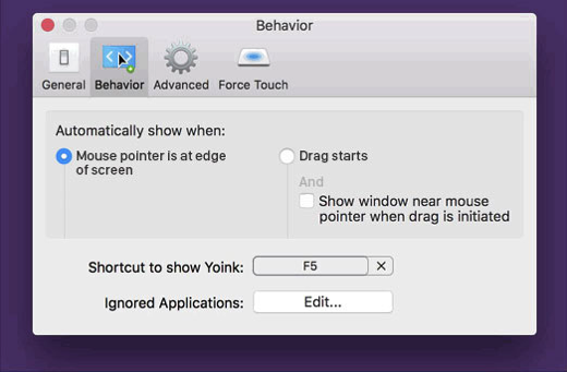
  • Speaking of radio buttons, Adrien Maston wrote me a very detailed mail with some ideas he had about resolving the issue:
    Adrien Maston Radio Button Yoink

Since there are only two options for « automatically show when », maybe the setting could be radios instead of a select.
Then each option would be formatted as a column and each column would contain specific settings (the « drag starts » column would contain the « Show window near mouse pointer when drag is initiated » checkbox. Then it would make sens that clicking the checkbox would also set to « drag starts ».

Adrien Maston, via eMail

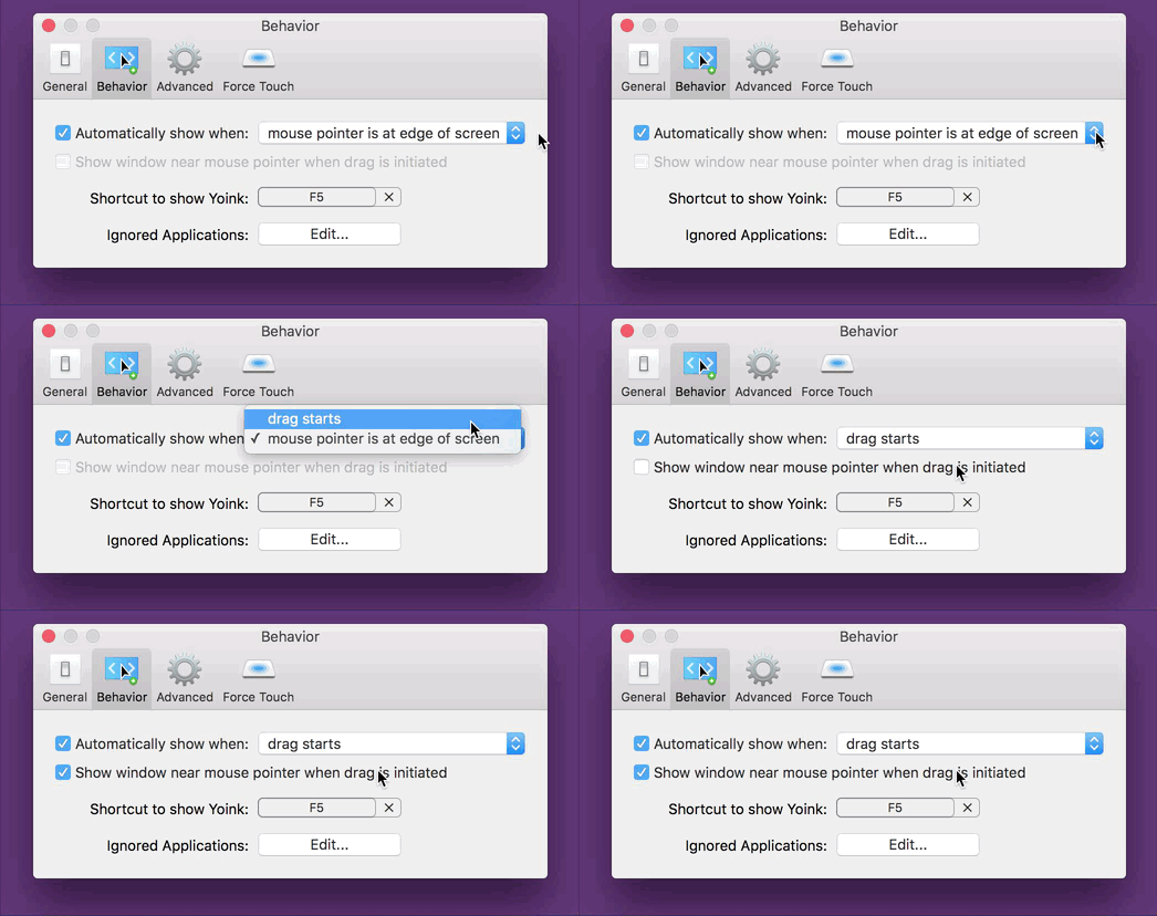
What I ended up doing in Yoink v3.2.1, the release that followed this discussion, was this:

Yoink 3.2.1 Preferences Active Checkbox

Instead of having the checkbox inactive, it’s active at all times and can be clicked right away. The advantage of this is that for one, the user knows the option exists and two, the user can select the option right away without having to figure out how to activate it.
The downside, and this has been pointed out to me a couple of times, and I agree, is that clicking the checkbox changes two settings at once (the checkbox and the popup, as you can see in the GIF above). It changes a setting the user has made before. And that’s bad UX design on its own right there.
My thinking was, it’s in the same preference pane, so the user sees what’s happening right away. It still was the wrong decision (as has been pointed out to me in the comments on designernews.co).

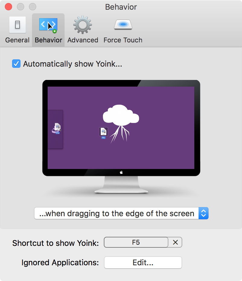
For Yoink v3.2.5, I re-thought the whole thing and decided to make it three options in a popup.
This is the result:

Yoink's Behavior Preference Pane in v3.2.5

It solves a couple of things:

  • The inactive checkbox is a thing of the past
  • The options you have for when and where Yoink should appear are much clearer
  • You get a preview video for every option so you know right away how each setting affects Yoink
Additionally, I think it’s the nicest Yoink’s Behavior preference pane has ever looked, so that’s a plus 😉

Eternal Storms Software Logo

– – – Do you enjoy my blog and/or my software? – – –
Stay up-to-date on all things Eternal Storms Software and join my low-frequency newsletter (one mail a month at most).
Thank you 🙂

Read more

An inactive checkbox is always a bit of a mystery to me.
Why is it inactive? How do I get it to activate so I can select it? More often than not, it takes me a couple of tries fiddling around with other preferences to finally activate the checkbox and be able to select it.
It shouldn’t be that way.

And now I realize I’ve been guilty of having such an inactive checkbox in Yoink‘s preferences myself:

Yoink 3.2 Preferences Inactive CheckboxThe inactive checkbox “Show window near mouse pointer (…)” is inactive and needs extra steps to be activated

It’s exactly what I dislike. What was I thinking?
As a new user who has no idea how these preferences are connected, you just don’t know how to get that checkbox active and, more importantly, how to change the setting available behind the inactive checkbox.
In the worst case, it’d take three steps to activate it. You’d have to:

  1. Select the checkbox “Automatically show when” (if it wasn’t active before)
  2. Change “mouse pointer is at edge of screen” to “drag starts”
  3. and then you’d finally be able to access the newly active checkbox
If I launch Yoink for the first time, I have no idea what’s going on. That’s not a very good user experience.
So with the upcoming update v3.2.1, the checkbox will always be active, and it’s much clearer how these two options are connected:

Yoink 3.2.1 Preferences Active CheckboxIn Yoink v3.2.1, the checkbox is always accessible, eliminating extra steps to be able to select it.

Obviously, not all cases are the same and sometimes, in some places, there might be a good reason to have a checkbox inactive.
But here, it was clearly the wrong choice.

[Update 27.10.2016: I published a follow-up here.]

Eternal Storms Software Logo

– – – Do you enjoy my blog and/or my software? – – –

Stay up-to-date on all things Eternal Storms Software and join my low-frequency newsletter (one mail a month at most).
Thank you 🙂

Read more