ui

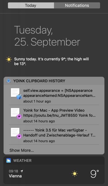
When testing your Today Widget on macOS Mojave and you see something like this using Dark Mode:

Widget with wrong appearance in macOS Mojave's Dark Mode

don’t fret, there’s a rather easy fix.

In your Today Widget’s Info.plist, in NSExtension > NSExtensionAttributes, there’s NSExtensionPointVersion.
For the widget above – with the wrong appearance – the version was set to 2.0:

NSExtensionPointVersion in Info.plist

To see where the problem might be, I created a new widget under macOS Mojave, and it turns out, it uses version 3.0, which also fixes the appearance issue:

New NSExtensionPointVersion in Info.plist

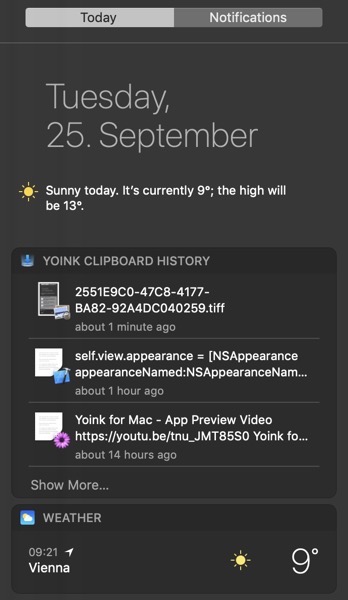
and voilà, it worked like a charm:

Widget with correct appearance in Dark Mode on macOS Mojave

Compatibility

I’ve tested back to macOS El Capitan 10.11 and it worked, it will possibly work for earlier versions of macOS, too.


Hope it helps 🙂

Read more

[This is a follow-up to this blog post. It was inspired by the response I received through social media and different websites.]

In a previous version of Yoink, I had the following conundrum:
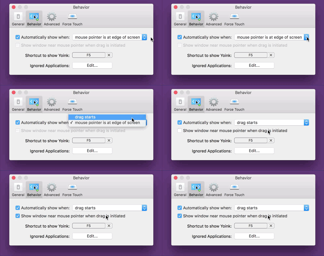
Yoink 3.2 Preferences Inactive Checkbox

The checkbox “Show window near mouse pointer when drag is initiated” is inactive and needs extra steps to be activated.
If I’m a new user of the app, at first, I have no idea how to activate that checkbox. At best, it’s something I need to set in this preference panel, at worst it’s a setting in a different one.
As a new user, my only option is to blindly change settings, waiting for one to activate the checkbox so I can select it.

There are different solutions to this problem, of varying degrees of effective- and usefulness:

  • A tooltip. If the checkbox is inactive and you hover over it, a tooltip appears, explaining what to do to activate the checkbox.
    It’s a quick and easy solution, however, it’s almost undiscoverable. I know of many users who don’t even know tooltips exist.
  • Hiding the checkbox instead of having it be inactive.
    That’s better, as it reduces clutter (as the checkbox would be inactive anyway). But it introduces another problem – nobody knows that the option even exists.

“For that UI, I think maybe an additional improvement would be to actually hide and show the checkbox completely instead of disabling it.
Also, indent the second checkbox so that it feels like it’s a sub-section of the first.
Another option might be to split things out into radio buttons instead of checkboxes and the popup menu.
That way you could expose the additional option tied to the appropriate radio choice, which you can’t exactly do with the menu item.”

Manton Reece, via Core Intuition’s slack channel

  • Speaking of radio buttons, Adrien Maston wrote me a very detailed mail with some ideas he had about resolving the issue:
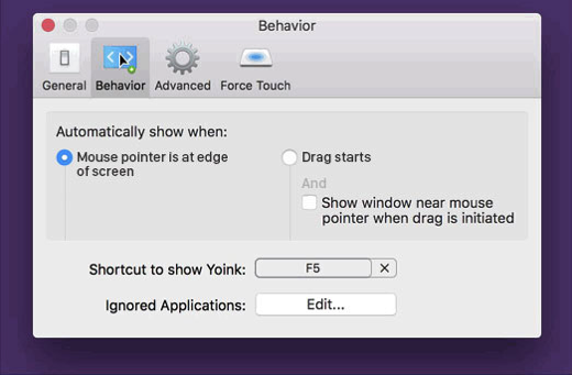
    Adrien Maston Radio Button Yoink

Since there are only two options for « automatically show when », maybe the setting could be radios instead of a select.
Then each option would be formatted as a column and each column would contain specific settings (the « drag starts » column would contain the « Show window near mouse pointer when drag is initiated » checkbox. Then it would make sens that clicking the checkbox would also set to « drag starts ».

Adrien Maston, via eMail

What I ended up doing in Yoink v3.2.1, the release that followed this discussion, was this:
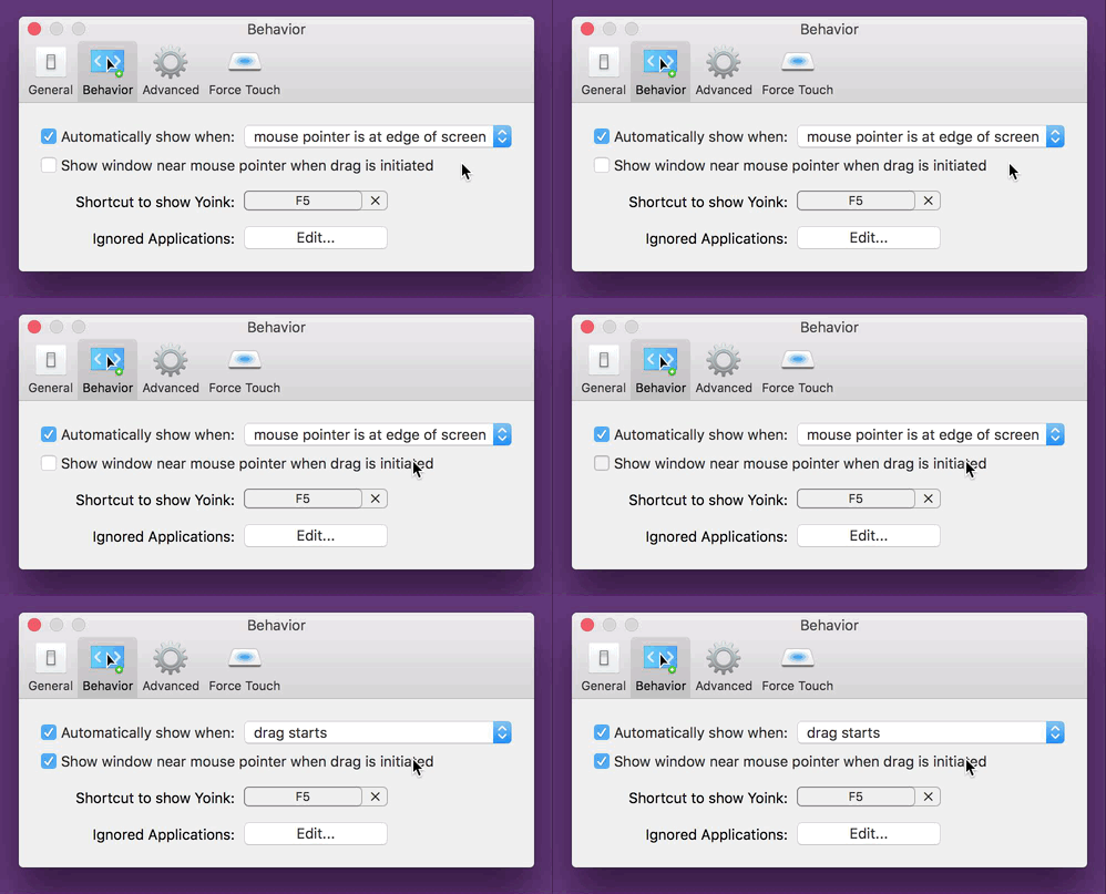
Yoink 3.2.1 Preferences Active Checkbox

Instead of having the checkbox inactive, it’s active at all times and can be clicked right away. The advantage of this is that for one, the user knows the option exists and two, the user can select the option right away without having to figure out how to activate it.
The downside, and this has been pointed out to me a couple of times, and I agree, is that clicking the checkbox changes two settings at once (the checkbox and the popup, as you can see in the GIF above). It changes a setting the user has made before. And that’s bad UX design on its own right there.
My thinking was, it’s in the same preference pane, so the user sees what’s happening right away. It still was the wrong decision (as has been pointed out to me in the comments on designernews.co).

For Yoink v3.2.5, I re-thought the whole thing and decided to make it three options in a popup.
This is the result:
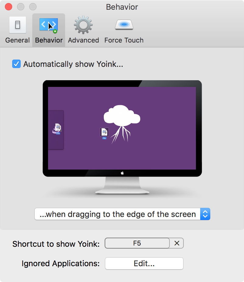
Yoink's Behavior Preference Pane in v3.2.5

It solves a couple of things:

  • The inactive checkbox is a thing of the past
  • The options you have for when and where Yoink should appear are much clearer
  • You get a preview video for every option so you know right away how each setting affects Yoink
Additionally, I think it’s the nicest Yoink’s Behavior preference pane has ever looked, so that’s a plus 😉

Eternal Storms Software Logo

– – – Do you enjoy my blog and/or my software? – – –
Stay up-to-date on all things Eternal Storms Software and join my low-frequency newsletter (one mail a month at most).
Thank you 🙂

Read more

An inactive checkbox is always a bit of a mystery to me.
Why is it inactive? How do I get it to activate so I can select it? More often than not, it takes me a couple of tries fiddling around with other preferences to finally activate the checkbox and be able to select it.
It shouldn’t be that way.

And now I realize I’ve been guilty of having such an inactive checkbox in Yoink‘s preferences myself:

Yoink 3.2 Preferences Inactive CheckboxThe inactive checkbox “Show window near mouse pointer (…)” is inactive and needs extra steps to be activated

It’s exactly what I dislike. What was I thinking?
As a new user who has no idea how these preferences are connected, you just don’t know how to get that checkbox active and, more importantly, how to change the setting available behind the inactive checkbox.
In the worst case, it’d take three steps to activate it. You’d have to:

  1. Select the checkbox “Automatically show when” (if it wasn’t active before)
  2. Change “mouse pointer is at edge of screen” to “drag starts”
  3. and then you’d finally be able to access the newly active checkbox
If I launch Yoink for the first time, I have no idea what’s going on. That’s not a very good user experience.
So with the upcoming update v3.2.1, the checkbox will always be active, and it’s much clearer how these two options are connected:

Yoink 3.2.1 Preferences Active CheckboxIn Yoink v3.2.1, the checkbox is always accessible, eliminating extra steps to be able to select it.

Obviously, not all cases are the same and sometimes, in some places, there might be a good reason to have a checkbox inactive.
But here, it was clearly the wrong choice.

[Update 27.10.2016: I published a follow-up here.]

Eternal Storms Software Logo

– – – Do you enjoy my blog and/or my software? – – –

Stay up-to-date on all things Eternal Storms Software and join my low-frequency newsletter (one mail a month at most).
Thank you 🙂

Read more

ESSSquareProgressIndicator animating

What Is ESSSquareProgressIndicator?

It’s an indeterminate progress indicator originally developed for the iOS game ZEN.

It uses Core Animation (specifically, CAShapeLayers) to do its job and it’s pretty straight forward.

CGPathRefs, CAShapeLayer

CAShapeLayer has two animatable properties – -strokeStart and -strokeEnd (with a minimum value of 0.0 – start of path – and 1.0 – end of path). Going beyond 1.0 or below 0.0 doesn’t work.

So when trying to animate those values along a rectangular path – which was the first thing I tried when creating this – you do get a nice animation, but it ends at the 0.0/1.0 (which is, basically, the same) mark. So you end up with something like this:

glitchy progress indicator animation

The goal, then, was to animate beyond 1.0. The solution I came to – I’m sure there are other ways – was to use a second CAShapeLayer that animated alongside the first for the last/first part of the animation.

For a square, the values of the CAShapeLayer’s -strokeStart and -strokeEnd are as follows (starting at the top left corner):

CAShapeLayer strokeStart strokeEnd values

The CGPath begins and ends in the top left corner because I drew the path that way (you could make it start in the lower left corner or in the middle of a side, it all depends on where you start the CGPath with CGPathMoveToPoint).

The progress indicator starts at the middle of the left line and reaches to the middle of the top line. These are the two CAShapeLayers at work. The left part is one shape layer, the top line is another. I’ll do this in pictures I drew in code so it’s simpler to understand (the lines represent where the layer animated to, the dots are the invisible rest of the square).

Animating

Animation Part 1We start at this position. The line to the left is layer2(strokeStart:0.875, strokeEnd:1.0), the line at the top is layer1(strokeStart:0.0, strokeEnd:0.125).

Animation Part 2The transition to this is the reason we need two layers as we can not animate one layer beyond the 1.0 value.
So we animate layer2 to (1.0, 1.0) and at the same time animate layer1 to (0.0, 0.25) which makes it look like one line moving.

Animation Part 3This next part is easy. We animate layer1 to (0.75, 1.0).

Animation Part 4Lastly, we animate with two layers again to get to the initial position so we can repeat the whole thing from there on.
We animate layer2 from (0.75, 1.0) to (0.875, 1.0) and layer1 from (0.0, 0.0) to (0.0, 0.125) at the same time, again making it look like one line moving.

The Source Code

The repository (a sample iOS app, but the class works the same on OS X) is available on Github.

It was developed for iOS 7.1 but should work on earlier systems, and has been tested on OS X Yosemite, but should work on earlier systems as well.

You just drop in an ordinary UIView or NSView and set its class to ESSSquareProgressIndicator. Done. You can then set the color and stroke width right within Interface Builder thanks to the fairly new Xcode macros IB_Designable and IBInspectable.

Open Source

I have some more source code available here (or directly on my github profile page) if you’re interested. If you have any questions or feedback regarding this progress indicator, please be sure to mail or tweet me 😉

Enjoy!

—-
My name is Matt, I’m the developer of Eternal Storms Software. If you’d like to comment, you can catch me on twitter here: [twitter-follow screen_name=’eternalstorms’ show_count=’yes’] or by eMail.

Read more