Welcome to the first anniversary edition of “What I…”. I can’t believe it’s been a year already, it feels so much shorter.
Another busy month comes to a close.
The bulk of this month obviously went into Yoink 3.2, but with a release also comes all of this other work you need to do – update the Mac App Store page, perhaps add new screenshots, think about keywords, update the website, write a blog post about it or create a newsletter mail… Release-days are busy. Long story short, after the work is done, there is so much more work to do…
Aside from all of that, though, I’ve also been trying to learn and get into Auto-Layout, which I’ve been neglecting far too long only to now realize it’s the most beautiful thing in the world, when it comes to localizing and internationalizing your app. It’s a godsend.
I also had to tip my toes into PHP again. I’ve had to do that every now and then (way back when I was still selling flickery outside the Mac App Store and had to communicate with PayPal somehow), so it’s nice to get back to it and work in a language other than Objective-C for a change. (ahem. Swift. ahem. I’ll have to get to that as well. Any day now.)
Let’s get into what I…
… Did
Finished up and released Yoink v3.2 (website, Mac App Store)
After a long time working on it (I checked, I last updated Yoink early in September 2015), I was finally able to give the green light for the latest update to Yoink.
If you follow this blog, you know what I’ve been through with this release 😉
I blogged about what’s new here.
As far as I can tell, it’s been very well received (I might do a short blog post about some coverage of it later).
Here’s a very nice review of the new version on the Mac App Store:
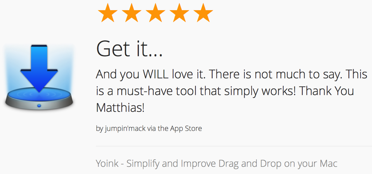 A recent review of Yoink on the Mac App Store (powered by launchkit.io)
I changed a couple of things regarding Yoink’s Mac App Store page.
I read about ASO (App Store Optimization) and realized I was wasting a perfect opportunity for additional keywords: The app’s display name (the name that appears on the Mac App Store). Up until now, it was just “Yoink” – so I changed it to “Yoink – Simplify and Improve Drag and Drop”. That gives me the keywords “drag” and “drop” for free, so there’s more place now in the actual keywords field.
Furthermore, I gave Yoink much-needed new App Store Screenshots.
This is what screenshots looked like before…
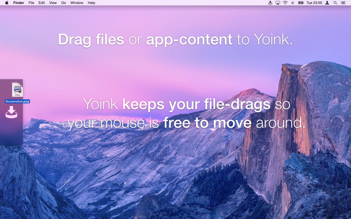
… and this is what they look like now:
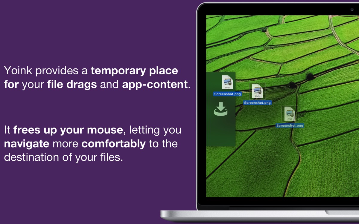
There were a couple of things important to me:
- Readability. I don’t know what I was thinking with the old screenshots there
- Yoink being displayed running on a Mac.
- Improved wording
- Kind of a vanity thing, but I wanted to have ESSPurple (my “company color”) in the shots.
Fun fact: Because so much changed between Yoink 3.1 and 3.2, I actually exceeded the limit of 4,000 characters in iTunes Connect’s “What’s New” section – by 2,000 characters. That was the entire “Bug fixes” section, so it had to go, and got replaced with “Numerous Bugfixes”. There were about twenty, which I’d have loved to list, just to give a complete account of what changed.
Apple’s review process was surprisingly painless (as in, no rejections) and quick (as in, two days. Two!)
I submitted the update early (on April 13th), to make sure that, if anything cataclysmic happened, I’d have enough time to sort it out. Thankfully, that extra time wasn’t needed.
What made me a little concerned was that I introduced two XPC services in this release (one that looks for any Force Touch capable devices and another one that handles newsletter subscriptions).
I thought especially the Force Touch XPC service might give me some trouble.
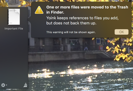
So I painstakingly explained which sandbox entitlements I used and how, which I think helped a great deal in getting this update reviewed as quickly as it was (plus, lower review times seem to be a trend recently – currently around two days), with no rejections.
Regarding press releases, I’ve made it a habit to send them out a week early with an “embargo”, to give members of the press time to first of all get to the email in time (as they surely receive tons of mails every day) and to prepare something if they liked it. I updated the press kit (nothing major, just added the new screenshots and a .webloc to the Usage Tips page).
Come release-day, I first released the app on iTunes Connect (it always takes a little time for the App Store to “realize” that the update was released). In the meantime I posted the blog entry I had prepared earlier for the update and when I thought the update was populated on the Mac App Store, sent out the newsletter to my subscribers (if you’d like to, you can subscribe here) and started talking about it on twitter and in my Facebook group.
All in all, I’m very happy with how the release went. It can always be better, but I can not complain.
Updated Yoink’s Website and Usage Tips Page (website, usage tips)
Along with the app, I wanted to update the website as well. Mainly because I wanted to mention Force Touch, and partly because the more you scrolled down on the website, the more of a mess it became.
Starting at the top of the website, I decided to move the customer and press reviews down a little. While I think they’re very important, as they show what real people using the app think about it, they’re not as important as an intro to what the app does.
Before (again coming down from the top), you had Yoink’s icon with a short blurb, the download and purchase buttons and right below that, selected reviews.
On the new site, what you see below the buttons is a nice “photo” of Yoink running on a MacBook Pro (with a background image that’s one of the complementary colors of purple to draw attention to it). Then come the reviews.
So now you have an intro to the app and below that, how nice people think the app is. I believe that works much better.
Furthermore, I tried to condense the site a little, it kind of felt like an endless scrolling website before, without real structure, almost like “what else can I quickly paste randomly on this website I think might be important”?
So I introduced “boxes”, like this one, in an attempt to give a little structure to the site:
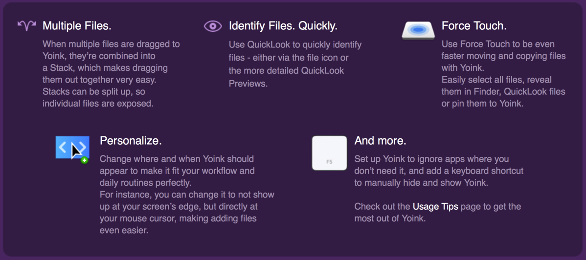
Previously, the features listed here were in a long list with a couple of screenshots and gifs, not at all attractive. I’m not a hundred percent happy with this either, but if you ask me, it’s way better than before.
I’ve applied the same “boxed” approach to the tips page, in order to condense it a little (it was also a long list) and give it a fresher look, in line with the app’s main page.
Lastly, I’ve added a newsletter signup form to the bottom of the page (and to the top right “Quick Links” list), because #GrowthHacking.
Learning Auto Layout, with SiriMote (website)
As I said in the intro to this post, I’ve been pushing off getting to know Auto Layout for far too long – though, in my defence, my apps have all been running with NSView’s auto resizing and I didn’t really have the time or need to switch.
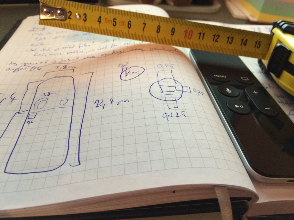
Anyway, now that I have started using Auto Layout (in SiriMote, just because it’s my smallest project and it doesn’t have anything too complex, UI wise), I don’t want to go back.
There’s so much magic happening behind the scenes here:


Now I only have one xib (because I also switched to base-localization instead of having one xib for each language) and when I change a string in a language, I don’t have to go through every UI element in the xib and move things around to make it fit – Auto Layout does it for me. Ah, the future. It’s so nice.
I’ve also gone a step further and tried animating the window solely by changing the constraints, not manipulating the window’s frame directly.
So far, it works and – after some work, as I came to understand constraints better – now looks just like before.
Featured in LaunchKit’s Launch Therapy Issue #8 (issue #8)
My post on getting featured on the Mac App Store in the “Get Productive” promotion made its way into launchkit’s excellent newsletter, Launch Therapy.
Having that kind of a reaction to something I wrote is very encouraging, and I hope I can improve my writing in a way that it gets featured even more 😛
BeautifulPixels ScreenFloat Sponorship (beautifulpixels)
After having sponsored BeautifulPixels for a week with Yoink, I ran another campaign, this time featuring ScreenFloat.
Yoink performed slightly better, but I attribute that to my inability to clearly communicate what ScreenFloat actually does. I’m trying to improve, but I struggle with it a fair bit.
“Floating screenshots” just doesn’t make clear how convenient it actually is, or doesn’t imply what can be done with it.
I must find a nicer way to describe the app.
Scripting in PHP
As you may know by now, I’ve started a newsletter. People interested in it can subscribe through the website, or through my apps’ about windows.
What I didn’t think of beforehand, though: what if I need to change the newsletter service I’m using, for whatever reason? Or what if the API changes? I’d need to put out an update just to make the app use the API of the new service.
That’s kind of inconvenient. So I decided to write a small php script that talks to the service’s API, put it on my own server and make my apps communicate with that php script instead of with the service’s API directly.
Now I have the freedom to switch the API behind the scenes, or update the API calls, should they change.
Still, some of the damage is done already, since I didn’t think of this before releasing Yoink 3.2, for example, or SiriMote. I’ll still have to update those apps once to make them use my php script, but from then on, it should be smooth sailings.
Adding more Character and Branding to my Applications
After adding some color and character to my website and about windows (see here), I decided to use ESSPurple a little more.
For all my apps (besides Transloader), I’m offering demos. When the trial period is over, an alert panel is shown. But that’s just lazy, and potentially not nice to look at.
That got me thinking: Perhaps it would benefit from some color. This is what I came up with:
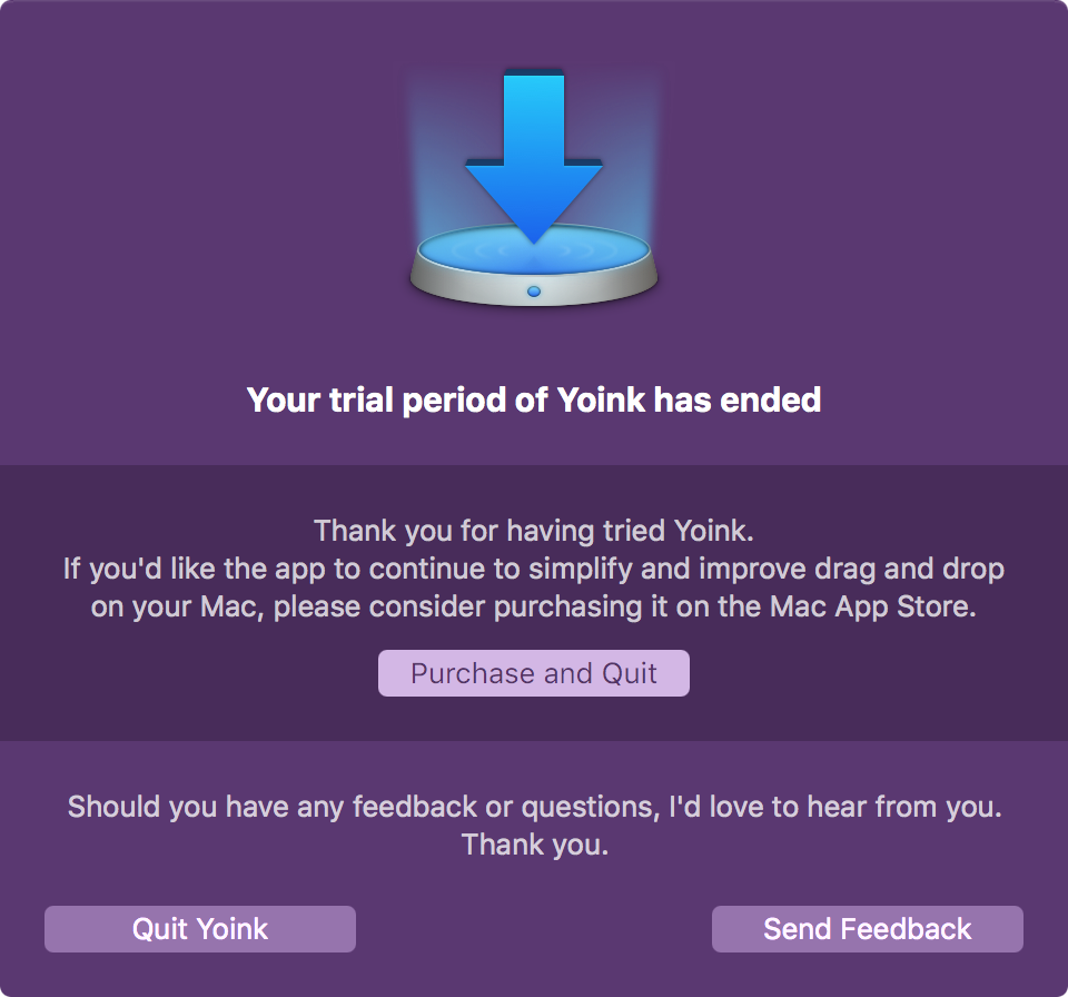 Yoink 3.2’s Demo Over Notice
And, as I wrote above, the Mac App Store Screenshots also received an update.
… Didn’t Do
Register for WWDC (apple)
I’ve been thinking a lot about whether or not I should apply for a ticket to Apple’s World Wide Developer Conference this year. After all, it is the best place to meet people in the industry and community. It’s also very valuable to be able to talk to Apple’s developers directly.
Even if I didn’t get a ticket, there’s usually a lot of other conferences and get-togethers around during the time of the conference.
But the flight alone would cost upwards of €1,000, and the hotels in San Francisco are insanely expensive. There’s no way I could justify that expense, to be honest.
I think Apple should announce WWDC earlier, not a ~month before the event. The beginning of the year would be good – flight tickets would cost less and it might even help with hotel prices.
Who knows, maybe next year.
Alternatively, I’m now thinking of attending one of Apple’s Tech Talks, either in London or somewhere in Germany (because they don’t have them here in Austria). My first choice would be London, just because I love it there. But I’ll make it dependent on who goes where. If more people go to Germany, then that’s where I’ll be going as well.
… Blogged About
Developer Tip: How to Install the Ink System Preferences Pane Without a Graphics Tablet (blog post)
In some cases, you need to test your apps with OS X’s built in handwriting recognition (called Ink) enabled.
This post shows you how to enable it, even if you don’t have a graphics tablet handy.
Under-the-Hood Improvements in Yoink 3.2 (blog post)
A technical blog post about what changed under the hood in Yoink 3.2, showing how I was able to improve the app’s performance and memory usage.
… Downloaded
 Safari Technology Preview (apple)
A good alternative to the webkit’s nightly builds, as it also includes upcoming browser features, not just the latest version of the browser’s foundation, WebKit.
It’s amazingly fast.
 Telegram (mac app store)
I was invited to partake in a survey, but it had to be over Telegram, so I downloaded it. Alas, for registration, they wanted my phone number, so in the Trash it went. Sorry, Telegram, nice try. That’s why I don’t use What’sApp, either.
 Shade (mac app store)
Quickly hide files on your desktop. Useful when you need to create screenshots or videos of your Mac.
![]() Miitomo (app store)
Miitomo (app store)
A fun little “game” by Nintendo where you answer questions about yourself and friends.
![]() Disney Crossy Road (app store)
Disney Crossy Road (app store)
You know Crossy Road. You know Disney. A perfect fit. Fun game.
… Read
Apple Developer Insights Webpage (apple)
Success stories of successful developers.
The iOS App Marketing Strategy Guide (apptamin)
“Everything we know about launching and marketing an iPad or iPhone app.”
5,000 Developers Talk About Their Salaries (freecodecamp)
Interesting insights. “The more you work, the more you get paid.”
How to Write App Descriptions That Sell (yalantis)
“There are three components of an app’s ‘definition’: its Name, its Description in the marketplace and Screenshots.”
Like It Is: Bob Dylan Explains What Really Killed Rock’n’Roll (cuepoint)
“… the genre was being commercially segregated, on the sly, into white (British Invasion) and black (soul) music by the (WASPy) establishment.”
Developers Switch to Subscription Prices to Move From a Consumer Audience to a Business One (macworld)
More and more apps seem to be switching to subscription-based business models. I wonder if it’s more sustainable than the “classic” approach of selling software, considering the backlash it caused for TextExpander’s developer Smile Software, for example.
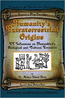 Humanity’s Extraterrestrial Origins (amazon)
An interesting, maybe amusing look at life from the other side of science. I wouldn’t take this at face value, but it makes you think for sure.
… Listened To
Core Intuition Podcast (website, itunes)
Lately, I’ve been enjoying the CoreInt podcast.
Leo Laporte Interviews Bill Atkinson (youtube)
About the early days of the Macintosh. A wonderful interview.
… Watched
 FAN (imdb)
Shah Rukh Khan’s latest movie. One of his finest roles, acting-wise, in our opinion. What’s unusual about this bollywood-movie is the absence of dance-numbers and songs. It’s all about the story this time 😉
 The Jungle Book (itunes)
The live-action adaption of the Disney animated classic.
My girlfriend and I enjoyed it a lot, though we both thought the songs felt out-of-place and didn’t fit with the movie. They should not have included them to make this a film in its own right. And even then – nothing beats the classic!
… Ate
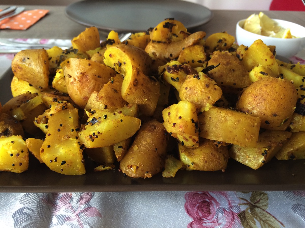
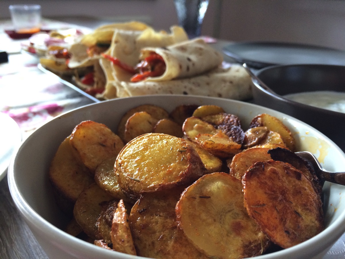 Vegetable Enchiladas with self-made Potato Chips
… Went to See
Sadly, I didn’t have a lot of time this month to go out and see places (though my girlfriend and I did go to see my Alma Mater, the University of Vienna, to see what’s new 😉 ), so please accept these cute photos of my girlfriend’s mom’s adorable dog, Lucky, instead.


– – – Do you enjoy my blog and/or my software? – – –
Stay up-to-date on all things Eternal Storms Software and join my low-frequency newsletter (one mail a month at most).
Thank you 🙂
 Spicy “Bombay Potatoes”
 For a quick weekend getaway, my girlfriend and I took a spontaneous short-trip to Innsbruck.

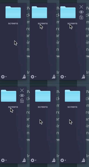 Version 3.2 will fix this and just fade in the buttons, leaving the file icon in place and only fading in the buttons at the side, not moving in.



 Cashew-Cream chicken with pistachios and rice.
 View from Schneeberg
 The group – a very cool bunch.
 Another nice view, combined with a little Austrian patriotism.
 Released SiriMote 1.0 (
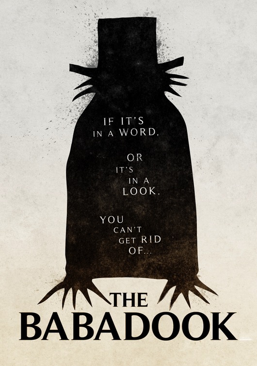 The Babadook (
 Bajirao Mastani (
 Dilwale (
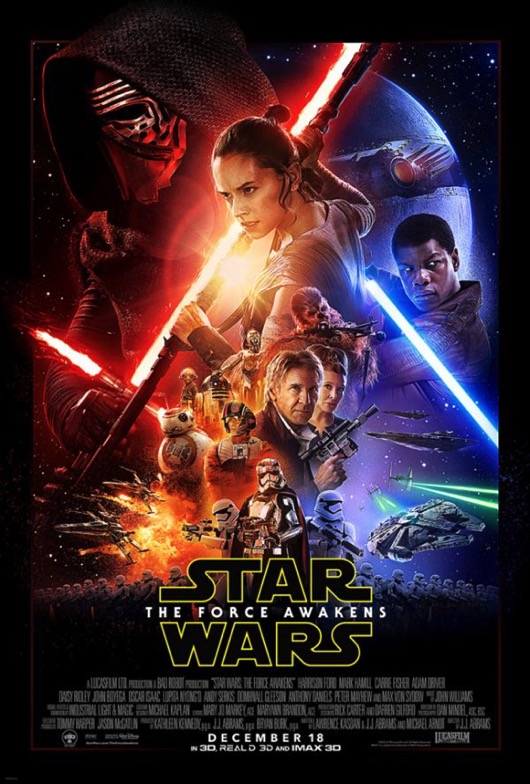 Star Wars: The Force Awakens (
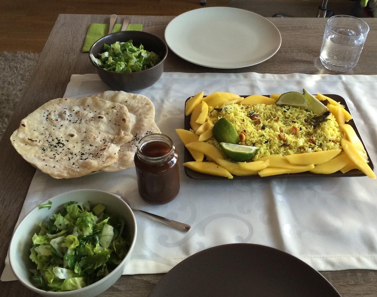 Spicy Lemon Rice with Tamarind Date Chutney and Chapati
 Star Wars: Identities. My girlfriend (on the left, “Ma’ka”) and I (on the right, “Brzl”) went to see this exhibit on December 31st and were simply blown away.