Mac App Store

(I apologize for the delay with this post, I had to work on updates for Yoink, ScreenFloat and Briefly and of course lots of work happened on flickery šŸ˜‰ ).

To finally continue with my promised series of blog posts about flickery 2.0ā€™s development, here I am back with: Uploading.
A minor disclaimer before we start: Any interface you see below isnā€™t anything near final, subject to change, etc etc.Ā 

If there is one part thatā€™s integral to any flickr client, it has to be uploading. So with 2.0, I want to make darn sure that itā€™s the best you can get.
Letā€™s dive in!Ā 

Activity (Background Uploading)

In flickery 1.x, uploading blocked the entire app so you couldnā€™t do anything else but wait. Sure, you got a beautiful sheet window to look at with the currently uploading image slowly transitioning from blurry to focused representing the upload progress, but it wasnā€™t very user-friendly.
I wanted to change that with 2.0, so now uploads will be in the background, in the app-wide Activities panel where you can track the progress and potential errors of Up- and Downloads.

Activityview

Itā€™s out of the way, you can close it and leave it running in the background (and of course the little image also transitions from blurry to focused šŸ˜‰ ). When the activity (Up- or Download) is finished, youā€™ll get an OS X notification letting you know the activity is done.

Notification

Another advantage of background uploads is that you can queue them up. You can begin one Upload and while that is running work on the next. And when you start that one, it will wait for any previous Uploads to finish and then begin uploading.

Adding to Photosets and Groups

Adding to Photosets or Groups for uploads is not very straightforward in flickery 1.x for Uploads. You canā€™t assign photosets right from the Upload view but have to wait until the upload finishes and the button bar at the bottom changes to ā€œAdd to Setā€ and ā€œAdd to Groupā€. By the time the upload is finished, you might not know anymore which photos youā€™d like to add to which photoset or you forget altogether. Itā€™s not really a ā€œset it, then forget itā€ approach.

This is going to change in flickery 2.0. Here, youā€™ll be able to set everything up beforehand and once the upload itself is done, photos are added to the photosets and groups you have set. So you can set everything up and leave it to flickery to do its thing.

Screenshot of flickery  03 04 2014 18 02 34

Location and Maps

In flickery 2.0, it will be even easier to assign locations to selected items (both photos and videos) using Appleā€™s MapKit features.

Screenshot of flickery  03 04 2014 18 20 01

The big improvement here is that you can now search for locations and flickery will reverse-geocode that info into a latitude/longitude pair that Maps can understand. If you have a camera without GPS and want to assign a specific location, this comes in very handy.

Sorting

Iā€™m adding better sorting to flickery with version 2.0. As you can see in the screenshot below, you can sort by Date and Title (booooring) but also by location, for example, based on the distance from the selected item. Items without a location will be sent to the end of the list.

Screenshot of flickery  03 04 2014 18 26 00

Using Googleā€™s Maps APIs (because Appleā€™s reverse-geocoding is a little bit limited), flickery will also let you sort by Country, City and ZIP/Postal Code.
This comes in very handy when youā€™re deciding which photosets to add to, for example, or just for the general order of the uploaded items and how they will appear on flickr.

Sadly, Googleā€™s APIs are limited as well (2,000 requests per day per IP address), but itā€™s better than Appleā€™s limitation (which gives out after about 50 consecutive requests – bug report filed! – and yes, I am not geocoding all items at the same time but one after the other, as ā€œdemandedā€ in Appleā€™s CoreLocation documentation). But I donā€™t think too many will run into issues with that.

Filtering

Dealing with many items for upload, it can become overwhelming trying to keep track of everything. With flickery 2.0 I want to simplify that by implementing filters, so you can quickly view only photos or videos, items with or without description, tags, location and if you’ve assigned a photoset/group or not.

Menu

That wil make it easy for you to keep on top of everything and make sure youā€™ve done everything you had planned for your upload.

Importing unsupported files

Just like in flickery 1.x, flickery 2.0 will let you quickly convert RAW files (which flickr doesnā€™t accept) to JPEG files, trying to keep as much EXIF data as possible (which is new in 2.0).

Import

Trimming videos has been in flickery 1.x as well, but is now done with AVKit instead of QuickTime and is quicker and more reliable. It offers the same trimming interface you already know (and hopefully, love) from QuickTime Player:

Trim

Editing

Iā€™m not sure yet about how deep I want to go into editing (if at all) with flickery 2.0. I figure, most items will come from iPhoto or Aperture anyway, already post-processed by an app that can do it better and is focused on it more than flickery ever would be.

Perhaps I will include very basic editing functionality like rotating and mirroring, but I think that will be about it.

Quick Uploads

With all this detailed uploading stuff, there needs to be a way to quickly upload something into your stream, a photoset or a group.

So with flickery 2.0, when you drag an image- or video file onto your stream, a photoset or a group it wonā€™t fuzz about and just directly, quickly upload it without you having to do anything else.

Ā 

I think thatā€™s it for this time, Iā€™ll see you next time with some more insights on flickeryā€™s development šŸ™‚

Thank you for reading!
Take care and I hope to see you again next time šŸ™‚

—-
My name is Matt, and Iā€™m the developer ofĀ Eternal Storms Software. You can follow me on twitter here: [twitter-follow screen_name=’eternalstorms’ show_count=’yes’]

Read more

Please join me on a journey through the past 2 years, from the idea of Briefly to the development and eventual release of the app šŸ™‚

The Idea for Briefly

The idea for Briefly was literally fed to me on a golden spoon.

Well, not literally. Literally, it was hurled at my head with a tweet by a twitter user I sadly can’t remember (believe me, I’ve tried digging up that tweet again, but I wasn’t successful).

I only remember the content (and I’m paraphrasing, because I don’t remember it word by word)

It should be way easier to do this [link to a still motion video I can’t find anymore either]

And that’s where I got the idea, because the tweeter was right – it should be easier to do this kind of video.

Getting the idea for Briefly was, thus, a case of “right place, right time” – in this case: twitter.

Existing Apps?

You might say – why create this app? There’s iMovie (on both OS X and iOS), there’s Final Cut Proā€¦ Why develop an app that does less?

As I stated in my (also-pseudo) post-mortem of Transloader, I believe in making apps (even if they’re small ones) that improve a particular workflow or fix a particular need.

So yes, you can use iMovie to make a still motion video fairly easy. But I figured it could be even easier and faster. Thus I stuck with the idea and started development of Briefly.

It was a gut decision to go for it as I don’t have time nor the will to do much (or any, really) market research and stuff like that. I’d rather spend my time working on code.
So it could have gone either way – have a good or miserable reception (and even if you do market research, it still can go either way).

I always pick projects this way. There are two types of apps I develop:
Apps I have a (sometimes desperate) need for myself (ScreenFloat, Yoink, Transloader) andĀ apps I think others might have a need for (flickery, Briefly).
On apps I need I usually start working right away. If I release them to the public is a different question, though. If I think it’s too niche or too small I usually don’t bother.
When I come up with an idea for an app that others might benefit from, I usually let it ripe in my head for a few weeks. I find that if I let it work out in my head, I either have less and less doubts about it or more and more. If I have too many doubts, I discard the idea for now.
If the picture of the app becomes clearer through this process, I make a move on it and start working.Ā 

Still Motion Videos?

I hear you say – Still Motion videos? What’s that?

After I released Briefly, I’ve been told that Still Motion videos aren’t really a thing, that it’s not a correct term, that time lapse would be the right term to use.

Yes, with Briefly you can create time lapse videos. Or stop motion videos. But what do those two types of videos have in common?
The photos are connected to each other. They are a series of photos correlating with each other, creating an animation or sense of movement.

But that was not the main focus for me (contrary to what you might think watching Briefly’s intro trailer).
The focus, for me, was still motion videos, which basically are the same as stop motion videos (as in, photos shown in rapid succession) but the photos don’t have to correlate with each other. They can be of completely different things.

Because that’s what the video in the tweet I got the idea from was. It was a video of hundreds of vacation photos shown for just a fraction of a second with a soundtrack. That became my goal for this app.

Plus, it’s a term on wikipedia. So it must be right. Right? Right? šŸ˜‰

Development

I began development of Briefly in October 2011. That’s not a typo. It took me almost two years to release this app. Here’s why:

First off, Briefly is not my only app.
In October 2011,Ā I have flickeryĀ andĀ ScreenFloatĀ to take care of. I’m also working on Yoink,Ā TransloaderĀ and flickery 2, with Yoink being in the final stages of development (released in late 2011) and Transloader taking me more than another year to complete. flickery 2 is still in development.

Secondly, Briefly depends on two frameworks I created.
One is for flickery 2 (because in Briefly, you can import photos from your photosets on flickr) so I had to complete certain portions of flickery 2 before I could continue development on Briefly.
The other one is ESSVideoShare (available as open source here). I had to create that framework first so I could implement sharing functionality in Briefly.
And last but not least, support for Instagram, which took some time as well. There were a few changes in the API when I wrote the integration, so I had to keep adapting.

That alone took me a couple of weeks to get done.

Prototyping

I started off creating the backend of Briefly, which is the video creation part.Ā 

Screenshot of ZlidezFirst interface for Briefly, then called Zlidez

I began developing the backend with QTKit, which, in hindsight, was not a good decision. Actually, it cost me two weeks, only to decide later to use AVFoundation instead.
AVFoundation is undoubtedly the future of audiovisual media frameworks on OS X and iOS. When you watch the WWDC videos, the message is clear.Ā Not using it was a mistake because QTKit would get deprecated some time and, more importantly, is not available on iOS. When I started development of Briefly, I hadn’t considered bringing it to iOS as well, but it later struck me that it would be a good fit for the platform.

Moving to AVFoundation from QTKit

Moving to AVFoundation from QTKit was a matter of delete and re-write. AVFoundation is quite a different beast and it didn’t make much sense trying to refactor what I had written for QTKit.

So I started from scratch. AVFoundation has a steep learning curve – at least to me. “Simple” things like adding an image to a movie is very different from QTKit, where it’s a matter of

– (void)addImage:(NSImage *)image forDuration:(QTTime)duration withAttributes:(NSDictionary *)attributes

This is far more complex in AVFoundation. It’s a matter of setting up an AVAssetWriter, AVAssetWriterInput, AVAssetWriterInputPixelBufferAdaptor and adding your samples to that pixelBufferAdaptor.

Quality Output

I spent the most time of the development on assuring Briefly creates the best possible output – which should be the priority #1 for any content-creation app, anyway.

First and foremost, I wanted to eliminate the occurrence of black borders in the video itself (if they occur in fullscreen playback, that’s nothing I can avoid) all while keeping it rendering quickly (especially on iOS devices).
I was in contact with three photographers to see what they thought about it and they helped shape the output a great deal. I must admit, I don’t know much (if anything at all) about photography so I was dependent on their input.

Soundtracks

Originally, I had planned to include a couple of royalty-free soundtracks with Briefly. But I seem to have bad luck communicating with license holders in general.

I have quite some experience regarding this, coming from GimmeSomeTune. No one wanted to talk to me about that, either, and the same happened with Briefly.
I wanted to get in touch with about 5 different “soundtrack-websites”. Not one replied. So I moved on. For now, users can choose soundtracks from their hard drives or iTunes library.

This might change with a future update as, since the release of Briefly, someone got in touch with me about that. We’ll see where it goes.

At least we made first contact šŸ™‚

What was important to me regarding soundtracks is that they automatically fade out if they are longer than the video, without the need of input from the user.

Designing Briefly

My goal was to be able to create still motion videos hassle-free in as little steps as necessary.

For Briefly, that was:
1) Choose the photos
2) Choose the soundtrack

(I don’t count clicking “Create” a real step).

I wanted an app where you could do everything you needed in one window. No panels, no inspectors, etc.
‘No preferences’ plays into that as well.
I don’t want users to have to think about what speed is best, in what order the photos should be displayed (Briefly automatically sorts added photos by date), what format it should be, if the soundtrack should fade out at the end over what period, that sort of thing.

The only real adjustment users can make is the video resolutionĀ (Auto, 240p, 360p, 480p, 720p, 1080p).
ItĀ was actually only an output test for myself and I had planned not to use it in the release, only providing the “Auto” option. I can’t say exactly why I changed my mind and decided to leave it in. Probably because I wanted to let users know somehow that Briefly would produce videos at these resolutions and if “Auto” was chosen, Briefly would figure out the best one.
The popup is a slight break from the “Briefly figures it out for you”-concept.

Briefly's first interface conceptFirst concept for Briefly’s interface (Briefly was then called PostHaste)

This first concept of Briefly’s interface is pretty close to what I released, though obviously, it was optimized to put the content in focus, not the interface elements.

For example, we (my designer, Alexander KƤƟner and me) fused the huge “No soundtrack selected” area into the bottom bar, between the Quality-popup and the Create button, making more place for user-selected photos.

The first iteration of the interface was this:

First iteration of Briefly's interface with wooden texturesFirst iteration of Briefly’s interface with wooden textures

When Alex and I started out designing the interface, I was pretty keen on the wooden textures. I don’t know why. I just liked them (and I still do, though I must say the release version looks much nicer).

Notice that the buttons Browseā€¦ and Importā€¦ are in the middle of the window and would vanish when photos were added. So once the user selected photos, additional photos could only be added through the File menu in the menu bar or drag and drop. Not a good design decision (especially for novice users), so we put the buttons in the title bar of the window (relatively close to release of the app) so they would always be accessible – except when in fullscreen mode, then they would disappear.

The screenshot above also shows the import view (which is pretty close to what shipped in the release version).
The import view started out as a window sheet, attached to the main window (like an open/save dialog). And it would have been fine, but there’s one problem – it makes drag’n’drop difficult because a sheet usually covers an area of the window it’s attached to.
I wanted users to be able to drag and drop from the import sheet to the main window and make multiple imports without the sheet closing every time. So the sheet had to go.
We put the import sheet into the main window as a view, so the content below it resizes when it’s shown and now users can drag and drop from the import view to the main window and click on “Import” multiple times without dismissing the import view.

More wooden BrieflyAnother, earlier screenshot of a wooden Briefly

Pretty close before release, I decided against the wooden textures. I think I found it too distracting. The focus should always be on what the user’s working on, not the interface.

Dark draft of BrieflyA darker version of Briefly

What you see in the screenshot above is a first draft of a darker, less distracting Briefly. It is quite a difference. And one more iteration of this darker interface is what’s in the release version today.

Flatter Briefly UIWe decided to go a little flatter and less texture-y.

We got rid of the title- and bottom-bar noise-texture and enlarged the soundtrack view a little bit to align with the top of the bottom bar and the bottom of the window giving it more space to breathe.

First Launch Experience

When you first launch Briefly, this is what you see:

First launch BrieflyBriefly’s UI when launched the first time

The popover you see in the screenshot used to be a sort of tutorial, instead of the arrows and explanations you can see underneath in the release version.
It would jump from UI element to UI element, explaining what each element does. Unnecessary. With the way it is now (the arrows), it’s much better.
For one because it’s always there when the window is empty, letting the user know what to do without them having to open up the tutorial again (and perhaps struggling to find a way to do so).
Secondly because a popover that jumps around is nauseating.

Saving

I designed Briefly as a one-shot app – add photos, a soundtrack, create the video and repeat with different photos and soundtrack. An app where you wouldn’t go back to past projects and redo them.

There’s no projects, no documents, no saving.

The only saving that happens is of content that hasn’t been turned into a video yet. So if you select photos and/or a soundtrack and then quit Briefly, those items would still be there on the next launch.

This could easily be turned into a Briefly-document to be edited later at any time and I might do so with a future version of Briefly.
The data saved is very small because all it does is take the paths (actually, NSURL bookmarks) and save them for later use.

Naming Briefly

Before finally coming up with and settling on Briefly, I went through a number of names.

The first name I had was “Zlidez – the z stands for zpeed”. I moved away from that because… it sucks.
Another was PostHaste – though already taken, as I later found out.

The name I absolutely loved was Momento – a portmanteau of momentum (for speed) and memento (i.e., photos). Sadly enough, this was also already taken.

Names before BrieflyBrainstorming session for Briefly’s name (notice that it isn’t on there)

more of briefly's former namesA closer selection of Briefly’s former names

As with most of the names for my apps, Briefly came to me out of the blue and I think it works very well.

Afterthoughts

I am very happy with how the app turned out. The reception has been great, although there are complaints about the rate at which photos are shown in the videos created with Briefly (although it says so in the description of the app on the App Store – “photos are shown for the fraction of a second”).

It got featured by Apple (and as of this writing, still is) on the Mac App Store front page in the “New & Noteworthy” category:

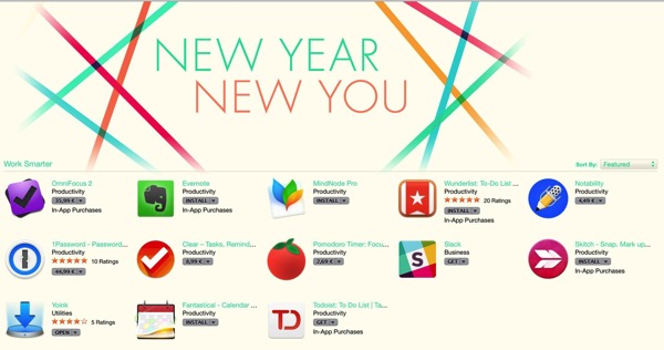
Apple Feature

and received nice reviews on TUAW,Ā Cult Of MacĀ and lots of others.

Working with Alex KƤƟnerĀ again has been a blast, but I knew it would be, coming off of Transloader, where he did excellent work as well.

Now we’re working on Briefly for iOS, which will be available later this year for iOS 7.

Thank you for reading,
Take care,
Matt

[twitter-follow screen_name=’eternalstorms’ show_count=’yes’]

Ā 

Read more

NewImage

Presenting Yoink 2.0

Screenshot of MarsEdit

Ā 

Ā 

Ā 

Ā 

Ā 

Ā 

Ā 

Ā 

Ā 

Ā 

A picture usually says more than a bunch of words.

What is Yoink?

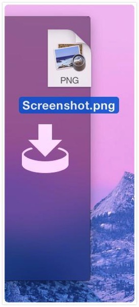
Yoink is an created to make “drag’n’dropping” files easier.
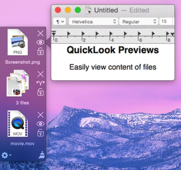
It shows a “shelf” when you start dragging files or content from applications so you can drop them onto Yoink. This way, your mouse is free for you to move between Finder windows, apps, spaces, fullscreen applications, etc.
Once you are where the files are supposed to go, you can drag the files out of Yoink again to drop them to their destination.

What’s new in version 2.0?

I got a lot of feedback on Yoink 1.0 from customers (thank you very much, by the way) and the changes you see in Yoink 2.0 are a direct result of it.

As you can tell from the image above, there’s a new look – done by the very talented Dietmar Kerschner.

Secondly, you can finally drop content from application onto Yoink – meaning images, text passages or links from within websites, for example. Or files on a server from the FTP client Transmit.

Also pictured in the image image above is a file stack. New in Yoink 2.0, when you drag multiple files onto Yoink at once, they’re not separate items in the list but just one item so you can easily drag them out at once again.

I’ve added a hotkey so you can manually show Yoink’s window so you can drag files from a Dock’s stack or applications like iTunes or Adobe Bridge that don’t trigger Yoink’s window for technical reasons – they use a non-standard NSPasteboard instance to do their dragging duties.

There are four new positions available – left, pinned to the top, left, pinned to the bottom, right, pinned to the top and right, pinned to the bottom (additional to the already existing left center and right center).

Availability and Pricing

Yoink is available exclusively on the Mac App Store for $2.99. But as usual, there’s a free, fully functional 15-day trial available at Yoink’s website (direct download). There’s also a quick screencast that shows exactly what Yoink does, and how it does it.

Feedback Appreciated

I really appreciate your feedback, input and criticism, so please do not hesitate to write me if you have any comments on my apps. Thank you kindly šŸ™‚

[twitter-follow screen_name=’eternalstorms’ show_count=’yes’]

Read more

YoinkIcon

Presenting: Yoink – taking the drag out of drag and drop

Functionality

Have you ever tried dragging something from, say, Finder, to a fullscreen app in Lion? It’s a pain. This is where Yoink comes in. Every time you start dragging a file, Yoink shows a window you can drag those files to. Then you just switch to the space or fullscreen app you’d like to drop the files to and drag them out of Yoink to the app. Very simple. There’s a video on the website which does a pretty good job at explaining what Yoink does, exactly.

The idea behind Yoink

The idea came to me while trying to drag a file from Finder to a new message in fullscreen Mail.app. I just couldn’t do it. Then I tried to drag images from Finder to Xcode in fullscreen. Not very easy either. Thus, Yoink was born.

The name

The original app for this little app was DragHelper. Yes, I know – why did I ever change it?
Well, I was watching the Simpsons, in the episode where Bart takes the last Doughnut or bearclaw or whatever it was from Kent Brockman’s plate by exclaiming “Yoink!” (to which Brockman asks himself: Yoink?!?) and I thought – that’d be a great name for an app that “yoinks” the dragged files.

Why Lion only?

The main reason is because I didn’t see the problem on Snow Leopard. The other reason is that I really wanted to try out the new NSTableView view-based APIs šŸ™‚ They’re very nice and shiny.

The menu bar icon controversy

The number one request I get from customers is to put in an option to remove the menu bar icon (the black down arrow). Well, I didn’t want it in there in the first place.
The first time I submitted Yoink to the Mac App Store, it got rejected because it didn’t have a way to quit the app if Yoink’s window wasn’t visible (the rejection note stated (somewhat paraphrased) “The app can’t be quit if the window is not visible”).

So I thought to myself: what’s the least obtrusive way to make it quittable at any given time _without_ putting an icon in the menu bar. Because why for the sweet love of God would Yoink need a menu bar icon? It’s a background app, for crying out loud.
So I put in a global hotkey for quitting Yoink and made it clear in the splash screen. Submitted it again.

Another rejection followed. This time, the rejection note stated “There needs to be a menu bar or an application menu or a status menu to include a quit item” (why this wasn’t stated in the first rejection is beyond me, but to err is human, and I’ve erred quite a couple of times, so I’m not complaining). Since it’s a background app, the first two were not possible, since background apps do not have their own menu bars – the only thing that was left was the menu bar icon. So I put it in there, and that was that.

Since I was pressed for time, I didn’t implement an option to hide the menu bar icon, but believe me, the upcoming update will include such an option. As I said, I don’t want that menu bar icon either. I just don’t see it make any sense.

The no launch on login controversy

The second most requested feature was to add a “Add to login items” button in Yoink’s preferences.
I tried to implement it, but in the sandbox environment of Lion, in which Yoink is running, it is currently not possible to do. I’ll have to wait until Apple fixes this until I can implement it.

Pricing and availability

Yoink is available exclusively through the Mac App Store for $2.99/ā‚¬2.39. A free 15-day trial is available at the website (direct download link)

As always, I very much appreciate your feedback, bug reports and feature requests, so please keep them coming šŸ™‚

Thank you and enjoy,
Matthias

Read more