dock

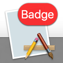
An app icon badged with 'Badge'

A recent conversation I had with Jeff Johnson (of ClickToFlash fame, @lapcatsoftware on twitter) prompted me to look into how badging an app’s icon in macOS’ Dock works.

There were a couple of questions that needed answering:

  • Does badging happen automatically when sending an NSUserNotification?
  • If not, how do I apply a badge to my app’s icon in the first place?
  • How do I retrieve and respect the user’s Notification settings for the app in System Preferences?

Automatic Badging by Sending a NSUserNotification?

NSUserNotification Notification

Nope, automatic badging doesn’t happen. Even though System Preferences -> Notifications suggests that badges and notifications belong together, in code, they’re separated.
That means you have to add the badge to your app’s icon yourself. Also, you need to keep track of whatever number you want to display with the badge and update or clear it at appropriate times.

For example, Mail.app uses the badge to display the amount of unread eMails you have. The badge doesn’t clear when you activate Mail and only decreases when you mark mails as read.
Transmission, on the other hand, informs you about how many downloads have finished since you last had the app active. Once you activate the app again, the badge gets cleared and re-starts from zero.

How to Badge the App’s Icon?

Badging is straightforward:

NSApp.dockTile.badgeLabel = @"Badge";

Please note that putting text into the badge is not a good idea – I did it here just for fun, but text in the badge is very limited and if you have a longer string, what you’ll end up with is something like “A….z”.
It’s best to stick with numbers.

Respecting System Preferences’ Notifications Settings?

If you only use badges (without notifications), you’ll notice your app is missing from System Preferences’ Notifications preference pane.
That can pose a problem, because now you either have to create your own user-setting for badges or the user will have no way of turning them off.
The trick, then, lies with NSUserNotification. Not in the API itself, but in two crucial steps:

  1. Code sign your app.
  2. Add this key-value pair to your Info.plist: NSUserNotificationAlertStyle with a string value of either banner (recommended by Apple) or alert.
    Supposedly, there’s another value, none, but that hasn’t worked for me yet – the app won’t appear in the Notifications preference pane.

Having the key-value pair in your Info.plist has no downside if you don’t use NSUserNotifications. There’s only the upside of having the user be able to disable your app’s badges if they like.

Now that the user can change the setting for your app’s badges, how do you read it out to see if you should badge or not? It’s easier than you think: you don’t.
Just like the system doesn’t show your NSUserNotifications if the user has disabled them for your app, the Dock simply doesn’t display your badge if the user has disabled it in System Preferences.

All you have to do is keep track of the number that should be displayed in the badge, and that you update or clear it at appropriate times.
For example, you might not want to have the badge visible when the user quits your app, so you could set -badgeLabel to nil in -applicationWillTerminate:.

By the way, if you ever need to reset System Preferences – Notifications for your app (or all apps), there’s a nice how-to on stackoverflow.

Happy badging 🙂

Update: Jeff Johnson follows up with some more tips and tricks about NSUserNotification in this blog post.

Eternal Storms Software Logo

– – – Do you enjoy my blog and/or my software? – – –
Stay up-to-date on all things Eternal Storms Software and join my low-frequency newsletter (one mail a month at most).
Thank you 🙂

Read more

Yoink

The Feature Request

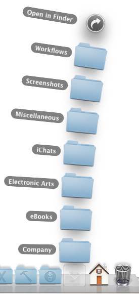
One of the most requested features for Yoink is being able to drag files from a Stack in the Dock to Yoink’s window. It sounds very simple and were I not the developer of this app, I myself would ask why Yoink hasn’t been able to do that from version 1.0.

Sadly, it’s not that simple.


stacks in dock

The Problem

For a reason unknown to me and maybe even a few people at Apple, the Dock does not use the general NSPasteboard used for dragging (NSPasteboard is responsible for being able to copy, cut and paste content from one document to another, but it also handles file drags, most generally with the NSDragPboard type).

No, the Dock uses a custom NSPasteboard for dragging (probably using NSPasteboard’s -pasteboardWithUniqueName method). The thing is, NSPasteboard doesn’t keep a public list around (and I don’t know of a private one, either) of the names of these unique pasteboards, which makes it impossible to check if a drag occurs on those uniquely named pasteboards.

This is not only the problem with the Dock, but also with iTunes – it also uses a unique pasteboard for its drags.

The Solution(s)

The thing is, even though the Dock uses a private pasteboard for its dragging handling purposes, if the Yoink window is visible, it still recognizes those drags. Which is a good thing, because knowing that, I can look for a solution.

As I see it, there are two possible solutions to this problem:

Possible solution #1: Have a hotkey to force Yoink’s window to show.

Although I like it, it does have its drawbacks. For starters, while you’re dragging with one hand, you don’t want to have to press a complex keyboard shortcut with the other. Many people I know use two hands to press shortcuts, so it would have to be an F-key, maybe. But pretty much all F keys are taken by default, and if not, other applications use them.
It’s more obvious than the second solution, but also harder to do while dragging.

Possible solution #2: Have hot corners or hot areas to drag to to force Yoink’s window to show

This one brings up several questions:
Should all corners be hot?
Should the user be able to define them?
Should it be corners only or should it be the entire edge of the screen?
And once the user drags an item to the hot corner to show Yoink’s window, they still would have to drag it from the corner to the window. So it’s a longer way for the mouse.
And of course, in those corners, files can’t be dropped. They corners would be small areas, yes, and even if it’s a rare case that you’d want to drop in a corner (I don’t think I’ve ever done it), it’s still a possible case.

The Decision

I’m leaning towards using hot corners, it kind of feels more natural to me for Yoink.

I’d like to implement hot corners in all four corners of all of your screens. And whichever hot corner you use, on that corner’s screen’s edge the Yoink window will show for you to drag to.

What do you think? Does that make sense? Please leave a note in the comments below, it means a lot to me 🙂

Addendum: General state of Yoink

Aside from the issue above, the next update for Yoink is coming along nicely.

x) Yoink will allow the creation of clippings (when you drag a selection of text out of an application), accept items from your Browser (images, text, links) or drag out pages of a pdf file in, say, Preview – Clipping Creation Video
x) You’ll have the option to collect several files dragged at once into one item in Yoink (here a video which explains it far better). This way you can more easily drag out several files at once. And yes, there’ll be a button to split those “file clusters” up again 🙂
x) I’ve also added new position options for Yoink’s window – not only can you put it on the center right or left edge of your screen, but also the top or bottom right and left. I didn’t implement the top center or bottom center (where the Dock is by default), because Yoink uses a tableview to display its items, and tables are based on rows, one below each other. That doesn’t work if the window is not vertical but horizontal.

The Decision – [UPDATEd]

Even though I stated above that I’m leaning towards hot corners, after a good night’s rest, I’m now more and more for a hotkey instead of hot corners.
First off, it is far more obvious for users since there’s a preference for the hotkey. The hot corners would be just there, whether people knew it or not.  Also I believe the principle of hotkeys is better known than hot corners, but don’t quote me on that.
Additionally, a hotkey would give the user the benefit to be able to hide Yoink’s window even if it’s got files in it, which has been another requested feature.

The more I think about it, a hotkey does make more sense. Wouldn’t you agree?

Thank you and take care,
Matthias

Read more