app

icon most likely not final

ScreenFloat 2 has officially entered “production”.
Apart from a bit of prototyping of various new features over the last couple of months and years, not a lot has happened in regards to ScreenFloat. But I feel now is the time to finally get it done.

ScreenFloat lets you keep visual references to anything you see on your screen floating above other windows using screenshots. It’s also a screenshot organizer.

Disclaimer: Estimated Time of Arrival, Pricing

I don’t do ETAs for my own products.
I’m a solo developer, I have multiple apps that need maintenance and updates, there are just too many moving parts for me to be able to estimate basically anything. And while that may be a serious lack of managerial skill: I accept that flaw and ignore it 🤷‍♂️.

Regarding pricing, I don’t know what ScreenFloat 2 will cost yet. But I am resolved on its upgrade path: existing customers of ScreenFloat 1 will receive ScreenFloat 2 for free.

About this Journal

I thought it would be fun to chronicle my progress, struggles, successes, failures, struggles, failures, break-throughs, failures, and random stuff while developing ScreenFloat 2. That’s all.

Fundamental Decisions

Before I can start coding, there are a few decisions I have to make in order to be clear on where I want to go and what I want to achieve.

Decision 1 – Build on ScreenFloat 1’s code base, or start from scratch?

I began work on ScreenFloat 1 on March 11th, 2010.
Memory is still managed manually (for you youngster coders out there: google retain / release to know what I’m talking about).
Objective-C’s @property wasn’t even available yet back then.
It’s ancient!
In addition, it was one of my first apps, so ScreenFloat 1’s code is all over the place. And while I don’t think code has to be “pretty”, I do think it has to be readable and understandable; ScreenFloat 1 is neither.
So yes, I’ll definitely be starting ScreenFloat 2 from scratch.
Which my next decision factored into…

Decision 2 – Objective-C, or Swift?

Swift, of course. I love Objective-C (it’s got me this far), but I think by now it’s clear that the future is written in Swift. That’s not to say that if there wasn’t Swift, I wouldn’t love to continue working in Objective-C. However, with more and more frameworks being Swift only (for example, Widgets), I need to move on as well.
While this decision is of no consequence to users of the final product – a feature in an app should work no matter what language was used to program it -, it is quite consequential to me.
I began learning Swift earlier this year – my freeware developer tool BackLog is a first result of that – and I’ll continue to learn. For me, the easiest way to do that is “on the job”: to actually work on something I’m going to ship. Two birds with one stone.
Will that increase development time? Possibly.
Is it worth it? I believe so.

Decision 3 – Keep old storage model, or migrate to Core Data?

ScreenFloat 1’s “storage model” was two plist files (one for the shots library and associated metadata, and one for categories the user created in the Shots Browser) and a folder full of image files.
It worked ok, but I’d like something more sophisticated, robust and scalable.
That sounds like Core Data to me.
It’s not a new framework to me (thankfully – it is a lot to learn). I’ve been using it for a couple of internal tools, and for apps I’m maintaining for third parties.

As a side note, I do want to keep the “folder full of image files”. It makes them accessible in Finder, instead of being stored somewhere on disk in an opaque Core Data storage file.

Decision 4 – Core Data with CloudKit, or Core Data with custom iCloud/CloudKit sync?

I recently took to twitter to see what other developers thought about Core Data with built-in iCloud sync. The consensus was pretty much to stay away: it can be slow, very opaque as to what it’s doing, and thus difficult to debug.

Synchronisation is difficult to debug as it is, so I don’t want to make it any harder than it has to be.
Over the years, I’ve gained quite a bit of experience when it comes to syncing with iCloud / CloudKit (I manually sync with iCloud using CloudKit in Yoink for iPad and iPhone and Transloader), so I’m confident I’ll be able to write my own custom CloudKit sync solution for ScreenFloat 2.

Decision 5 – macOS, sure, but what about iOS/iPadOS?

ScreenFloat 2 will be available for Mac, as well as iOS/iPadOS.
So some code (most notably storage and sync) has to be able to run on all those platforms – something to consider going forward.

As with all my other apps, ScreenFloat 2 for Mac and ScreenFloat 2 for iOS will be developed for and tailored to each respective platform mostly separately, and so they will also be sold separately.

That’s it for this time.
Thank you for joining me. Feedback, input and questions are welcome: mail me, tweet me.
Take care! 🤗
Read more

Yoink for Mac, the drag-and-drop improving utility, is now available in version 3.6.8.

What’s New?

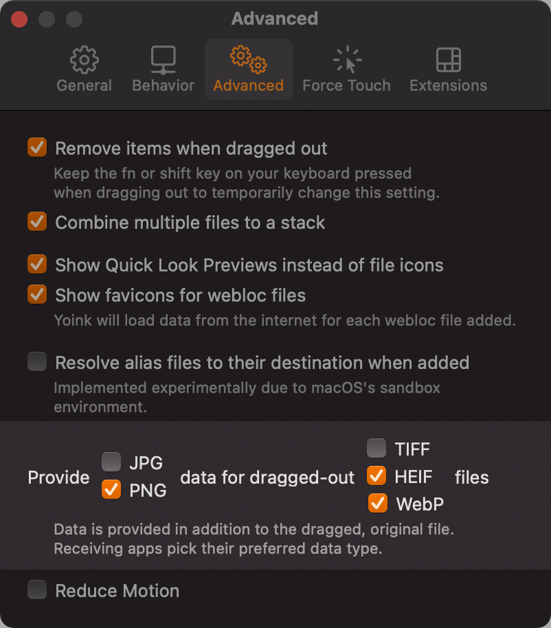
There’s now a preference for having Yoink dynamically provide JPEG and/or PNG data for TIFF, HEIF and/or WebP image files you drag out of it.

I’ve also fixed a couple of bug fixes and made some quality-of-life improvements, like having a dedicated “Pinned Copies” sub-menu in Yoink’s contextual menu’s Clipboard History.

Where to get Yoink

Website (+ free, 30-day demo)
Mac App Store
Setapp

As always, it’s a free update for existing customers of the app.

It requires macOS Sierra 10.12 or newer and runs natively on Apple Silicon and Intel Macs.
Yoink is available in English, German, French, Italian, Simplified Chinese, Japanese, Korean and Portuguese.

Enjoy 🤗

Read more

Yoink for iPad and iPhone's App Icon

Today, Yoink for iPad and iPhone is 3 years old 🥳. Time surely flies when you have… bugs to fix.

It certainly doesn’t feel like three years. It feels like only yesterday, to be honest.
On the other hand, the release process, yes, that felt like it took three years, because I was eager to release alongside iOS 11 (which, due to its drag and drop capabilities, made Yoink for iOS possible in the first place), but there were some serious delays with App Review, who rejected the app multiple times because of its keyboard extension, and later, its File Provider (while other, similar keyboard/FP extensions were apparently perfectly fine and allowed on the App Store. This is my single biggest gripe with App Review – the inconsistencies in rejections. It’s obvious why these things happen, and it’s understandable, but it’s frustrating nonetheless).

But all that’s in the past. Yoink for iOS has been out there for three years now, and it has been doing great – thanks to all of you who use it, leave ratings, reviews or send feedback.
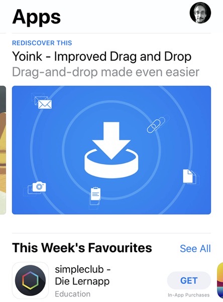
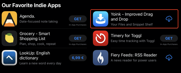
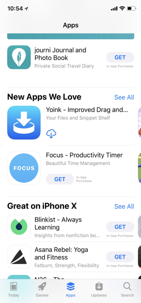
It’s been featured on the App Store on numerous occasions – here are a few examples:

Yoink featured on ios app store

Yoink iOS App Store Feature  17 09 2020 14 39 25

Yoink iOS iPhone App Store US Feature  07 12 2017 13 06 01

So thank you all for three amazing years. Let’s hope for many, many more 🤗

P.S.: Keep an eye out on my social channels (twitter | facebook | linkedin), as I’ll be posting a few promo codes there!


– Matthias
mail | website | twitter | instagram | facebook

Read more

Here’s an update on the state of my apps regarding macOS Big Sur and Macs with Apple Silicon.

In short: All my apps are ready for both, and the updates mentioned below will be released when macOS Big Sur is available at the latest (depending heavily on App Review and whether or not macOS Big Sur’s release is going to be the same, fun catastrophe of a surprise as iOS 14’s).

Let’s get into a little more detail.

Yoink for Mac (website | Mac App Store)

Yoink 128 2xFor Yoink – your file shelf that simplifies and improves drag and drop on your Mac –, all I had to do to make it fit nicely within Big Sur was to resolve some UI issues.
Recompiling for Apple Silicon went without further intervention on my part.

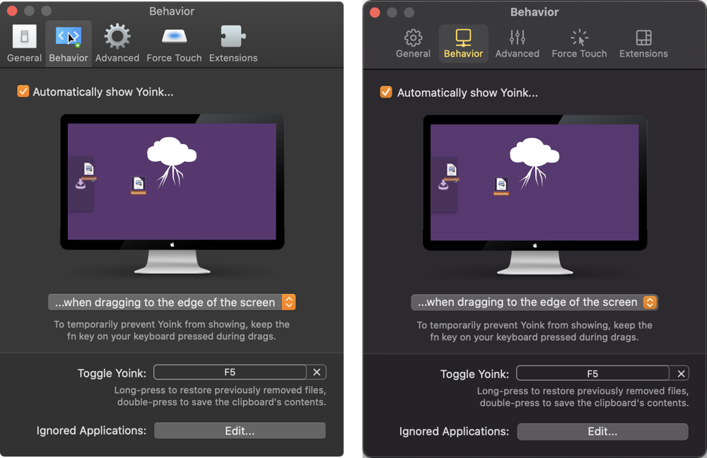
– Firstly, I updated the preferences window to the new style (which you can read more about here).
2

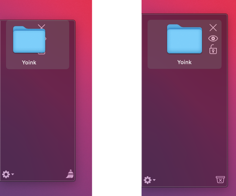
– Secondly, macOS Big Sur introduces larger insets for most (if not all) of its scrollable views, so I’ve had to make Yoink’s window a little wider to make everything fit nicely again, while maintaining the new inset and selection look.
1

– Last but not least, I asked Alex Käßner to update Yoink’s icon, and he certainly delivered (see above).

ScreenFloat (website | Mac App Store)

ScreenFloat for Mac App Icon

For ScreenFloat – which lets you create floating screenshots to keep almost anything visible in whatever app, space or window you are – my priority was to get it running natively on Apple Silicon and fix the most glaring UI issues on Big Sur (like the preferences window, again).
A bigger update is in the works, so my attention goes into that, but I wanted to make sure that – until the big update drops – it’ll run as efficiently and well as it can.

flickery (website | Mac App Store)

flickery for Mac App Icon

flickery – a full-featured client for flickr – will run natively on Apple Silicon and received, like ScreenFloat above and the apps below, a minor face-lift of its preferences window.
I’ve also had to remove QTKit (which I mostly did with a previous update of the app for macOS Catalina – but some more references I had kept around came up as an error in Xcode, so those had to go as well).
It was used to allow the user to edit videos before uploading them. It’s gone for the time being, but there are plenty of free tools (including QuickTime Player) that can step up here for the user in the meantime.

Transloader for Mac (website | Mac App Store | iOS App Store)

Transloader for Mac App Icon

Transloader – which lets you start downloads on your Mac remotely from your iOS device – also will receive a minor update. I had to remove some shadows from texts so it would look nicer in Dark Mode (and who does shadows nowadays anymore, anyways…).
I’ve also had to update its use of CloudKit, because some APIs were deprecated and replaced (in particular, I was using CKSubscription instead of the newer CKQuerySubscription). In the end, it was easy enough.
Transloader 3.0 is still in the works (some bits of progress you can read about here, here and here), so, like with ScreenFloat, I wanted to make sure it runs on macOS Big Sur (and natively on Apple Silicon) until the bigger update is available.

Glimpses (website | Mac App Store)

Glimpses for Mac App Icon

Glimpses – an app that lets you effortlessly create still motion videos – will receive a more substantial update.
After I fixed a glaring UI issue where the progress bar that Glimpses shows for the render progress was almost invisible, I gave the video creation algorithm an overhaul, which makes it up to 4x faster than before, which I’m really happy with. Multi-threading ftw! The app, too, will run natively on Apple Silicon.

SiriMote (free, website)

SiriMote for Mac App Icon

SiriMote didn’t require any UI fixes for Big Sur, but v1.3.9 which I recently released fixes a couple of connectivity issues – and already runs natively on Apple Silicon!
The app allows you to control your Mac and apps with your Apple TV Siri Remote.

I’m glad I was able to make all my apps ready for macOS Big Sur, and am very curious where things are going with Apple Silicon!

– Matthias
mail | website | twitter | instagram | facebook

Read more