… Did
Worked on Glimpses v2.1 (website, mac app store)
Glimpses 2.0, I’m petrified to say, was released and then not updated again on June 7th, 2015 – that’s more than a year ago. An update has been overdue for quite some time.
In version 2.1, I focused on bringing the app up-to-speed concerning the integration with macOS – mainly, the Photos.app.
Version 2.1 includes a Share extension so photos can be sent from Photos.app to Glimpses right from within the app. Glimpses will also accept drag’n’dropped photos from Photos.app, something that didn’t work before, because Photos.app uses promise file drags.
It also includes a QuickLook plugin, which makes identifying project files easier. Photos can now be shuffled and edited in external editors.
Of course, Glimpses also includes many improvements where performance is concerned, as well as usability improvements.
I’ve also transferred the app to the base-location system along with AutoLayout. It took a bit of time, but I think moving forward, probably wanting to localize the app into further languages, this will make things much easier.
Glimpses v2.1 will be released early-to-mid-August 2016 as I’m still working on overhauling its website.
Worked on Yoink v3.2.1 (website, mac app store)
I’ve also been working on an update for Yoink – a typical x.x.1 bugfix release.
It includes bugfixes to its Force Touch capability, alias files and a crash when going backwards in the splash screen.
Yoink v.3.2.1 will be released shortly.
Worked on ScreenFloat v1.5.13 (website, mac app store)
This will be a specific update for early adopters of macOS Sierra, where ScreenFloat currently doesn’t take screenshots (I blogged about it, in case you’re interested about what’s going on).
The TL;DR version: I’m using the screencapture command-line utility via NSTask, and interactive screencaptures are apparently blocked in sandboxed apps on macOS Sierra.
I’m not yet sure how I will fix this issue, as I haven’t heard back from Apple yet about it (although I filed a bugreport: rdar://27610157 and contacted Apple directly).
There are two ways this can go: The easy way, and the hard way.
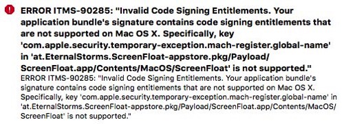
The easy way would mean me adding a temporary entitlement to ScreenFloat so until I can run my own screencapture solution, it will work unchanged for the time being.
The hard way would mean me developing my own screencapture solution right away and make it in time for macOS Sierra’s official public release.
I’ve started working on ‘the hard way’, just in case.
… Downloaded
![]() LEGO Pirates of the Caribbean (mac app store)
LEGO Pirates of the Caribbean (mac app store)
I love those LEGO games, but somehow missed this one when it was released. I recently picked it up and it’s just lovely. Jack Sparrow is as quirky as ever.
![]() Claquette (mac app store)
Claquette (mac app store)
A great screen recorder app for Mac.
“Edit your recordings and share them as Animated GIF/PNG or as movie.”
I had something like this in the works myself (especially the animated GIF part), but it never worked quite correctly using Apple’s built-in tools.
I spoke with Thomas, the developer of this app and a fellow Austrian, some time ago and he told me he developed his own GIF creation code for this app – something that takes a lot of effort and dedication.
It’s all around a great app and can only recommend it!
![]() iPulse (mac app store)
iPulse (mac app store)
A Mac app that shows the system status.
However, I can not for the life of me figure out what all the circles or colors mean. No idea.
![]() Split Screen (mac app store)
Split Screen (mac app store)
Resizes your windows to exactly half of your screen size. Can be practical.
![]() Snip (app store)
Snip (app store)
A cool new game by a developer friend of mine, Thomas, where you have to hit a target by snipping a circular object. Very intelligent design!
You can watch an introductory video at the website.
![]() Pokémon Go (app store)
Pokémon Go (app store)
In my youth, I completely missed Pokémon. It just went by me. Sure, I’d heard of it and watched other people play here and there, but I never played it myself.
It all changed with Pokémon Go, though. My girlfriend and I go out and play almost daily, and it’s really fun. One of us watches the traffic, the other one plays 😉
Sure, I have no idea what these Pokémon are called or what they can do (something my girlfriend can recall before you can even ask her). It’s still fun when you find (and capture) new ones.
I can recommend getting it, but please be safe out there.
 macOS Sierra beta (public beta, website)
Because of the issues with ScreenFloat, I had to get the macOS Sierra beta. But to not have to install the beta over my production setup, I had to get a new external hard drive (my two backup drives are, well, for backups, and pretty full).
I originally had my heart set on an external SSD, but they weren’t available. My backup plan was an internal SSD with an external enclosure, but I couldn’t get the enclosure. Then I thought I’d get an SD card for my MacBook Pro, you know, because it’s practical and small. But for the price of a 128 GB SD card, I could have bought a dozen external SSDs, or hundreds of external HDs. So I decided on an ordinary, external HD. For a beta OS drive, it works just fine and it was the cheapest solution after all. Plus, it’s a 1TB drive, so I can put other stuff on there and keep the 128 GB partition for future betas of macOS.
Too bad, though, I always thought I’d install beta systems on an SD card. That’s just so cool.
… Read
Working on Fable Destroyed my Life, but I don’t Regret it (polygon)
“We felt invincible. With Lionhead, Peter Molyneux and Microsoft in your corner, what could go wrong?”
Inside Apple’s Perfectionism Machine (mashable)
“From the beginning, the Mac has been about Apple taking responsibility for the whole thing: hardware, software, how applications can work and, increasingly, Internet services”
Why it’s Time to go Back to the Moon (theverge)
“It can teach us about interplanetary living, just as the International Space Station has taught us about life in space.”
Apple’s ‘Differential Privacy’ is About Collection Your Data – but not Your Data (wired)
“Differential privacy is a research topic in the areas of statistics and data analytics that uses hashing, subsampling and noise injection to enable…crowdsourced learning while keeping the data of individual users completely private.”
The macOS Sierra Developer Preview: Different Name, Same ol’ Mac (arstechnica)
“But the Mac feels like it has settled into a quiet and reliable groove, a groove that Sierra is happy to trundle along in.”
Physicists Simulate Sending Particles of Light Into the Past, Strengthening the Case that Time Travel is Possible (earthmysterynews)
“One aspect of general relativity that has long intrigued physicists is the relative ease with which one can find solutions to Einstein’s field equations that contain closed timelike curves (CTCs)—causal loops in space–time that return to the same point in space and time.”
Indiana Jones and the Iron Phoenix: The Lost Sequel to Fate of Atlantis (mixnmojo)
“It’s a title equal parts fascinating and frustrating to learn about, as it seems to have been more or less exactly what Fate of Atlantis fans would have wanted in a successor.”
… Watched
 The Conjuring 2 (itunes)
Just like The Conjuring 1, this is a great horror flick. The only thing that bugged me was some CGI that felt completely out of place, but it was brief, so it was bearable.
Other than that, if you’re into horror movies, go check it out 🙂
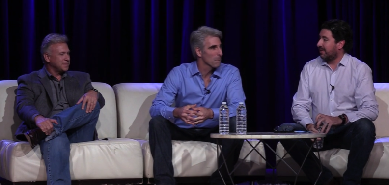 The Talk Show Live From WWDC 2016 (vimeo)
An interview of Craig Federighi and Phil Schiller by John Gruber. Highly recommended.
 Zelda – Breath of the Wild Trailer (youtube)
Can’t wait for this game to come out. I’ve been playing all of these with my cousin, and I’m so looking forward to playing this one with him.
… Ate
 Jerk Chicken with Rice and Corn on the cob
… Went to See
 Britta and I went for a bike ride to ‘Gänsehäufel’, an open-air public bath, went for a swim and then rode back again.
The most I moved in months!

– – – Do you enjoy my blog and/or my software? – – –
Stay up-to-date on all things Eternal Storms Software and join my low-frequency newsletter (one mail a month at most).
Thank you 🙂
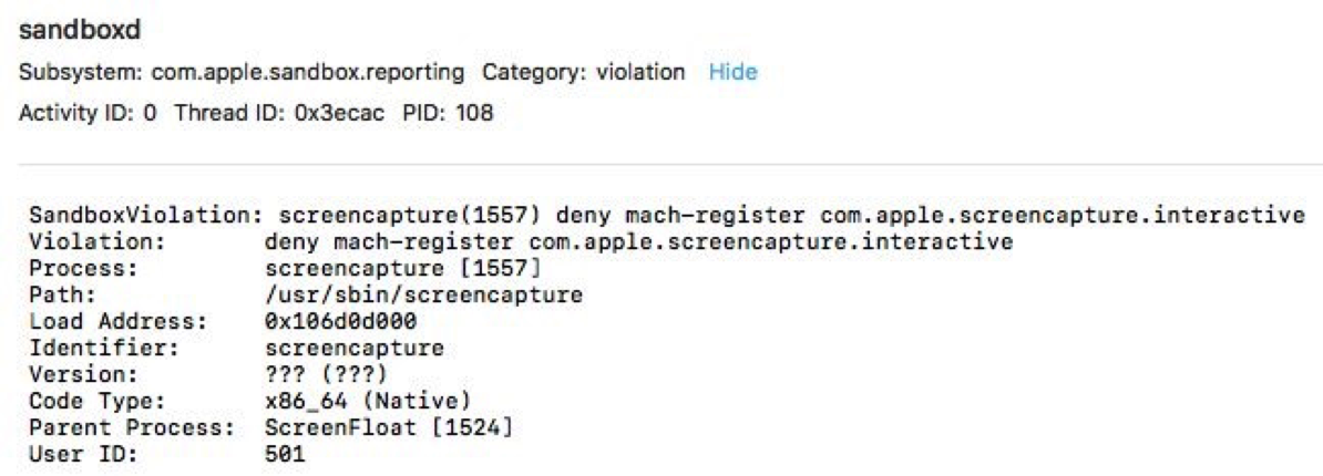 The output in Console.app when trying to launch an interactive screencapture with NSTask.
 Malcolm in the Middle (
 Samosas with Self-Made Tamarind- and Mango Chutney as a starter…
 … and Creamy Tomato-Eggplant-Rice as the main course.
 A family trip to the Prater in Vienna. From left to right: My cousin Alex, his wife Victoria, my girlfriend Britta and me.
 Spicy Mango-Chicken Rice
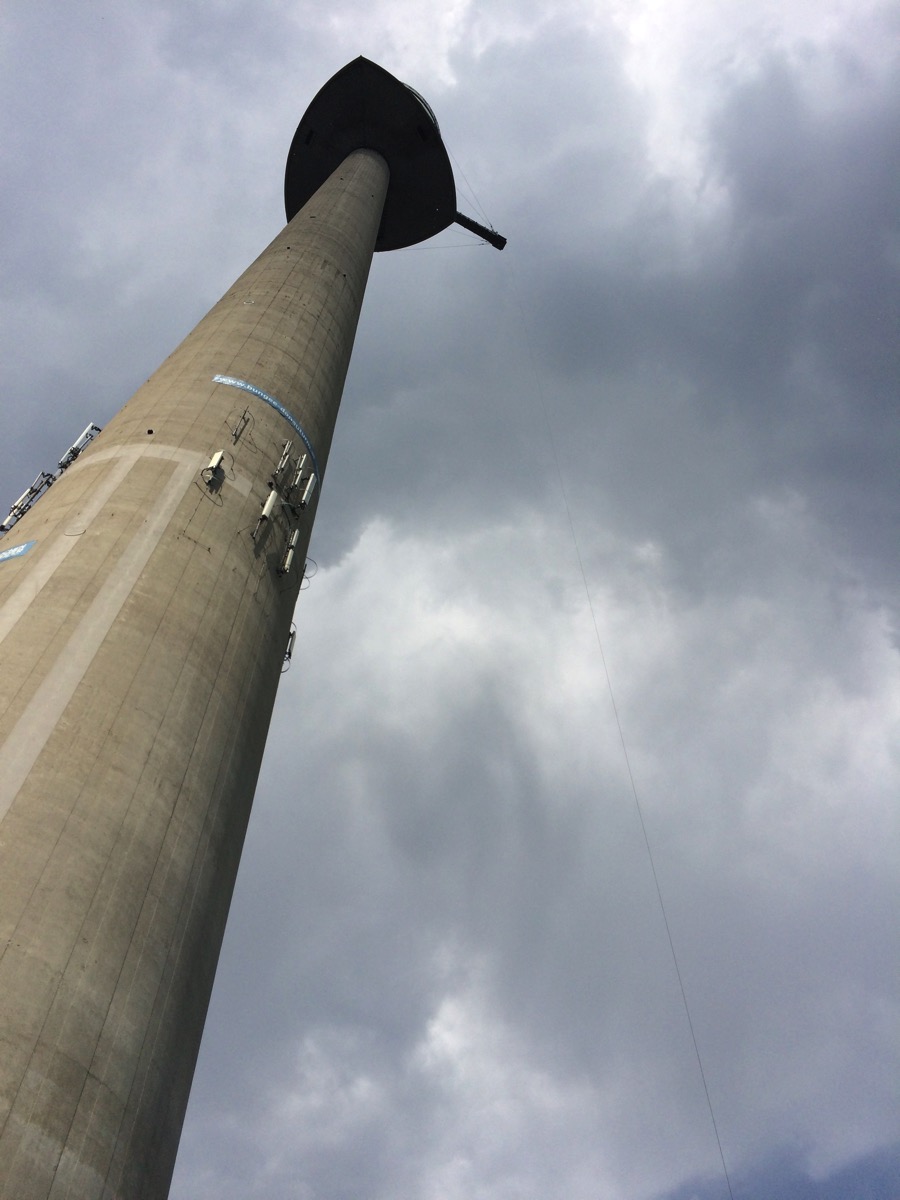 My cousin bungee-jumped off the Donauturm in Vienna, and we all went to see and cheer him on.