… Did
Interview for MacFormat about Metal (click)
Craig Grannell (@CraigGrannell on twitter) sent me and a couple of other developers a couple of questions about what we thought Metal would bring to the Mac. I’m very proud his article starts by quoting me:
Try to imagine riding a bike with square wheels. To move, more effort is required than when using ordinary wheels. This is how Eternal Storms Software founder Matthias Gansrigler describes OpenGL [compared to Metal] on the Mac.
It’s my first interview for a print magazine, my second overall (the first being this piece on the german site MacGadget a couple of years ago about OS X 10.5 Leopard).
Took part in the iTunes Affiliate Links Program (click)
I was told a couple of times now that I should set up affiliate links at least on my webpage, and I finally got around to do it. I don’t expect a lot of profit from this, but in this day and age, and as an indie developer, every bit helps. Setup is very easy and quickly done, so if you have a couple of minutes, I suggest you set up affiliate links as well.
Brought my cousin’s iOS game ‘Reach ZEN’ to the new Apple TV (click)
It’s a simple game, so the interface-conversion was done fairly quickly. Most of the APIs used are available on the tvOS as well (with the exception of social APIs – twitter and facebook).
What took the most time, though, was to make sure the game worked naturally, intuitively with the Apple TV Siri Remote.
The Focus Engine takes a little time to get used to and if you don’t use autolayout, you can forget using UIFocusGuide to aid the Focus Engine in finding the next UI element that should be focused.
Most buttons you see in ‘Reach ZEN’ are a custom class to draw the line animation, so making them focusable was fairly easy – changing the color to white if selected or a dark purple if not.
It’s a fun platform to develop for, and I’d like to implement multiplayer into ‘Reach ZEN’ at some point when I have some spare time.
The Apple TV is a very nice platform, I think, and the stuff that’s appeared on its App Store thus far looks very promising.
Anyway, ‘Reach ZEN’ is $0.99 on the App Store – and one download gets you the game for iPhone+iPad+Apple TV. I hope you enjoy – the Apple TV app will be available this or next week 🙂
Wrote about Pairing the Apple TV Siri Remote with the Mac for Testing Purposes (click)
Speaking of the new Apple TV, I figured out how to un-pair the Apple TV Siri Remote from the Apple TV and pair it with the Mac so it can be used in Xcode’s Apple TV Simulator, which is very nice if you’d like to quickly test some stuff locally.
Bought the Magic Trackpad 2 (click)
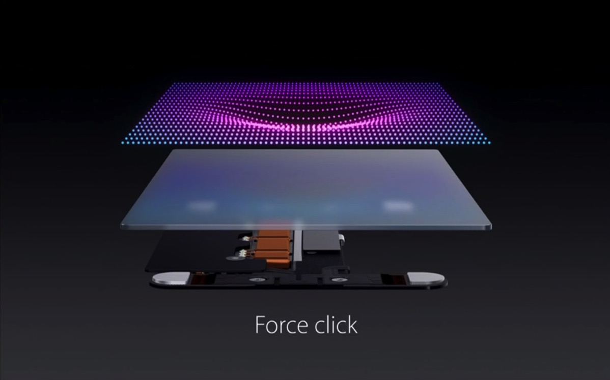
As soon as Force Touch arrived in the new MacBook, I’ve been wanting to do something with it. However, purchasing a new Mac just for a new Trackpad seemed a little over the top for me, so I kept hoping Apple would release a refreshed Magic Trackpad, which it thankfully did.
It’s a very cool device, it’s much larger than the previous one (I saw a picture online that compared its size to the iPad mini’s screen, and it’s almost identical), easy to the touch, very smooth.
I like the haptic feedback when fast-forwarding or rewinding in QuickTime – that’s just something you need to experience for yourself to really grasp how (r)evolutionary this is. I can’t see myself ever going back to a non-Force-Touch trackpad.
What astounds me is that the revised Magic Mouse didn’t get Force Touch. Just as much as it baffles me that the new Magic Keyboard didn’t get the butterfly mechanism for its keys.
So in an effort to exchange my wired equipment for wireless hardware (mouse and keyboard, primarily) I got my brother’s (old) Magic Mouse (which works just as well as the new one, just with batteries, imho) and I’m planning on purchasing the new Magic Keyboard (or the old one, if there’s a good deal somewhere). I believe I’ll miss the number pad of the USB keyboard, though. It is pretty comfortable.
The new keyboard is pretty close to what I remember the MacBook’s keyboard’s keys felt like – and I liked it (I had a chance to test it at Saturn last week). But it’s not enough to convince me to shell out 50 bucks more.
Force Touch in Yoink (click)
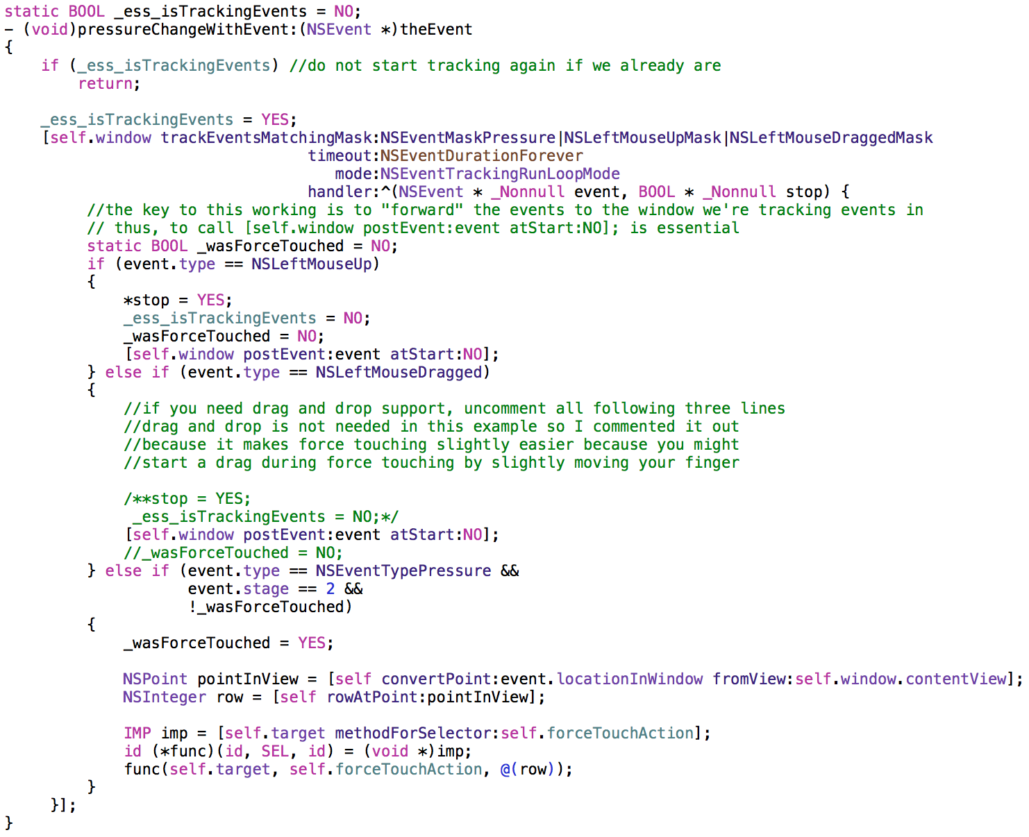
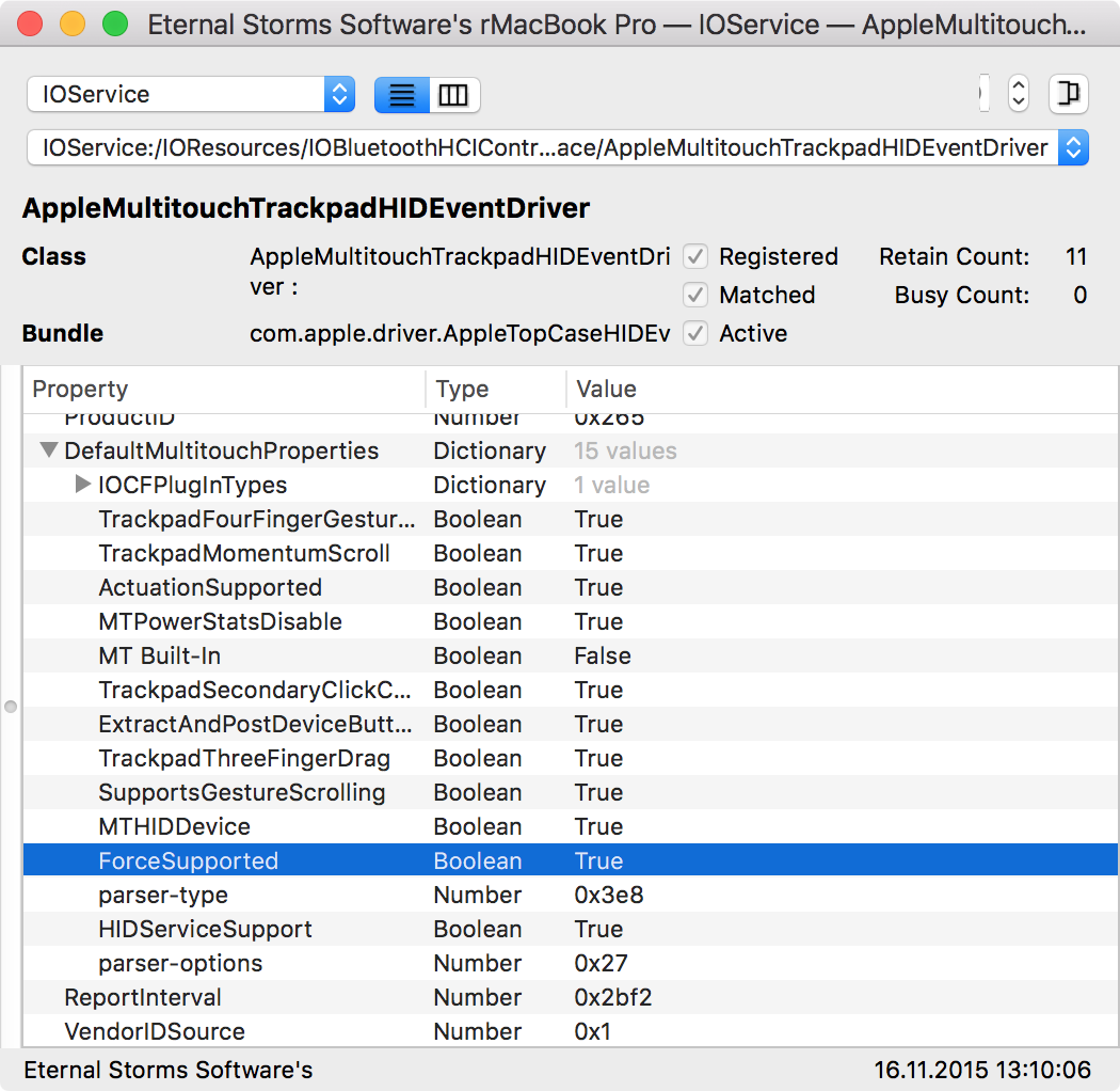
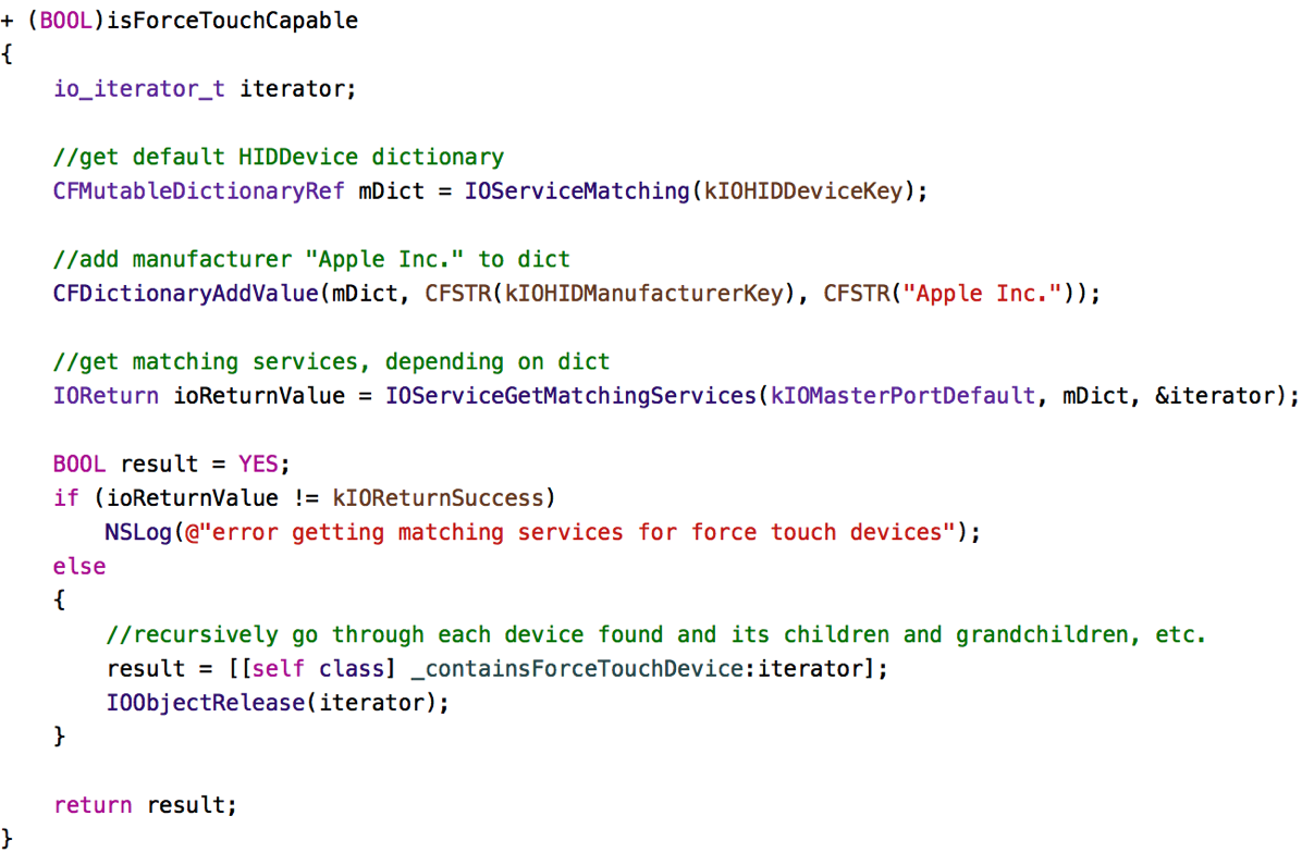
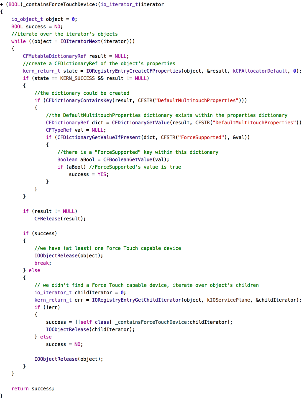
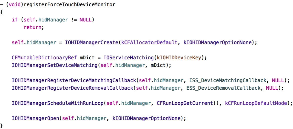
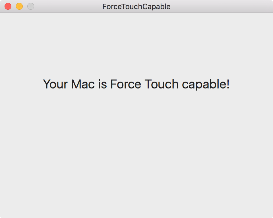
À propos the Magic Trackpad 2, Yoink is the first app of mine that I’d like to make use of Force Touch. In what turned out to be an odyssey of a couple of weeks, I finally found out how to receive Force Touch events from an NSTableView (something that – one would think – would be easy to do, but it’s surprisingly convoluted and opaque).
In Yoink, force touching on a file will select all files to allow for easily dragging them all out at once. For now, a double-click with the option key pressed could be used, but I think Force Touch will feel more natural.
I’m also experimenting with haptic feedback, that you feel something when your drag enters Yoink’s window. I’m not convinced completely yet, but perhaps it will be an option soon.
Updated ScreenFloat to v5.1.12 (click)
As a minor update, it fixes a potential crashing bug when opening the Shots Browser, incorporates the new About panel and adds the ability to quickly create a new shot from the menu not having to dig down to the submenu but clicking on the containing menu item instead. It’s a minor thing, but it makes it a little bit faster to take a shot when not using the keyboard shortcut.
For version 2.0, naturally, with a new device like the Magic Trackpad 2, a lot of use cases come to mind, but that’s still a little time off. Plus, Force Touch is no where near being a mainstream input possibility, so that’s always something to keep in mind. In a couple of years, sure, everyone will have it, but right now, it’s very, very ‘niche’.
 Bought a new coffee machine
After my coffee maker bit the dust right after it’s warranty expired, I had to get a new one, and this time, with a milk frother. It’s coffee 2.0 – so good. Makes me feel like I lived in the dark ages before.
… Downloaded
 OS X 10.11 El Capitan (click)
I don’t understand why Apple’s new version of OS X currently holds an average rating of 2½ stars – that seems very low to me.
To me, this update has been nothing but a breath of fresh air and brought new life into my retina MacBook Pro from 2012. The UI is much smoother (in Yosemite, three windows open and Mission Control would lose frames any place it could).
 Plex (click)
A natural addition to the new Apple TV. Be sure to get it.
 Lara Croft GO (click)
A marvellous puzzle-platforming-game, very nicely executed. Would be interesting to see it on the Apple TV, but for now, it’ll have to do on the iPad (which is also very nice, by the way). When I first downloaded it, I played an hour straight and had a hard time putting it down.
 Beach Buggy Racing (click)
Something to test the new Apple Siri Remote with and it’s just plain fun, though controlling with the remote’s tilt-control took me a while to get used to (I also never got used to tilt-controls on the iPhone or iPad – I always switched to button controls where available). For some reason, on the Apple TV, it works better for me. Probably because the screen doesn’t turn with me turning the remote. That’s what always bugged me with tilt-controls.
… Read
This time without a synopsis on my part as I’m pressed for time – my apologies. But the titles give you the gist of it anyway.
Why Apple Is Still Sweating The Details on iMac (click)
Lessons Learned with 3D Touch (click)
How Pixar Changed All The Rules To Make The Good Dinosaur (click)
Perfect Smooth Scrolling in UITableViews (click)
On Apple’s Incredible Platform Advantage (click)
Apple TV, iPhone, iPad: Best Controllers (click)
… Watched
It’s been a busy month, movie-wise. A lot of interesting new movies came out this month here in Austria and my girlfriend and I were trying hard to catch up 😉 And it’s not over yet – The Hunger Games Finale, The Good Dinosaur, Star Wars… Pretty busy this year.
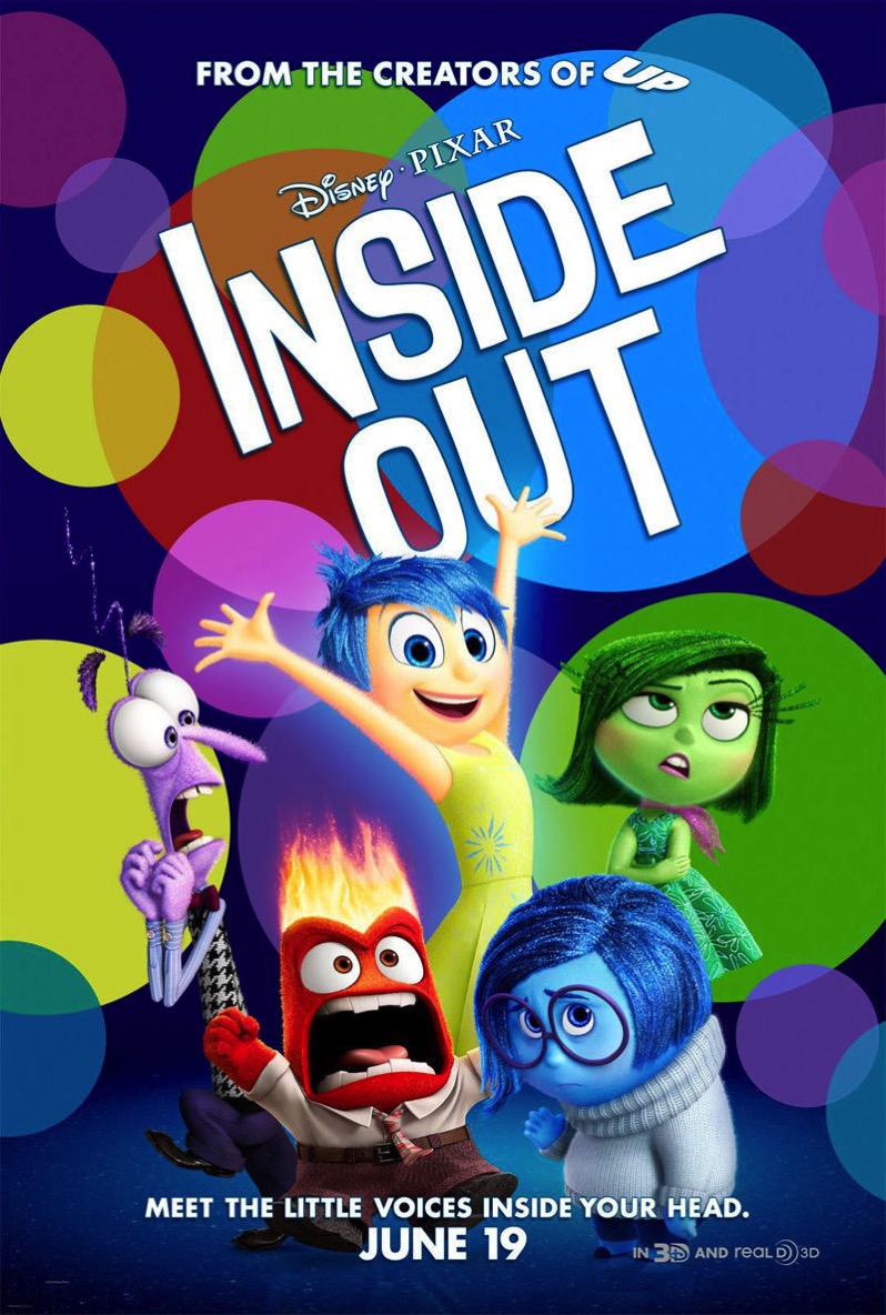 Inside Out
Another Pixar masterpiece. My favorite remains Monsters, Inc. for now, but Inside Out makes for a good second, maybe third place in my personal ranking. They do try to make you cry a little too hard at the end there, but it’s a movie about emotions, so that’s to be expected. The imagery is amazing and the cast does an amazing job voicing Joy, Fear, Disgust, Anger and Sadness.
I’m wondering what took them so long to release it in Austria, though. Usually, these movies are released worldwide at the same time. They seem to be able to do it with The Good Dinosaur… Weird.
 Crimson Peak
An OK movie with a story not strong enough to really hold my interest. The cinematography and sets were amazing, though. A lot to see, for sure.
 The Visit
M. Night Shyamalan is back, with a great, pretty scary movie. And it wouldn’t be a Shyamalan movie without a twist. What it is? Go see yourself 😉
 Paranormal Activity – The Ghost Dimension
The thing about the Paranormal Activity movies that made cold sweat running down my skin was you never really got to see what actually haunted people. This changes in this (apparently final) movie of the series and takes away a certain je-ne-sais-quoi. It’s still scary, but not as primal-scary as the first couple of movies. Nevertheless, it’s a good conclusion to the series.
A Developer’s Honest Take on His Team’s Failure (click)
Remember that game that would end after a certain amount of people died in-game? Hear what went wrong, and what went right.
… Ate
 Wok
Wok
 Yum. Just sayin’
![]() Yoink
Yoink ScreenFloat
![]() Transloader
Transloader![]() Glimpses
Glimpses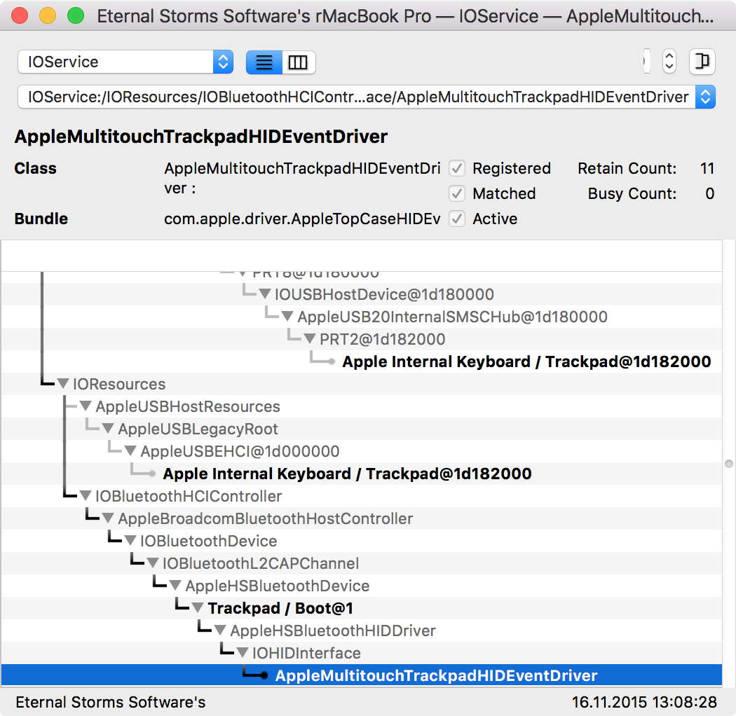

 Bought a new coffee machine
 Plex (
 Lara Croft GO (
 Beach Buggy Racing (
 Inside Out
 Crimson Peak
 The Visit
 Paranormal Activity – The Ghost Dimension
 Wok
Wok Yum. Just sayin’