Apple

Last year, I started using the iTunes Affiliate Program.
The program allows you to make a little money by linking to your apps with your affiliate token and lets you track where clicks and purchases come from, as well.
I thought it’d be interesting to do a little retrospective, now that a year has gone by.

Using Affiliate Links

Turning an (Mac) App Store link (or almost any other iTunes – based link) into an affiliate link couldn’t be simpler.
All you need to do is append your affiliate token (like &at=your_token).
Additionally, you can provide context with your links so you can track them more easily later on.
For instance, I “tag” my links with “twitter”, “facebook”, “blog”, “website”, “newsletter”, “yoinkdemo” and so on.
That makes it very easy to track where your customers come from.

I use affiliate links for every iTunes link I share – be it an app of my own or that of another developer.

Tools and Info

There are tools available to you to make affiliate linking even easier, like John Voorhees’ Blink (for iOS).
I personally don’t use any extra software – I have a note in Notes.app with all my affiliate links and then just change the aforementioned context string.

If you’re interested in an in-depth look at the iTunes Affiliate Program, I recommend you read John Voorhees’ excellent comprehensive guide about it on MacStories.
It’ll get you up to speed on how to set it all up.

Where do Clicks Come From?

A very interesting aspect of the iTunes Affiliate Program is its tracking capabilities.
When someone clicks your link, you know:

  • the country the user is in
  • when the link was clicked
  • the context string you provided for the link (like “website”, “blog”, etc)
Live-View of Clicks on Links

A click presented in the live-view of iTunes Affiliate Program’s dashboard. I can see the click came from the US, and from within Yoink‘s “Demo Expired” window.

Furthermore, it tracks what the user purchased – a Mac app, an iOS app, a song, a book, etc.

Top 5 Countries

Based on the number of clicks, the top 5 countries from where people click on my links are:

  1. United States
    22,498 clicks
    $254.15
  2. Brazil
    924 clicks
    $4.96
  3. Germany
    570 clicks
    $76.70
  4. United Kingdom
    91 clicks
    $46.10
  5. Spain
    50 clicks
    $19.17

Apparently, more clicks don’t automatically equal a higher payout.

Conversion Rates

The program allows you to see the conversion rates for your links.
Who really purchased after clicking my link? Here’s what I found out:

  1. 38.62% purchased an app after clicking a link on my website
  2. 25.70% purchased an app after clicking on the link from the “demo expired” window inside the app
    (I haven’t had the affiliate link in the “demo expired” window in Yoink for the entirety of the year, more like only half a year)
  3. 00.72% purchased something when they clicked on a link on my blog

I can’t be sure what the user purchased – once a user clicks a link with an affiliate token, that token is used for the next 24 hours for that user.
Which means that they might click on a link for Yoink, but don’t purchase it. Then, some hours later, they purchase a book on the iBook Store – that will count towards that link’s conversion rate.

A Year of iTunes Affiliate Program Links

Here’s the gist of my first year in the iTunes Affiliate Program:

  • Clicks: 24,647
  • Items Bought: 4,465
  • Revenue Generated: $ 9791.12
  • Payout: $ 685.38
  • Average Conversion Rate: 18.12%

Granted, $685.38 isn’t a lot, but it’s money I wouldn’t have seen otherwise, and as an indie developer, every bit counts 😉

Eternal Storms Software Logo

– – – Do you enjoy my blog and/or my software? – – –
Stay up-to-date on all things Eternal Storms Software and join my low-frequency newsletter (one mail a month at most).
Thank you 🙂

Read more

One of my biggest gripes with the App Store is not being able to contact customers who leave a review directly.

A tweet by @fafner (developer of the App MindNode) today, August 13th 2014 in which he asked if developers read reviews on the App Store, made me think about this some more.

The one thing I really miss about selling Apps on my own, outside of the App Store, is the contact you have with your customers.
If there was a problem with one of my Apps, they had to contact me directly, since there was no other way. And we could take things from there, have an ongoing stream of communication.

With the App Store, customers are inclined to leave a review of my App with feature requests, bug reports or more general criticism rather than contact me directly. Even though I make it very easy to write me through my website and the Apps themselves.

While I really appreciate every review, there’s nothing more frustrating than getting a review about, say, a request of a feature that, unknown to the reviewer, has already been implemented and not being able to tell them about it (replying to the review with another review of your own app is possible, but there’s little to no chance the customer will ever read it, plus you’d have to rate the App to do so and that opens up an entirely different can of worms (in short: don’t do it)).
Or even worse, you get a bug report and you can’t contact them for more information in order to reproduce it.

What I currently do when this happens is fire up google and search for the reviewer’s nickname – a more than often lengthy procedure. When a Twitter, Facebook, YouTube, tumblr (and so on) account finally comes up, I use that to contact them, well aware it might not even be them – it has happened before that I contacted someone and they were the completely wrong person. It’s embarrassing, but they usually understand and think nothing of it.

It takes a lot of time and nerves that’s only worth it if you have the right person in the end. Otherwise, that time could have been so much better spent.
Additionally, you’re never entirely sure if they check their messages on YouTube, for example.

I understand why the App Store doesn’t allow for direct contact from the developer to the customer. First and foremost, it’s a privacy issue and that’s more important now than it ever was.
Threaded comments on the App Store seem unappealing to me as well plus it could escalate quickly if the customer or developer gets upset for some reason, so threads would have to be curated somehow. Also, other people could chime in in what was meant to be a two-way communication. Unfavorable as well.

Nevertheless, a solution on Apple’s part would be favorable. Actually, I’ve filed bug reports (radars) with Apple on how they could improve this.

They are based on the premise that not the developer initiates contact, but the customer does (and why wouldn’t they want to – they bought the App, they want it to work).

One (rdar://13367865) is to pop up a “Contact Developer” button when a user selects two or less stars for a review on the App Store. It might also be based on keywords (crap, useless, sh*t come to mind ;))
So the user selects one star and before they can click send, another button is shown directly next to it asking the reviewer to contact the developer. Problem solved.

The other one (rdar://13379347) is for crashes. You know how, when an Apple App crashes, you get a text area to supply some more information and send that to Apple?
This could also be done for third-party Apps.
The developer could supply their support email in the Info.plist (a collection of metadata for the App, like version, copyright info, etc) in the App’s bundle.
When the crash happens, you get a crash report window. Additionally to the buttons “Reopen” and “Cancel”, there could be a “Contact Developer” button, if the email has been supplied in the plist. You click it and it opens up a new mail message with the crash report already attached, leaving the possibility for more info (or it is done in-window like the Apple App Crash dialog).

Developers do get crash reports through Apple’s iTunes Connect, but that’s all they get. There’s no contact information attached (again because of privacy issues, of course).

It surprises me that not more work has been done in that area on the App Store.

—-
My name is Matt, and I’m the developer of Eternal Storms Software. If you’d like to comment, you can catch me on twitter here: [twitter-follow screen_name=’eternalstorms’ show_count=’yes’] or by eMail.

Read more

Wwdc13

Image credit: developer.apple.com/wwdc

The Keynote presentation

If you haven’t seen yesterday’s (Monday, June 11th, 2013) WWDC keynote yet, you can watch it here on Apple’s website.

The keynote started with a very inspirational video. It’s a direct answer to recent ramblings about how Apple have lost their drive or stopped innovating and it somehow gave me the feeling it’s a direct successor to the famous “Here’s to the crazy ones“. A mantra Tim Cook doesn’t get tired of sharing any chance he gets – It’s all about the best product they can possibly make.
Watching this video literally made me think “This is going to be a WWDC keynote we’ll remember for quite a while”.

Tim Cook, CEO

seemed very energetic and enthusiastic about what he had to tell us. Frankly, I think it was the best performance from him yet. His voice was also not as ‘whispery’ as usual but a little louder and more profound. He seemed happy to be there and excited to be sharing new stuff (probably because he got tired of all those stupid “What’s Apple going to do next” questions – I’m looking at you, D11 – and finally had to show something new, silencing those questions)
And as a plus, he said “Only Apple could do this” just once which is a plus in my book. At past occasions, I think he overdid that phrase a little.

Craig Federighi, SVP Software Engineering

was, in a word, epic. Drew Wilson nailed it, in my opinion. He’s naturally funny and doesn’t ignore what’s going on around him, reacting to reactions from the audience, which, if not overdone, is a very good thing, loosening up everyone involved.
He’s a natural at giving presentations and he has fun doing what he does. A class act all around. I’d like to see him more often.

The way Craig talked about the textures in OS X (specifically, Calendar) and iOS (specifically, Game Center), I wonder if he played a key-role in Scott Forstall’s ousting.

Here a few quotes, when demoing OS X Mavericks:

“Absolutely no virtual cows were harmed in the making of this user interface.”
“It’s really amazing – even without the stitching, the window still sticks right there on the screen, it doesn’t fall off without the stitching.”

And later, when demoing iOS 7:

“We just completely ran out of green felt and wood – this has got to be good for the environment.”

No, I don’t think Federighi and Forstall were very fond of each other. But what do I know, perhaps he was making fun of himself 😉

Phil Schiller, SVP Worldwide Marketing

was solid and fun, as always. “‘Stopped innovating’ my ass” was, obviously, one of the best lines in the keynote. Seems to me he’s always the one to comment on certain publications in keynotes in a fun way, and that’s what I like about him. He doesn’t ignore those things but addresses them head-on.
Yes, he did mix up Firewire 2 with Thunderbolt 2 when introducing the Mac Pro, but who cares? It’s a new friggin’ Mac Pro!
Phil’s a very down to earth, straight up guy, very sympathetic.

I actually ‘met’ him during the WWDC 2004 Campus Bash – he was eating a taco (they had a make-it-yourself-taco-bar) and I was so stunned he stood in front of me all of a sudden, I just nodded at him and he nodded back. Yes, we’re the bestest buddies now!

He’s even cooler in person.

Roger Rosner, VP Productivity Applications

I frankly can’t remember the last time we saw him in a keynote (if ever), so I can’t really compare this one to previous appearances.
That aside, it was a decent performance, though I feel he lags behind the others – maybe because he hasn’t had too many chances to present at a keynote.
He did seem excited about iWork for iCloud, though, and I hope for his and his team’s sake it doesn’t share the same fate as iwork.com which was in beta for a while and then cancelled without much fanfare. 

Eddy Cue, SVP Internet Software and Services

Also a decent performance and I bet he’s got a new friend in US Senator John McCain.
I wish he had mentioned something about improving iCloud’s key-value storage, though. But I guess that’s something that will be probably handled less publicly at WWDC’s sessions and labs.
It’s nice they’re introducing new services (like iTunes Radio), but their existing services could use some love. Seriously.

The new stuff

Enough about the presenters, let’s talk about the announcements they made.

OS X Mavericks

Oh, that name.

First off, I keep calling it Maverick, as Maverick_s_ seems too “plural-y” to me.
It’s a name like MacBook. I can’t say how much I hated that name. But now, I love it. iBook and PowerBook seem odd to me now, and I think it will be the same with the new naming scheme of OS X.

But right now, I actually would have preferred Sea Lion. Change is hard.

iBooks, Maps on Mac

was just a matter of time. I don’t quite understand why it took so long – I think it might be a marketing thing, to have something exclusive for iPad/iPhone. Create momentum there and bring it back to the Mac to use that momentum some more.

Maps’ ‘Send location to iOS’ is awesome. The interface seems very minimalistic (which isn’t a bad thing), however, after all the textures I was used to from OS X (Mountain) Lion, it looks naked. But it’s just a matter of getting used to it again.

Calendar.app is stripped down to its bare minimum, also – no textures. It looks very nice and will look even better once I’m used to it again.

Multiple Displays

Finally that fullscreen button in the windows’ top right corner is actually usable. With OS X Mavericks, fullscreen is finally the way it should have been from the beginning.
SecondBar got sherlocked as the menu bar is now shown on the second display and the Dock can be summoned there.

AirPlay Display is a very welcome addition, though I do not own an AppleTV. But any way to extend the desktop is very fine by me.

Finder Tabs, Tags

‘Finally’, is all I can say for the tabs. And they will make Yoink more useful as well.

Tags are Spotlight comments taken mainstream. Good move. And an important step in the no-filesystem-direction.

Advanced Technologies

The improvements made on the core of OS X amaze me. It really shows how smart the people working at Apple are.

Timer coalescing and memory compression are great new ways to improve CPU- and memory usage. And even things where you’d think that after 9 releases, there would be no way to improve upon them, were indeed improved upon, like video- and audio playback, which uses up to 35% less energy.

App Nap fits in well with the energy saving ideology introduced in previous OS releases with automatic and sudden termination.

Albeit, it’s not only about saving energy, it’s also about freeing up resources for applications in the foreground that really need them.

It’s great to see so much love for OS X and the Mac again. The advancements and improvements made show that Apple is still very much interested in the Mac and its future. At least for the next decade (both Craig Federighi and Phil Schiller said something about “the next ten years” – though I shouldn’t read too much into that).

On another note, I wonder why some of the icons – or the interface in general –  weren’t changed to be in the same vain as iOS 7’s. But then again, even the iPad (beta) version of iOS 7 isn’t finished yet and I imagine OS X would be an even bigger undertaking. Perhaps there’s another ‘Back to the Mac’ event coming. 

Mac Pro

Speaking of the Mac – Apple finally introduced a new Mac Pro (by the way – if you haven’t seen Apple’s website for the new Mac Pro yet, you really should – it’s very well done!).

And what a Mac Pro it is. It’s breathtaking.

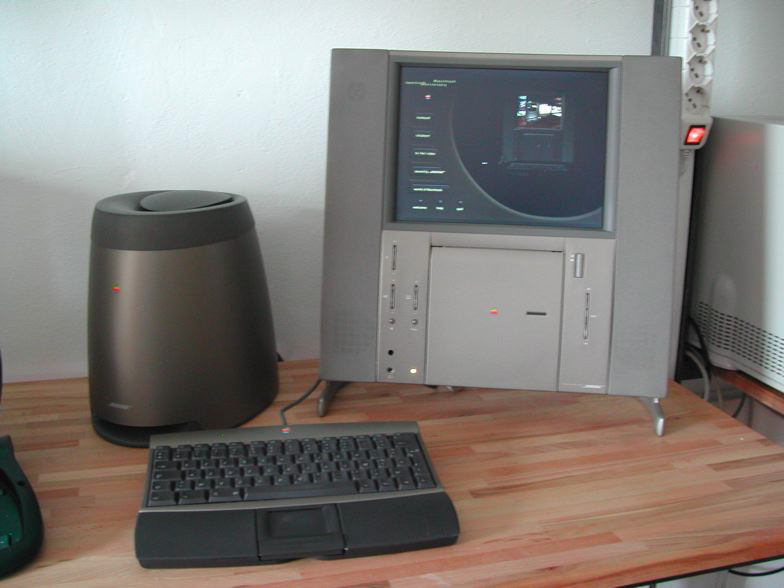
I can’t help make the comparison to the (sadly ill-fated) G4 Cube (and, as pointed out to me by @F451 on twitter, the 20th Anniversary Mac). I think it’s the Cube done right, cylindrically – though I don’t know anything about the price, yet. I just hope it’s priced aggressively.

Phil Schiller said it’s unusual for Apple to show a sneak peek of a future product. But for the Mac Pro, it was the right time.
– Pro customers were getting restless (there was a lot of talk about Apple ignoring the needs of its Pro customers)
– They aren’t sold in Europe anymore
– The last (very minor) update was a year ago and
– I don’t think too many people were buying them anymore.
So the fear of cannibalisation by a future product was non-existent.
This was the right time.

iWork for iCloud

To be honest, I’m not too interested in web apps. I haven’t once used anything on icloud.com or the ill-fated iwork.com beta.
There’s probably a sophisticated strategy behind the web version of iWork, but I’d rather they put those efforts and resources into a new version for the Mac.

Alas, Rosner assured us there would in fact be a new version of iWork for the Mac and iOS coming later this year and I’m very excited about that. I just wish they’d presented that instead of the web apps.

iOS

Man, there’s  a rift going through the iOS community. People I follow on twitter are either ecstatically pleased about the new changes or devastatingly disappointed and appalled.

As far as I’m concerned, I like it – very much so.
I don’t like a couple of icons (most gradients look weird and the Safari icon doesn’t look good at all to me), but everything else I’ve seen so far is pretty neat (which isn’t much, I have an iPhone 3GS so I can’t even install the beta, I guess it’s finally time for me to upgrade… or get an iPod touch).

Control Center is a godsend and way overdue – and the one new feature I’m most excited about in iOS 7. How much time I wasted drilling into the settings to disable WiFi, the cellular network or Bluetooth, I don’t even want to think about it.

The End

As I said before, Tim Cook doesn’t get tired reiterating what Apple’s goal is:

“I’d like to close this morning with a reminder. That our goal at Apple is to make amazing products that our customers love. Really great products that enrich people’s lives. The words you saw at the beginning of the show are more than just words to us. They’re the values we live by. They drive us. You’ve seen them reflected in the products over the years and just as much in the products this morning. And you will continue to see these reflected in the products in the future. We created an ad to help us express just how deeply we feel about this.”

And another video is played. “This is it. This is what matters.”

I think this was one of the best keynotes. They all were on their top of their game, and the stuff they had to show was breathtaking. Makes me even more inspired to work on my own stuff.

I wish I was at WWDC this year. Sadly, 71 seconds is what it takes my ISP to connect to developer.apple.com/wwdc … 😉


[twitter-follow screen_name=’eternalstorms’ show_count=’yes’]

Read more

Yoink

The Feature Request

One of the most requested features for Yoink is being able to drag files from a Stack in the Dock to Yoink’s window. It sounds very simple and were I not the developer of this app, I myself would ask why Yoink hasn’t been able to do that from version 1.0.

Sadly, it’s not that simple.


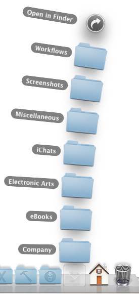
stacks in dock

The Problem

For a reason unknown to me and maybe even a few people at Apple, the Dock does not use the general NSPasteboard used for dragging (NSPasteboard is responsible for being able to copy, cut and paste content from one document to another, but it also handles file drags, most generally with the NSDragPboard type).

No, the Dock uses a custom NSPasteboard for dragging (probably using NSPasteboard’s -pasteboardWithUniqueName method). The thing is, NSPasteboard doesn’t keep a public list around (and I don’t know of a private one, either) of the names of these unique pasteboards, which makes it impossible to check if a drag occurs on those uniquely named pasteboards.

This is not only the problem with the Dock, but also with iTunes – it also uses a unique pasteboard for its drags.

The Solution(s)

The thing is, even though the Dock uses a private pasteboard for its dragging handling purposes, if the Yoink window is visible, it still recognizes those drags. Which is a good thing, because knowing that, I can look for a solution.

As I see it, there are two possible solutions to this problem:

Possible solution #1: Have a hotkey to force Yoink’s window to show.

Although I like it, it does have its drawbacks. For starters, while you’re dragging with one hand, you don’t want to have to press a complex keyboard shortcut with the other. Many people I know use two hands to press shortcuts, so it would have to be an F-key, maybe. But pretty much all F keys are taken by default, and if not, other applications use them.
It’s more obvious than the second solution, but also harder to do while dragging.

Possible solution #2: Have hot corners or hot areas to drag to to force Yoink’s window to show

This one brings up several questions:
Should all corners be hot?
Should the user be able to define them?
Should it be corners only or should it be the entire edge of the screen?
And once the user drags an item to the hot corner to show Yoink’s window, they still would have to drag it from the corner to the window. So it’s a longer way for the mouse.
And of course, in those corners, files can’t be dropped. They corners would be small areas, yes, and even if it’s a rare case that you’d want to drop in a corner (I don’t think I’ve ever done it), it’s still a possible case.

The Decision

I’m leaning towards using hot corners, it kind of feels more natural to me for Yoink.

I’d like to implement hot corners in all four corners of all of your screens. And whichever hot corner you use, on that corner’s screen’s edge the Yoink window will show for you to drag to.

What do you think? Does that make sense? Please leave a note in the comments below, it means a lot to me 🙂

Addendum: General state of Yoink

Aside from the issue above, the next update for Yoink is coming along nicely.

x) Yoink will allow the creation of clippings (when you drag a selection of text out of an application), accept items from your Browser (images, text, links) or drag out pages of a pdf file in, say, Preview – Clipping Creation Video
x) You’ll have the option to collect several files dragged at once into one item in Yoink (here a video which explains it far better). This way you can more easily drag out several files at once. And yes, there’ll be a button to split those “file clusters” up again 🙂
x) I’ve also added new position options for Yoink’s window – not only can you put it on the center right or left edge of your screen, but also the top or bottom right and left. I didn’t implement the top center or bottom center (where the Dock is by default), because Yoink uses a tableview to display its items, and tables are based on rows, one below each other. That doesn’t work if the window is not vertical but horizontal.

The Decision – [UPDATEd]

Even though I stated above that I’m leaning towards hot corners, after a good night’s rest, I’m now more and more for a hotkey instead of hot corners.
First off, it is far more obvious for users since there’s a preference for the hotkey. The hot corners would be just there, whether people knew it or not.  Also I believe the principle of hotkeys is better known than hot corners, but don’t quote me on that.
Additionally, a hotkey would give the user the benefit to be able to hide Yoink’s window even if it’s got files in it, which has been another requested feature.

The more I think about it, a hotkey does make more sense. Wouldn’t you agree?

Thank you and take care,
Matthias

Read more