Author's Posts

Please join me on a journey through the past 2 years, from the idea of Briefly to the development and eventual release of the app 🙂

The Idea for Briefly

The idea for Briefly was literally fed to me on a golden spoon.

Well, not literally. Literally, it was hurled at my head with a tweet by a twitter user I sadly can’t remember (believe me, I’ve tried digging up that tweet again, but I wasn’t successful).

I only remember the content (and I’m paraphrasing, because I don’t remember it word by word)

It should be way easier to do this [link to a still motion video I can’t find anymore either]

And that’s where I got the idea, because the tweeter was right – it should be easier to do this kind of video.

Getting the idea for Briefly was, thus, a case of “right place, right time” – in this case: twitter.

Existing Apps?

You might say – why create this app? There’s iMovie (on both OS X and iOS), there’s Final Cut Pro… Why develop an app that does less?

As I stated in my (also-pseudo) post-mortem of Transloader, I believe in making apps (even if they’re small ones) that improve a particular workflow or fix a particular need.

So yes, you can use iMovie to make a still motion video fairly easy. But I figured it could be even easier and faster. Thus I stuck with the idea and started development of Briefly.

It was a gut decision to go for it as I don’t have time nor the will to do much (or any, really) market research and stuff like that. I’d rather spend my time working on code.
So it could have gone either way – have a good or miserable reception (and even if you do market research, it still can go either way).

I always pick projects this way. There are two types of apps I develop:
Apps I have a (sometimes desperate) need for myself (ScreenFloat, Yoink, Transloader) and apps I think others might have a need for (flickery, Briefly).
On apps I need I usually start working right away. If I release them to the public is a different question, though. If I think it’s too niche or too small I usually don’t bother.
When I come up with an idea for an app that others might benefit from, I usually let it ripe in my head for a few weeks. I find that if I let it work out in my head, I either have less and less doubts about it or more and more. If I have too many doubts, I discard the idea for now.
If the picture of the app becomes clearer through this process, I make a move on it and start working. 

Still Motion Videos?

I hear you say – Still Motion videos? What’s that?

After I released Briefly, I’ve been told that Still Motion videos aren’t really a thing, that it’s not a correct term, that time lapse would be the right term to use.

Yes, with Briefly you can create time lapse videos. Or stop motion videos. But what do those two types of videos have in common?
The photos are connected to each other. They are a series of photos correlating with each other, creating an animation or sense of movement.

But that was not the main focus for me (contrary to what you might think watching Briefly’s intro trailer).
The focus, for me, was still motion videos, which basically are the same as stop motion videos (as in, photos shown in rapid succession) but the photos don’t have to correlate with each other. They can be of completely different things.

Because that’s what the video in the tweet I got the idea from was. It was a video of hundreds of vacation photos shown for just a fraction of a second with a soundtrack. That became my goal for this app.

Plus, it’s a term on wikipedia. So it must be right. Right? Right? 😉

Development

I began development of Briefly in October 2011. That’s not a typo. It took me almost two years to release this app. Here’s why:

First off, Briefly is not my only app.
In October 2011, I have flickery and ScreenFloat to take care of. I’m also working on Yoink, Transloader and flickery 2, with Yoink being in the final stages of development (released in late 2011) and Transloader taking me more than another year to complete. flickery 2 is still in development.

Secondly, Briefly depends on two frameworks I created.
One is for flickery 2 (because in Briefly, you can import photos from your photosets on flickr) so I had to complete certain portions of flickery 2 before I could continue development on Briefly.
The other one is ESSVideoShare (available as open source here). I had to create that framework first so I could implement sharing functionality in Briefly.
And last but not least, support for Instagram, which took some time as well. There were a few changes in the API when I wrote the integration, so I had to keep adapting.

That alone took me a couple of weeks to get done.

Prototyping

I started off creating the backend of Briefly, which is the video creation part. 

Screenshot of ZlidezFirst interface for Briefly, then called Zlidez

I began developing the backend with QTKit, which, in hindsight, was not a good decision. Actually, it cost me two weeks, only to decide later to use AVFoundation instead.
AVFoundation is undoubtedly the future of audiovisual media frameworks on OS X and iOS. When you watch the WWDC videos, the message is clear. Not using it was a mistake because QTKit would get deprecated some time and, more importantly, is not available on iOS. When I started development of Briefly, I hadn’t considered bringing it to iOS as well, but it later struck me that it would be a good fit for the platform.

Moving to AVFoundation from QTKit

Moving to AVFoundation from QTKit was a matter of delete and re-write. AVFoundation is quite a different beast and it didn’t make much sense trying to refactor what I had written for QTKit.

So I started from scratch. AVFoundation has a steep learning curve – at least to me. “Simple” things like adding an image to a movie is very different from QTKit, where it’s a matter of

– (void)addImage:(NSImage *)image forDuration:(QTTime)duration withAttributes:(NSDictionary *)attributes

This is far more complex in AVFoundation. It’s a matter of setting up an AVAssetWriter, AVAssetWriterInput, AVAssetWriterInputPixelBufferAdaptor and adding your samples to that pixelBufferAdaptor.

Quality Output

I spent the most time of the development on assuring Briefly creates the best possible output – which should be the priority #1 for any content-creation app, anyway.

First and foremost, I wanted to eliminate the occurrence of black borders in the video itself (if they occur in fullscreen playback, that’s nothing I can avoid) all while keeping it rendering quickly (especially on iOS devices).
I was in contact with three photographers to see what they thought about it and they helped shape the output a great deal. I must admit, I don’t know much (if anything at all) about photography so I was dependent on their input.

Soundtracks

Originally, I had planned to include a couple of royalty-free soundtracks with Briefly. But I seem to have bad luck communicating with license holders in general.

I have quite some experience regarding this, coming from GimmeSomeTune. No one wanted to talk to me about that, either, and the same happened with Briefly.
I wanted to get in touch with about 5 different “soundtrack-websites”. Not one replied. So I moved on. For now, users can choose soundtracks from their hard drives or iTunes library.

This might change with a future update as, since the release of Briefly, someone got in touch with me about that. We’ll see where it goes.

At least we made first contact 🙂

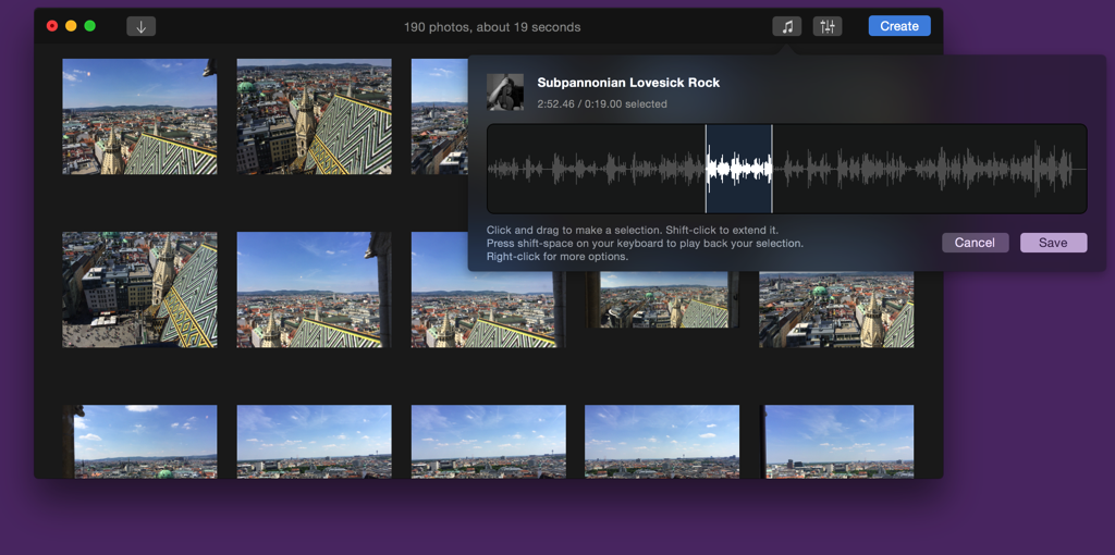
What was important to me regarding soundtracks is that they automatically fade out if they are longer than the video, without the need of input from the user.

Designing Briefly

My goal was to be able to create still motion videos hassle-free in as little steps as necessary.

For Briefly, that was:
1) Choose the photos
2) Choose the soundtrack

(I don’t count clicking “Create” a real step).

I wanted an app where you could do everything you needed in one window. No panels, no inspectors, etc.
‘No preferences’ plays into that as well.
I don’t want users to have to think about what speed is best, in what order the photos should be displayed (Briefly automatically sorts added photos by date), what format it should be, if the soundtrack should fade out at the end over what period, that sort of thing.

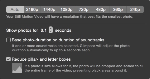
The only real adjustment users can make is the video resolution (Auto, 240p, 360p, 480p, 720p, 1080p).
It was actually only an output test for myself and I had planned not to use it in the release, only providing the “Auto” option. I can’t say exactly why I changed my mind and decided to leave it in. Probably because I wanted to let users know somehow that Briefly would produce videos at these resolutions and if “Auto” was chosen, Briefly would figure out the best one.
The popup is a slight break from the “Briefly figures it out for you”-concept.

Briefly's first interface conceptFirst concept for Briefly’s interface (Briefly was then called PostHaste)

This first concept of Briefly’s interface is pretty close to what I released, though obviously, it was optimized to put the content in focus, not the interface elements.

For example, we (my designer, Alexander Käßner and me) fused the huge “No soundtrack selected” area into the bottom bar, between the Quality-popup and the Create button, making more place for user-selected photos.

The first iteration of the interface was this:

First iteration of Briefly's interface with wooden texturesFirst iteration of Briefly’s interface with wooden textures

When Alex and I started out designing the interface, I was pretty keen on the wooden textures. I don’t know why. I just liked them (and I still do, though I must say the release version looks much nicer).

Notice that the buttons Browse… and Import… are in the middle of the window and would vanish when photos were added. So once the user selected photos, additional photos could only be added through the File menu in the menu bar or drag and drop. Not a good design decision (especially for novice users), so we put the buttons in the title bar of the window (relatively close to release of the app) so they would always be accessible – except when in fullscreen mode, then they would disappear.

The screenshot above also shows the import view (which is pretty close to what shipped in the release version).
The import view started out as a window sheet, attached to the main window (like an open/save dialog). And it would have been fine, but there’s one problem – it makes drag’n’drop difficult because a sheet usually covers an area of the window it’s attached to.
I wanted users to be able to drag and drop from the import sheet to the main window and make multiple imports without the sheet closing every time. So the sheet had to go.
We put the import sheet into the main window as a view, so the content below it resizes when it’s shown and now users can drag and drop from the import view to the main window and click on “Import” multiple times without dismissing the import view.

More wooden BrieflyAnother, earlier screenshot of a wooden Briefly

Pretty close before release, I decided against the wooden textures. I think I found it too distracting. The focus should always be on what the user’s working on, not the interface.

Dark draft of BrieflyA darker version of Briefly

What you see in the screenshot above is a first draft of a darker, less distracting Briefly. It is quite a difference. And one more iteration of this darker interface is what’s in the release version today.

Flatter Briefly UIWe decided to go a little flatter and less texture-y.

We got rid of the title- and bottom-bar noise-texture and enlarged the soundtrack view a little bit to align with the top of the bottom bar and the bottom of the window giving it more space to breathe.

First Launch Experience

When you first launch Briefly, this is what you see:

First launch BrieflyBriefly’s UI when launched the first time

The popover you see in the screenshot used to be a sort of tutorial, instead of the arrows and explanations you can see underneath in the release version.
It would jump from UI element to UI element, explaining what each element does. Unnecessary. With the way it is now (the arrows), it’s much better.
For one because it’s always there when the window is empty, letting the user know what to do without them having to open up the tutorial again (and perhaps struggling to find a way to do so).
Secondly because a popover that jumps around is nauseating.

Saving

I designed Briefly as a one-shot app – add photos, a soundtrack, create the video and repeat with different photos and soundtrack. An app where you wouldn’t go back to past projects and redo them.

There’s no projects, no documents, no saving.

The only saving that happens is of content that hasn’t been turned into a video yet. So if you select photos and/or a soundtrack and then quit Briefly, those items would still be there on the next launch.

This could easily be turned into a Briefly-document to be edited later at any time and I might do so with a future version of Briefly.
The data saved is very small because all it does is take the paths (actually, NSURL bookmarks) and save them for later use.

Naming Briefly

Before finally coming up with and settling on Briefly, I went through a number of names.

The first name I had was “Zlidez – the z stands for zpeed”. I moved away from that because… it sucks.
Another was PostHaste – though already taken, as I later found out.

The name I absolutely loved was Momento – a portmanteau of momentum (for speed) and memento (i.e., photos). Sadly enough, this was also already taken.

Names before BrieflyBrainstorming session for Briefly’s name (notice that it isn’t on there)

more of briefly's former namesA closer selection of Briefly’s former names

As with most of the names for my apps, Briefly came to me out of the blue and I think it works very well.

Afterthoughts

I am very happy with how the app turned out. The reception has been great, although there are complaints about the rate at which photos are shown in the videos created with Briefly (although it says so in the description of the app on the App Store – “photos are shown for the fraction of a second”).

It got featured by Apple (and as of this writing, still is) on the Mac App Store front page in the “New & Noteworthy” category:

Apple Feature

and received nice reviews on TUAW, Cult Of Mac and lots of others.

Working with Alex Käßner again has been a blast, but I knew it would be, coming off of Transloader, where he did excellent work as well.

Now we’re working on Briefly for iOS, which will be available later this year for iOS 7.

Thank you for reading,
Take care,
Matt

[twitter-follow screen_name=’eternalstorms’ show_count=’yes’]


Read more

Briefly Icon

Proudly Introducing: Briefly

Briefly is my brand new app for Mac (and soon, iOS) that I’ve been working on since October 2011 (yes, that long!) and I’m so happy I’m finally able to release it.

It’s my first content-creation-app (as in, you produce something with this app). All my other apps are utilities or apps that help you get things done in a quicker or easier fashion, but this one actually lets you create something cool 🙂

3 final

What is Briefly?

Still Motion videos are a fun and neat way to show hundreds of photos within a short amount of time. Say, you want to show all your vacation or holiday photos, or photos from a hiking trip you took but don’t want to sort any of them out. With still motion videos, you can show them all.

Briefly lets you create those videos with just a few clicks. Add your photos (from your hard drive, flickr and/or Instagram), an optional soundtrack and let Briefly do the rest.
It will create your video (up to 1080p – Briefly can also choose the best resolution automatically to reduce or completely eliminate black borders around your photos), fade out the audio if it is longer than the video at the end and let you publish it on popular video sharing sites like YouTube and Vimeo, as well as Facebook and flickr (yes, Briefly is the reason I wrote ESSVideoShare (blog post about that here)).

Pricing and Availability

Briefly is available exclusively on the Mac App Store for currently $4,99 (35% off). The iOS version will be released later this year on iOS 7.
As is tradition, a free, 15-day trial is available for download here (direct download here, 4,7MB, zip).


Thank you for reading – I hope you enjoy Briefly and my other apps 🙂

Warm regards,
Matt

[twitter-follow screen_name=’eternalstorms’ show_count=’yes’]


Read more

Wwdc13

Image credit: developer.apple.com/wwdc

The Keynote presentation

If you haven’t seen yesterday’s (Monday, June 11th, 2013) WWDC keynote yet, you can watch it here on Apple’s website.

The keynote started with a very inspirational video. It’s a direct answer to recent ramblings about how Apple have lost their drive or stopped innovating and it somehow gave me the feeling it’s a direct successor to the famous “Here’s to the crazy ones“. A mantra Tim Cook doesn’t get tired of sharing any chance he gets – It’s all about the best product they can possibly make.
Watching this video literally made me think “This is going to be a WWDC keynote we’ll remember for quite a while”.

Tim Cook, CEO

seemed very energetic and enthusiastic about what he had to tell us. Frankly, I think it was the best performance from him yet. His voice was also not as ‘whispery’ as usual but a little louder and more profound. He seemed happy to be there and excited to be sharing new stuff (probably because he got tired of all those stupid “What’s Apple going to do next” questions – I’m looking at you, D11 – and finally had to show something new, silencing those questions)
And as a plus, he said “Only Apple could do this” just once which is a plus in my book. At past occasions, I think he overdid that phrase a little.

Craig Federighi, SVP Software Engineering

was, in a word, epic. Drew Wilson nailed it, in my opinion. He’s naturally funny and doesn’t ignore what’s going on around him, reacting to reactions from the audience, which, if not overdone, is a very good thing, loosening up everyone involved.
He’s a natural at giving presentations and he has fun doing what he does. A class act all around. I’d like to see him more often.

The way Craig talked about the textures in OS X (specifically, Calendar) and iOS (specifically, Game Center), I wonder if he played a key-role in Scott Forstall’s ousting.

Here a few quotes, when demoing OS X Mavericks:

“Absolutely no virtual cows were harmed in the making of this user interface.”
“It’s really amazing – even without the stitching, the window still sticks right there on the screen, it doesn’t fall off without the stitching.”

And later, when demoing iOS 7:

“We just completely ran out of green felt and wood – this has got to be good for the environment.”

No, I don’t think Federighi and Forstall were very fond of each other. But what do I know, perhaps he was making fun of himself 😉

Phil Schiller, SVP Worldwide Marketing

was solid and fun, as always. “‘Stopped innovating’ my ass” was, obviously, one of the best lines in the keynote. Seems to me he’s always the one to comment on certain publications in keynotes in a fun way, and that’s what I like about him. He doesn’t ignore those things but addresses them head-on.
Yes, he did mix up Firewire 2 with Thunderbolt 2 when introducing the Mac Pro, but who cares? It’s a new friggin’ Mac Pro!
Phil’s a very down to earth, straight up guy, very sympathetic.

I actually ‘met’ him during the WWDC 2004 Campus Bash – he was eating a taco (they had a make-it-yourself-taco-bar) and I was so stunned he stood in front of me all of a sudden, I just nodded at him and he nodded back. Yes, we’re the bestest buddies now!

He’s even cooler in person.

Roger Rosner, VP Productivity Applications

I frankly can’t remember the last time we saw him in a keynote (if ever), so I can’t really compare this one to previous appearances.
That aside, it was a decent performance, though I feel he lags behind the others – maybe because he hasn’t had too many chances to present at a keynote.
He did seem excited about iWork for iCloud, though, and I hope for his and his team’s sake it doesn’t share the same fate as iwork.com which was in beta for a while and then cancelled without much fanfare. 

Eddy Cue, SVP Internet Software and Services

Also a decent performance and I bet he’s got a new friend in US Senator John McCain.
I wish he had mentioned something about improving iCloud’s key-value storage, though. But I guess that’s something that will be probably handled less publicly at WWDC’s sessions and labs.
It’s nice they’re introducing new services (like iTunes Radio), but their existing services could use some love. Seriously.

The new stuff

Enough about the presenters, let’s talk about the announcements they made.

OS X Mavericks

Oh, that name.

First off, I keep calling it Maverick, as Maverick_s_ seems too “plural-y” to me.
It’s a name like MacBook. I can’t say how much I hated that name. But now, I love it. iBook and PowerBook seem odd to me now, and I think it will be the same with the new naming scheme of OS X.

But right now, I actually would have preferred Sea Lion. Change is hard.

iBooks, Maps on Mac

was just a matter of time. I don’t quite understand why it took so long – I think it might be a marketing thing, to have something exclusive for iPad/iPhone. Create momentum there and bring it back to the Mac to use that momentum some more.

Maps’ ‘Send location to iOS’ is awesome. The interface seems very minimalistic (which isn’t a bad thing), however, after all the textures I was used to from OS X (Mountain) Lion, it looks naked. But it’s just a matter of getting used to it again.

Calendar.app is stripped down to its bare minimum, also – no textures. It looks very nice and will look even better once I’m used to it again.

Multiple Displays

Finally that fullscreen button in the windows’ top right corner is actually usable. With OS X Mavericks, fullscreen is finally the way it should have been from the beginning.
SecondBar got sherlocked as the menu bar is now shown on the second display and the Dock can be summoned there.

AirPlay Display is a very welcome addition, though I do not own an AppleTV. But any way to extend the desktop is very fine by me.

Finder Tabs, Tags

‘Finally’, is all I can say for the tabs. And they will make Yoink more useful as well.

Tags are Spotlight comments taken mainstream. Good move. And an important step in the no-filesystem-direction.

Advanced Technologies

The improvements made on the core of OS X amaze me. It really shows how smart the people working at Apple are.

Timer coalescing and memory compression are great new ways to improve CPU- and memory usage. And even things where you’d think that after 9 releases, there would be no way to improve upon them, were indeed improved upon, like video- and audio playback, which uses up to 35% less energy.

App Nap fits in well with the energy saving ideology introduced in previous OS releases with automatic and sudden termination.

Albeit, it’s not only about saving energy, it’s also about freeing up resources for applications in the foreground that really need them.

It’s great to see so much love for OS X and the Mac again. The advancements and improvements made show that Apple is still very much interested in the Mac and its future. At least for the next decade (both Craig Federighi and Phil Schiller said something about “the next ten years” – though I shouldn’t read too much into that).

On another note, I wonder why some of the icons – or the interface in general –  weren’t changed to be in the same vain as iOS 7’s. But then again, even the iPad (beta) version of iOS 7 isn’t finished yet and I imagine OS X would be an even bigger undertaking. Perhaps there’s another ‘Back to the Mac’ event coming. 

Mac Pro

Speaking of the Mac – Apple finally introduced a new Mac Pro (by the way – if you haven’t seen Apple’s website for the new Mac Pro yet, you really should – it’s very well done!).

And what a Mac Pro it is. It’s breathtaking.

I can’t help make the comparison to the (sadly ill-fated) G4 Cube (and, as pointed out to me by @F451 on twitter, the 20th Anniversary Mac). I think it’s the Cube done right, cylindrically – though I don’t know anything about the price, yet. I just hope it’s priced aggressively.

Phil Schiller said it’s unusual for Apple to show a sneak peek of a future product. But for the Mac Pro, it was the right time.
– Pro customers were getting restless (there was a lot of talk about Apple ignoring the needs of its Pro customers)
– They aren’t sold in Europe anymore
– The last (very minor) update was a year ago and
– I don’t think too many people were buying them anymore.
So the fear of cannibalisation by a future product was non-existent.
This was the right time.

iWork for iCloud

To be honest, I’m not too interested in web apps. I haven’t once used anything on icloud.com or the ill-fated iwork.com beta.
There’s probably a sophisticated strategy behind the web version of iWork, but I’d rather they put those efforts and resources into a new version for the Mac.

Alas, Rosner assured us there would in fact be a new version of iWork for the Mac and iOS coming later this year and I’m very excited about that. I just wish they’d presented that instead of the web apps.

iOS

Man, there’s  a rift going through the iOS community. People I follow on twitter are either ecstatically pleased about the new changes or devastatingly disappointed and appalled.

As far as I’m concerned, I like it – very much so.
I don’t like a couple of icons (most gradients look weird and the Safari icon doesn’t look good at all to me), but everything else I’ve seen so far is pretty neat (which isn’t much, I have an iPhone 3GS so I can’t even install the beta, I guess it’s finally time for me to upgrade… or get an iPod touch).

Control Center is a godsend and way overdue – and the one new feature I’m most excited about in iOS 7. How much time I wasted drilling into the settings to disable WiFi, the cellular network or Bluetooth, I don’t even want to think about it.

The End

As I said before, Tim Cook doesn’t get tired reiterating what Apple’s goal is:

“I’d like to close this morning with a reminder. That our goal at Apple is to make amazing products that our customers love. Really great products that enrich people’s lives. The words you saw at the beginning of the show are more than just words to us. They’re the values we live by. They drive us. You’ve seen them reflected in the products over the years and just as much in the products this morning. And you will continue to see these reflected in the products in the future. We created an ad to help us express just how deeply we feel about this.”

And another video is played. “This is it. This is what matters.”

I think this was one of the best keynotes. They all were on their top of their game, and the stuff they had to show was breathtaking. Makes me even more inspired to work on my own stuff.

I wish I was at WWDC this year. Sadly, 71 seconds is what it takes my ISP to connect to developer.apple.com/wwdc … 😉


[twitter-follow screen_name=’eternalstorms’ show_count=’yes’]

Read more

Transloader Mac Icon

You might have heard about my new app, Transloader, for OS X and iOS.
I’d like to give you a little background info on the app because it’s been an interesting process creating it and getting it out to users.

What Is Transloader?

Transloader (né Lifeline – as in a line that keeps your connection to your Mac alive) lets you send URLs from your iOS device to your Mac for download.
Say you’re browsing on your iPad and come across a Mac demo app you’d like to try. On your iPad, you can’t download it and even if you can, there’s not much use in it since it’s a Mac app. This is where Transloader is useful.
Enter the URL to the demo into Transloader on your iPad and it gets synced to Transloader on your Mac where the URL will be downloaded to your Downloads folder, ready for you to use when you return to your Mac.
That’s it. Pretty simple, isn’t it?
Creating it, however, wasn’t 😉

Got To Get You Into My Life

The idea for Transloader, like for all my other apps, came out of a need I had myself, a little more than two years ago (and I’d been sitting on pins and needles ever since, thinking someone else might come up with a similar idea and beat me to it).

I browse the web a lot on my iPad. And it’s not unusual that I come across a zip or dmg file, or even a movie I’d like to download for later.
What I used to do was send myself an eMail containing the URL to the file – and I can’t tell you how much that bothered me.
It’s so much unnecessary work to do it, it’s so tedious:

  • Copy the URL
  • Open Mail
  • New Mail
  • Enter my eMail address (I have several, so I need to find the right one in the list)
  • Paste the URL into the mail’s body
  • Send
  • Confirm I don’t want a subject for the eMail
  • Sent

And when I’m back on my Mac:

  • Launch Mail (if I don’t forget I sent myself a link)
  • Find the mail
  • Copy the URL
  • Launch my browser
  • Paste the URL into the browser and wait for the download

I believe in writing apps for a single problem, even if it’s a very small one. I like to keep things clean. And to their purpose. I don’t like using eMails to remind myself of something. That’s what the Reminders.app is for or perhaps the Notes app (though I can’t tell you how many times I forgot I put something into Notes.app for later, and only months later found it by accident).

I wanted a much simpler way to do this. So I had the idea for Transloader. The workflow would be very simple:

  • Copy the URL
  • Launch Transloader
  • Add the URL

and on the Mac:

  • If Transloader’s not running either launch it
  • or if it is running – do nothing.

Let the app take care of everything else. The sync, the download – that also has the advantage that the user does not have to initiate the download. It starts downloading as soon as the URL is synced – and, ideally, the download is ready once you’re back at your Mac. That was the idea for Transloader.

We have all the time in the world

To reiterate, I had the idea for the app about 2 years ago – before Apple introduced iCloud.
So I had to find a way to make the iOS app talk to the Mac counterpart.
I basically copied the way Apple’s Remote.app on iOS handles the connection to iTunes on the Mac, asking for a PIN.
The setup needed to be done by the user. Start the server app on the Mac, launch the app on iOS, add the server by entering the IP and the port to connect on and then enter the random PIN displayed on the Mac.
Once the setup was done, the app worked pretty much the same as it does now. Add URLs on iOS and it would get transferred to the Mac directly.

There were quite a few things different, though.
Due to the direct connection to the Mac, more control was possible. For startes, you could have multiple Macs you could differentiate between and send URLs to. You could interrupt downloads, you could see how far along the download on your Mac was and how fast it was going and you could delete the downloaded file from your Mac once it was finished, remotely from your iOS device.
On the other hand, to add URLs, an internet connection was mandatory at the time of entry and the setup to get the app working was tedious. The Mac had to be running, so did the Mac app. Also, adding URLs over the internet was only experimental, only the Bonjour service (meaning you had to be in the same WiFi network for it to work) was really supported. (Although I must say I never had a problem with adding URLs over the internet, but it depends on your WiFi router, port forwarding, etc).

Part of why it took so long to release the app was that I wasn’t completely sure if the “experimental” internet connection would go over well with users. The purpose of the app was to be able to add URLs while on the road, somewhere in a café for example, not at home where you’re at your Mac anyway.

Lifline on MacLifeline, the first iteration of Transloader, on the Mac.

Lifeline on iPhoneLifeline, the first iteration of Transloader, on the iPhone. Server Selection.

Photo 3Lifeline, the first iteration of Transloader, on the iPhone. Showing progress and speed of the download.

Stuck inside a Cloud

Some time went by where I didn’t do any work on the app. Only using it myself and showing it off to people to get feedback.
Maybe half a year passed. Perhaps a little more.
Then what happened was that Apple announced iCloud. At first I didn’t make the connection, but I soon came to realize that it would be the perfect fit for my app.
I always hated the fact that a server/client configuration was necessary for the app to work. I didn’t want to put the user through any of that.
Also, with iCloud, at the time of entering a new URL, a connection to the internet is not necessary and the Mac app doesn’t have to be running. It gets synced as soon as there is an internet connection again. Big plus.

I realized I wouldn’t be able to give the user the control they would have had with my own implementation (mainly getting feedback on the progress of the download and its speed) and that I would make myself rely on a service that might not be available at times, but knowing that using the app would get much simpler, especially first setup (of which there is basically none now), was enough to make me go for it. And I haven’t regretted the choice since.

Changing from my own system to iCloud was a complete re-write of the app. Obviously.
However, it took way less time than the first implementation since I didn’t have to deal with any server/client implementation or communication between the two. All of that is handled by iCloud.

It took maybe two weeks to get the app working and basically finished (no polish, of course). In comparison, the first version took me a few months.

She feels good, she knows she’s looking fine

Once I got the app working and finished from a coding standpoint, it was time to get the UI done.
Everything you see is the creation of the brilliant Alexander Käßner who, I think, couldn’t have done a better job with the app.
And customers seem to agree, they do like the graphical elements very much.
After maybe two days I had a mockup and a few days later, the graphical elements were done and put into the app. It was a quick and painless process.

Do what the rest all do, or face the fact that the Apple Store Review Team may have no other choice than to reject you (in short – DAMN, Transloader was rejected)

I usually submit new apps to the App Store well knowing the first submission will likely result in a rejection.
Transloader was no exception. Not because of the usual reasons (Sandbox, for example, or a stupid unnecessary bug I overlooked in final testing), but because I was using iCloud in a different, unexpected way. And I kind of felt it was going to cause problems.

And I wasn’t wrong. It didn’t take too long until I got a call from a very sweet, patient and understanding representative of the Review Team, telling me Transloader got rejected for using iCloud as a transport mechanism and an iCloud account being necessary for the app to work.

I tried making the point that at no point is any file stored on iCloud and that the sync was used as a sync, not as a transport mechanism – it syncs the URLs to all devices. What the Mac does with that link is a different story, but of no concern to iCloud, because the actual download has nothing to do with iCloud or the sync.
I also tried arguing that if the reason for rejection was that an iCloud account was necessary, there shouldn’t be any twitter, Facebook, flickr or instagram apps allowed on the App Store either because they all needed accounts for their respective services as well (a cheap shot, I know, but I was frustrated).

Anyway, my points didn’t go over well. The rejection was done.

Reconsider, Baby

At this point, I was kind of desperate. I was so close to finally releasing the app but couldn’t have been farther away at the same time.
I resubmitted the app to Apple with a video explaining how the two apps worked together and a lengthy review note providing even more details.
Yet again, no dice. I got another call from the representative, asking me not to submit the app again without significant changes to how it worked.

So I considered going back to my original implementation. Users would just have to endure the horrible server/client setup.
I just wanted the app out at this point. I got lots of positive feedback from friends, family and colleagues about the app so I was confident it would do ok.

I started to work on re-implementing the first implementation when about two weeks later, I got another call. They were sorry it took so long to review, it was a complicated, different way of using iCloud and they had to make sure it all was in order. It would be live on the App Store in a few hours. I just sat there in amazement, mumbling out a “Wow, thank you” and hung up.

I seem to have a guardian angel and I couldn’t be more grateful.

Don’t ask me what I want it for if you don’t want to pay some more

You might have noticed that the iOS app is free and the Mac app is $4.99.
I had to find a way to make sure Windows-PC users wouldn’t pay for an app on iOS they couldn’t use.
Transloader for iOS depends on the Mac app, and the Mac app depends on the iOS app. One without the other is completely, entirely, utterly useless through and through.

Another angle, obviously, is that Mac users might not have an iOS device but pay for the Mac app. I had to decide for one way or another, though, and I figured the chance of a Windows user having an iPhone is higher than a Mac user not having one.
Plus, I added a disclaimer in the apps’ descriptions that both a Mac and iOS device are necessary. So far it hasn’t failed me.
There have been enquiries to develop Transloader for Windows, though 🙂

Now you’re expecting me to live without you…

Transloader is the first app I don’t provide a demo for. It’s not because I don’t want to, it’s because I can’t.
iCloud needs a provisioning profile in the app bundle that is only available to apps downloaded through the Mac/iOS App Store which makes a demo impossible.

It’s been quite a journey and I’m so very happy I was finally able to release the app. I’ve got a few things planned for it and I’m looking forward to putting out updates and implementing some of your amazing suggestions. Keep them coming 🙂

Thank you for your time 🙂
Take care,
Matt

[twitter-follow screen_name=’eternalstorms’ show_count=’yes’]

Read more