os x

[ Note: This is a guest blog post written by Frank Gregor (@TheCocoaNaut on twitter), an OS X- and iOS developer based in Austria, about his Mac app Review Times ] Review Times Icon

Once upon a time… No, only fairytales start that way. And this is no fairytale. It is a “true story”, like, I’m sure, many other developers have experienced one way or another. (-:

Some time around Christmas 2014, I stumbled upon a tweet, linking to appreviewtimes.com. Many of you may know about this website already. It gives you the average time Apple is currently taking to review apps for submission on the iOS and Mac App Stores.

I thought, hey, that would make a nice little Mac tool. So I asked a couple of developers on Twitter what they thought of such an app. The response I got was great. Without exception, everyone I asked wanted something like that. I had had some free time on my hands, so the idea manifested.

I wanted to build a small app that would live exclusively in the menu bar and offered a Today Widget. The information I would display in the app I would get from appreviewtimes.com. So I contacted Dave Verwer (@daveverwer on twitter), founder of Curated and publisher of the well-known iOSDevWeekly newsletter. He was the contact listed for the Shiny Development team, who are the creators of appreviewtimes.

I asked Dave if they perhaps already had such an app available or in development, and if that wasn’t the case, if they’d mind if I developed the app and used their data for it:

Hey Dave,

I found you as contact for Shiny Development, the maker of App-Review-Times. So I think it would be a great thing to have a little OS X tool that shows in an app extension the current review times via Notification Center. I’m building exactly such a tool and I have to grab and parse the website to get all the needed data.

So, to make things easier for development: Would it be possible to get all that raw data (iOS & OS X) as JSON or XML? Would be really great! (-;

Cheers, phranck

Dave answered promptly:

Hi Frank

I’m afraid that we don’t have either JSON or XML feeds of the information.

Please feel free to scrape the HTML though, as long as you include a link back to the original site.

Thanks Dave

Great! Now nothing stood in the way of me selling this App on the App Store (though I would learn better later). I got to work and within two days, I had a working prototype.

The fact that this app would run as a menu bar tool was very beneficial to me. I had been working on a piece of open source code, which does exactly that: place an icon in the menu bar and display a popover when clicked. This gave me a very good reason to further develop and improve the open source code.
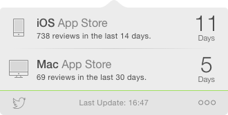
Screenshot of Review Times Popover

Now was the time to tweet some screenshots, to whet the appetite of potential customers. It worked well. I received a lot of inquiries about what the app was about. This way, I got my first beta testers.
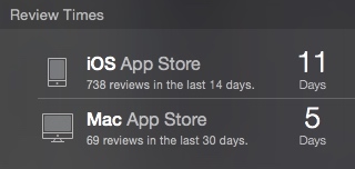
Review Times Today Widget

All in all, about three to four weeks went into developing the app and I believed the app was ready. I needed a nice icon that should really catch the eye. I made the acquaintance of Dan (@derpixeldan on twitter) and he created something truly wonderful at an unbeatable price… (-;

Around Mid-January, I submitted the app to the Mac App Store. Excitedly I waited for the notification on my iPhone that the review process had begun. About three weeks later, I received the message I longed for.

It didn’t take long and the review team contacted me again. But this message wasn’t what I had hoped for. My app got rejected! The reason Apple gave me was

…featuring speculative information about Apple products/services…

which I didn’t find reasonable at all. I was shocked. Every developer who ever received a “Rejected” notice knows this feeling of unease. I was annoyed and angry at the same time. Why in the world… ?!?! Did I go about this entire thing too naively?
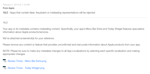
Appstore Rejection

If you are familiar with Apple, you know they like to have control. And speculative information – like the average time it may take for Apple to review an app until submission to the App Store, shown by an app by some developer – well, that was completely out of their control. So Apple showed me, who’s boss.

That took the wind out of my wings in respects to this tool. I didn’t want to get into a discussion with Apple, it wouldn’t have lead anywhere anyway. I vented on twitter and let the whole thing rest for a couple of days – until, again on twitter, I received inquiries about what had happened to the app and how I would proceed with it. There were two possible options for me: 1) publish it as open source code 2) sell it outside of the Mac App Store from my website

On Twitter, I asked for input.

Since previously, people had stated their interest in paying for this app, I decided to go with option 2. After some research and testing how to best implement selling it from my website, I came to the conclusion that I should use Paddle. Their integration into an app is absurdly easy to do and they have first-class support.

All said and done, it took three more days of coding and testing and then everything was ready. I built a one-page website, wrote to many Mac-Blogs and magazines (none of whom replied!) and announced the release on twitter. Since so many developers wanted this tool, I was preparing for incredible sales-days… (-:

Poppycock. Virtually nothing happened. I sold a couple of copies, but all in all it went very, very slowly. Even after two months – with heavy-duty tweeting about it – I didn’t even make up for the cost of the icon. Reality had its grip on me again. So I had to act. Without thinking about it too long, I deleted all license- and purchase-handling code and released the app for free from my website.

Now everyone can download and install the app from http://reviewtimes.cocoanaut.com. Since then, I’ve had about 1-2 downloads a day.


Frank Gregor (@TheCocoaNaut on twitter) is an OS X- and iOS developer based in Austria. Among others, he is responsible for the Mac apps Review Times, Nekrologger and the iOS app f4analyse.

Read more

I’m not sure if I’m imagining things, but I believe at some point before OS X Yosemite, a determinate NSProgressIndicator was able to animate to its new doubleValue, not just “jump” to it.

In an effort to have that animation again, I wrote a little category on NSProgressIndicator that does exactly that, using NSAnimation.

Progress bar animation using ESSProgressIndicatorCategory

NSProgressIndicator and Animation

NSProgressIndicator has a method called -startAnimation:. However, as the documentation states, this has no effect on determinate progress indicators.
Calling progressIndicator.animator.doubleValue = 5.0; doesn’t animate either. So with options that come with the class, we’re stuck.

As I try not to reinvent the wheel for something that’s already solved, I did some googling around, but that didn’t yield any results, either.
What became clear, though, was that there’s a lot of confusion about what -startAnimation: actually does.

NSProgressIndicator+ESSProgressIndicatorCategory

Not finding a solution on the internet, I decided to write my own, as I figured it wouldn’t take a lot of time (it didn’t).

I definitely didn’t want to subclass NSProgressIndicator and override any drawing methods.
That would have a) taken an unjustified amount of time and b) been a huge pain in the neck for sure.

The solution to me then was to use NSAnimation.

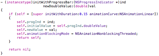
The goal was to have one method to call that sets the new doubleValue and animates to it nicely:

New method to animate a progress indicator's doubleValueThe category’s – (void)animateToDoubleValue: method

It calls a subclass of NSAnimation named ESSProgressBarAnimation with the new value and starts the animation.

initialization of the NSAnimation subclassInitializing the NSAnimation subclass ESSProgressBarAnimation

We save the original doubleValue of the progressindicator, set the duration and animationCurve and set the animation’s animationBlockingMode to NSAnimationNonBlockingThreaded so that when there’s a mouse event, for example, the animation doesn’t stop.

NSAnimation's setCurrentProgress method

When an NSAnimation object’s -startAnimation method is called, it automatically calls -setCurrentProgress: on itself until currentProgress is 1.0, meaning the animation has ended (currentProgress ranges from 0.0 to 1.0). The value is based on the duration and the animationCurve.
In this overridden method, we calculate the delta between the new and the initial doubleValue of the progressIndicator, multiply it by currentProgress and send it to the progressIndicator. That’s it.

How To Use NSProgressIndicator+ESSProgressIndicatorCategory

Add the category’s .h and .m files to your project, import it where you need it and update your progress indicator’s doubleValue by calling -animateToDoubleValue: with the doubleValue you desire to animate to.

The Source Code

The repository (a sample OS X app) is available on Github.

It was developed (and tested) on OS X Yosemite 10.10.3 using Xcode 6.3.1 but should work on earlier versions of the operating system.

More source code is available here (or directly on my github profile page) if you’re interested. If you have any questions or feedback regarding my open source projects, please be sure to mail or tweet me – I’m looking forward to your feedback!

Enjoy!

Read more

For Briefly, I needed a nice, subtle animation for switching between the detail soundtrack view and the reorderable list view. In OS X Yosemite 10.10.3’s Photos.app, I noticed something I liked very much.
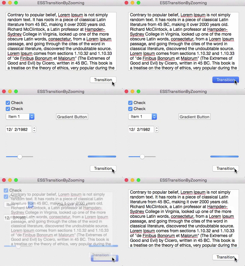
When going into an album, for example, the current view is zoomed out of focus and the new view is zoomed in.

Zoomtransition Animation Gif

NSView+ESSViewCategory

I wrote a little category on NSView to do just that, it’s a one liner (ironically, in this pic, it’s more than one line) :

Line of code

It’s pretty self-explanatory. You pass in the view you want to transition from and the one you want to transition to, the type of transition (zooming in or out), the duration and an optional completionHandler that’s called when the animation ends.

Alternatively, it’s also available as an instance method where the view you call this on will be passed into the class method as fromView:

Instancemethod

The Views

For the transition to work, fromView has to be in a view hierarchy, toView shouldn’t. They should be the same size, otherwise more work on your part is necessary (which I had to do in Briefly because the NSPopover the views reside in resizes before / after the transition), but either way the code provided should give you a nice head start.

fromView’s superview is temporarily set to have a CALayer to make use of Core Animation during the transition. After the animation ends, the superview’s wantsLayer – state is reset to what it was before the animation. If we didn’t do this, the animation would appear sluggish.

ESSViewZoomTransition

As you can see in the gif above, there are two types of the transition:

ESSViewZoomTransitionZoomOut – the transition from the textView to the view with the checkboxes.
ESSViewZoomTransitionZoomIn the transition from the checkbox-view to the textView

How To Use NSView+ESSViewCategory

You’ll have to first add the NSView+ESSViewCategory.h and *.m files to your project.
Please note that the category imports <Quartz/Quartz.h> for Core Animation’s CAMediaTiming class, so you might have to add that framework to your project, too.

fromView
It has to be inside of a view hierarchy. Fades out during the transition.

toView
Can be in a different xib file (for example, a NSViewController) or in the same as fromView. It’s important that it is not already on screen somewhere. Fades in during the transition.

Once you have set up your views, either call the class method and pass fromView and toView as well as the other parameters or call the instance method on fromView.

How It Works

The method creates an NSImage of both toView and fromView, puts them into two NSImageViews that have the same frame as the views and animates those two NSImageViews accordingly (calling imageView.animator.frame = …; and imageView.animator.alphaValue = …; )
Because fromView’s superview temporarily gets a CALayer, .animator is powered by Core Animation, which makes for a much smoother animation than doing the same without a layer-backed view.

ImagecreationCreating an NSImage of toView.

So the views themselves aren’t actually resized, they’re just screenshotted, removed from view as we place the NSImageView on top of it, creating the illusion that nothing happened. Then we animate the NSImageViews and insert toView after the animation is done, removing both NSImageViews.

The Source Code

The repository (a sample OS X app) is available on Github.

It was developed (and tested) on OS X Yosemite 10.10.3 using Xcode 6.3.1, but should work on earlier versions of the operating system.

I have some more source code available here (or directly on my github profile page) if you’re interested. If you have any questions or feedback regarding my open source projects, please be sure to mail or tweet me – I’m looking forward to your feedback!

Enjoy!

Read more

ESSSquareProgressIndicator animating

What Is ESSSquareProgressIndicator?

It’s an indeterminate progress indicator originally developed for the iOS game ZEN.

It uses Core Animation (specifically, CAShapeLayers) to do its job and it’s pretty straight forward.

CGPathRefs, CAShapeLayer

CAShapeLayer has two animatable properties – -strokeStart and -strokeEnd (with a minimum value of 0.0 – start of path – and 1.0 – end of path). Going beyond 1.0 or below 0.0 doesn’t work.

So when trying to animate those values along a rectangular path – which was the first thing I tried when creating this – you do get a nice animation, but it ends at the 0.0/1.0 (which is, basically, the same) mark. So you end up with something like this:

glitchy progress indicator animation

The goal, then, was to animate beyond 1.0. The solution I came to – I’m sure there are other ways – was to use a second CAShapeLayer that animated alongside the first for the last/first part of the animation.

For a square, the values of the CAShapeLayer’s -strokeStart and -strokeEnd are as follows (starting at the top left corner):

CAShapeLayer strokeStart strokeEnd values

The CGPath begins and ends in the top left corner because I drew the path that way (you could make it start in the lower left corner or in the middle of a side, it all depends on where you start the CGPath with CGPathMoveToPoint).

The progress indicator starts at the middle of the left line and reaches to the middle of the top line. These are the two CAShapeLayers at work. The left part is one shape layer, the top line is another. I’ll do this in pictures I drew in code so it’s simpler to understand (the lines represent where the layer animated to, the dots are the invisible rest of the square).

Animating

Animation Part 1We start at this position. The line to the left is layer2(strokeStart:0.875, strokeEnd:1.0), the line at the top is layer1(strokeStart:0.0, strokeEnd:0.125).

Animation Part 2The transition to this is the reason we need two layers as we can not animate one layer beyond the 1.0 value.
So we animate layer2 to (1.0, 1.0) and at the same time animate layer1 to (0.0, 0.25) which makes it look like one line moving.

Animation Part 3This next part is easy. We animate layer1 to (0.75, 1.0).

Animation Part 4Lastly, we animate with two layers again to get to the initial position so we can repeat the whole thing from there on.
We animate layer2 from (0.75, 1.0) to (0.875, 1.0) and layer1 from (0.0, 0.0) to (0.0, 0.125) at the same time, again making it look like one line moving.

The Source Code

The repository (a sample iOS app, but the class works the same on OS X) is available on Github.

It was developed for iOS 7.1 but should work on earlier systems, and has been tested on OS X Yosemite, but should work on earlier systems as well.

You just drop in an ordinary UIView or NSView and set its class to ESSSquareProgressIndicator. Done. You can then set the color and stroke width right within Interface Builder thanks to the fairly new Xcode macros IB_Designable and IBInspectable.

Open Source

I have some more source code available here (or directly on my github profile page) if you’re interested. If you have any questions or feedback regarding this progress indicator, please be sure to mail or tweet me 😉

Enjoy!

—-
My name is Matt, I’m the developer of Eternal Storms Software. If you’d like to comment, you can catch me on twitter here: [twitter-follow screen_name=’eternalstorms’ show_count=’yes’] or by eMail.

Read more