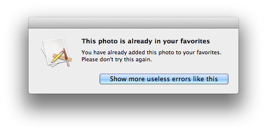
“Positive” Error Messages
For me, “positive” error messages are alerts that tell you something “failed” because the user has already done it before and so there’s no use in doing it again.
Like in the example screenshot above. The user added, at some point in history, a photo to their favorites. Now they stumble upon this photo again in some user’s photo stream and add it to their favorites again. And this error pops up, telling them they’re an idiot for not remembering it’s in their favorites already.
Necessity of Feedback
Giving the user feedback on what they do is very important, no argument there. But you have to be careful not to cross the line from giving helpful feedback to just being outright obnoxious or worse, unnecessarily interrupt the user’s workflow.
Alert panels are a good way of telling the user something went wrong when it needs their (immediate) attention. But halting the application to tell the user something has already been successfully done – what’s the use in that?
Example: flickery
flickery is the app where I run into this most often. “Photo already in favorites”. “Already in Group”. “Already in Set”. “Already in Gallery”. “Already member of the group”. etc.
Early versions of flickery did have these alerts in them. Actually, I hadn’t given it much thought at the time. But using the app a lot myself it quickly became clear to me that it’s just plain annoying.
flickery does have a “flying” animation when adding photos to favorites, sets, groups and galleries. Isn’t that all the feedback necessary in that case?
The user is informed something happened and that’s what counts. And if it’s already in there – who cares? Putting it in there was the point all along.
I do the same thing in ScreenFloat. When you add a shot to a category and it’s already in there, you won’t see an error panel telling the user it’s already in there. That was what they wanted anyway.
So, what’s the point?
Short and simple: avoid alerts, if you can.
They disrupt the flow of the app and take the user away from what they’re currently doing. There are many better ways to let the user know something happened – especially if it’s positive feedback.
[twitter-follow screen_name=’eternalstorms’ show_count=’yes’]
Reblogged this on Delightful UX and commented:
Thank you Matthias for articulating this issue so well. Equally frustrating are alerts that don’t tell me how to remedy the problem I’m confronted with. “Thanks for telling me I can’t do that, but what should I do about it?” Another important element to consider.
definitely! just as annoying!
Glad you liked the post – thank you for the reblog 🙂 !
Matthias – I completely agree! Thank you for blogging about this. I am one to often get extremely annoyed with insulting error messages. Errors are something that’s very easy to neglect in the midst of all the important issues in software development but they reflect so poorly on the software when things go wrong! I can’t actually believe they said “please don’t try this again.”
I’d love to add this example to my talk about bad error messages this week (will credit you, of course) and feature it on http://errorwallofshame.tumblr.com.
Hi.
I created that error message, just to illustrate the point I was trying to make 😉
It’s not really in use by any application, I just whipped it up on a whim.
Take care 🙂
I realised that yesterday while displaying it in my talk – always nice to have a reason to feel super intelligent 🙂 People still laughed. http://bit.ly/Tr6r9d Take care also 🙂
Same complaint when collaborative web apps tell you, “Error! That thing you just tried to delete was already deleted. Success?”
Reblogged this on Free Soft Fire.