About Michael
Michael is a student at Aalborg University, Denmark, studying Engineering Psychology — it’s about how to shape (technology mostly) products to fit humans. Although they don’t do a lot of visual design, he’s taken a personal interest in that on his own, hoping to land a job as a designer / user experience researcher at a medium sized company after he graduates this summer.
Info
About Amusic
Michael made the app with some of his fellow students, designing most of it on his own. Sadly, the app was actually never submitted to the App Store due to lack of time to finish it.
What he particularly likes about it…
“The two screens are actually the same — the player view. But unlike in the Apple Music app where the queue is an afterthought that is hidden beneath the cover art, in this design, you can choose whether to be utilitarian and use the queue view or have it look pretty. Easily change between the two. The player is beautiful either way. When you change, the song animates to its new position and stays there until you decide to change it again. Choose your style and forget about it if you like.
Better yet, the waveform slider is both pretty and SUPER useful as it lets you easily fast forward to your favourite part of the song.”
…and dislikes

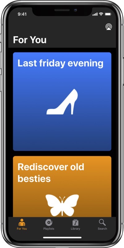
“I’m not very happy with the artwork on the “for you” screen. Also it should pack more content pr. screen estate.”
Thank you, Michael, for sharing 🙂
About the “Show and Tell” Blog Series
Show and Tell presents developers’ and designers’ most and least favorite elements of UI/UX in an app they helped create or design. If you’d like to share, submissions are open! Submit your app here! Thank you 🙂
Comments are closed.