I’ve been wanting to make my website a bit more “alive” for a while, and I finally had the time to do something about it.
App’s Prices
For the longest time, I didn’t show the prices for my apps on my website (crazy, I know), simply because I didn’t feel like going into the HTML source, updating the static price, and re-uploading the page every time I had a sale.
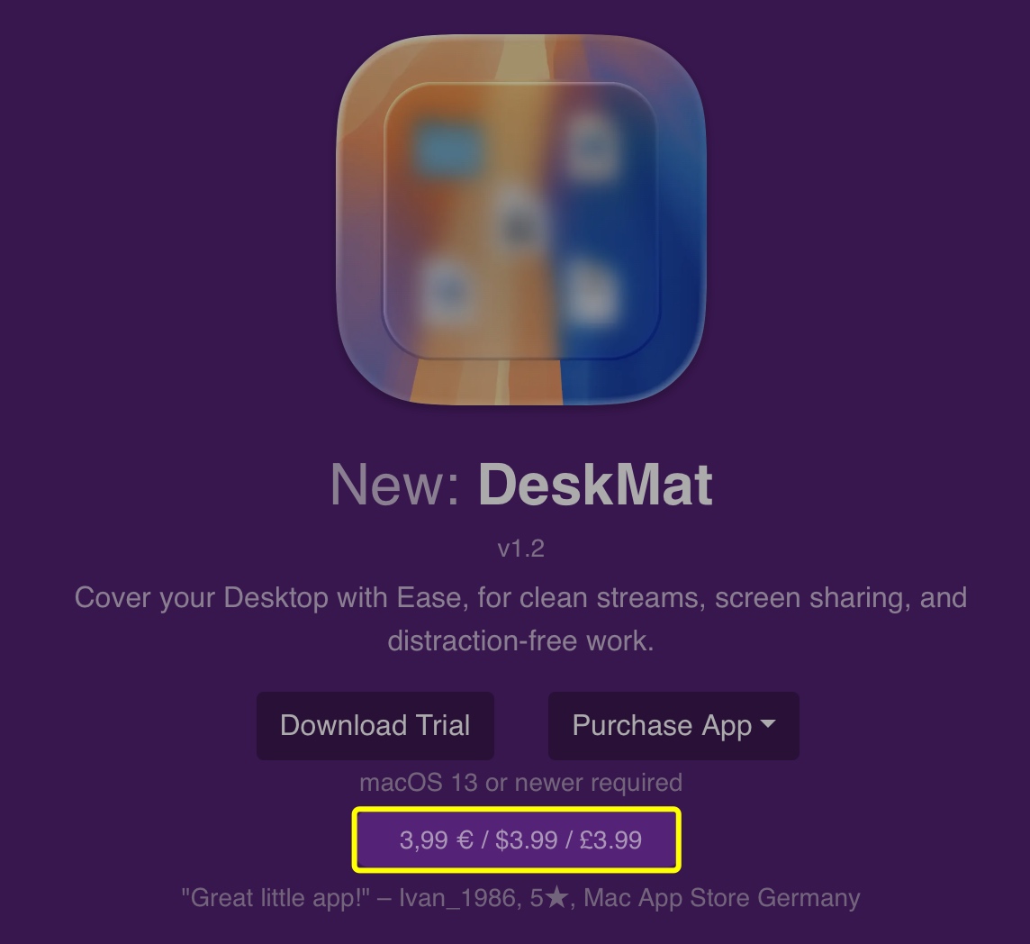
Now, I have a PHP script that takes care of it for me. It can load prices for different localities using the App Store API, or from Paddle. I currently just get them from Apple right now, because my apps’ prices are the same on the App Stores and my website. The results are cached for 6 hours so I don’t have to query the API for every page load. For time-sensitive sales, I can easily discard the cache and have the page (and thus, prices) reload for everyone instantly.
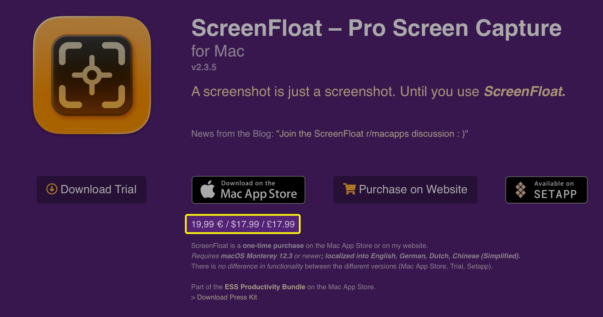
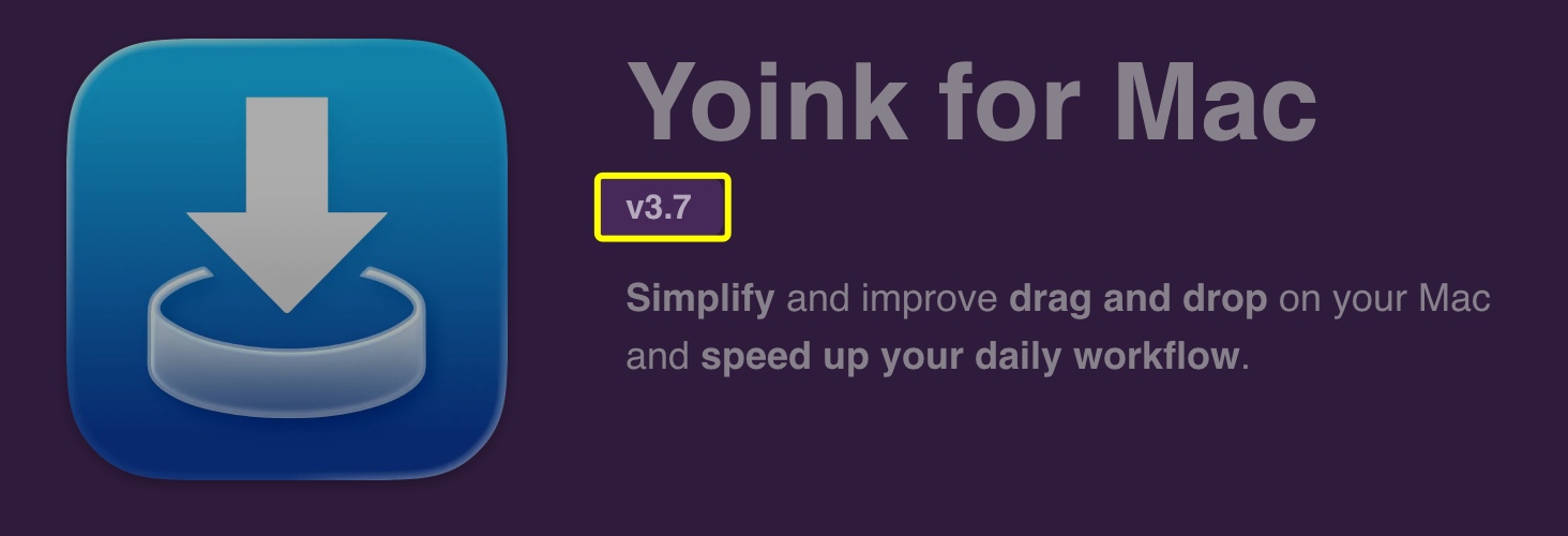
Prices are now shown on the main website (see above), and on each app’s webpage:
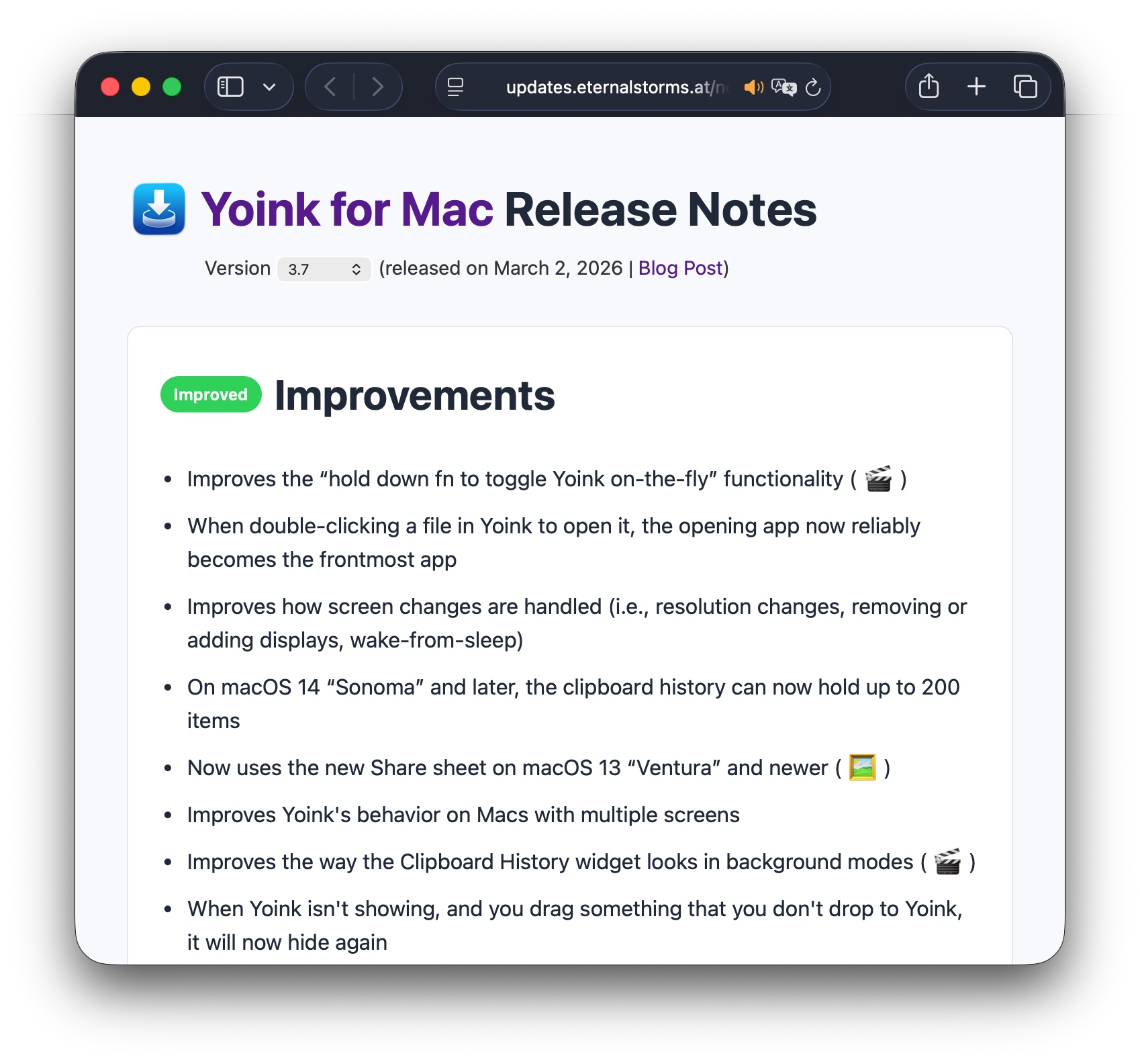
“Current Version” Indicator, Release Notes
For ScreenFloat 2.0, I built an entire API and database with PHP and MySQL for the release notes I show in-app:
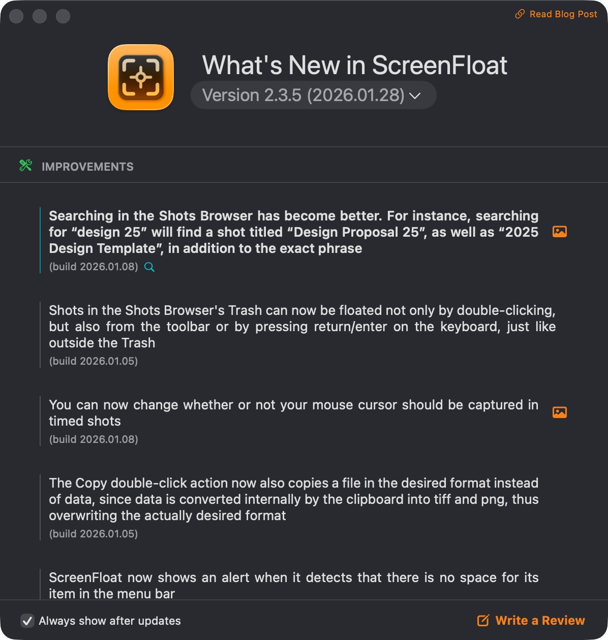
It allows me to get all sorts of information about any release, the obvious ones being version, release date and download file size.
This powers my in-app update mechanisms, the in-app release notes you can see above, and now the “current version” of apps on my website (see below), along with a web version of my apps’ release notes.
A click onto the version brings you to the web release notes. I tried to replicate the in-app release notes as closely as possible, with image- and video previews of features, etc. You can switch between English and German, rich- and plain text, and browse through the release history.
Highlighted Blog Posts
Though I’ve always linked to my blog from my website, I thought it would be neat to feature the newest blog post on the main page and the latest app-related post on the app’s webpage. I hope this is more enticing to click than a simple “Blog” link.
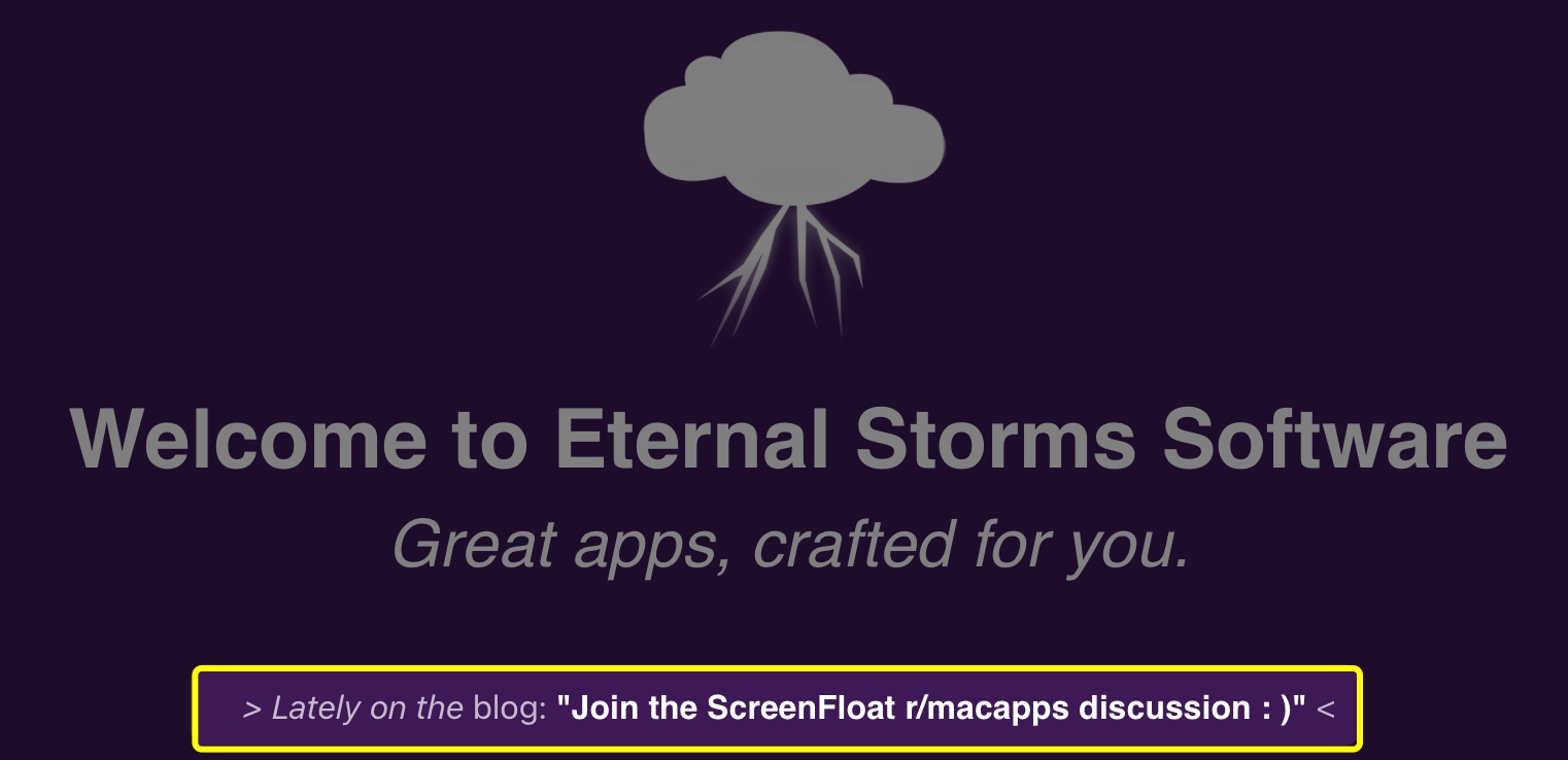
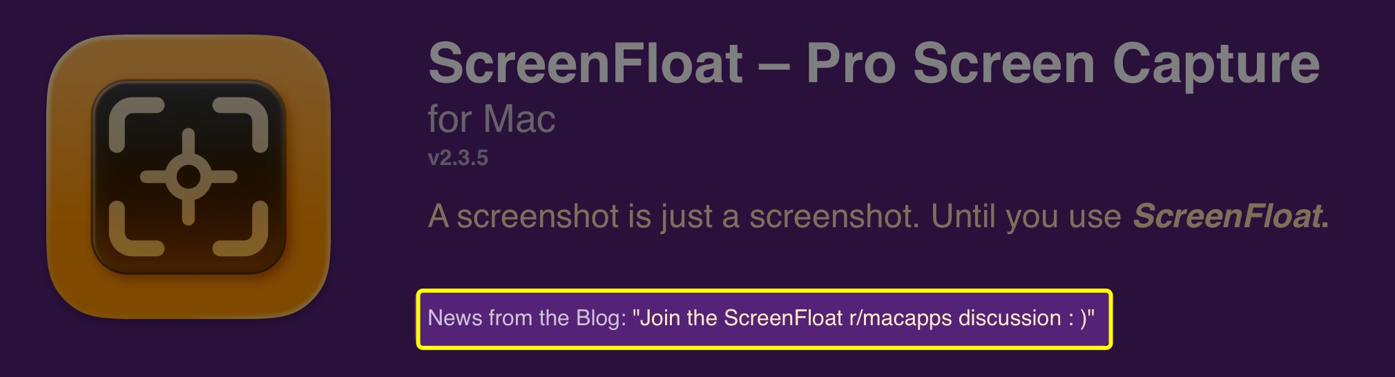
This uses the basic WordPress API. It looks for posts with specific tags or within specific categories, published within the last 2 months. If there aren’t any blog posts with that criteria, nothing is shown. I thought that better than showing old, outdated posts. I don’t want to give off “deserted” vibes.
Friends Page
I have a new Friends page where I highlight a few long-time friends of Eternal Storms Software. I still need to find a way to include that into the main website better.
Auto-Applying Discount Codes on my Web Store
Probably a no-brainer for anyone else, but I coded my web store myself, and only for Black Friday 2025 had the idea of auto-applying discount codes. That way, everyone gets the benefit of a discount when a sale’s going on, even if they don’t know about it.
The way it works is, I have a specific naming scheme for site-wide and app-specific discount codes, and the web store looks for them and applies them automatically.
Tip Jar
Recently, I’ve been implementing Tip Jars into my apps, for anyone who’d like to completely voluntary further support my work, beyond the app’s one-time purchase price (I don’t offer subscriptions).
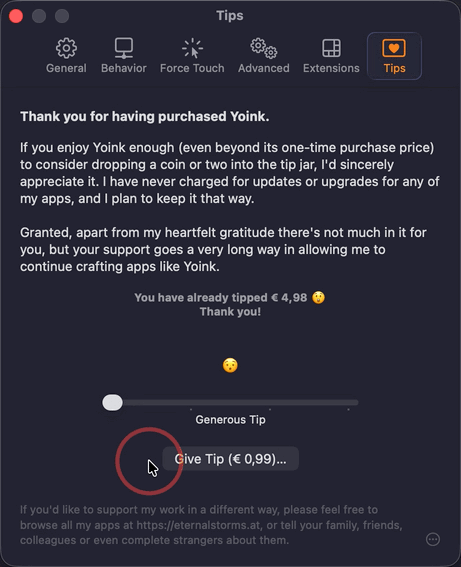
Since I implemented it for both the App Store and via Paddle for the direct-purchase versions of my apps, I figured I’d implement a small web version of the latter, too.
I’m linking to it from my blog, but I’m still undecided about adding it to the main page. Probably going to leave it out.
Things Still In the Works
For now, there are two things I still haven’t gotten around to including.
Dynamic App Reviews
I do include reviews from the App Stores on the main and app pages, but they’re static. I’d like it to be a bit more dynamic, where I’d show random 4- and 5-star reviews. Apple offers APIs for that, so it shouldn’t be too much of a hassle.
A “Sources” Page
I’d like to have a page up indicating official sources for my apps: my website, the App Store, Bundlehunt (on occasion), MacUpdate, etc.
Basically a single source of truth for figuring out if a website offering a download of or licenses for my apps is official and legit.
Now back to work. Since I’m not vibe-coding, my apps don’t develop themselves!

.png")

.png")
.png")