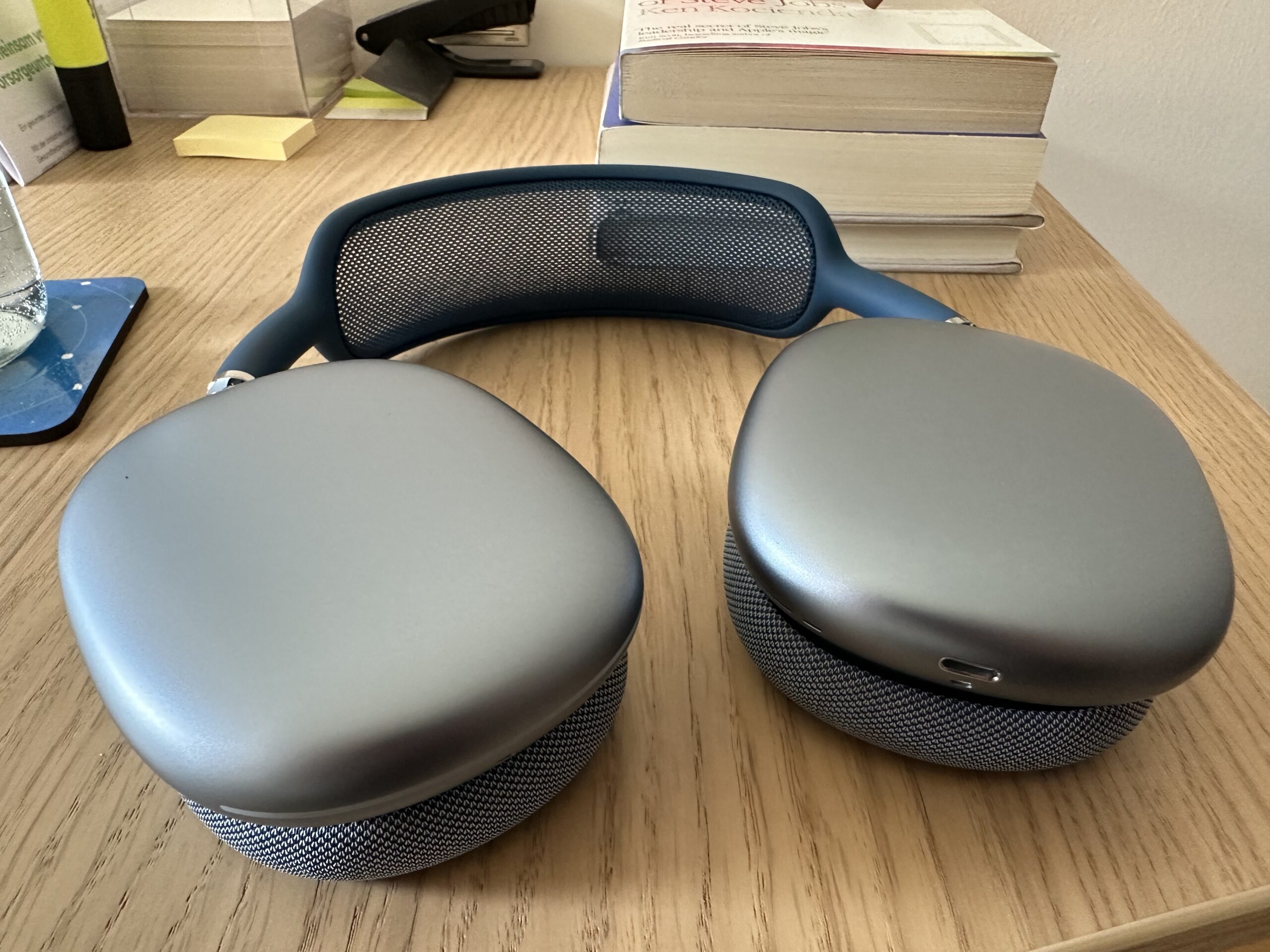
I’d been eyeing the AirPods Max for a while, but held off on ordering them in hopes that there might be at least a refresh of colors. But that never happened, so I finally pulled the trigger and ordered them. A month later, here they are! But I’ll have to return them.
Apple AirPods Max in Sky Blue
Setup
In pure Apple fashion, and as it ought to be, setup is easy and quickly done. So much so, I actually almost missed it happened.
Build, Look and Feel
On paper, they’re heavy compared to other comparable headphones. On my head, though, I barely felt them at all – and I wore them all day during work and streams.
Sky Blue is a lovely color
They feel extremely comfortable. I love the mesh on the ear pieces – it’s very soft and squishy which, *when* I felt it, felt amazing. My ears did get a bit warm after a while (expected with over-ears), but it’s still pretty cold here in Austria, so I’d expect this to become worse as summer closes in. At times, I was quite happy to take them off for a couple of seconds to let fresh (prince of bel-) air in. Altogether, they do feel their prize – premium.
A small side note: The USB-C-to-Lightning cable included in the package is not braided. I don’t care either way, but that feels like Apple skimping a little bit. A bad look for their Max product?
The Max’s case is very nice to the touch. If I were to travel with them, I’d probably have them in an extra enclosure or wrapped up in something anyway, so while it does look odd and doesn’t cover/engulf the entire thing, I don’t have any complaints with the case. I was careful when taking them out of the case though, as the two ear pieces unnervingly clank together as they come out of the case.
Battery life is great; it lasts way longer than two work days, so: no complaints. Charging via Lightning doesn’t bother me at all, it’s how I charge everything anyway, except the Apple Watch. Any battery life is better than my current AirPods’ – I get about 30 minutes on the right one, and an ~1h20 on the left 🤷♂️
Sound
Now, I’m coming from regular AirPods 2nd generation (released in March 2019), and I don’t have any other headphones to compare them to. Let’s just say, I expected quite an improvement in terms of sound – and I was not disappointed. To me, they sound full, rich and just generally well-balanced. I won’t bore you with this too much; there are tons of other in-depth reviews out there regarding sound. They sound incredible to me.
Spatial audio/Dolby Atmos is a blast. “Here Comes The Sun” by The Beatles is a joy to listen to; Norah Jones’ “Come Away With Me” album is a pleasure to the ears. As for Spatial audio with head tracking: it’s a nice gimmick, but I don’t really have or see a use for it when playing music or watching something. I tried it for a bit, then turned it off and never looked back. I’m sure this will play a role once Apple’s VR/AR headset is released, though 🤔 Spatialised Stereo Audio is very good in most cases, too. There was the odd song where the “ordinary” stereo version sounded more balanced and defined than its spatialised version, but for the most part, I preferred the spatialised versions.
Active Noise Cancellation and Transparency
I’ve never had or tried any noise-cancelling headphones before, so this was new to me. I went into this thinking noise cancelling means noise elimination: anything coming from the outside is completely blocked out. That is not true. You’ll hear some stuff, and you won’t hear other stuff. Let me give you a couple of (weird) examples:
What I could not hear at all with ANC on: – Our fridge running – Our dishwasher running – Our PlayStation running – Our upstairs neighbor practicing her singing and piano – Street noises when our balcony door or a window is open – The passive ventilation in our bathroom – My girlfriend washing her hands in the bathroom with me in another room – My girlfriend chopping veggies in the kitchen
What I could still kind of hear with ANC on: – Our dishwasher drawing water – My girlfriend talking or coughing – Myself unwrapping a cough drop – The clinking of my spoon against my coffee cup – Myself peeing (yes, I had to try that – who wouldn’t!?) – Washing my hands (I’d just peed, after all) – My girlfriend (no! not peeing!) typing on her keyboard – Myself typing on my keyboard – The active ventilation in our bathroom – The washing machine – Our capsule-coffee machine – The doorbell very, very faintly, almost missed it
Now, keep in mind that even though I still could hear that stuff, it was reduced by *a lot*. With music playing, it became very difficult to make out any “external” sounds. I quickly grew used to noise cancellation. It is very well done in the AirPods Max. And if you’re wondering if wearing glasses made any difference: no, not at all, although it might depend on the kind of temples your glasses have (mine are pretty thin).
As for transparency, it’s downright amazing. (Transparency is a mode that uses the headphone’s microphones to let “external” sounds through, so you can more easily hear somebody talking to you). It doesn’t sound tinny or like talking into a pillow, it’s very natural and quite close to not wearing any headphones at all. I read somewhere that Apple’s AirPods do this best compared to other manufacturers, and I can see (or hear) why.
So why return them?
It all comes down to two minor, and one glaring issue. On the second full day of using the AirPods Max, I noticed that the back of my ears hurt, because I’m wearing glasses, and the ear cups do press down on them (they must, it’s what they’re designed to do). That became a bit uncomfortable and could only be fixed by taking off the AirPods, defeating the purpose of having them (taking off my glasses is not an option).
I could actually hear my own heartbeat (faintly, but enough so that it bothered me on occasion). On that note, even more pronounced, I could actually hear a low “drone” in my ears whenever I moved. Not because of ANC, but because the vibrations of my movement or muscles translated into the ear cups. That got annoying quickly.
And the kicker: their Bluetooth connection to my Mac (which is right next to me). Intermittent drops in playback, or a little “click” here and there – often several times a minute. I also experienced it using them with Apple TV (right next to the couch where we’re sitting), albeit much less so.
To justify spending €629 on a product, I really have to love it. And… I didn’t. The droning sound when I moved, hearing my own heartbeat on occasion, and the connectivity issues… Especially that last one is unacceptable for a product at that price point.
I’m actually sad about it, because I expected love them. I like the way they look, feel, and sound, but at that price point, that’s just not enough.
Back to my old AirPods from 2019?
Nope. I decided to get the AirPods Pro 2nd generation. I ordered them and got them the next day – I did not have to wait another month for them to arrive 😄
Apple AirPods Pro
Noise cancelling is *almost* on-par. The Maxes cover your ears, so from that fact alone they are a bit better in that regard. Transparency sounds just a touch “tinnier”, but it’s still very natural sounding. I can’t hear my own heartbeat, nor any vibration droning in my ears when I move. I can use them for workouts and outside, even when it’s raining. I have not experienced any connectivity issues. My ears don’t get warm, and my glasses’ temples don’t hurt me after a while. They sound amazing. Not “for their size”. They sound amazing, period.
Pro max me happy
I’m surprised to say it, but I am way happier with the AirPods Pro than I think I ever could have been with the AirPods Max. Sometimes, pro is max less is more.
[This is a follow-up to this blog post. It was inspired by the response I received through social media and different websites.]
In a previous version of Yoink, I had the following conundrum:
The checkbox “Show window near mouse pointer when drag is initiated” is inactive and needs extra steps to be activated.
If I’m a new user of the app, at first, I have no idea how to activate that checkbox. At best, it’s something I need to set in this preference panel, at worst it’s a setting in a different one.
As a new user, my only option is to blindly change settings, waiting for one to activate the checkbox so I can select it.
There are different solutions to this problem, of varying degrees of effective- and usefulness:
A tooltip. If the checkbox is inactive and you hover over it, a tooltip appears, explaining what to do to activate the checkbox.
It’s a quick and easy solution, however, it’s almost undiscoverable. I know of many users who don’t even know tooltips exist.
Hiding the checkbox instead of having it be inactive.
That’s better, as it reduces clutter (as the checkbox would be inactive anyway). But it introduces another problem – nobody knows that the option even exists.
“For that UI, I think maybe an additional improvement would be to actually hide and show the checkbox completely instead of disabling it.
Also, indent the second checkbox so that it feels like it’s a sub-section of the first.
Another option might be to split things out into radio buttons instead of checkboxes and the popup menu.
That way you could expose the additional option tied to the appropriate radio choice, which you can’t exactly do with the menu item.”
– Manton Reece, via Core Intuition’s slack channel
Speaking of radio buttons, Adrien Maston wrote me a very detailed mail with some ideas he had about resolving the issue:
Since there are only two options for « automatically show when », maybe the setting could be radios instead of a select.
Then each option would be formatted as a column and each column would contain specific settings (the « drag starts » column would contain the « Show window near mouse pointer when drag is initiated » checkbox. Then it would make sens that clicking the checkbox would also set to « drag starts ».
What I ended up doing in Yoink v3.2.1, the release that followed this discussion, was this:
Instead of having the checkbox inactive, it’s active at all times and can be clicked right away. The advantage of this is that for one, the user knows the option exists and two, the user can select the option right away without having to figure out how to activate it.
The downside, and this has been pointed out to me a couple of times, and I agree, is that clicking the checkbox changes two settings at once (the checkbox and the popup, as you can see in the GIF above). It changes a setting the user has made before. And that’s bad UX design on its own right there.
My thinking was, it’s in the same preference pane, so the user sees what’s happening right away. It still was the wrong decision (as has been pointed out to me in the comments on designernews.co).
For Yoink v3.2.5, I re-thought the whole thing and decided to make it three options in a popup.
This is the result:
It solves a couple of things:
The inactive checkbox is a thing of the past
The options you have for when and where Yoink should appear are much clearer
You get a preview video for every option so you know right away how each setting affects Yoink
Additionally, I think it’s the nicest Yoink’s Behavior preference pane has ever looked, so that’s a plus 😉
An inactive checkbox is always a bit of a mystery to me.
Why is it inactive? How do I get it to activate so I can select it? More often than not, it takes me a couple of tries fiddling around with other preferences to finally activate the checkbox and be able to select it.
It shouldn’t be that way.
And now I realize I’ve been guilty of having such an inactive checkbox in Yoink‘s preferences myself:
The inactive checkbox “Show window near mouse pointer (…)” is inactive and needs extra steps to be activated
It’s exactly what I dislike. What was I thinking?
As a new user who has no idea how these preferences are connected, you just don’t know how to get that checkbox active and, more importantly, how to change the setting available behind the inactive checkbox.
In the worst case, it’d take three steps to activate it. You’d have to:
Select the checkbox “Automatically show when” (if it wasn’t active before)
Change “mouse pointer is at edge of screen” to “drag starts”
and then you’d finally be able to access the newly active checkbox
If I launch Yoink for the first time, I have no idea what’s going on. That’s not a very good user experience.
So with the upcoming update v3.2.1, the checkbox will always be active, and it’s much clearer how these two options are connected:
In Yoink v3.2.1, the checkbox is always accessible, eliminating extra steps to be able to select it.
Obviously, not all cases are the same and sometimes, in some places, there might be a good reason to have a checkbox inactive.
But here, it was clearly the wrong choice.
[Update 27.10.2016: I published a follow-up here.]
– – – Do you enjoy my blog and/or my software? – – –


.png")
