It was a very busy month, so let’s get right to what I…
… Did
Newsletter App-Integration (subscribe)
Last month, I told you about my newsletter. I’ve been working on it some more and now have found what I think is a neat way to integrate subscribing into my apps – via the About window:

If an Acknowledgments button is shown (dependent on whether or not there’s an according PDF in the bundle), subscription can be accessed through the ellipsis button (which you can see in the GIF).
On the other hand, if the Acknowledgements button isn’t shown, the subscription field is shown right away when the About window is opened.
Akin to OS X’s login window, the email-field shakes if email-validation fails or if any other error occurs, while showing a thank you-message if subscribing was successful.
The communication with the MailChimp API is done inside an XPC service, so it can play nice in OS X’s sandbox without having to give internet access to the entire application if it’s not needed.
During the first couple of builds, I launched the XPC service when the user clicked Subscribe. Since launching an XPC service takes a moment, feedback was delayed and resulted in a undesirable user experience (the thank you message or the “something-failed-shake-animation” would be delayed, leaving the user in the dark for a little while whether something was still going on or not).
I decided to launch the XPC service as soon as the menu item is selected. Since the user has to enter an email before being able to click the Subscribe button, it gives the XPC service enough time to launch and give feedback right away.
I’ve been battling a similar issue with Yoink 3.2 – but more on that later.
SiriMote: Drawing the Apple TV Siri Remote in Code (website)

For an upcoming update of SiriMote (which will let you put your Mac or its display to sleep), I needed a way to display a hi-res schematic image of the Apple TV Siri Remote.
For the drawn Siri Remote to resize correctly and always display the buttons in the right ratios to one another, I took “extremely precise” measurements (as I called them on twitter – of course, they aren’t, but they’re good enough) of the remote so I could reproduce it in code. So this happened:
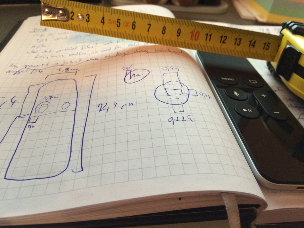
The GIF you see above is the result of a day’s worth of measuring and putting the measurements in code. (You can also bare witness to a slight mis-alignment of the button title MENU during resizing. It’s been fixed.) I’ll open source the code once I’ve re-written it in Swift. It’s currently Objective-C (as that is still my go-to language, considering all my apps are coded in it).
SiriMote: Getting Touch Events from the Apple TV Siri Remote (website)
More work went into SiriMote, trying to receive touch events. Up until recently, I had been unable to do so. I had given up on it until I came to think of private frameworks (which I dislike using) – I knew in the back of my mind that there was something that was designed to talk to multi-touch devices.
MultitouchSupport.framework it’s called, and it’s incredibly easy to use (despite not having a documentation for it. But as in most of these cases, Google is your friend). It wasn’t long until I was able to recognize two fingers moving on the Siri Remote – yet another instance where my newly created Siri Remote drawing code came in handy to visualize it:
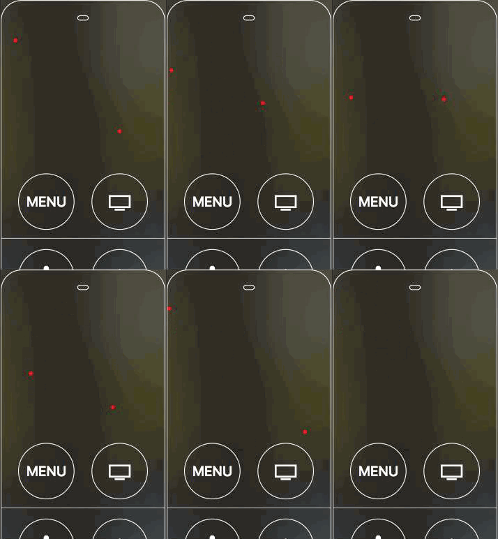
Seems like the Apple TV Siri Remote is able to detect two fingers at most (on the Mac using the MultitouchSupport.framework).
I’m not entirely sure what I’ll do with this yet (or if I’ll release it at all, considering it’s using a private framework), but allowing for simple gestures might not be too far off.
Finishing up Yoink v3.2 (website, Mac App Store)
Another month passed and I still haven’t submitted Yoink 3.2 to the Mac App Store. I know, it’s embarrassing. But there have been some issues that I’ve been wanting to resolve before releasing it to the public.
- NSURL/Bookmarks: When dragging a file to Yoink, it receives an NSURL to that file, while also gaining permission to access that file within the sandbox.
In previous builds, Yoink kept that URL around until it was quit, only then creating a bookmark to be able to access it upon relaunch.
Although it works, there were two issues: 1) The resource was kept alive even though the file was sitting idly inside Yoink and 2) if the file was moved outside of Yoink to a different destination, Yoink didn’t know about it and though the file could still be accessed (and moved), a sandbox exception was raised.
In the upcoming update, Yoink creates a bookmark of the URL right away and only starts accessing the resource if it’s needed (loading the icon, showing the QuickLook preview, moving/copying/aliasing the file from within Yoink, etc).
Refactoring this was more work than I had anticipated, since everything was laid out to work with an NSURL instead of an NSData object (which is what a NSURL bookmark is).
Moving to bookmarks also helped in finding and fixing a bug when a file that resided in Yoink was edited and saved in another application (which often is just a delete of the original file and a creation of a new file).
- QuickLook: A minor thing, but it’s always been bugging me that I calculated the QuickLook panel’s size by rendering the QuickLook thumbnail image off screen and getting its dimensions. It just seems so inefficient and ugly.
After digging around, I finally found QLThumbnailGetContentRect, which, I know, has been there for ages, but Mr. Four-Eyes here has been unable to find it.
Anyway, it does exactly what I needed and after some very rudimentary measurements, it’s a couple of milliseconds faster than my previous approach and gives me the satisfaction that I could remove a couple of very ugly lines from my code.
Another interesting tidbit about QuickLook – even if you create the icon preview on another thread than the main one, trying to create too many at once will still stall your app. I found that creating two at once (using an NSOperationQueue, for example) works very well, but if you have upwards of 250 files, it can start stalling (probably depending on the hardware, too). I decided on creating one item after another, it’s fast and doesn’t stall the app, even with upwards of 1000 files.
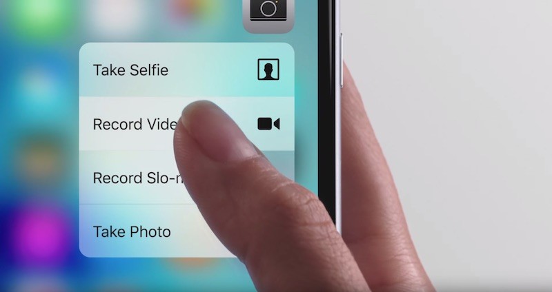
- Force Touch: The cool, new, flashy feature in Yoink 3.2 will be Force Touch integration. It’s been a wild ride so far. I liked the implementation I did, but I wasn’t really satisfied with it either.
Force Touch generally has two pressed states: State 1, which is basically an ordinary mouse click and stage 2, which represents a force click.
I wanted Force-Touch-Select-All to work like this: Press all the way to stage 2 on a file in Yoink to select all files, let go one stage to stage 1 and drag all the files out at once. This allows you to drag out all files at once without having to let go of the mouse button entirely (although that is still a way to do it, too – I just found it to be nicer not having to click twice).
The main problem was that under some circumstances, when the Magic Trackpad was released, a –mouseDown and –mouseUp was called, which is basically another click, so the selection was undone and just one file ended up being selected.
The problem got worse when thinking about another Force Touch option – revealing files in Finder, where, if more than one file is selected, a contextual menu is shown. With the problem in mind, during a Force Touch, the contextual menu was shown, but as soon as the button was released, the menu was closed, because of the issue I just described.
Long story short, I had to refactor the Force Touch recognition that prohibited a –mouseDown/Up when the Force Touch was released all the way.
Another issue was mouse movement – I have to allow for a little dragging without starting a file drag because force touching can trigger a small mouse movement, and a file drag would interrupt the Force Touch event. So I allow the mouse to be moved for about 4 pixels until a drag occurs, giving the user a little wiggle-room when force touching.
I also want some Force Touch actions to happen as soon as Force Touch happens (i.e., select all) and some only after Force Touch happened and the mouse button was released all the way (reveal files). I found a nice solution and will open source it after Yoink 3.2 is available.
- Force Touch Preferences: Something else I’ve been going back and forth on – whether to show the Force Touch settings icon in Yoink’s preferences even though a Force Touch Trackpad was not available. At first, I thought it best to not show it in such a case (less clutter). Now, I think it’d be better if the user knew the feature is there even though they can not use it currently. So I’ve settled on showing the Force Touch settings icon at all times, but it’s disabled if a device of such capabilities is currently not available on the Mac.
Another option would have been to enable it at all times and show explanatory text that Force Touch was not available right now. But that’s just one more click and a lot of words to describe what a disabled settings icon does at one look.
- Force Touch Device Recognition: To find out if the Mac Yoink is running on has a Force Touch capable device, I have to use IOKit and give two sandbox permissions: one for USB devices and one for Bluetooth (Bluetooth, obviously for the Magic Trackpad 2 and USB for when the Magic Trackpad is charging as well as for the internal one in Apple’s newest MacBooks).
In the build I was ready to submit to Apple (before I was invited to participate in the Mac App Store’s Get Productive Promotion), I had Force Touch device recognition built right into Yoink. It occurred to me that that might not be the best way to go and perhaps might have even resulted in a rejection. I hadn’t done anything with XPC services up to that point, but it was too perfect an opportunity to pass up, so I extracted the code and put it into an XPC service.
An XPC service has one major advantage in a sandbox environment, besides easier recovery from crashes: privilege separation. Only the XPC service has sandbox permission to access USB and Bluetooth devices. At first, I had the XPC service running at all times, but the thing is, I don’t need it running at all times. There’s only one time I continuously need to know if a Force Touch device is available – when the Preferences window is opened and while it is open. As soon as it’s closed, I can discard of the XPC service and clean up all the resources it’s using.
To access Yoink’s preferences, there’s only one way – through the menu either from Yoink’s optional menu bar icon or through the Advanced button at the lower left of Yoink’s window.
To be able to let the Preferences window know before showing if a Force Touch device is available, I’m launching the XPC service as soon as the menu is opened (quitting it again if the menu is closed). If the Preferences window is subsequently opened, the XPC service stays alive and continuously informs the Preferences window about the availability of any Force Touch capable devices.
The Preferences window can then enable or disable the Force Touch settings icon accordingly. As soon as the Preferences window is closed, the XPC service is invalidated and not used anymore (and ultimately terminated by the OS).
- Control-Click for Right-Click: Something I discovered only recently was that control-clicking onto a file icon in Yoink didn’t trigger the contextual menu (though a real right-click worked).
Apparently NSViews as subviews of an NSTableCellView don’t send the event to the appropriate place so the menu is shown. For some reason, I had one big NSView in there (that did absolutely nothing) which was the culprit. Now control-click works again. I guess I will have to file a rdar on that.
- Reduce Motion: When moving Yoink to a different place on your screen, it fluently floats from its location to the new destination. I now offer a setting to reduce motion for these animations. It’ll also take care of the adding/removing animation when adding files to/moving files out of Yoink.
- File Icon / Button Animation: With version 3.1 of Yoink, buttons to Remove, QuickLook or Pin a file were hidden until mousing over the item, resulting in an animation where the file icon moved off to the left and the buttons moved in from the right. I was happy about it at the time, but I came to realize that this is bad UI design. Although a file can be moved out of Yoink by clicking and dragging anywhere in the tableView’s row (the filename, the file icon or the background), most users believe that they have to click and drag the file icon or perhaps the filename (rightly so, because the Finder does it that way). So when you moused over the file icon, it moved away. How frustrating is that?
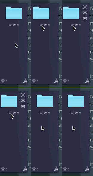 Version 3.2 will fix this and just fade in the buttons, leaving the file icon in place and only fading in the buttons at the side, not moving in.
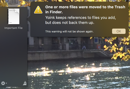
- File Deletion: Some users believe Yoink keeps copies of the files you move to it. That is not the case, Yoink only references the files you drop on it. I’m vary of this and don’t want people to lose any files because of it. So I decided, since I’m watching the files dropped to Yoink anyway to watch for filename changes and move events, to also watch for if a file is moved to the Trash. If this happens, a popover is shown informing users of the fact that Yoink doesn’t keep copies of files around:
Thinking about What I… (
blog)
I’m a lazy (and lousy) writer, so I like having to force myself to write at least once a month for this blog so I can hopefully improve my writing, get better at expressing myself and be more transparent about what I do. Also, it’s a nice journal of the progress on my work and what I have done at any given month – a nice look back.
How I go about it, however, is highly unprofessional and inefficient. For example, when I get to the “What I Read” section of this post, I usually panic, because I didn’t keep a log at all and have to retrace my steps, go through my browser’s history, read through my twitter favorites, messages, slack, etc. I’ll change that this month, with links I read going right into Safari’s Reading List (which currently holds mostly programming articles for future reference, those will have to go into a bookmarks folder) and clearing it once the post is done.
Another thing I don’t keep track of is “What I Downloaded”. Panic again. Basically any part of this post is a reason for me to panic, because I don’t keep logs of what I do (which is the purpose of this blog post category, ironically). For things I worked on, I basically go through my commit messages – highly tedious.
So yes, this is something that needs to change for me to be able to do this blog post in a non-absurd amount of time – this blog post, I’ve been working on for more than 5 hours now, with most of the time being spent on retracing my steps).
… Downloaded

Firewatch (website / steam)
A very nice game, a little on the short side, though, but nonetheless the $19.99. That scenery alone is pretty enough to make you want to buy and play it.

Lost Journey (iOS App Store)
A puzzle game that for no apparent reason reminds me of Monument Valley for some reason.

Bridge Constructor (iOS App Store)
Another nice puzzle game.

GIF Brewery 3 (Mac App Store)
From time to time, I have to create a GIF directly from my screen to be posted on twitter. I personally use an “in-house tool” for it (that maybe some day will see the light of day outside of these narrow halls at the Eternal Storms Software headquarters), but I thought I’d take a look at how other apps solved this. GIF Brewery came highly recommended. It looks nice, but trying to create my first GIF, it just didn’t create it. Perhaps it was my fault somehow – I haven’t tried it yet again because I haven’t had to create another GIF. Still, It’s worth checking out, it seems to be fully-featured to satisfy all your GIF-creation needs.
… Read
The Apple vs. FBI discussion has dominated my reading this month, starting with
Tim Cook’s Open Letter to Apple’s Customers (and the world, really) Regarding the FBI’s Request to Backdoor One iPhone 5c (apple)
Tim Cook’s letter seems genuine and heart-felt to me. To get a good overview about what’s going on, I read
Apple, The FBI and Security (stratechery)
A very good summary of the entire issue. If you’re trying to get caught up, read this and you’re all set. If you’re into science-fiction, the following article will spark your interest:
How the FBI Could Use Acid And Lasers to Access Data Stored on Seized iPhone (arstechnica)
A very tricky and unsafe method of retrieving data from the iPhone in question. An interesting read, but probably not feasible or worth the trouble, seeing as it would most probably destroy the phone and not yield any results.
Seeing as this is technically possible, it’s also possible for Apple to do what the FBI asked for:
Apple Can Comply With the FBI Court Order (trailofbits)
A blog post detailing why and how it’s technically possible for Apple to comply with the FBI’s court order.
Why Tim Cook Is So Furious (medium)
Showing why, although they claim it not to be, what the FBI is asking for is in fact a backdoor.
Other than this topic, I read about Blizzard’s Sound Design:
Blizzard Sound Design – Heroes Of The Storm (polygon)
In my opinion, Blizzard’s games have always had the best sounds and music pieces, starting at their very beginnings.
This article shows what lengths they go to and what it takes to create these amazing sounds.
An Intro PR Guide for Startups (craigkerstiens)
Always looking for ways to improve my press releases and basically anything that has to do with marketing and public relations, I click through a lot of these kinds of articles. It doesn’t tell me too much I haven’t heard already, but reiteration doesn’t hurt, either.
I also started reading a new book I got from my girlfriend on my birthday:
Death on the Nile by Agatha Christie (amazon.com / amazon.de)
I love the movie, and the book is everything I hoped it would be.
… Listened To
While working on so much this month, I tried listening to a couple of podcasts (usually, spoken words distracts me too much to be able to work efficiently, but since everybody’s listening to podcasts these days and I have no idea at what other time I would be able to, I thought I’d give it a shot).
The Talk Show – Episode 146 (podcast)
Apple obviously is trying to be more open and is doing the rounds, releasing its top managers into the wild, wild world that is the internet.
Recently, Craig Federighi (Apple’s SVP of Software Engineering) and Eddy Cue (Apple’s SVP of Internet Software and Services) joined John Gruber’s (of daringfireball-fame) The Talk Show.
Thimbleweed Park Podcast – Episode 41 (podcast)
I’m a fan of Ron Gilbert’s work, so listening to the podcast about the development of his newest game, Thimbleweed Park, is a given.
… Watched

The Boy (imdb / iTunes)
A good horror flick with a twist.

Sinister 2 (imdb / iTunes)
My girlfriend and I totally forgot to watch the sequel to what was a shock-filled first part, until we kind of stumbled upon it again. Loved it, though it is, indeed, very sinister.

The X-Files Season 10 / Reboot (iTunes)
Watched it in German. I hate they changed Fox Mulder’s voice. Why? Why do that?
It wasn’t the best season of the X-Files, but it also wasn’t the worst. I’m glad another movie and another season are being thought about / discussed by the powers that be.
… Ate
 Cashew-Cream chicken with pistachios and rice.
… Went to See
On February 10th, I turned 30 (time certainly flies). For the weekend, I thought it would be nice to celebrate with friends and family, so I invited them to join me in going to Puchberg am Schneeberg, which is a very nice, quiet place here in Austria. We spent our days hiking, swimming, playing board games and generally biding our time.
 View from Schneeberg
 The group – a very cool bunch.
From the left: My brother, my cousin’s girlfriend, my cousin, my girlfriend, me, my cousin, my cousin and my cousin’s wife
(those are two different cousins, of course – otherwise that would have been an uncomfortable weekend 😉 )
It turned out to be so cold up there that my iPhone ‘died’ shortly after taking this picture. Once it warmed up, I got it working again.
Those were some worrisome hours for me, let me tell you 😛
 Another nice view, combined with a little Austrian patriotism.




 Version 3.2 will fix this and just fade in the buttons, leaving the file icon in place and only fading in the buttons at the side, not moving in.


 Cashew-Cream chicken with pistachios and rice.
 View from Schneeberg
 The group – a very cool bunch.
 Another nice view, combined with a little Austrian patriotism.
 Released SiriMote 1.0 (
 The Babadook (
 Bajirao Mastani (
 Dilwale (
 Star Wars: The Force Awakens (
 Spicy Lemon Rice with Tamarind Date Chutney and Chapati
 Star Wars: Identities. My girlfriend (on the left, “Ma’ka”) and I (on the right, “Brzl”) went to see this exhibit on December 31st and were simply blown away.