In an effort to bring some personality to my apps, website and blog and make them easily recognizable by “connecting” them visually I rolled out a minor re-”design” of my website and blog yesterday.
The Color Scheme
The entire color scheme is based off the Eternal Storms Software logo.
Up until now, neither the website nor this blog reflected those colors. As a matter of fact, the only place that had some of this personality was the iOS part of Transloader. In its “About” screen, you’d see this:
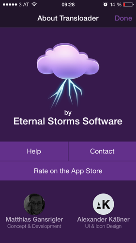 Screenshot of Transloader on iOS
It’s immediately recognizable – and not only by the logo.
The Website and Blog
It was about time I brought that over to the website, because it looked like this (please excuse the missing text and bezels, I took this from the Wayback Machine as I stupidly don’t keep old websites around):
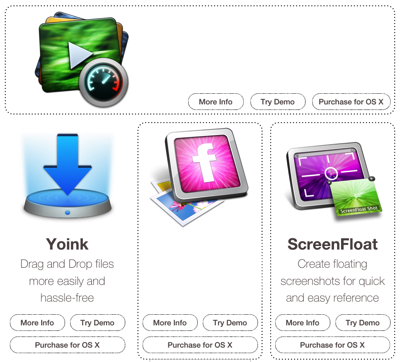 eternalstorms.at before the re-“design”
At the time, I had a good reason for it. I wanted the user to be able to see all my apps at once, without any distraction. But it lacks a certain “je-ne-sais-quoi”. It has no identity. You don’t know who it’s from. Heck, there’s not even a logo anywhere to be seen.
Lo and behold, the new website looks like this:
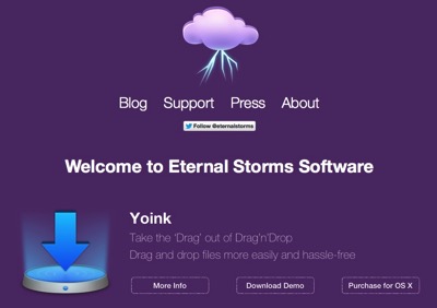 eternalstorms.at after the re-“design”
It’s probably not the best website you’ve ever seen, but it’s certainly an improvement over the old one.
The Apps
Now I can’t go in and make all my apps purple. That would look ludicrous (or would it?). But I still want to carry over some of this into my apps, and I believe the best place to do this is in the apps’ About windows. Currently, they look like this:
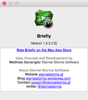 Briefly’s About window before the re-design
It has all the necessary information in there, but it could be more personal, more fun, if you will. Here’s what the new one will look like:
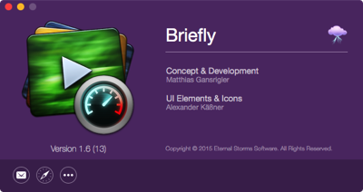 Briefly’s About window after the re-design
It will roll out in all apps with future updates. The nice thing is that it’s very much a drop-in replacement for the standard about panel Apple’s providing in Cocoa. It takes all its information from the app’s Info.plist file and additional information (like twitter, Facebook, Acknowledgements, Credits) can be provided in a strings file which will then be used in the about panel. So I just drop it in, change some strings in the strings file and I’m done, I don’t need to touch the xib in Interface Builder. Perhaps I’ll do a blog post about it some other time.
App Store Screenshots
All this kind of raises the question – should I brand my App Store screenshots as well? I’m leaning toward “no”. Definitely no logo or slogan, though. That would just distract from the product. Perhaps I could color explanation text accordingly, or put them in colored overlays. Or create an Eternal Storms Software Desktop Background Image that will be present in all App Store screenshots, that would definitely be a more subtle way of doing it. I might try it out on an app and see how it does.
But in general, I am against branding of App Store Screenshots. They should present the app. A description of the company could always be put into the last paragraph of the App Store App description. That’s a nice place for it.