Business

Screen shot 2011 06 07 at 11 51 24

Another WWDC keynote has come to an end, and boy, what a keynote it was. Those guys at Apple surely don’t fool around!

I really hate to have missed this year’s WWDC. There’s lots of new stuff to be discussed there, and while I will download the session videos once they’re available through the Apple Developer Center to developers, it’s still a completely different thing being there, conversing with other people, sharing and exchanging ideas and thoughts and getting to talk to Apple Engineers.

I’ve attended WWDC two times in the past, ’06 and ’08 and I’m so glad I joined in on that experience. I can’t wait to go again, and I’m sad I wasn’t able to this year…

Now let’s get down to some business and talk about some of the new stuff shown at the keynote.

Lion.

We didn’t get to see a whole lot of new stuff on Lion during the keynote. Most of what they showed was discussed earlier already.

In-App Purchases, Delta updates.

A great new thing is in-app purchases (if the thing with lodsys is settled anytime soon) and delta updates.
With delta updates, unlike “usual” updates, where the old application is replaced by the new one which is downloaded completely, only changes in the software bundle will be downloaded and written over the outdated parts. A huge win in bandwidth limits, speed and convenience.

Autosave, Resume.

Things we’ve already seen include autosave and resume. Both huge features in my book because, YES, why would we have to press cmd-s if we have a computer to do it for us automagically and YES, an application should start off where you last left it.
It’s just common sense and if Apple wants to remove the file system, it’s a no-brainer.

Mission Control.

Just one word – awesome 😉 It’s a great evolution of Spaces and Exposé, both features I use profusely and couldn’t imagine living without (although I use it slightly less since I’ve hooked up a Cinema Display to my MacBook Pro as a second display).

Launchpad and fullscreen apps.

Launchpad, well, it’s just a logical step if Apple wants to get rid of the file system as we’ve come to know it.

Fullscreen apps sounds like something I wouldn’t use too often, but who knows, Apple has made it very easy to switch between fullscreen and non-fullscreen apps with the swipe of a few fingers, so with time, I might come around. Right now, it feels kind of unnatural to me.
Going fullscreen was something I did for a short period of time in an app (run a slideshow, go through photos in flickery (shameless self-advertisement, I know), etc.), not something I’d work in for hours.

General thoughts on Lion and later releases.

I think it’s painfully clear where Apple is heading with Lion and subsequent iterations of Mac OS X – away from a file system based operating system to an application based operating system.
Documents will no longer be stored in folders inside folders inside folders but inside the applications they belong to, which, if you ask me, makes sense. To open a document, you don’t need to navigate to the document in Finder but just open the according application and choose the document there, as seen on the iPad with the iWork apps.
There might be a way to still access the file system (kind of like how the Terminal is for users who’d like to access the underpinnings of OS X) but for most of the users, they won’t need to.
A friend on twitter (@freeridecoding) said something that struck me as possible – that Lion will be the last Mac OS that is separate from iOS.

iOS 5.

What can I say except “Boom”? iOS 5 will be a great new release. Here’s a few features I’m excited about (since everything not in the keynote is under NDA, I can only talk about end-user features)

Notification Center.

About time. I’m glad they hired that jailbreak-software-guy, since he obviously knows what he’s doing.

iMessage.

Nice idea, but I’d like to know how they handle SMS now. Is it a different app? Will I have to remember what contact of mine has an iOS device with iOS 5 so I can use iMessage or if they have a, say, Nokia and I have to use the SMS app? Does the iMessage app do this for me? Figure out what device at the other end of the line and send either an iMessage or an SMS?

Reading List.

Great new feature, love it. I’ve been using a bookmark folder and MobileMe Bookmarks Sync for that functionality, but now it will be simpler. Very nice.
Not so nice for a certain developer of a certain Instapaper app. To quote him: “Shit.” (@marcoarment)

Twitter Integration.

I’ll have to see if this will replace any other twitter app for me. I’m guessing no.

Reminders.

This is an idea I had been thinking about for a few weeks (especially the location-aware tasks.) Too bad for me as a developer, I guess. Great for me as a user since this will be the first to-do list I’ll be using.

PC Free.

Finally. There’s nothing I’ve been loathing more than having to physically connect my iPad or iPhone to my Mac just to update the system software.

Sherlocked.

I just wanted to let you in on my thoughts about this. You might have heard this term on twitter or the general web. My understanding is it refers to a search app in OS 8 times called “Watson“, developed by Karelia Software. They wrote that software, released it and some time later, Apple came out with their search software for Mac OS 8.5 called “Sherlock” which was more or less an exact copy of Watson (which put Watson out of business, more or less, but Karelia Software is still doing great). This is where the verb “sherlocked” comes from.

Apple has done this a couple of times before, one of the earliest with the system 7 menu bar clock, where they copied an independent software developer’s idea and app.

Sometimes, Apple has the decency to buy things instead of just stealing them – like CoverFlow, but sadly, that’s not the case very often.

I think this is “below all pig”, as we say in German (which means an effin’ outrage! ).
I don’t like this. Affected developers obviously have no idea that they’re going to get sherlocked and if their application in question is their only source of income, this can put people and families at risk.

So I’d like to see Apple buy things instead of stealing them, but that’s probably quite unrealistic. I guess it’s an occupational hazard – developing for Apple devices more so than for any other’s.

iCloud.

iCloud is the new digital hub. It used to be iTunes, your local machine. Now it’s the cloud, and I do think it’s the way to go. You want your data everywhere, without having to manually copy files over. You want changes instantly populated to your other devices, so you can work on any device whenever and wherever you want. This is great!

For me, personally, Lion and iCloud are what I’m most interested in now. I’d been hoping for an easy way for developers to sync their users’ data amongst devices, and now with iCloud, we have it!

It will be interesting to see how iCloud develops, especially if it would be possible to share sync’ed data with other users of iCloud for, say, collaborative features. That would be a great next step.

Conclusion.

I have yet to install and try out any of this, I’m currently working on an external project with a deadline due very soon and I just haven’t got the time to install all this new software until the deadline has passed (and I hopefully complete the project, hehe), but I’m looking forward to trying all of this!

In summary, this is what your typical user and most developers (including me – this is me, by the way 😀 ) looked like while watching the keynote:

Before the keynote:

before

During the keynote:

during

After the keynote:

after

On the other hand, some developers looked like this while getting sherlocked:

Before the keynote:

before

During the keynote:

during

After the keynote:

after


[twitter-follow screen_name=’eternalstorms’ show_count=’yes’]

Read more

ScreenFloat

It gives me huge pleasure to announce the immediate availability of ScreenFloat – an app to increase your productivity on your Mac!

What Is ScreenFloat

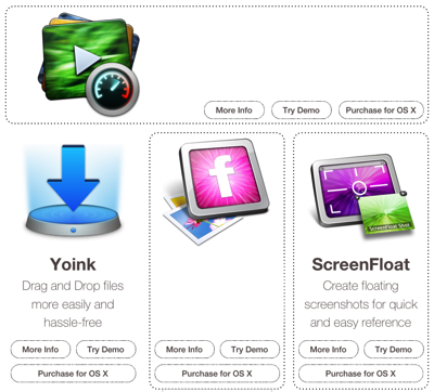
ScreenFloat lets you create screenshots that float above all other windows. This way, you do not need to resize or move windows around just to keep a piece of information visible on your display.


It also lets you store information for later use with the built-in Shots Browser, which lets you categorize and manage shots you’ve taken with the use of tags, smart categories and categories (which are basically smart folders or ordinary folders).

How to use ScreenFloat

ScreenFloat gives you customizable keyboard shortcuts to do its stuff.


By default, cmd-shift-2 will let you create a floating shot and cmd-shift-1 opens the Shots Browser. Creating a floating shot works the same way as creating a selective screenshot (which is cmd-shift-4 by Mac OS X’s default).

What else is there to say about ScreenFloat

It comes with a system service. Which means, when you select text in any Cocoa application (like Safari orTextEdit), you can invoke ScreenFloat’s service to create a floating shot from that. This also has a customizable keyboard shortcut for the user’s convenience. ScreenFloat resides either in your Dock (by default) or in your menu bar.

Availability and Pricing

ScreenFloat is available exclusively on the Mac App Store, a demo is available through the website. You can get it for just €5.99/$7.99! For updates on ScreenFloat, you can follow @screenfloatapp or @eternalstorms on twitter!


Let me know what you think in the comments or by eMail!

Thank you and take care, Matthias

[twitter-follow screen_name=’eternalstorms’ show_count=’yes’]

Read more

iTunes Connect is the interface Apple provides for developers to interact with the Mac- and iOS App Store.
It lets you check the review status of your apps, change metadata and screenshots, request promo codes, review your financials, manage your in app purchases and more. It does those things quite well.

However, there are a few improvements I’d like to see:

#1 – Review Summary

Short of going through every country in the App Store and checking for reviews of your apps, there is no way to get an overview over the reviews of your apps.

An overview would be greatly appreciated – not just by me, I’m sure.
Of course, one could argue that some reviews are not in English, but that’s not really a reason not to have at least a star rating statistic. Also, Google Translate can help you make sense of reviews that are not in a language you speak (and that’s enough most of the time to grasp what the reviewer is saying).
On the other hand, it doesn’t even have to be the content of the reviews if that’s what’s holding them back. Being able to see the star ratings alone would be a great improvement.

Being mailed about new reviews would be nice too, maybe not live, but once every _fill in appropriate timeframe here_, although I realize that would be a huge load on Apple’s servers. Now if they only had a larger server farm…

#2 – Charts Overview

It would be kind of nice to be informed about how your apps perform in terms of charts in different countries – Top Grossing, Top Selling, Top Free, etc.
But maybe that’s just me – I’m such a sucker for that kind of data.

#3 – Price History and Sales Performance

Sure, it may be the developer’s responsibility to keep track of how they priced their apps, when and for how long. But since Apple has some sort of statistic anyway, meaning their daily sales and trends module, why not implement a price history? And add sales performance at those prices, while they’re at it.
Something like: On that day, flickery was priced at €xx and sold xxx licenses. On another day, flickery was priced at €x and sold xxxx licenses.
I believe lots of developers would appreciate such a feature. I sure would.

#4 – Getting in touch with customers

If you get a bad review or a user requests a refund for their purchase, it would be great to be able to get in touch with them – sometimes it is unclear as to why the customer is dissatisfied with your product.
Before the Mac App Store, it was easy to contact your users. Now, not so much.
With the Mac App Store, the developer depends on the customer getting in touch with the former. I’m guessing it’s some sort of data privacy issue.
They could, however, do something like this: When the user rates an app badly, they could be asked to tell the developer about it / get in touch with the developer directly.
Part of this issue is that on the App Store App-Specific-Site, there’s no “Contact Developer” button. Although iTunes Connect makes you enter a “Contact eMail Address” for your  app, I don’t see it used anywhere on the page. That’s definitely something they should change.

#5 – An estimate when your App will be Reviewed

When you submit an app to the Mac App Store all it will say is “Waiting for Review” once it is processed. Not very informative, is it?
They could at least provide a rough estimate when your app is likely to get reviewed so you can plan around that a little bit.
Another, maybe better, way would be to show what place you’re at in the review-queue – although I’m guessing Apple does not want anyone to know how many apps have been submitted to the App Store.

It would also be great to get an estimate on how long the review itself will take, based on current review times for other apps. I think they have something like that for the iOS App Store so I guess it will eventually make its way to the Mac App Store, just like the recently added promo codes.

#6 – Notifications for Special Events

flickery is currently featured in the New and Noteworthy section of the Mac App Store (thank you so much, Mac App Store – team 🙂 ).
I stumbled upon this while checking for reviews – it would have been great to get a notification about that, I think every developer would like to know when they’re featured and where – albeit I assume they do send out notifications if they feature an app in a special way (like the banners on the front page of the Mac App Store).


All in all, though, the iTunes Connect team has been doing a great job and I can’t respect them enough for what they’ve accomplished. These are just my six cents. Kudos to those responsible. Kudos.

[twitter-follow screen_name=’eternalstorms’ show_count=’yes’]

Read more

As you might know, I’m currently in the process of getting flickery into the Mac App Store. I know, I’m a little late to the game. I originally had planned to have flickery in the Mac App Store when it first launched, however, time was not on my side.

Anyways, flickery has been rejected from the Mac App Store. For two reasons.

Reason for Rejection #1: Private API.

I’m using a great framework called BWToolkit in flickery. It’s a UI framework with HUD-style buttons, scrollbars, etc – you get the idea.

Apparently, it uses private APIs for its NSTokenField subclass (which I was not aware of at the time of submission and – thank god – am not currently using in flickery).

I get why usage of private APIs is discouraged (or simply, not allowed) – they might not be there in a future release of the OS, there might be something wrong with it in certain cases, etc and I’m happy to comply with Apple on that matter. However, this next point kind of bugs me.

Reason for Rejection #2: Installing of Plug-Ins for iPhoto and Aperture.

The Developer Agreement states:


3.3.2 An Application may install or run additional interpreted or executable code (e.g., plug-ins and extensions) for use in conjunction with the Application as long as such code:

– does not change the Application’s submitted binary or would not otherwise be considered an Update (as determined in Apple’s sole discretion); and

– does not change the primary purpose of the Application by providing features or functionality that are inconsistent with the intended and advertised purpose of the Application as submitted to the Mac App Store.


I guess that is applicable for video conversion-applications which need to download some kind of codecs or frameworks that can not, for legal reasons, ship those codecs with it. Some of these applications do not work without those codecs and demand you download them, otherwise you have to quit. I do understand why Apple does not want that. It’s inconvenient to the user, it’s tedious and it just plain sucks, in my opinion.

However, if you ship a photo sharing application it only makes sense to include plugins for iPhoto and/or Aperture, for example, so users can access their photos right from the source. They are not installed automatically, but at the user’s request (if they were installed automatically, that would be another story).

It does not change the submitted binary and it certainly does not change the primary purpose of the application (by providing features or functionality that are inconsistent with the intended and advertised purpose of the Application as submitted to the Mac App Store). One of the primary purposes of the application is to get stuff on flickr. With a plugin for, say, iPhoto, it makes it very convenient for the user to do so.
The features and functionality are there anyway, uploading works both with plugins not installed or installed.

If this is a violation of the rule, why not just disallow plug-ins altogether? What the flickery exporter plug-in for both iPhoto and Aperture does is the very definition of a plug-in, don’t you think?

A Solution?

It’s no solution, it’s more of a workaround which other applications currently use as well.

I re-submitted flickery with the plug-ins removed, albeit with a button to go to a webpage to download the plugins. flickery will install them for you if you drag them onto it (I hope they’ll allow that).

However, I don’t go down without making some sort of noise. I did write an eMail to the Mac App Store team regarding this, asking for a re-evaluation of this topic.
If they (however unlikely) do change their minds, I will be happy to re-add those plug-ins to flickery.

Fingers crossed.

[twitter-follow screen_name=’eternalstorms’ show_count=’yes’]

Read more